Survey Global Settings
Global settings apply to the entire Survey. Use them to control presentation, progress, navigation, and overall behavior.
For the full Survey workflow, start with Understanding and Building Surveys. For question types, see Survey Blocks Reference; for conditional paths, see Survey Branching and Logic.
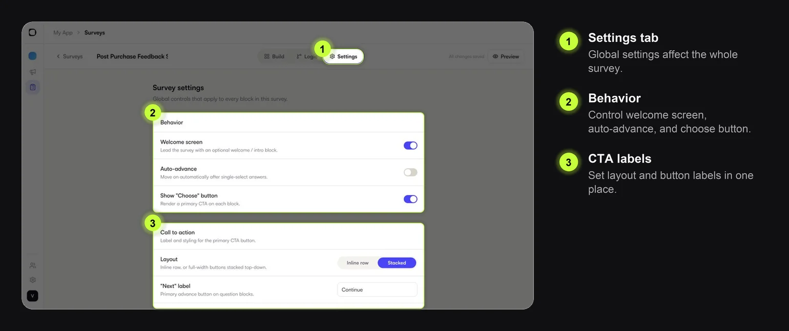
Behavior
| Setting | What it changes | Guidance |
|---|---|---|
| Welcome screen | Shows or hides the intro block | Use it when users need context before answering |
| Auto-advance | Moves ahead after single-select answers | Good for very short Surveys; avoid if users may tap accidentally |
| Show Choose button | Shows a primary CTA on blocks | Keep it on when users need to confirm their choice |
If the Survey is triggered at a very obvious moment, such as after order delivery, you can often skip the welcome screen.
Call to Action
Use CTA settings to control button layout, labels, and styling.
Common labels:
| Label | Where it appears |
|---|---|
| Start | Welcome block |
| Next | Question blocks |
| Back | Previous-step navigation |
| Done | Final or result block |
Use clear verbs. Avoid playful labels unless they match your app tone.
Styling settings such as color, text color, font weight, and corner radius work the same way across CTA controls. Set them once for consistency.
Pagination
| Setting | What it changes | Guidance |
|---|---|---|
| Show page numbers | Displays a count such as 1 of 3 | Useful when the Survey has more than one question |
| Progress bar | Shows completion progress | Helpful for multi-step Surveys |
| Count question blocks only | Excludes welcome/content screens from progress | Use when the progress should reflect questions only |
| Back button | Allows users to return to earlier blocks | Keep it on unless answers must be final |
| Continuous or Segmented | Changes progress style | Use segmented when each step should feel distinct |
Progress should reduce uncertainty. If the Survey is only one question, it may not need much progress UI.
Survey Timer
Use the timer only when timing is part of the experience.
Good uses:
- limited-time polls
- quiz-style experiences
- research where response time matters
Avoid timers for feedback Surveys. They can make the request feel pressured.
Display
| Setting | What it changes | Guidance |
|---|---|---|
| Dialog | Shows the Survey centered over the screen | Good for focused feedback |
| Bottom sheet | Shows the Survey from the bottom | Good for lightweight contextual prompts |
| Backdrop opacity | Dims the app behind the Survey | Higher opacity increases focus |
| Tap backdrop to dismiss | Lets users close by tapping outside | Useful for low-priority Surveys |
| Show close button | Shows an explicit close control | Usually keep this on |
For mobile feedback, bottom sheets feel lighter. Dialogs feel more deliberate.
Practical Defaults
For a simple feedback Survey, start with:
| Area | Suggested default |
|---|---|
| Welcome screen | On if context is needed, otherwise off |
| Auto-advance | Off |
| Choose button | On |
| Progress bar | On for 2+ questions |
| Back button | On |
| Display | Bottom sheet for lightweight prompts, dialog for focused feedback |
| Close button | On |
Change defaults only when the Survey goal needs it.