
SUMMARY
Good mobile onboarding reduces churn by accelerating activation - the moment users first experience product value. The strongest onboarding flows reduce friction, shorten time-to-value, use progressive disclosure where possible, and treat onboarding as a retention system rather than a setup checklist.
Key Takeaways
- Activation is one of the strongest early predictors of retention.
- Progressive disclosure often reduces friction better than front-loaded setup.
- Poor permission timing and overloaded first sessions increase early churn.
- Mobile onboarding requires native-feeling journeys, not web-first tooling layered onto apps.
- Strong onboarding lowers support load and improves long-term retention.

Introduction
User retention is often framed as a downstream growth metric, but our team views it as something shaped much earlier often within a user’s first few sessions.
In practice, onboarding is not just a product introduction layer;
it is where expectations are set, friction is either reduced or amplified, and early value is either discovered or missed.
Industry benchmarks consistently show steep drop-offs in the days immediately following install.
But the more important takeaway is not simply that churn happens early , it is that much of it is preventable.
Our perspective is that onboarding quality is one of the strongest predictors of whether users stay long enough to form a habit.
What Mobile App Onboarding Really Is
Mobile app onboarding is the sequence of steps that takes a new user from first install to their first meaningful action.
It is not a feature tour. It is not a setup checklist.
The point is activation.
Activation means the user experiences the product’s core value for the first time sending the first message, logging the first check-in, completing the first transaction.
Every step in onboarding should answer one question:
Does this move the user closer to that moment or further away?
Onboarding is not a tutorial.
It is the shortest path from a new user to their first success.
Why Mobile App Onboarding Matters
The case for onboarding is not philosophical.
It is in the numbers.
The median Day-1 retention rate across mobile apps is roughly 25%. By Day 30, it falls sharply.
Adjust benchmarks show this pattern consistently.
Appcues and Mixpanel benchmark data also suggest users who activate early retain materially better than those who do not.
That gap is not simply a product quality gap.
It is often an onboarding gap.
When users do not reach their first success quickly, they leave.
They rarely complain.
They simply stop returning.
The downstream effects of better onboarding are measurable across every growth metric:
- Higher activation rates
- Stronger Day-7 retention
- Lower support volume
- Better lifetime value
For many mobile teams, the highest-ROI growth investment is not more acquisition.
It is getting users already arriving to activation faster.
The Psychology of the First Session
The first session is an emotional evaluation, not just a usability test.
Users arrive with expectations.
When the app matches those expectations, users feel in control.
When it does not, they feel uncertain.
That feeling happens fast.
And it is difficult to recover from.
Dense instructions, too many choices, and long setup flows increase cognitive load exactly when users have the least patience for it.
The goal of onboarding is not merely to teach users how the app works.
It is to make them feel like they already understand it.
Good onboarding does three things:
- Reduces time to first value
- Sets clear expectations
- Builds early confidence
Users who feel capable in session one are far more likely to return in session two.
Why the First Session Often Decides Retention
A strong onboarding experience reduces the emotional cost of learning something new.
It replaces pressure with progress.
The first experience becomes the lens through which the product is judged.
If the first session feels smooth, users assume the rest of the product will feel the same.
If it feels confusing, they expect more friction ahead.
That expectation shapes retention.
Onboarding does not just explain features.
It shapes belief.
Common Mobile App Onboarding Patterns
Most products combine multiple patterns depending on complexity and user intent.
Welcome / Intro Screens
Used to communicate value before asking for commitment.
Sign-Up-First Onboarding
Useful where personalization, security, or compliance matters.
Value-First Onboarding
Lets users experience the product before creating an account.
Progressive (Just-in-Time) Onboarding
Introduces guidance gradually when relevant.
Persona-Based Onboarding
Adapts based on user goals.
Goal-Oriented Onboarding
Aligns onboarding around the outcome the user wants.
Each pattern solves a different problem.
The question is not which pattern is best universally.
It is which pattern reduces friction for your product.
Progressive Disclosure vs Front-Loaded Setup
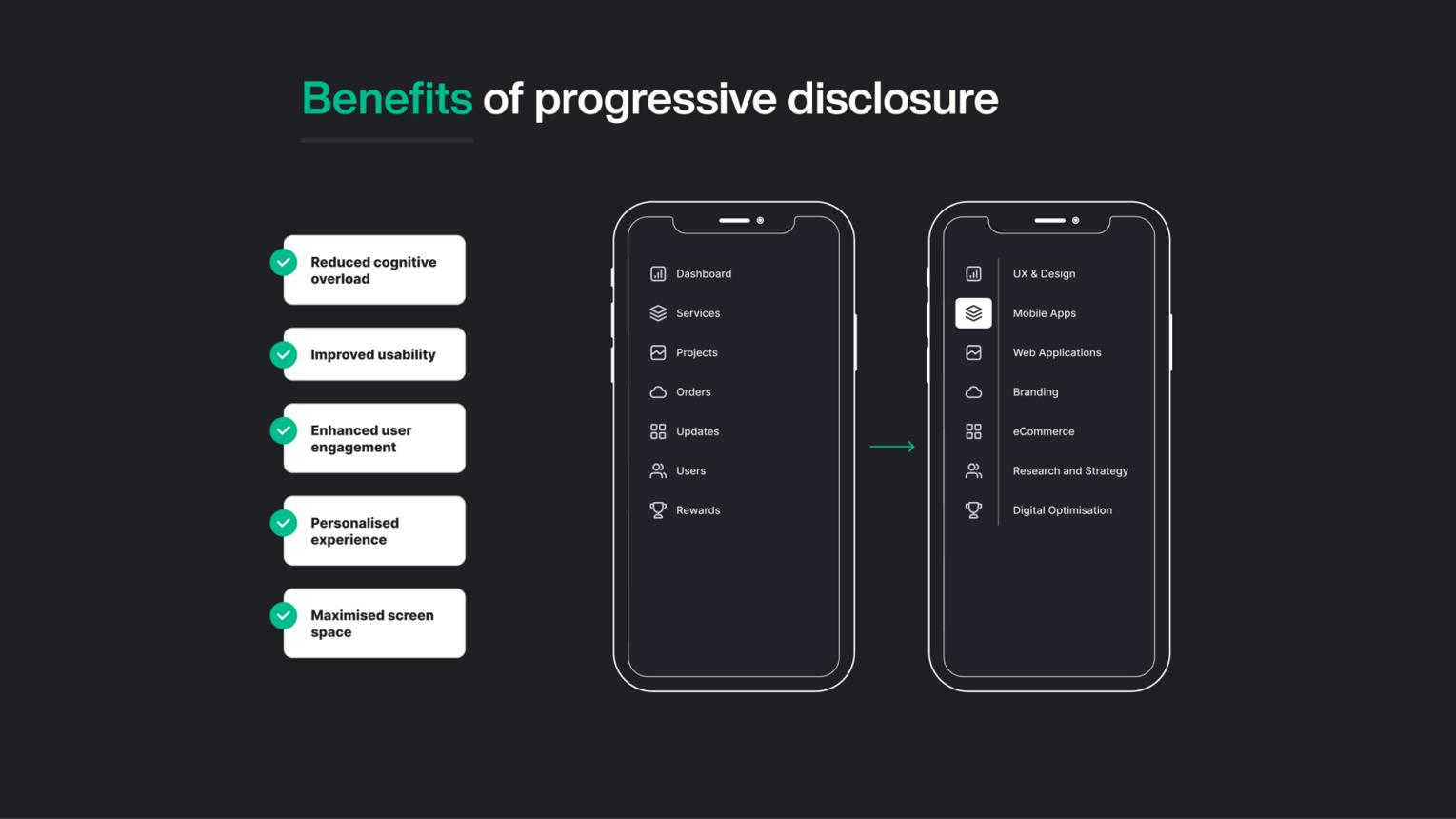
This is one of the most important onboarding design decisions.
Front-Loaded Setup
Requires users to configure before experiencing value.
Necessary in some contexts.
But expensive in early friction.
Progressive Disclosure
Starts users in the product immediately.
Guidance appears as needed.
Often lowers friction and improves time-to-value.
Our view is that many products overuse front-loaded setup.
In practice, strong onboarding often combines both:
Minimal setup upfront.
Progressive guidance as users explore.
Activation: The Moment That Matters
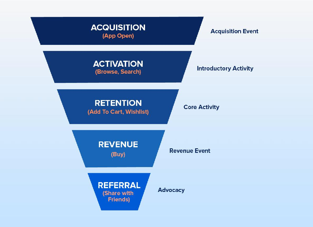
Activation is the moment a user experiences real value for the first time.
This is often the behavior most correlated with retention.
Research from Mixpanel product benchmarks has shown meaningful Day-7 retention gaps between users who activate early and those who do not.
That is why activation is often treated as the north star onboarding metric.
Every screen.
Every permission prompt.
Every copy decision.
Should be evaluated by whether it helps users reach activation faster.
A good onboarding flow does not explain everything.
It focuses on one meaningful action.
Create your first task.
Send your first message.
Complete your first transaction.
When that happens, onboarding has done its job.
The Three Pillars of Activation
Activation usually depends on three behavioral foundations:
- Clarity (users know what to do)
- Motivation (users see why it matters)
- Friction reduction (users can do it easily)
When all three align, activation feels natural.
How to Identify Your Activation Metric
Activation is not guessed.
It is usually found in behavior data.
A common approach:
- Compare retained vs churned users.
- Find actions retained users consistently complete early.
- Validate whether increasing completion of that action improves retention.
That action often becomes the activation candidate.
Common mistakes:
- Using onboarding completion instead of a value event
- Picking actions too easy to be meaningful
- Using one activation metric for all user segments
App Activation Rate: What the Numbers Tell You
Activation rate is the percentage of users who reach the activation event.
It varies by category, acquisition source, and onboarding design.
Three things matter:
- Activation rate itself
- Time-to-activate
- Segment-level differences
Our team sees onboarding design as the biggest lever here.
Reducing steps to first value tends to move activation more than acquisition changes.
Permission Requests and Loading States: Silent Killers
Two things often kill onboarding before value:
Permission Timing
Asking for permissions too early often leads to declines.
Contextual timing performs far better.
Ask when the user understands why it matters.
The action creates context.
The context increases acceptance.
Loading States
In first sessions, delays communicate product quality.
A blank spinner feels broken.
A thoughtful progress state feels intentional.
Small details.
Large trust impact.
Why Mobile Onboarding Requires a Different Approach
Most onboarding tools were built for web and SaaS assumptions.
Mobile is structurally different.
It requires:
- Native-feeling interactions
- Lightweight performance-optimized SDKs
- Platform-consistent flows
- Gesture-aware guidance
When tools ignore these realities, onboarding feels layered on instead of integrated.
Users feel that.
And friction rises.
Why Most Onboarding Tools Fail in Mobile Apps
A common mistake is expecting tooling to fix what is fundamentally a clarity problem.
Failure patterns tend to repeat:
- Generic flows ignore user context
- Information is front-loaded
- Features are explained instead of outcomes clarified
- Overlay layers break native feel
- Onboarding is treated as a one-time event
Our view is simple:
Tools solve execution problems.
They rarely solve activation problems on their own.
How Poor Onboarding Creates Hidden Support Load
Bad onboarding leads to two outcomes.
Users leave.
Or they ask for help.
The second cost is often underestimated.
Support tickets tied to onboarding failures often trace back to:
- Missing guidance
- Unclear dependencies
- Confusing setup
- Weak first-session direction
Teams that improve onboarding clarity often reduce support load without changing product functionality.
Users simply stop needing help with basics.
App User Churn: What Onboarding Has to Do With It
The relationship between onboarding and churn is not theoretical.
It is causal.
Users who encounter friction before experiencing value are significantly more likely to churn in the first week.
And the battle for retention is often fought in that window.
Reducing churn through onboarding typically means improving three things:
- Getting users to activation faster
- Ensuring activation delivers core value
- Creating a follow-up trigger that brings users back
When these align, churn often falls.
Key Metrics That Reveal Onboarding Health
Onboarding is a behavioral system that should be measured.
Key metrics:
- Activation Rate
- Time-to-Value
- Day-1 Retention
- Day-7 Retention
- Day-30 Retention
- Permission Acceptance
- Drop-off by Step
If activation is low, clarity may be the issue.
If activation is high but retention drops, expectation mismatch may be the issue.
The metrics together tell the story.
Mobile App Retention: The Long-Term Outcome
| Metric | Indicative Benchmark | What It Signals |
|---|---|---|
| Day-1 Retention | 25–40% | First-session value |
| Day-7 Retention | 11–25% | Early habit formation |
| Day-30 Retention | 6–15% | Long-term retention |
Retention is proof onboarding worked.
Day-1 asks:
Did the first session give users a reason to return?
Day-7 asks:
Is behavior becoming routine?
Day-30 asks:
Has habit formation started?
Three strategies often extend onboarding beyond session one:
- Re-engagement in first 24 hours
- Progressive feature discovery
- Milestone acknowledgement
Onboarding does not end at install.
Its effects should continue.
Consumer Apps vs Fintech Apps: Two Different Realities
Onboarding design changes with product risk.
Consumer apps often optimize for immediate access.
Fintech apps often optimize for trust, verification, and security.
Success metrics differ accordingly.
That changes how friction should be judged.
Some friction protects trust.
Not all friction is bad friction.
The Link Between Onboarding and Long-Term Engagement
A smooth first experience increases confidence.
Confidence leads to exploration.
Exploration leads to engagement.
This is where onboarding becomes more than a setup flow.
It becomes part of the habit loop.
Common Onboarding Mistakes That Reduce Retention
Common failure patterns:
- Overloading users with information
- Forcing commitment before value
- Hiding core actions behind layers
- Silent interfaces with weak feedback
- Treating onboarding as one-time only
- Ignoring empty states
In our experience, more onboarding is often not better.
Sometimes less guidance improves activation.
Methodology
This analysis synthesizes retention benchmarks and onboarding research from Adjust, Mixpanel, Appcues, Airship, AppsFlyer, and Localytics, alongside product UX heuristics and mobile onboarding pattern analysis conducted by our team.
Benchmarks cited are used directionally to identify common patterns, while recommendations reflect product design interpretation rather than universal prescriptions.
Closing Thought
Onboarding is not a set of screens.
It is the first relationship between a user and a product.
And because that relationship shapes activation, churn, support load, and habit formation, onboarding is not simply a UX layer.
It is one of the most consequential growth systems a product team designs.
Sources & References
- Mixpanel. Product Benchmarks Report.
- Airship. Push Notification Benchmarks.
- AppsFlyer. State of App Marketing Benchmarks.
- Localytics (Upland). Mobile App Engagement Benchmarks.
Apple Human Interface Guidelines
Google Material Design Guidance
Nielsen Norman Group Research
Written by Anupam Singh, CEO at Digia
Focused on mobile onboarding systems, activation strategy, retention design, and user journey optimization.