




TL;DR
- The 85% Week-3 dropout rate is consistent across edtech apps, categories, and geographies. Teams know the number, track it, and almost universally respond by sending more notifications.
- That response fails. The cause is not forgetting to open the app. The cause is that the learning loop breaks before the habit forms.
- The learning loop has four stages: effort, progress signal, reward, and return intention. When any stage breaks, the habit does not develop. The loop has to fire reliably in the first two weeks for a study habit to survive the Week-3 evaluation.
- Notifications make the dropout worse rather than better at this stage. The user has not forgotten. They have de-prioritised. A guilt-based reminder sent to someone who has made a conscious decision to stop accelerates the abandonment rather than reversing it.
- The article covers what the Week-3 cliff looks like in retention data and why it consistently appears at the three-week mark across categories and geographies.
- It identifies where the learning loop most commonly breaks: progress signals that are not legible, sessions too long to complete in available time windows, and absence of micro-win moments before the session ends.
- It covers the specific design failures responsible, the in-app mechanics that extend retention past Week 3, and what Indian edtech apps like BYJU's and Unacademy do differently in first-session design.
- It includes the Week-1 and Week-2 in-app intervention playbook with specific campaign types, formats, and day-by-day trigger logic.
- The article closes with why moving the cliff is a product decision, not a CRM decision, and the specific changes that move it structurally rather than delaying it by a few days.
EdTech shows some of the most brutal retention rates across all subscription categories, with industry averages hovering at just 4% to 27% depending on the segment. For context, media and professional services maintain 84% customer retention rates. Retail holds onto 63% of customers. EdTech, in the category that is explicitly about helping people improve their lives, haemorrhages users at rates that would make most subscription businesses unviable.
The Week-3 cliff is the specific shape this failure takes. Users who survive the first three days after installing a learning app tend to make it to Day 7. Users who make it past Day 7 have a reasonable chance of reaching Day 14. But somewhere between Day 14 and Day 21, a large cohort exits. Not all at once. Gradually, over a window that consistently appears in the retention data of edtech apps across categories and geographies. By Day 30, the industry average D30 retention rate for education apps sits around 2%, which places it among the lowest performing mobile app categories at the month mark.
Teams that know this number tend to respond in one of two ways. They send more notifications. Or they add more content. Neither addresses the actual cause, and this article explains why.
The Week-3 Cliff: What the Data Shows and Why It Happens There
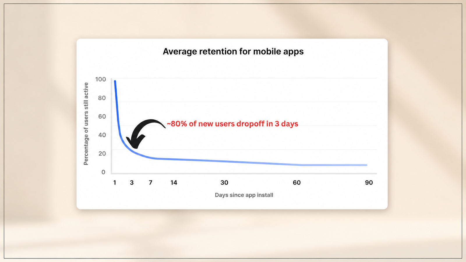
The Week-3 dropout is not random. It maps to something specific in the psychology of behaviour change and in the product experience that most edtech apps deliver.
Habit formation research places the median time to form an automatic habit at 66 days, with a range of 18 to 254 days depending on the complexity of the behaviour and the individual, per the landmark study by Phillippa Lally at University College London. Three weeks is not enough time for a learning habit to become automatic. It is, however, the window during which the user is evaluating whether the investment is worth continuing. The first week is curiosity. The second week is assessment. The third week is the decision point: is this working well enough to keep doing?
The decision point arrives at the same time that two things typically happen in the user's life. First, the novelty of the app has worn off. The first session carried the energy of a new resolution. The tenth session does not. Second, the user's pre-existing schedule has reasserted itself. The commute they thought they would use for learning is being used for other things. The evening slot they intended for study has been claimed by competing demands. The app that felt easy to fit into life in Week 1 has become another thing requiring effort in Week 3.
For the habit to survive this window, the product needs to have delivered enough tangible progress signal by Week 3 that the user's evaluation produces a positive answer. Research on adult learners in digital environments shows that perceived lack of progress is a primary driver of dropout, more so than content quality or difficulty level. Users who cannot see that they are improving stop believing they will improve. When they stop believing they will improve, the friction of showing up each day loses its justification.
The Week-3 cliff is not a crisis that happens to users. It is the predictable result of a product that delivered curiosity in Week 1 but failed to deliver visible progress by Week 3.
Why Notifications Don't Fix It
The instinct to send more notifications when retention drops is understandable. It is also almost entirely counterproductive for edtech apps at the Week-3 stage.
A push notification works as a retention intervention when the user has forgotten to do something they want to do. A reminder to open Netflix when the user has been meaning to finish a series they enjoy is useful. It reconnects an existing desire with the action required to satisfy it.
A push notification does not work when the user has not forgotten. They have decided not to open the app because the experience of opening it has not been rewarding enough to overcome the friction of doing so. Sending "You haven't practiced in 3 days!" to a user who has consciously de-prioritised the app because they do not feel like they are making progress is not a reminder. It is an accusation. Research on edtech churn found that adult learners who felt they were not progressing experienced notifications as shame-inducing rather than motivating, which accelerated their decision to abandon rather than delaying it.
EdTech apps have a 2% D30 retention rate on average. Duolingo's next-day retention rate is 55% compared to the education app average of 18.8% after Day 1. The difference between Duolingo and the category average is not notification volume. Duolingo sends notifications. But the notification is a trigger for a habit that has already formed through product design, not a substitute for a habit that never formed because the product design did not create one.
The teams that treat Week-3 dropout as a notification problem are treating a symptom rather than a cause. The symptom is declining session frequency. The cause is that the learning loop has stopped firing.
The Learning Loop: What It Is and Where It Breaks
The learning loop is the cycle that has to fire reliably in the first two weeks for a study habit to form before the Week-3 evaluation arrives. It has four stages: effort, progress signal, reward, and return intention.
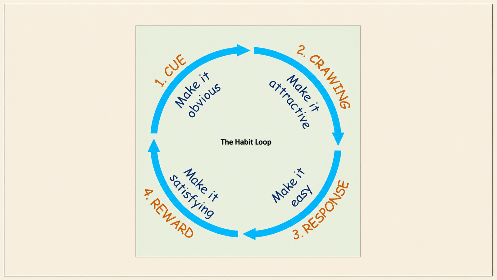
The user applies effort (completes a lesson, finishes an exercise, watches a module). The product delivers a progress signal (something has changed because of the effort). The signal produces a reward (the user feels more capable, more advanced, or closer to their goal). The reward creates a return intention (there is a reason to come back tomorrow). When all four stages fire reliably, the habit forms. When any stage breaks, the loop fails to reinforce itself and the habit does not develop.
The three specific points where the loop most commonly breaks in edtech apps:
The progress signal is not legible. The user completed a lesson. The lesson produced no visible change in their state in the product. Their XP bar ticked up slightly. A checkmark appeared on a module they could not see the value of completing. Nothing communicated what they now know that they did not know before, or how much closer they are to their stated learning goal. A primary driver of edtech dropout is that learners do not feel their progress — 41% of churned customers in one case study got stuck and felt no improvement, but had consumed significant content. The content was delivered. The progress signal was not.
The session is too long to complete on a commute. Most edtech apps are built around 20 to 45-minute lesson modules. Most Indian urban learners have 15 to 25-minute commute windows in which they intended to study. The mismatch between lesson length and available time means that users who start a session during a commute cannot complete it, which means they cannot receive the completion reward, which means the loop does not fire. An incomplete lesson does not reinforce the return intention the way a completed session does.
There are no micro-win moments before the session ends. If the only reward the product delivers comes at the completion of a full lesson, users who run out of time before completing the lesson receive nothing. A session with no reward signal at any point within it is a session that consumed effort and delivered nothing in return. After several of these sessions, the cost-benefit evaluation tips negative.
The Specific Design Failures That Break the Loop
Beyond the three structural failures above, specific design decisions that appear throughout edtech apps produce reliable loop-breaking outcomes:
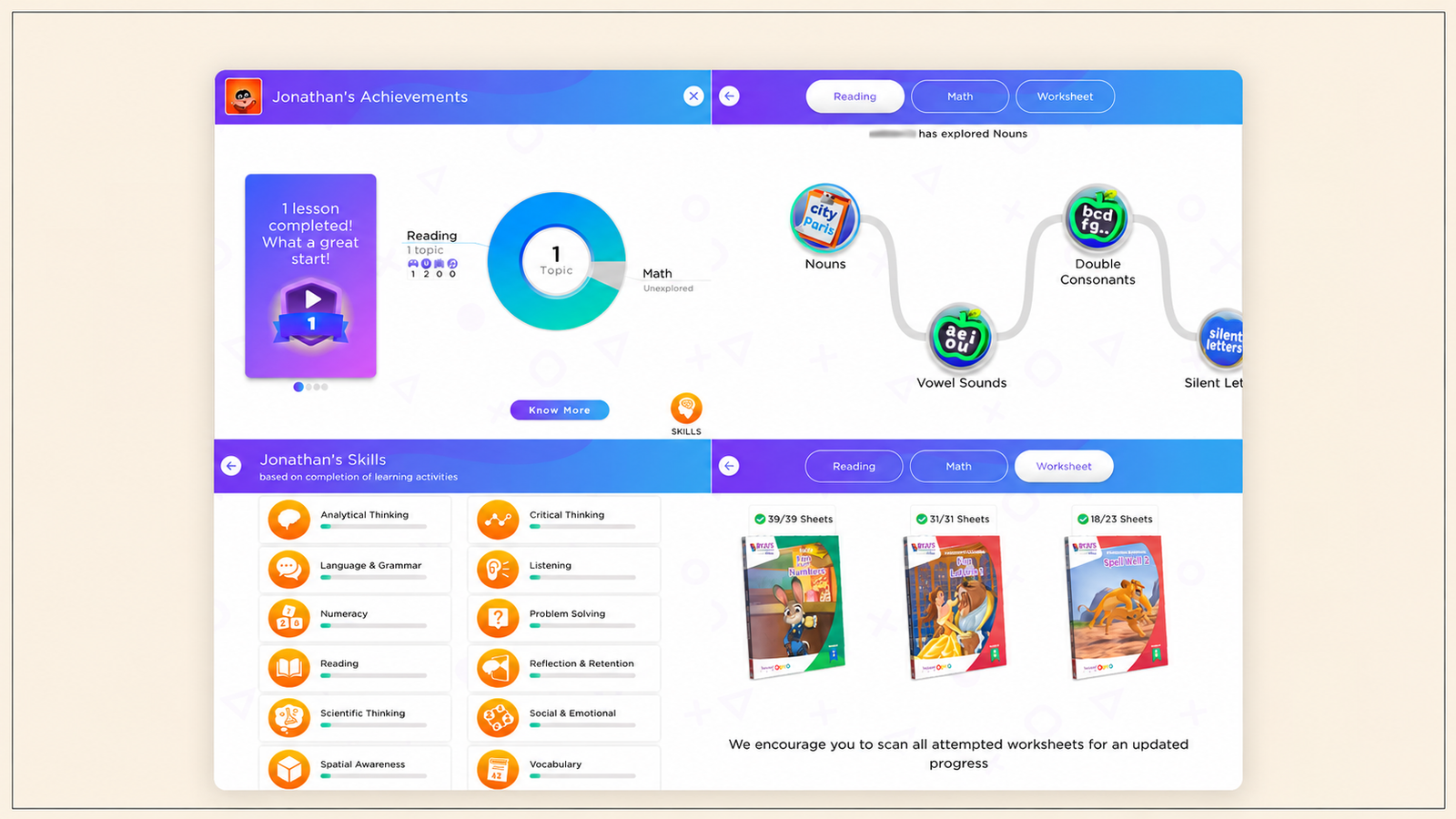
Progress that measures consumption, not capability. Tracking how many modules a user has completed measures what the product delivered, not what the user has learned. A user who has "completed Module 4" does not know what that means for their actual capability. A user who can see "You can now read 400 new characters" or "Your test scores have improved 23% since last week" knows what the effort produced. Replacing consumption metrics (modules watched, hours spent) with capability metrics (skills acquired, accuracy improved) is one of the highest-impact changes in edtech product design for retention.
Onboarding that peaks motivation before learning begins. A 7-minute onboarding flow that includes a welcome video, profile setup, and feature tour exhausts the user's initial motivation before they have experienced a single learning moment. One edtech case study found that motivation peaked before users touched their first lesson because onboarding took 14 minutes of setup before any learning occurred. By the time the first lesson loaded, the motivational spike that brought the user to the app had already dissipated.
Session length mismatch. A product designed for 45-minute deep sessions cannot retain a user base of urban professionals and students with 10 to 20-minute available windows. The session length has to match the commute. If the unit of learning is not completable in the user's natural available time, the completion reward never fires.
Absence of recovery mechanics. When a user misses a day, most edtech apps respond by resetting the user's streak to zero and sending a guilt-based notification. This creates the shame dynamic that adult learners are particularly sensitive to. The correct response is a forgiveness mechanic: a streak freeze, a catch-up option, or a reframing that separates the user's progress from the day they missed. Duolingo's Streak Freeze, which allows users to maintain their streak through a missed day, increased the relative number of active daily learners by 0.38%, which across millions of users is a substantial retention gain. More importantly, it eliminated the shame reset that drives permanent abandonment.
The In-App Mechanics That Extend Retention Past Week 3
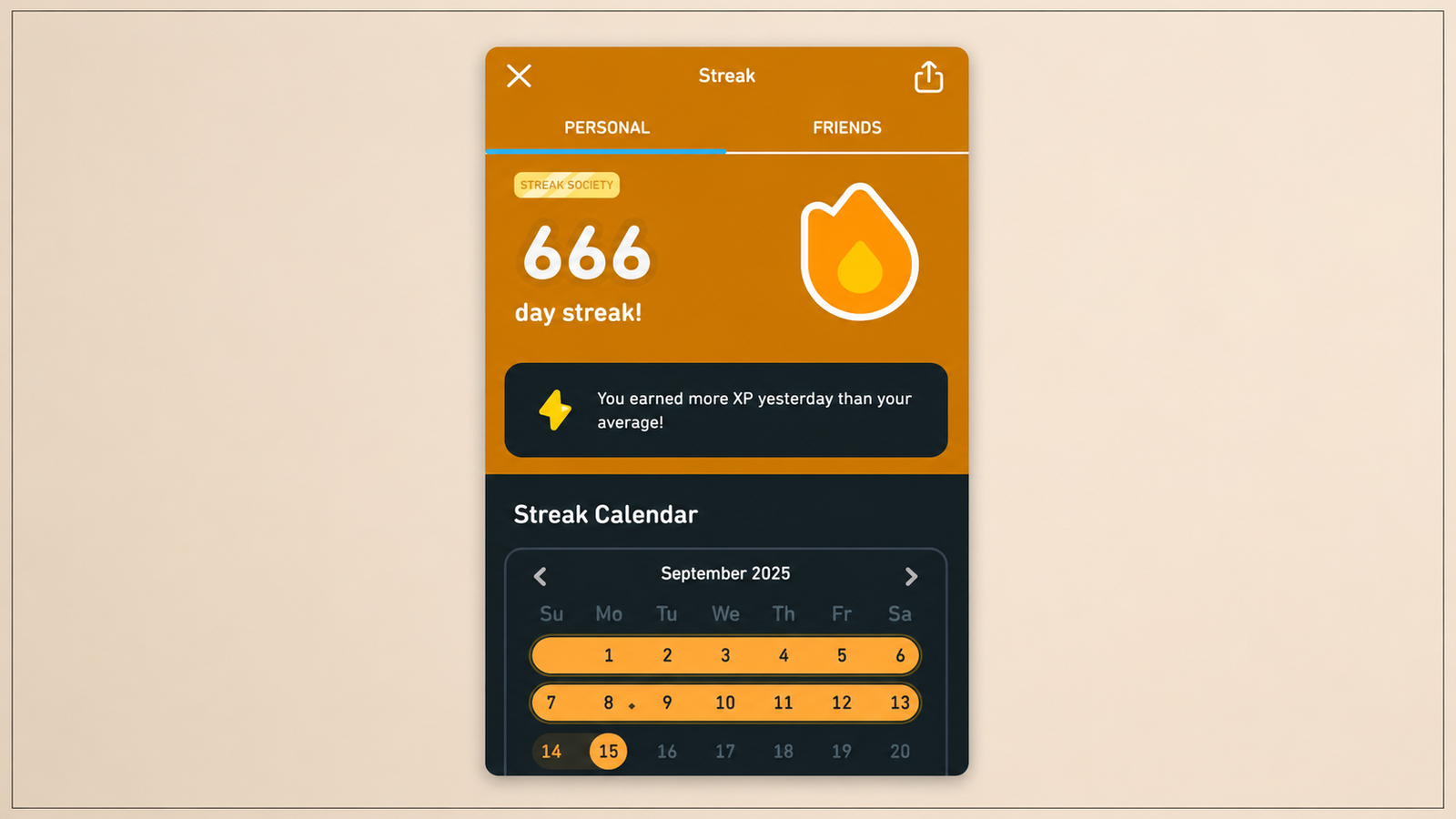
The mechanics that work for edtech retention share one characteristic: they make progress visible and make the cost of stopping feel real before the user has decided to stop.
Streaks, implemented correctly. A streak is not a gamification add-on. It is a habit formation device that exploits loss aversion to keep the return intention active. Duolingo learners who reach a streak of just 7 days are 3.6 times more likely to complete their course than those who do not. The streak works because it changes the user's daily calculation from "do I feel like studying today?" to "do I want to lose my 12-day streak?" The second question is answered differently from the first, because loss aversion is a stronger motivational driver than positive intention.
The critical implementation detail that most edtech teams get wrong: the streak must be paired with a forgiveness mechanic. A streak with no safety net produces high anxiety that drives premium conversion for some users and permanent abandonment for others. Duolingo's Streak Freeze, available for purchase with in-app currency, resolved this by allowing one missed day without consequence, and streak freeze availability increased average streak length by 48% among users who passed 7 days. The streak is the pressure. The freeze is the release valve. Both are necessary.
Visible progress curves. A progress curve that shows where the user was at the start of their learning journey and where they are today converts the abstract concept of improvement into a concrete visual. The user's vocabulary count from Week 1 versus Week 3. Their test accuracy from the first session versus the most recent. Their skill level in a specific topic over time. These visualisations matter because perceived progress is the primary antidote to the dropout decision at Week 3. If the user can see the change, the evaluation at Week 3 produces a positive answer.
Micro-lesson format. Lessons that complete in 5 to 10 minutes produce higher completion rates than lessons designed for 30 to 45-minute sessions. The Duolingo model structures its core learning action at under 3 minutes per lesson. Duolingo's core lesson takes less than 3 minutes to complete and requires almost no effort at low motivation levels. This is deliberate: the lesson is designed to be completable even when the user's motivation is low, because the habit needs to fire even on bad days. A 45-minute lesson requires a high-motivation decision every time. A 5-minute lesson requires almost no motivation at all.
Social accountability features. Social connection changes the nature of the return intention from internal (I want to improve) to relational (someone else will notice if I stop). Duolingo's friend streak, which allows two users to share a streak that both must maintain, creates external accountability that the product itself cannot generate. Users who are no longer intrinsically motivated by their learning goal may still open the app to maintain a friend streak with someone they care about. For Indian edtech apps with social contexts (competitive exam preparation, professional skill building), peer comparison features, cohort learning groups, and leaderboards serve the same function.
What Indian EdTech Apps Do in First-Session Design
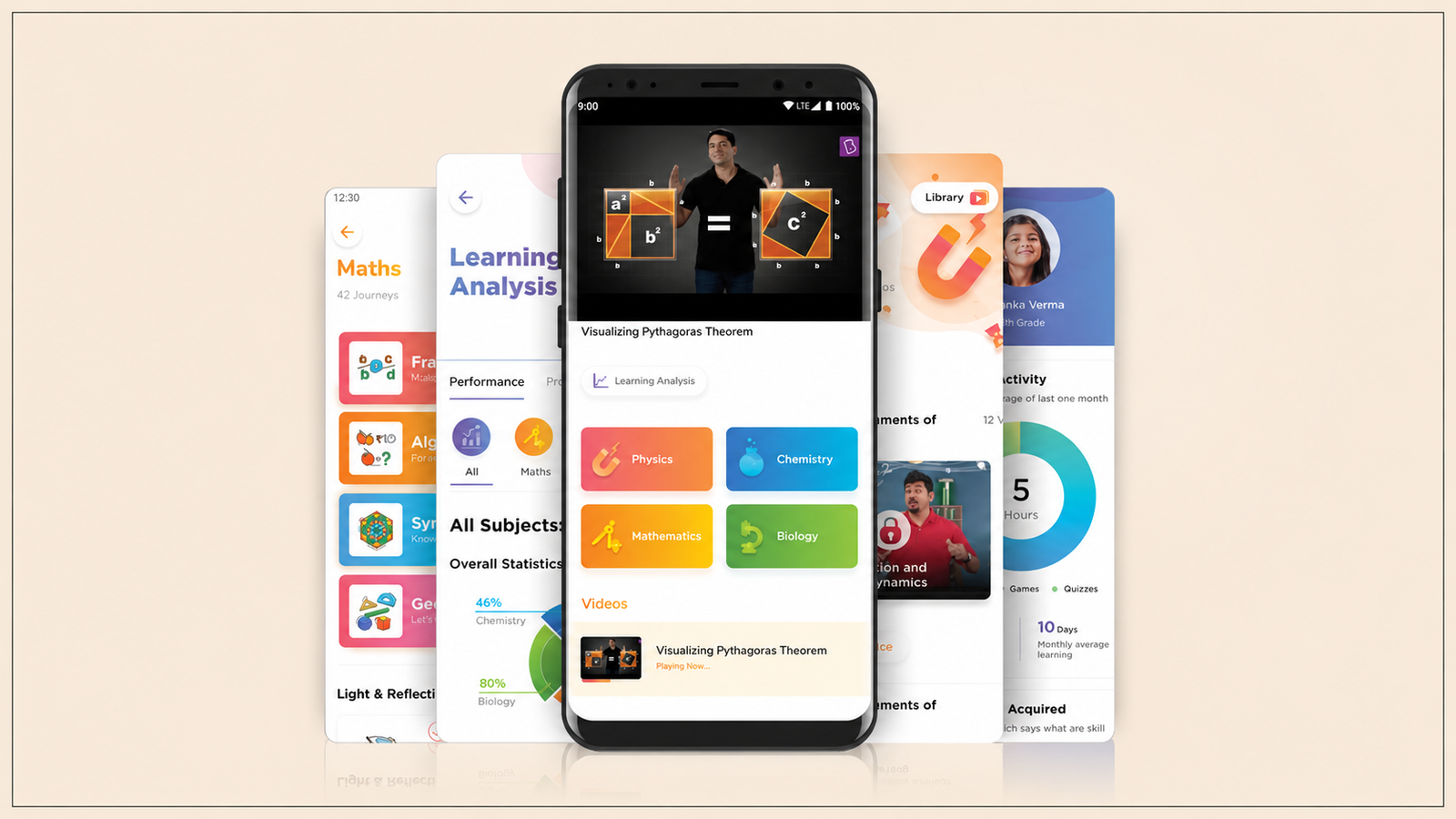
The Indian edtech market has a specific user profile that differs from the global average. The primary use cases are competitive exam preparation (JEE, NEET, UPSC, SSC), professional certification, and language learning. The user is typically a student or working professional with high-stakes motivation (exam performance directly affects career trajectory) but limited available time. The session window is often a commute or a break in a packed day.
BYJU'S built its early product around video-led content with personable educators who created emotional connection to the learning material. The first-session design prioritised motivational engagement over immediate skill demonstration. The strength of this approach is strong initial motivation. The weakness is that the loop depends on the user's ongoing emotional connection to the educator rather than on visible progress, which makes it vulnerable to the Week-3 evaluation if skill progress has not been demonstrated.
Unacademy structured its product around live classes and recorded lectures, creating social presence through live cohorts. The first-session design introduces the learner to a live class or a recorded educator session quickly, which creates the sense of belonging to a learning community. Social belonging is a stronger retention driver than content quality for competitive exam aspirants, because the peer group is motivating in ways the content alone is not.
Apps built on the Duolingo model for Indian language learning (including Duolingo itself for Hindi, Tamil, and other Indian languages) apply the micro-lesson format, streak mechanics, and gamified XP system to Indian language contexts. Duolingo's next-day retention rate of 55% vs the education app average of 18.8% demonstrates the magnitude of the habit design advantage over content-first competitors.
The consistent pattern across the highest-retention Indian edtech apps: the first session gets the user to a tangible win in under 10 minutes. Not a tour of the product. Not an explanation of the curriculum. A completed unit, a demonstrated skill, a score that can be compared against something. The first win is the foundation of the return intention that has to survive Week 3.
The Week-1 and Week-2 In-App Intervention Playbook
The Week-3 cliff is moved by in-app interventions that fire during Weeks 1 and 2, before the evaluation point arrives. By Week 3, the evaluation has already been running. The interventions that matter are the ones that populate the user's Week-3 evaluation with positive evidence.
Day 1 to Day 3: First-win reinforcement. The most important intervention in the first 72 hours is a progress recap immediately after the first completed session. Not a notification. An in-app message that fires at session end: "You learned X new [words/concepts/skills] in your first session. Here's where you started and where you are now." This makes the first session's value explicit rather than leaving the user to infer it.
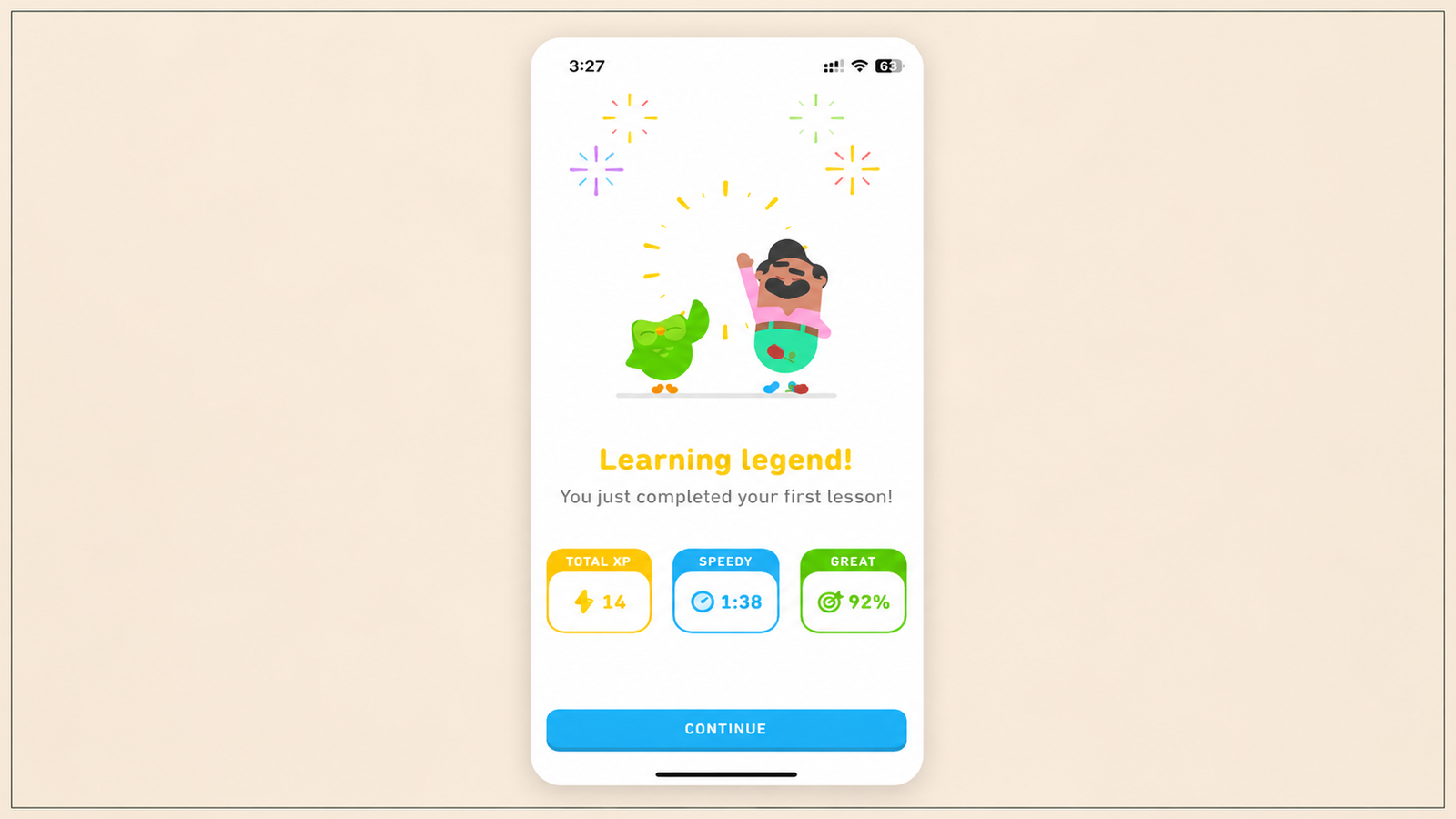
Day 4 to Day 7: Streak establishment. By Day 4, a user who has opened the app on each of the first three days has a 3-day streak. The in-app intervention at this point is a streak milestone message that makes the streak value visible: "You've studied 3 days in a row. Learners who reach 7 days are 3.6 times more likely to complete their goal." This tells the user that the streak they are building has predictive value, which converts a gamification mechanic into a goal worth protecting.
Day 7 to Day 14: Progress comparison. A mid-onboarding progress recap compares the user's current state against their Day 1 state. Skills added, accuracy improved, content completed. Framed not as consumption ("You've watched 4 hours") but as capability ("Your accuracy on grammar exercises has improved from 48% to 71%"). This is the evidence the user will draw on during the Week-3 evaluation. If it does not exist in the product experience, the evaluation has no positive data to work with.
Day 14: Peer comparison nudge. For competitive exam aspirants and professional learners, a peer comparison at Day 14 shows where the user ranks relative to their cohort. Not to shame them if they are below average, but to give them a social reference point. "You're in the top 40% of learners who started in the same week as you." For users who are motivated by competitive context, this is a stronger return driver than any intrinsic progress signal.
Day 15 to Day 21: Re-activation modal for irregular users. For users who miss two consecutive days in Week 2 or Week 3, a re-activation modal that fires at the next session start surfaces their progress to date and frames the return as building on something rather than starting over: "You're 14 days in and you've [specific progress]. Pick up where you left off." The framing matters: progress ownership, not guilt. Research shows that acknowledging the gap immediately increases shame and reduces return rates, while leading with the user's existing progress activates ownership rather than loss.
These interventions are campaign types, not individual messages. Each fires based on a specific user event and lifecycle condition, not on a fixed schedule. Digia Engage's event-based trigger architecture fires each campaign within 100ms of the qualifying event, which means the first-win reinforcement appears at session end rather than in a separate notification 24 hours later.
How to Redesign the Learning Loop: Product Changes, Not CRM Changes
Moving the Week-3 cliff to Week-6 or beyond requires product changes. CRM campaigns can delay the cliff by a few days through re-engagement interventions. They cannot move it structurally because the cliff is caused by a product failure, not a communication failure.
The product changes that matter:
Replace the session unit with a micro-lesson unit. If the current smallest completable learning unit is 20 minutes, redesign around a 5-minute minimum. Every minute above 5 that is required for a completion reward is a minute that increases the probability that the user cannot reach the reward in their available window. Duolingo's sub-3-minute lesson completion window is deliberately calibrated to remain accessible even at minimal motivation. For edtech teams building around longer formats (lectures, case studies, live sessions), the micro-unit is a progress marker within the longer format that fires a completion reward without requiring the full session to end.
Replace consumption metrics with capability metrics. Retire "modules completed" and "hours watched" as the primary progress indicators. Replace them with skill-level indicators, accuracy trends, and vocabulary or concept counts that show what the user now knows that they did not know before. The Week-3 evaluation runs on what the user believes they have gained. If the product shows consumption, the evaluation is of consumption. If the product shows capability, the evaluation is of capability.
Implement a forgiveness mechanic before the streak system. Launching streaks without a safety net is a partial implementation. The streak creates loss aversion. The forgiveness mechanic (freeze, catch-up option, or soft reset) determines whether that loss aversion drives daily return or permanent exit when a day is missed. Build the freeze before the streak goes live. The sequencing matters.
Build the Week-3 progress recap into the product architecture, not the campaign calendar. A Week-3 progress recap that arrives as a push notification is a CRM intervention. A Week-3 progress recap that appears at session start as an in-app card, generated from the user's actual data, is a product feature. The second is significantly more effective because it appears in context and draws on personalised data rather than generic language.
Design the onboarding for time-to-first-win, not time-to-first-lesson. The first win is not completing the onboarding flow. It is completing a learning moment that produces a visible progress signal. Compress everything between install and first win to the minimum. The first 10 minutes of a new edtech user's experience determines whether the Week-3 evaluation has anything positive to draw on.
Topics Not in the Brief That EdTech Teams Should Know
The shame barrier in adult learning. Adult learners have a specific vulnerability that child learners do not: they experience confusion as evidence of failure rather than as a normal part of learning. Research showed that 41% of churned edtech customers had stopped because they got stuck on a specific lesson and felt too embarrassed to ask for help. They abandoned the product rather than expose their confusion. EdTech apps that add friction-free help mechanisms, inline hints, anonymous question features, and adaptive content that responds to struggle signals, address this dropout driver directly.
The pause subscription mechanism as a retention tool. One high-retention edtech product eliminated the binary of "stay subscribed or cancel" by offering a 30-day no-penalty pause, with progress fully saved and one-click restart. Users who paused retained at a significantly higher rate than users who cancelled. The pause option addresses the single most common reason for Week-3 dropout that is not about product quality: the user's schedule has temporarily become too demanding to maintain the habit. A pause option keeps them in the ecosystem rather than forcing a cancellation decision.
Social learning cohorts and peer accountability. For competitive exam aspirants and professional learners, a cohort of users at the same stage of the same goal is a retention mechanism that the individual product experience cannot replicate. Knowing that 47 other people are preparing for the same exam in the same timeframe creates accountability that is qualitatively different from any in-app gamification mechanic. Indian edtech apps with strong cohort features, study groups, live Q&A sessions, and peer leaderboards consistently outperform content-only apps in Week-3 retention.
AI-powered personalisation of difficulty. A session that is too easy produces no progress signal because the user did not feel challenged. A session that is too hard produces no progress signal because the user could not complete it successfully. The Goldilocks zone of learning, the session that challenges without overwhelming, is the only zone that produces the effort-to-reward cycle. AI-adaptive difficulty, which adjusts exercise difficulty in real time based on the user's response pattern, keeps more users in the Goldilocks zone across more sessions, which produces more reliable learning loop reinforcement.
Key Takeaways
The 85% Week-3 dropout rate is consistent because it maps to a predictable psychological window: the moment the novelty of a new learning tool is gone and the user's pre-existing schedule has reasserted itself. The evaluation that produces the dropout decision runs on the evidence the product has generated in the preceding two weeks.
Notifications do not fix Week-3 dropout because the cause is not forgetting. The cause is a product that has not delivered enough visible progress to justify the effort of continuing. A notification that sends a guilt-based reminder to a user who has made a conscious de-prioritisation decision accelerates abandonment rather than reversing it.
The learning loop breaks at three consistent points: progress signals that are not legible, sessions that are too long to complete in available time windows, and absence of micro-win moments within sessions.
The in-app mechanics that extend retention past Week 3 are streaks with forgiveness mechanics, visible capability-based progress curves, micro-lesson formats completable in under 5 minutes, and social accountability features that create external return intention.
Indian edtech apps that outperform the category average get users to a tangible first win in the first session, structure their core learning action around the commute window rather than the long-form study session, and build social cohort features that make the Week-3 evaluation a social decision rather than a purely individual one.
Moving the Week-3 cliff is a product decision: replace consumption metrics with capability metrics, implement the micro-lesson unit as the smallest reward-earning action, launch streaks with forgiveness mechanics, and build the Week-3 progress recap into the product architecture rather than the CRM calendar.
Further Reading
From Digia Engage:
- Mobile App Retention Rate: What It Is and What's Pulling It Down — the D1, D7, and D30 retention context for understanding where the Week-3 cliff sits in the broader retention curve
- How to Build an In-App Onboarding Flow That Gets Users to Their First Win — the first-win architecture that determines what the Week-3 evaluation has to work with
- Gamification in Mobile Apps: Streaks, Rewards, and Retention Mechanics — streak mechanics, forgiveness mechanics, and the full gamification toolkit for edtech retention
- When NOT to Show a Nudge: Building a Suppression Logic — the suppression framework that prevents re-engagement nudges from firing as shame-based interruptions
- In-App Surveys: How to Get a 30% Response Rate — collecting Week-3 feedback at the highest-receptivity moment to understand the specific dropout reason before the decision is made
- Digia Engage Nudges — event-based trigger architecture for the Week-1 and Week-2 in-app intervention playbook
External Sources:
- The EdTech Retention Problem: Why Learners Keep Canceling — Loyalty.cx (4% to 27% edtech retention range; $4.2 billion retention crisis; Duolingo 55% next-day retention vs. 18.8% category average)
- EdTech Churn Rate Case Study: From 15% to 50% Retention — Loyalty.cx (41% of churned users got stuck without help; shame barrier in adult learning; pause subscription mechanism case study; consumption vs. capability metrics)
- The EdTech Retention Problem: Why Learners Keep Canceling — Loyalty.cx (CAC $806 to $1,617; average customer lifespan 4 months vs. 6 to 15 months to break even; unit economics breakdown)
- How Duolingo's Streak Builds Habit — Duolingo (7-day streak users 3.6x more likely to complete; streak freeze increased daily active learners by 0.38%)
- Duolingo Gamification Strategy: A Full Case Study — Trophy (streak freeze increases average streak length 48%; DAU growth from 5M to 40M 2020 to 2024; friend streak mechanics)
- Duolingo's Customer Retention Strategy — Propel (55% month-over-month DAU retention; churn from 47% to 28%; reactivation framing: progress ownership vs. loss)
- Duolingo Case Study: The Gamification of Learning — Shauchenka (47.7M DAU in 2025; streak freeze and repair mechanics; time-to-value in onboarding; define one daily habit and reinforce it relentlessly)
- Duolingo Gamification Explained — StriveCloud (churn from 47% to 28%; 36% YoY DAU increase; 80% of students credited gamification as primary reason for daily use)
- How Duolingo Gamified Monthly Active Users — The PM Repo (sub-3-minute core lesson; Hooked Model applied to edtech; 113M MAU by Q3 2024)
- Mobile App Retention Benchmarks: Education Apps — Passion.io (2% D30 retention for education apps; category benchmark context)
- Habit Formation: How Long Does It Take? — European Journal of Social Psychology, Lally et al. (66-day median; 18 to 254 day range for automatic habit formation)
- How India's Biggest EdTech Startups Are Winning Students Through Gamification — Forbes (BYJU'S gamification strategy including game-based practice tests and positive reinforcement mechanics; 53-minute average daily engagement rate; 85% subscription renewal rate; how framing exam challenges as games reduces anxiety and increases engagement)
- Retention Rates for Mobile Apps by Industry — Plotline (gamification elements increase D30 retention 15% to 30%; Brian Balfour PMF retention curve framework)
- BYJU'S The Learning App: An Investigative Study on the Transformation from Traditional Learning to Technology-Based Personalized Learning — ResearchGate, International Journal of Scientific and Technology Research (peer-reviewed study on how BYJU'S uses a blend of content, media, and technology to make learning interactive; analysis of the app's personalised learning approach with high school and higher secondary students in India; how the app facilitates the shift from rote learning to concept-based understanding)
The Week-1 and Week-2 in-app intervention playbook described in this article, first-win reinforcement, streak establishment messages, progress comparison cards, peer comparison nudges, and re-activation modals, is deployable in Digia Engage without engineering tickets after initial SDK setup. Each campaign fires on a specific user event rather than a fixed schedule, which means the first-win reinforcement appears at session end rather than in a notification delivered 24 hours later. Book a demo to see how the trigger and targeting layer works for an edtech app's retention calendar, or read the gamification guide for the streak and forgiveness mechanic architecture in detail.