
TL;DR: More than 90% of users never complete onboarding. The global 30-day onboarding completion rate sits at 8.4%, and it has barely moved in four years. Teams fix copy, rework messaging, and wonder why the numbers don't shift. The actual problem is structural: the wrong UI patterns at the wrong moments. This article covers where drop-offs actually happen, why early permission requests damage completion, what progress indicators do and don't fix, how step chunking affects flow, when to offer a skip option, how to choose between coach marks and inline help, and what recovery patterns work for users who abandon mid-flow.
The drop-off isn't a content problem
The standard response to a bad onboarding completion rate is to rewrite the copy. Clearer value proposition, friendlier tone, shorter sentences. This sometimes helps at the margins. It rarely moves the number significantly, because the copy is not usually what breaks the flow.
72% of users abandon apps during onboarding if it requires too many steps. That is a UI architecture problem. The user hit one screen too many, or a permission dialog appeared before they understood why they should accept it, or the form asked for information they weren't ready to give. None of those failures get fixed by rewording.
The product teams that meaningfully improve completion rates do it by changing the structure of the flow, not its language. What follows is a breakdown of the specific UI patterns that cause and prevent drop-off, based on the actual failure points in mobile onboarding flows.
Where users actually leave: three failure points
Drop-off in onboarding is not evenly distributed. It clusters at predictable moments, and knowing where those are is the prerequisite to fixing anything.
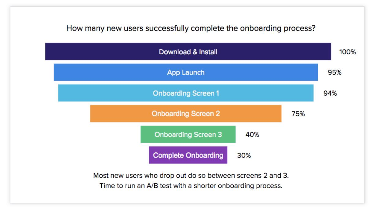
The first friction point is the account creation wall. Asking a new user to create an account, verify an email, or set a password before they have seen a single piece of the product is the highest-impact drop-off point in most flows. The user downloaded the app on a signal of interest, not commitment. Demanding credentials before demonstrating value trades that interest against the friction cost of signing up, and a large percentage of users decide the tradeoff isn't worth it. Social sign-on via Apple or Google converts 2 to 3 times higher than email-and-password flows at this exact moment.
The second is the permission cluster. This is covered in detail below, but the pattern is consistent: when apps surface permission requests (notifications, location, contacts, camera) early in the flow, before the user has any context for why those permissions matter, opt-in rates fall and exit rates rise. The permission request doesn't feel like part of the product, it feels like an interruption.
The third is the information collection step. Profile setup, preference selection, and personalization questions all have real value downstream, but placed too early they read as gatekeeping. Users who haven't yet seen what the app does have no motivation to answer questions about themselves. This step works much better after the user has had a first experience of the product's value.
The common thread across all three: they ask for something before they've given anything. Users apply a rough cost-benefit calculation to every step in a flow. The calculation is one-sided if the benefit half is empty.
The permission ask problem
iOS and Android surface a system dialog when an app requests access to notifications, location, contacts, or camera. The user gets one chance to accept or decline. If they decline, re-prompting requires the user to navigate to system settings manually, which almost nobody does.
This makes the timing and framing of permission requests one of the highest-stakes UX decisions in mobile onboarding.
The mistake most apps make is asking for permissions early, often in sequence, before the user has used any feature that depends on them. A user who opens a fitness app and is immediately asked for location access, notification permission, and contacts before they've completed a single workout has no frame of reference for why any of those requests are reasonable. The system dialogs feel like demands, not features.
The fix has two parts. First, delay the request until the moment the permission directly enables something the user is trying to do. A camera app asking for camera access when the user taps the camera button is obvious and unobtrusive. The same request on screen two of a six-screen onboarding carousel is confusing. Instagram's approach to photo access is the canonical example: it asks only when the user has opened the camera and is ready to take a photo. The request is contextually inevitable at that point.
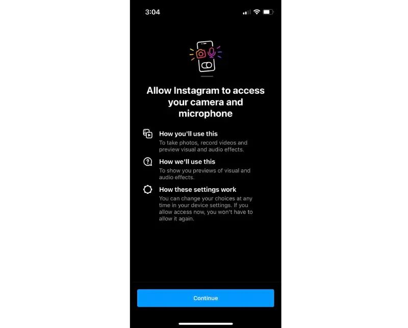
Second, run a "permission priming" screen before the system dialog fires. This is a custom screen the app controls, which explains what the permission enables and why it benefits the user specifically. iOS permission priming lifts opt-in rates by 20 to 40%. The system dialog, when it appears immediately after, feels like a confirmation rather than a surprise.
Two things to avoid: asking for multiple permissions in rapid sequence (each one lowers the probability the next one gets accepted), and burying the "not now" option so small that accepting feels like the only path forward. Both patterns read as aggressive to users, and they respond by exiting.
Progress indicators: motivation or pressure?
The intuition behind progress indicators is sound. Showing users how far they've come creates a sunk-cost effect that motivates completion. 78% of products now include progress indicators during onboarding, which suggests the industry broadly agrees they help.
The reality is more conditional than that.
Progress indicators help when the total length of the flow is reasonable and the steps feel roughly even in effort. A "Step 2 of 4" indicator on a four-screen flow gives the user a clear end point and a sense of forward movement. That's useful.
Progress indicators work against completion when they reveal a longer flow than the user expected. A user who thought they were a few taps from the app and discovers they're on step 2 of 9 is more likely to abandon than a user who had no indicator at all, because the indicator has just made the remaining cost visible. UXPin's guidance on progress trackers is clear on this: aim for 3 to 7 steps, and consider whether showing the full count is actually useful at each point in the flow.
There is a related failure mode: showing a progress bar that fills slowly, or that stalls at a step requiring significant input. A progress indicator that communicates "you've barely started" is worse than no indicator.
The design decisions that matter here are:
Whether to show total steps or just current position. "Step 3 of 5" communicates both. A simple dot indicator or a minimal progress bar communicates position without foregrounding how far remains. For longer flows, the second approach tends to produce better outcomes.
Whether to front-load or back-load effort. Flows where early steps are quick and later steps require more input perform better than the reverse. Getting users to step 4 of 5 before asking for anything demanding creates a completion pressure that works in your favor.
Whether the indicator can create anxiety. Health and finance apps that require identity verification or medical history inputs sometimes find that showing the full step count reads as daunting. In those cases, grouping steps into phases ("Set up your profile," "Verify your identity") and showing progress within phases reduces the sense of overwhelm without hiding the structure.
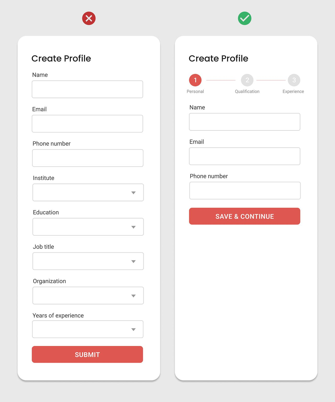
Step chunking and cognitive load
Step chunking is the practice of breaking a long onboarding flow into shorter, clearly bounded groups of actions. It matters because mobile users have limited working memory and limited patience, and a 15-field form on a single screen is a different cognitive experience than a 5-screen flow collecting the same information three fields at a time.
Multi-step onboarding has 22% higher completion when animated, which points to the underlying mechanic: each transition signals progress and provides a micro-recovery moment between steps.
The principle is progressive disclosure. You collect the minimum information needed for the user to experience value, then layer in additional questions as the user has more context and more reasons to invest. LinkedIn's approach to profile completion is a long-form version of this: it spreads profile setup over weeks rather than demanding everything at account creation. Each nudge toward completion is contextual and comes after the user has already gotten value from the platform.
On mobile, the practical chunking rules are:
Collect only what the current step genuinely requires. If a step asks for name, email, birthday, gender, and preferences, it can almost always be split. The question to ask for each field is: does the user need to provide this before they can do anything meaningful?
Group thematically related steps and label the groups. A fintech app that needs identity verification can name the phase ("Let's set up your identity") and show progress within it without making the full 8-step KYC flow visible at once.
Small changes like showing 3 steps instead of 8 fields at once can improve flow completion in measurable ways. The information collected is identical. The cognitive experience is not.
One important limit on chunking: too many screens with very little content each creates its own friction. A 10-step flow where each step contains a single input field feels tedious. The target is grouped-but-not-dense: roughly 2 to 4 meaningful inputs per screen for data collection steps, with clear transitions between groups.
The skip option dilemma
The skip button question divides product teams more than almost any other onboarding decision. One camp argues that offering skip trains users to skip, reducing activation rates. The other argues that forcing users through steps they don't want creates resentment that kills retention. Both are correct in specific circumstances.
NNGroup's position is direct: most apps should minimize mandatory onboarding as much as possible, putting users into the interface directly rather than through a series of required screens. Onboarding flows require user attention and effort. Even when users go through them, research shows they don't always achieve better task performance than users who skip. That's a strong argument for making onboarding optional wherever possible.
The practical framework for deciding whether to offer skip:
If the step collects personalisation data that improves the first experience, don't make it skippable, but do explain precisely what the personalization does. Users tolerate a preference survey when they understand the output. They abandon it when it reads as friction with no stated benefit.
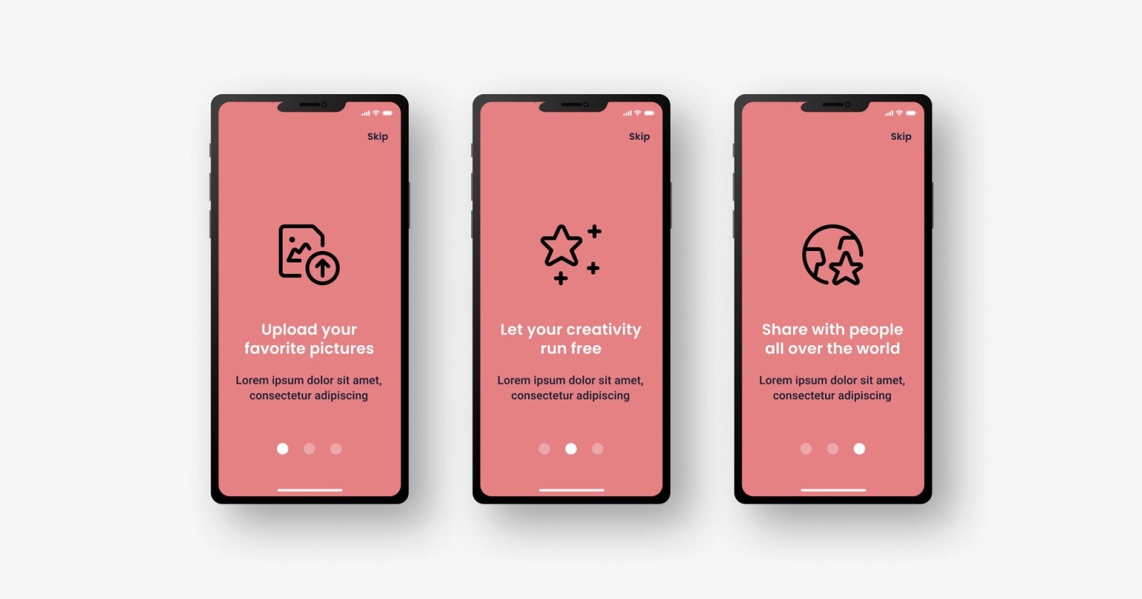
If the step is a feature tour or a carousel of value propositions, make it skippable and make the skip button visible. Apps with 4 or more introductory screens should offer a skip option as standard. Trapping users in a promotional tour they didn't ask for is one of the fastest paths to an uninstall.
If the step requires account setup or identity verification before core features are accessible, consider whether a lighter version of the feature can be made available first. Freemium apps that let users experience value before requiring an account consistently outperform apps that gate everything behind signup.
The word "Skip" itself is worth examining. Research on deferral button copy suggests that "Maybe later" outperforms "Skip" for steps the user should eventually complete, because it communicates deferral rather than permanent avoidance. "Skip" implies the step doesn't matter. "Maybe later" implies it does matter and the timing is flexible.
One thing that definitely doesn't work: making the skip button so small or low-contrast that it's functionally invisible. Users who find the skip button hidden report feeling tricked, and that perception damages trust in the product before the first real session begins.
Inline help vs tooltip vs coach mark: choosing the right layer
These three patterns are often treated as interchangeable options for guiding users. They're not. Each one occupies a different position on the push-pull spectrum of help content, and choosing the wrong one for a given situation produces outcomes ranging from ignored guidance to flow abandonment.
The distinction that matters most is whether the help is triggered by the user's action (a pull revelation) or pushed to the user regardless of what they're doing (a push revelation). NNGroup's research on onboarding versus contextual help is clear: push revelations, meaning guided tours, coach mark sequences, and deck-of-cards walkthroughs that fire automatically, are frequently skipped and don't consistently improve task performance even when users go through them. The problem isn't the format. It's the timing: the user receives information before they need it, has no reason to retain it, and can't apply it to anything they're currently trying to do.
Coach marks are overlay elements that highlight specific UI components and deliver a brief instructional prompt. They work well when a feature is genuinely novel, when the user has just encountered it, and when the mark appears contextually rather than as part of a pre-launch sequence. The failure mode is a chain of coach marks that fires on app open and walks through every element of the interface before the user has touched anything. Research on coach mark best practices consistently points to one rule: show them when a user first encounters the relevant feature, not before. Always allow dismissal. Never chain more than three in sequence.
Tooltips are the more lightweight version: small labels or explanations attached to specific UI elements. They're appropriate for explaining what an icon does when the meaning isn't obvious. They're not appropriate as a substitute for clear interface design. A tooltip that explains a confusing icon is a band-aid, not a solution, and users who have to hover or long-press to understand what a button does will often just not press it.
Inline help is integrated directly into the interface rather than layered over it. Empty states that show what to do next, placeholder text that demonstrates the expected input format, and contextual instruction beneath a form field are all inline help. This approach produces the lowest friction and the highest comprehension, because the guidance appears exactly where the user is looking, at exactly the moment they need it. Products with empty state guidance see 28% less confusion during onboarding. That's a meaningful number for a pattern that adds no overlay and requires no dismissal.
The practical selection logic: use inline help as the default, add tooltips for genuinely ambiguous interface elements, and use coach marks sparingly for novel features the user has just reached. Reserve the full guided tour for complex tools where the interaction model itself is unfamiliar, and always make it skippable.
Recovery patterns for mid-flow abandonment
A user who drops off mid-onboarding is not necessarily a lost user. They may have been interrupted, run into friction at a specific step, or deferred for reasons unrelated to intent. The question is whether the app has a plan to bring them back.
Most apps don't. The default is silence until a generic "We miss you" push notification fires three days later. That's not a recovery pattern. It's a hope.
Effective recovery starts with knowing exactly where the user stopped. Funnel analysis on onboarding steps tells you which specific screen generated the abandonment. A user who reached step 4 of 5 and dropped is fundamentally different from a user who hit the account creation screen and never came back. The recovery message, timing, and re-entry point should reflect that difference.
Resume flows. The highest-impact recovery pattern is a deep link that returns the user to exactly the step they stopped at, with their previous inputs preserved. Asking a user who completed three steps of onboarding to start over is a separate friction point that kills re-engagement. One-click re-entry flows that drop users back where they left off consistently outperform flows that restart from the beginning.
Contextual re-engagement nudges. A push notification or in-app message tied to the specific drop-off point performs substantially better than a generic win-back message. If the user dropped at the profile setup step, the message should reference that step directly. If they dropped at a permission request, the message can explain the benefit before asking again.
Timing the re-engagement. The first recovery nudge should fire within 24 hours of abandonment for most consumer apps. Users who dropped off because of distraction or timing are most recoverable in the first day. The second touch, if the first is ignored, should wait 48 to 72 hours and take a different tone. Duolingo's email sequence is a studied example of graduated re-engagement: the tone shifts from gentle reminder to mild self-awareness ("Am I coming on too strong?") across a sequence that adjusts based on the user's response signal.
Offering lighter re-entry. If the original drop-off was at a high-friction step (identity verification, payment details, extensive profile setup), consider whether the user can access a limited version of the product before completing that step. Letting a user experience the core value before completing full setup creates a stronger motivation to return and finish than any message can generate on its own.
The underlying principle is that recovery is a product design problem, not a marketing problem. The best recovery flow is one where the app acknowledges where the user is, meets them there, and makes the remaining steps feel manageable rather than daunting.
Key takeaways
The global onboarding completion rate is 8.4% and has been stable for years. That stability is a structural problem, not a copywriting one.
The three highest-impact drop-off moments are account creation walls, early permission requests, and premature information collection. All three share the same root cause: asking for commitment before demonstrating value.
Delay permission requests until the moment a specific feature requires them. Run a priming screen before the system dialog. Never stack multiple permission requests in sequence.
Progress indicators help when the total flow is short and predictable. They hurt when they reveal an unexpectedly long process. Show progress within phases rather than a raw total step count for flows longer than five steps.
Step chunking outperforms single-screen forms for the same information. Aim for 2 to 4 inputs per screen and group steps thematically. Progressive disclosure, collecting minimum data first and layering in additional questions after the user has experienced value, consistently outperforms front-loaded data collection.
Offer a visible skip option for feature tours and non-essential setup steps. Use "Maybe later" over "Skip" for steps the user should eventually complete. Don't hide the skip button.
Use inline help as the default guidance layer. Add tooltips for genuinely ambiguous elements. Coach marks work for novel features encountered for the first time, not for full-interface tours on app launch. Contextual help at the moment of need consistently outperforms pushed guidance.
Recovery requires knowing exactly where the user stopped, a deep link that resumes from that point, and a re-engagement message specific to that step. The first nudge should fire within 24 hours. Generic win-back messaging doesn't recover meaningful numbers.
Further reading
From Digia Engage
- App Onboarding Rate: Measure User Activation Success
- Contextual Nudges vs Global Campaigns: What Actually Works
- Activation: Get Users to Their First Win Faster
- How Amazon Drives Add-Ons Using Embedded UI Components
Want to run onboarding nudges, coach marks, and re-engagement flows without a release cycle? See how Digia Engage works or book a demo.
Sources
- Global app onboarding completion rate 8.4%, 90%+ of users never complete onboarding - Digia Engage (citing Business of Apps Q2 2025 data)
- 72% of users abandon apps during onboarding if it requires too many steps - UserGuiding, 100+ User Onboarding Statistics 2026
- 78% of products use progress indicators during onboarding, multi-step onboarding with animation has 22% higher completion, empty state guidance reduces confusion by 28% - UserGuiding, 100+ User Onboarding Statistics 2026
- Social sign-on converts 2 to 3x higher than email-and-password flows; permission priming lifts opt-in rates by 20 to 40% - UXCam, 12 Apps with Great User Onboarding 2026
- Instagram photo access example; permission priming best practices - UserOnboard, Onboarding UX Patterns: Permission Priming
- Progress tracker best practices: aim for 3 to 7 steps, step count visibility guidance - UXPin, Progress Tracker Design: UX Best Practices 2026
- NNGroup on skip option, most mobile apps don't need instructional onboarding - Nielsen Norman Group, Onboarding: Skip It When Possible
- NNGroup analysis of onboarding tutorials vs contextual help, pull vs push revelations - Nielsen Norman Group, Onboarding Tutorials vs Contextual Help
- NNGroup coach marks and instructional overlays for mobile apps - Nielsen Norman Group, Instructional Overlays and Coach Marks for Mobile Apps
- NNGroup mobile app onboarding analysis, deck-of-cards tutorials don't improve task performance - Nielsen Norman Group, Mobile-App Onboarding: An Analysis of Components and Techniques
- Contextual help outperforms push onboarding, push revelations frequently skipped - COBE, Why Contextual Help Outperforms Onboardings in UX Design
- Coach mark best practices: show contextually, allow dismissal, never chain more than three - Go2Blog, Mastering Coach Marks for Effective Mobile App Onboarding 2026
- Fintech: showing 3 steps instead of 8 fields improves completion, progressive KYC disclosure - Netcore Cloud, Say Goodbye to Onboarding Drop-offs for Fintech Apps
Mobile app teams using Digia Engage can deploy onboarding nudges, contextual coach marks, and re-engagement flows from a dashboard, with no app release required. Triggers fire in under 100ms on real user actions. Get a demo.