

TL;DR:
- The post-order screen is dead time by design: the user is waiting, the session is active, and nothing is competing for their attention. Most service apps treat it as infrastructure. Urban Company has turned it into one of their highest-conversion cross-sell surfaces.
- The psychology: why captive, post-commitment attention converts better than pre-purchase attention.
- The anatomy: the post-order screen taken apart element by element (the map, the professional card, the progress stepper, the smart add-ons, the cross-sell carousel, the rating and tip module), and what each one is doing for engagement, not just for logistics.
- The journey: the exact behavioural path a user follows from "order confirmed" to "second service booked," stage by stage, contrasted against the friction of the original booking journey.
- Sourcing note: Urban Company-specific analysis is based on published UX case studies, product teardowns, Urban Company's own design and engineering blog posts, and heuristic evaluations cited throughout. Cross-sell psychology statistics are attributed to their research sources.
Most mobile apps treat the tracking screen the same way airports treat the gate area: as an infrastructure obligation, not an opportunity. The user needs to know their flight (or their technician, or their delivery) is on the way. The screen exists to provide that information. The design team builds a map, an ETA, a status indicator. They ship it. They move on.
Urban Company, which serves approximately 5.8 million transacting users with 77% of its revenue coming from repeat customers, has not made that decision. The company has recognised that the post-order screen is not dead time. It is the highest-attention moment in the session. The user opened the app, made a decision, completed a transaction, and is now in a state of satisfied waiting. Nothing is competing for that attention. No purchase decision is pending. No friction exists. And the user is in a confirmed-positive emotional state, the state that immediately follows a purchase they feel good about.
That combination, captive attention plus satisfied intent plus no friction, is the rarest condition in mobile commerce. Urban Company has turned it into a cross-sell surface, and it has built the screen's every component, and the user's exact path through it, around that fact. This piece goes deeper than the surface-level "why it works" and takes apart the screen itself, then the journey a user actually walks from booking one service to booking a second.
What the Post-Order Screen Is and Why Most Apps Miss It
A note on scope: what most write-ups call "the tracking screen" and what Urban Company actually ships are not quite the same object. The order details screen that appears the instant payment clears, and the live-tracking view that takes over as the professional's ETA counts down, are the same continuous surface in Urban Company's app rather than two separate screens with a hard transition between them. The map fades in, the stepper advances, the cross-sell content persists underneath, but the user never leaves the screen or re-navigates. That continuity matters for the cross-sell mechanic: it means the commercial surface has one long uninterrupted session to work with, not two short ones separated by a page load. For the rest of this piece, "post-order screen" refers to that whole continuous surface, from confirmation through live tracking through service completion.
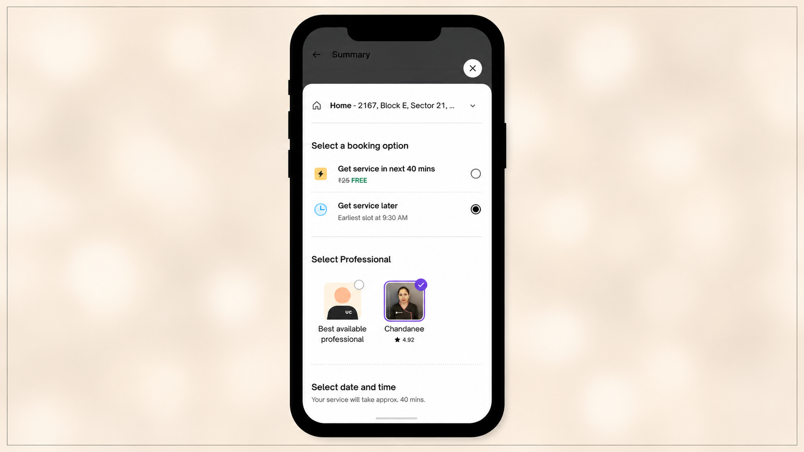
The user who is on this screen is in a specific state that is categorically different from any other moment in the app journey. They are not browsing. They have completed the primary conversion event. They are not deciding. The decision has been made, payment processed, and service confirmed. They are not anxious. Unlike the pre-purchase state, where decision anxiety is present, the post-commitment state is characterised by cognitive dissonance reduction: the user is actively reinforcing their purchase decision in their mind, not questioning it.
Post-purchase is the highest-intent moment in ecommerce: the sale is secured, the payment method is on file, and the customer has already decided to trust you. Industry benchmarks put post-purchase offer take rates at approximately 10 to 16% at the confirmation page, compared to 3 to 5% for pre-checkout offers. The post-order screen extends this post-commitment window from the confirmation moment (a few seconds) to the full session (anywhere from 5 to 30 minutes depending on the service type and the professional's ETA, plus a second, shorter window at service completion). Urban Company has an extended post-commitment attention window that most ecommerce apps do not, and it is stitched together from two captive moments rather than one, as the anatomy section below lays out.
The reason most service apps miss this is architectural: the tracking screen was built by the engineering team as a logistics display, not by the product team as an engagement surface. Its purpose is defined by its data inputs (GPS coordinates, ETA calculation, status updates) rather than by the user's state at the moment they see it. When the purpose is defined by data inputs, the output is a logistics screen. When the purpose is defined by user state, the output is an engagement opportunity.
The Psychology of Post-Commitment Cross-Sell
The behavioural mechanism that makes cross-sell effective at the post-commitment moment is not intuitive, because it appears to contradict the usual logic of sales timing. The usual logic says: sell before the customer's wallet is closed. Offer the upsell before checkout, while the user is still in a spending mindset. The post-order screen appears to be the opposite of this: the wallet is closed, the session is ending, the commercial moment is over.
The actual psychology runs the other way. The mechanism is cognitive dissonance reduction. When a customer has made a purchase, they are in a state of elevated receptiveness to information that confirms the quality of their decision. They are, unconsciously, looking for evidence that they made the right choice. A cross-sell presented at this moment does not create the anxiety that a pre-purchase offer creates (should I be spending more? is this the right option? am I being manipulated into upgrading?). Instead, it slots into the user's need to confirm that the brand they have chosen is one that offers everything they might want.
There's independent evidence for why this timing matters specifically at checkout versus after it. Baymard's large-scale checkout usability testing found that 66% of users who hit a forced cross-sell step during Amazon's checkout showed extreme frustration, because inserting a decision into an in-progress transaction reads as an obstacle to completing the thing the user already committed to doing. That finding is effectively the mirror image of the post-order screen's design logic: Urban Company's cross-sell sits after the transaction is fully closed, not inside it, which is precisely the placement Baymard's research says avoids the frustration response.
McKinsey research confirms that existing customers are 60 to 70% likely to purchase again when presented with a relevant offer at the right time, compared to 5 to 20% for new prospects. The post-order screen user is both an existing customer (they have used Urban Company before or have just become one) and a user at the exact moment the conversion probability is highest. The relevance of the offer determines whether the probability is realised.
The second mechanism is reduced friction. The user's payment details are already in the system. They have already navigated through the booking flow. A cross-sell on the post-order screen does not ask them to re-enter information or re-commit mentally to the act of purchasing. It asks them to make a secondary decision in a context where the primary friction has already been cleared.
The third mechanism is what UX researchers call the "halo effect" of a recent positive decision. A user who has just booked a home cleaning service is in a positive emotional frame toward Urban Company as a platform. That positive frame extends to the other services the platform offers. A cross-sell presented during this halo window benefits from the frame of the preceding positive decision in a way that a cold browse session does not.
What Urban Company Places on the Post-Order Screen
Urban Company's post-order screen cross-sell architecture reflects a deliberate set of decisions about which services to surface, where to position them relative to the primary tracking function, and how to frame them.
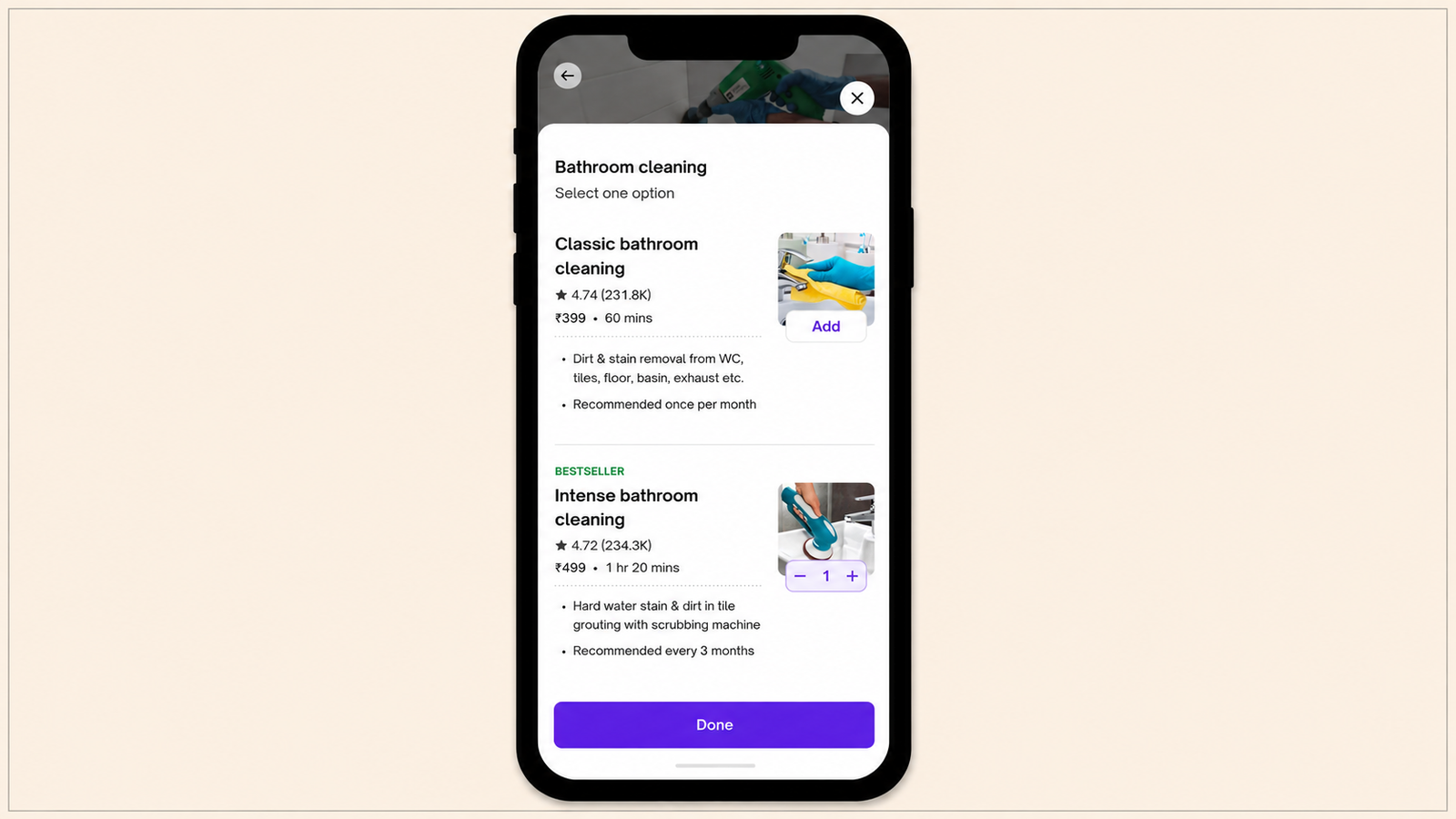
Service relevance over algorithmic similarity. The cross-sell elements that appear on Urban Company's post-order screen are not algorithmically determined "users who booked X also booked Y" recommendations. They are contextually adjacent services: if the user has booked a home cleaning, the cross-sell surface shows deep cleaning, bathroom cleaning, and sofa cleaning options. If the user has booked an AC service, it shows plumbing, electrical inspection, and other home maintenance categories. The cross-sells are adjacent within the home services context, not algorithmically adjacent based on general purchase patterns. The contextual adjacency is what makes them feel like a natural extension of the current intent rather than an unrelated commercial insert.
Positioning below the fold of the tracking function. The cross-sell elements are placed below the tracking map and the primary service information (professional name, rating, ETA). The user's primary visual focus is the map and the ETA. The cross-sell does not obstruct the primary function. It does not interrupt the user's monitoring of their professional's arrival. It sits below, available for discovery but not forced into the visual path of the primary task. This positioning is the design constraint that separates cross-sell as engagement from cross-sell as irritant.
Framing as completion, not addition. The cross-sell framing on Urban Company's post-order screen does not say "you might also want" or "other users also bought." It frames secondary services as completing or extending the home maintenance intent the user has already demonstrated. A user who has booked a bathroom cleaning sees "Add a bathroom deep clean" or "Add kitchen cleaning" not as an unrelated add-on but as a natural extension of what they are already doing. The framing turns the cross-sell from a commercial suggestion into a service completion offer.
No time pressure or artificial urgency. Urban Company does not apply countdown timers, "limited slots" messaging, or artificial scarcity to the post-order screen cross-sell. The absence of manufactured urgency is a trust design decision: a user who is satisfied with their existing booking and is watching a professional arrive is not in a state of urgency. Injecting artificial urgency into that state would feel tone-deaf and would undermine the positive emotional frame the post-commitment moment creates. The cross-sell is presented as available, not as urgent.
The Anatomy of the Post-Order Screen: Every Element, Decoded
This is the level of detail most teardowns skip. Every component on the screen is doing double duty (a logistics job and an engagement job), and the two jobs are usually in tension with each other. Understanding how Urban Company resolves that tension, element by element, is what makes the cross-sell placement discussed above actually work rather than just sound reasonable in a slide deck.
The status strip and order ID. The top of the screen orients the user in one glance: what was booked, when, and a reference number. This is pure logistics, but it also does quiet engagement work too: it's the first confirmation the user sees that the transaction actually went through, which is the opening beat of the cognitive-dissonance-reduction process described above. The user isn't wondering "did that work?" for even a second, which means the screen doesn't have to spend any of its captive attention re-litigating trust before it can spend that attention on anything else.
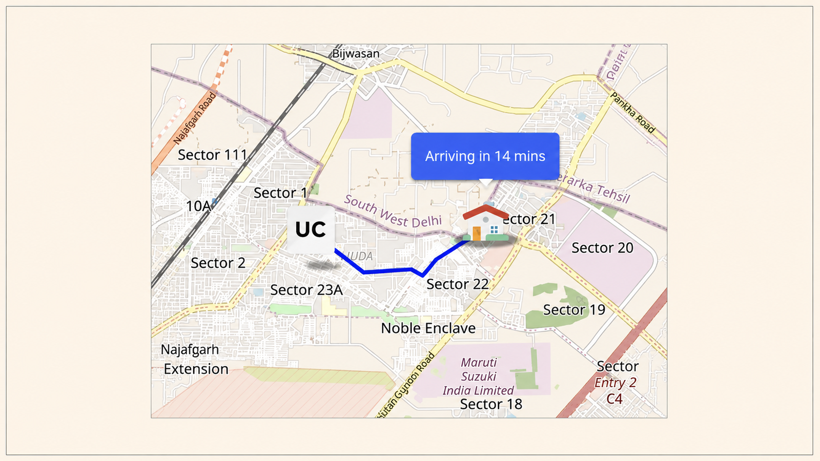
The live map and the professional's moving pin. This is the visual anchor of the screen and the element the user actually came for. It answers the one question that matters during the wait ("how much longer?") continuously, without the user having to ask. Its engagement function is subtler: a moving pin on a map is a low-effort, ambient-attention activity. The user can glance at it every so often without committing focused attention, which is exactly the kind of half-engaged state in which a scroll past a cross-sell carousel below doesn't feel like a distraction from the "real" task.
The professional card: photo, name, rating, ETA countdown. This humanises what would otherwise be a logistics transaction. It also does something specific for the cross-sell mechanic: the professional's rating is a second, independent confirmation of the "I made a good choice" narrative the user's mind is already running. A 4.8-star professional card sitting above a cross-sell carousel reinforces the platform's overall quality signal right before the user is asked to consider trusting it with a second job.
The contact bar: call and chat. Urban Company's redesigned app added the ability to chat with your professional directly in-app, reducing the need for phone calls. Functionally, this resolves the one real anxiety a waiting user might have (where are they, are they close). Structurally, it keeps that anxiety-resolution inside the app rather than sending the user to their phone's dialer and out of the session entirely. Every minute the user stays inside the app rather than tabbing away is a minute the cross-sell surface below remains available to be seen.
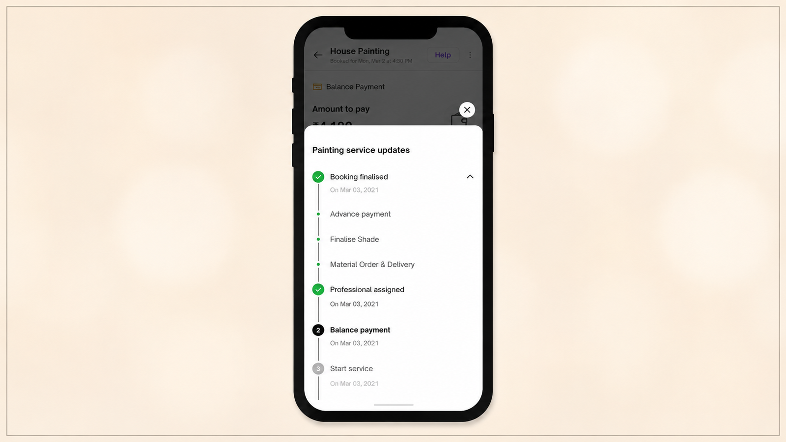
The service progress stepper. The app shows service progress with details of every step, letting the user know exactly where their booking stands at any moment. This turns an undifferentiated wait into a legible narrative with visible milestones: booked, professional assigned, en route, arrived, in progress, completed. Each stage transition is a small, low-stakes reassurance event, and because the stepper updates in place rather than sending a push notification that pulls the user elsewhere, each check-in is another pass across the same screen, and another pass across the cross-sell content sitting below it.
The quote and pricing detail. Detailed quotes before service begins are surfaced specifically to reduce surprises later. This element's engagement function is to close off a specific source of pre-service anxiety (will I be overcharged) before it can compete for the user's attention with anything else on the screen. A user who is quietly worried about the final bill is not a user in a receptive state to consider adding a second one.
Reschedule and cancel controls. These sit on the screen but are deliberately low in visual weight. Their job is not to be used often; it's to be visible enough that the user never feels locked in. Somewhat counterintuitively, an easy exit is what makes everything else on the screen feel optional rather than forced, including the cross-sell content. A screen with no visible way out reads as coercive even in places that aren't actually coercive; a screen with a clearly available way out reads as safe to browse.
Smart add-ons. These are distinct from the cross-sell carousel and worth separating out, since the two get conflated in most breakdowns. The app includes smart add-ons designed to make sure the user doesn't miss anything relevant to the current booking: small, same-visit items tied to the booking already in progress (an extra fixture, a consumable, additional time on the same job).
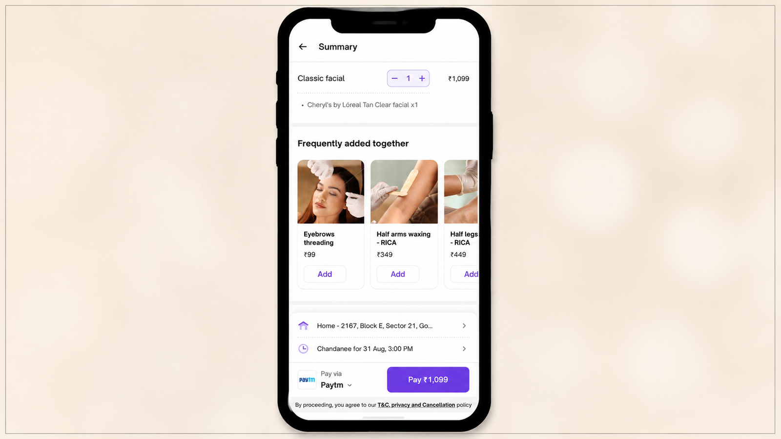
The cross-sell carousel, by contrast, surfaces separate, adjacent services that typically become their own booking. Add-ons extend the current transaction; cross-sells start a new one. Urban Company runs both, in different positions on the screen, because they solve different problems and carry different amounts of decision friction for the user.
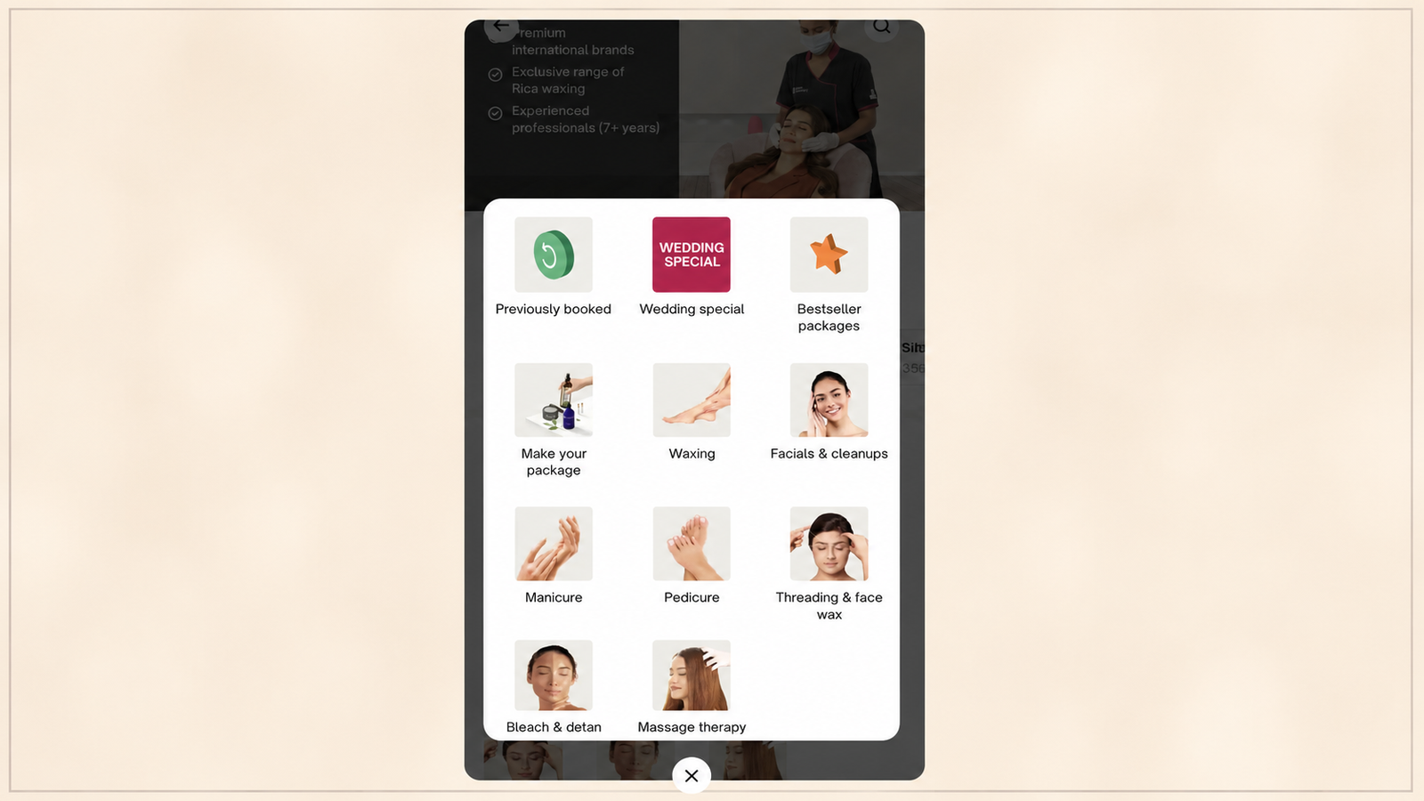
The cross-sell carousel. This is the commercial payload discussed in the sections above: a small set of contextually adjacent services, framed as completion rather than addition, sitting below the primary tracking content.
One-click checkout on the add-on and cross-sell. The redesigned app lets users check out in one click, with preferences auto-selected down to the last variable. This is the single most important mechanical detail behind why the cross-sell converts as well as it does; it is discussed at length in the journey section below, because it is less a screen element than a journey shortcut.
Issue tracking and the help-centre entry point. The app added issue tracking with real-time assignment of support and resolution updates directly in the booking flow. This functions as a pressure-release valve. If something does go wrong with the current booking, the user has an immediate, low-effort path to raise it, which means that friction doesn't have to build up silently and eventually poison the user's trust in everything else on the screen, cross-sell included.
The post-service rating and tip module. The redesign introduced tip appreciations for favourite professionals as part of the post-service flow. This is worth flagging as its own captive moment, distinct from the tracking window: it fires after the job is done, when the user is rating the experience and deciding whether to tip. It's a second, shorter post-commitment window with the same psychological profile as the tracking screen (satisfaction, no pending decision, free attention), and Urban Company treats it as a second cross-sell and retention opportunity rather than letting the session simply end after the rating is submitted.
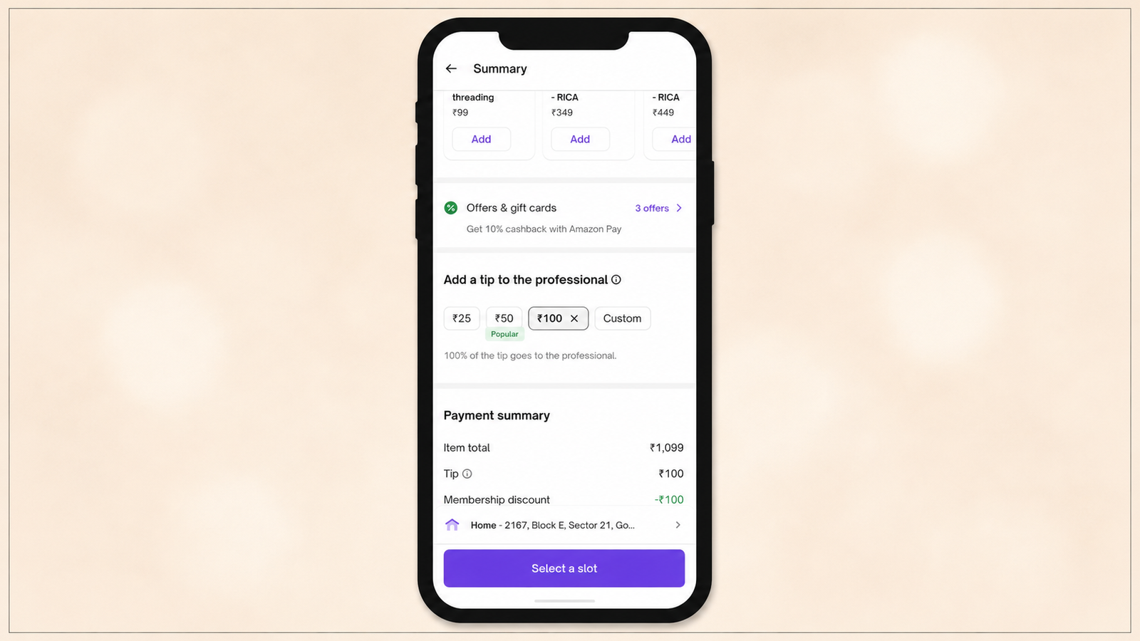
Refund and warranty tracking. The app added refund tracking for peace of mind and one-click warranty claims for repair services. These live mostly outside the immediate post-order window but extend the same trust infrastructure across the following days, which matters for the retention loop discussed in the journey section, since a user who trusts the resolution process is a user more willing to book again without re-litigating whether the platform is reliable.
The Engagement Journey: How Watching an ETA Turns Into a Second Booking
Every element above exists to serve a specific behavioural sequence. This section walks that sequence stage by stage, not as an abstract funnel, but as the actual path a user's attention and decisions follow, contrasted against the friction of the original booking journey wherever the contrast is instructive.
Stage 1: Trigger. Order confirmed. The sequence starts the instant payment clears. The screen transitions from checkout to the order details view, and every downstream stage depends on the fact that this transition happens without the user navigating anywhere: no new page load, no return to a home screen, no re-entry point required.
Stage 2: Passive monitoring (the first 60 to 90 seconds). The user's attention is fully on the primary function: is the booking real, who's coming, how long. This is the least available window for anything commercial, and Urban Company doesn't try to use it: the cross-sell carousel exists below the fold specifically so it isn't competing for attention during this stage.
Stage 3: Idle attention. The ETA stabilises. Once the professional's arrival time settles into a predictable range, the intensity of monitoring drops. The user still checks back periodically, but the interval between checks lengthens, and each check requires less cognitive effort. This is the point at which a scroll past the fold becomes psychologically available for the first time in the session.
Stage 4: Discovery. The cross-sell carousel enters the frame. On a scroll or during one of the idle-attention check-ins, the adjacent-services carousel becomes visible. Because it's contextually adjacent (home cleaning booking → bathroom or sofa cleaning options) rather than algorithmically generic, it reads as continuous with what the user is already doing rather than as an interruption of it.
Stage 5: Micro-evaluation. The halo-effect filter. The user runs a fast, low-stakes judgment: does this apply to me, do I actually need this. Because the user is in the cognitive-dissonance-reduction state described earlier, this evaluation is biased toward confirmation rather than scepticism: the question in the user's head is closer to "does Urban Company also cover this" than "is this company trying to upsell me."
Stage 6: Tap-through. Viewing the adjacent service without leaving the session. The user opens the suggested service's detail view. Critically, this happens inside the same session as the original booking: the user never returns to a home screen or a search bar, which means none of the browsing friction of a fresh session (deciding what to search for, comparing categories) is present.
Stage 7: Low-friction add. The compressed checkout. This is where the mechanical design pays off most visibly. Contrast the two paths:
The original booking journey, as documented in a product management case study of Urban Company's ordering flow, runs: add a delivery address, search or select a service, add it to the cart, go to cart and continue, log in or create an account, select a time slot, then confirm order details and pay. Seven distinct steps, several of which involve typing, searching, or authenticating.
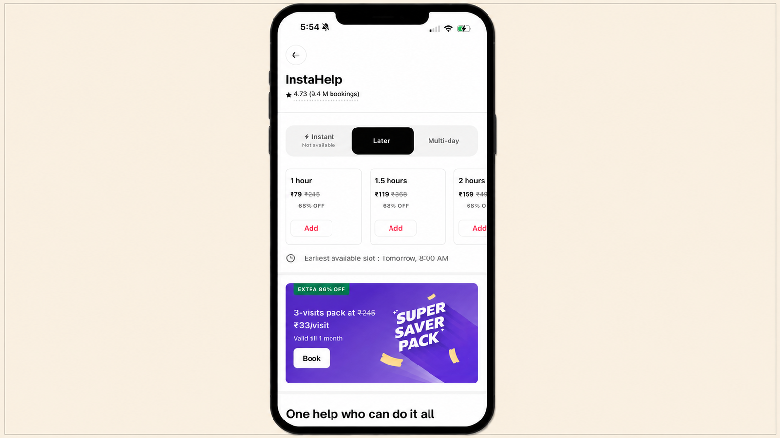
The cross-sell path from the post-order screen skips address entry (already on file from the active booking), skips login (already authenticated), and, because the app auto-selects preferences down to the last variable for one-click checkout, often skips most of slot selection as well, defaulting to the next reasonable availability or bundling into the existing visit. What was a seven-step decision the first time becomes closer to a two-step confirmation the second time, inside the same session, minutes after the first purchase.
Stage 8: Secondary confirmation. Two jobs, one session. The new booking is confirmed without the user leaving the post-order screen. Depending on the service and scheduling, it either extends the current professional's visit or appears as a second, separately scheduled job, but either way, the confirmation happens in place, and the original tracking content (map, ETA, stepper) remains exactly where it was.
Stage 9: Fulfilment loop. The post-service screen reopens the window. When the original service completes, the rating-and-tip screen constitutes a second captive moment with the same psychological shape as the first: the job is done, the user is satisfied (in the modal case), and attention is briefly free again before the session ends. This is a natural point for a second cross-sell touch, distinct in tone from the first: less "add a service now" and more "book again" or a nudge toward a rebooking of the same professional.
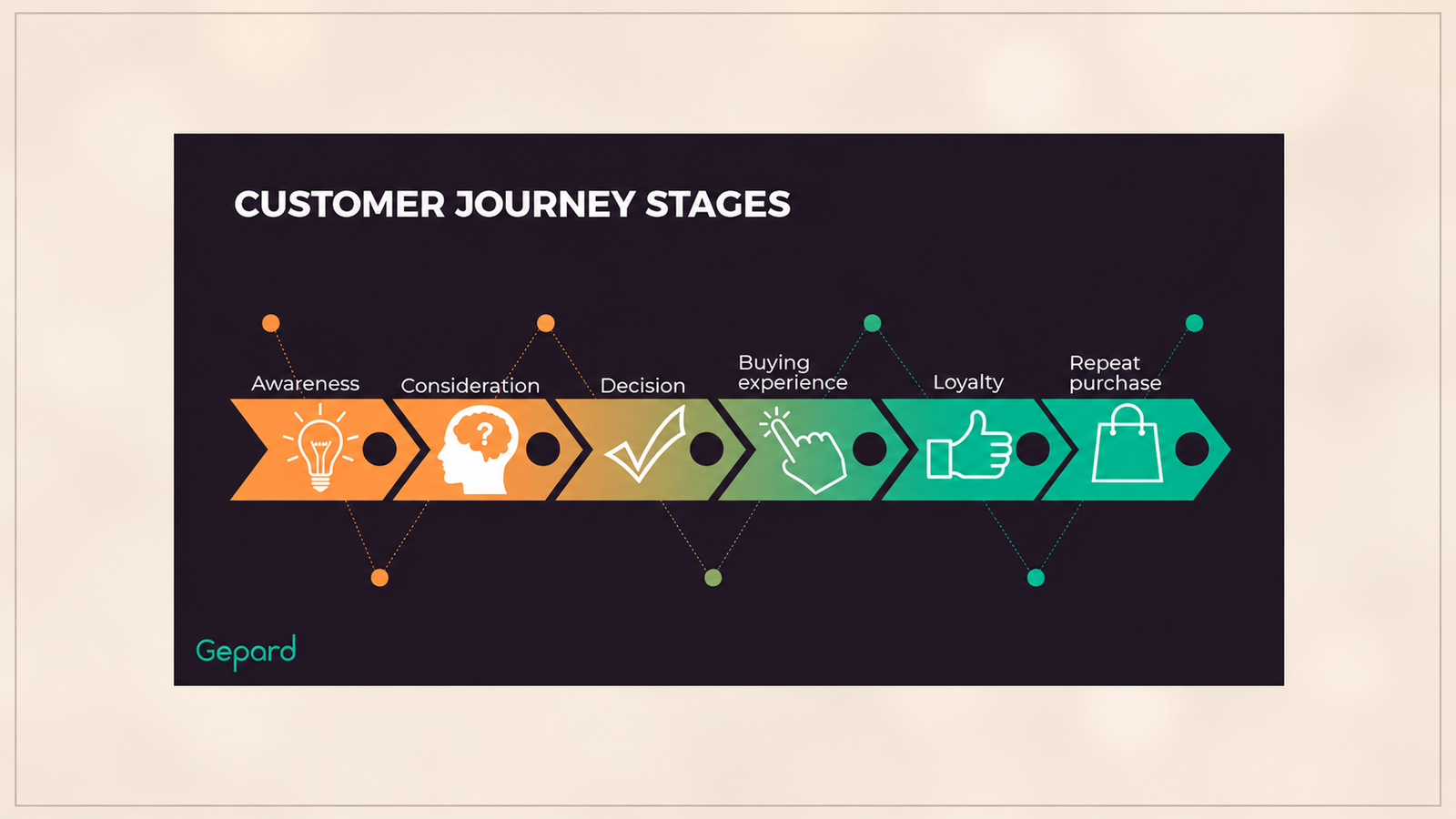
Stage 10: Retention loop. Rebooking, preferred professionals, and the subscription funnel. This is the stage that turns a single cross-sell into a habit. Urban Company's own engineering team has published on the mechanics behind it: when customers wanted to rebook a specific professional, nearly half of near-term slots were already blocked, pushing customer-professional pairs to exchange phone numbers and transact off-platform instead. Urban Company addressed this by reserving a portion of each professional's near-term calendar specifically for rebooking requests and releasing it back to general availability only if it went unused, alongside letting professionals opt in to accept repeat customers in slots they'd otherwise blocked off. The result was roughly a 20-percentage-point reduction in unavailable rebooking slots and a corresponding increase in rebooking conversion. The terminal node of this loop, for the platform's most frequent users, is a subscription: Urban Company Plus has more than 1 million subscribers, accounting for roughly 20% of the platform's total user base, converting a pattern of repeated post-order cross-sells into a standing commitment rather than a series of individual decisions.
Suppression logic threads through every stage of this journey, not just the tracking window in isolation. The most important suppression rule for cross-sell on captive surfaces is to suppress completely during any negative service event: delay, cancellation, error, or complaint state. A user who hits a negative event at Stage 3 should not see a cross-sell carousel at Stage 4; a user whose Stage 9 rating is low should not be shown a rebooking nudge at Stage 10. The journey only functions as designed when every stage remains gated on the service actually going well.
The Design Constraint That Makes It Work
The post-order screen cross-sell works at Urban Company because of a design constraint that most teams do not apply: the cross-sell does not compete with the primary function. Every design decision on the screen defers to the user's primary task, which is monitoring the progress of the service they have already booked.
The map is prominent. The ETA is prominent. The professional's details are prominent. The contact options are accessible. These are the elements the user came to the screen for, and they are not reduced, obscured, or repositioned to accommodate commercial content.
The cross-sell sits within the scrollable content below these primary elements. It is available to users who have seen what they need from the tracking interface and are willing to scroll. It is not visible to users who open the tracking screen, check the ETA, and minimise the app. The commercial intent only reaches users who are actively browsing the session rather than just checking a status.
This constraint is the single most important design decision in the architecture. Cross-sell and upsell strategies can backfire when they are not implemented carefully. Bombarding customers with too many suggestions can overwhelm them and hurt the experience. A few highly relevant recommendations outperform many random suggestions. The post-order screen's cross-sell limits itself to a small number of contextually relevant services, presented in a browseable format below the primary tracking function. It does not interrupt, overlay, or reduce the primary utility of the screen. The commercial intent is additive to the experience, not competitive with it.
The failure mode that most teams encounter when attempting cross-sell on equivalent screens is the opposite design decision: the commercial element competes with the primary function. A cross-sell banner that overlays the tracking map, a modal that interrupts the session to present an offer, or a notification that fires while the user is watching their ETA tick down all break the trust relationship that the post-commitment moment creates. They signal that the commercial goal has been elevated above the user's primary task. The result is irritation, dismissal, and a lasting negative association with the platform's communication style.
The Execution Mistakes That Turn a Captive Moment Into an Irritant
Most apps that have attempted to monetise equivalent captive moments have made one or more of the following mistakes, each of which produces the irritation outcome instead of the conversion outcome.
Interrupting the primary task. A food delivery app that fires a promotional modal while the user is actively tracking their order location has interrupted the primary task to serve a commercial goal. The user's attention was on the map. The modal redirected it. The user's response is to dismiss the modal as quickly as possible and return to the task they came for. The commercial content has been processed as an obstacle, not an offer.
Unrelated offers. A ride-hailing app that serves food delivery promotions on its ride tracking screen has placed a cross-sell with no contextual relationship to the current session. The user who is tracking a ride home from a business meeting is not in a home-delivered food intent state. The offer may be factually correct (the app does offer food delivery) but it is contextually irrelevant, which means it does not benefit from the halo effect of the current positive session. It reads as advertising, not as a service extension.
Too many options. A service app that displays ten cross-sell options on the tracking screen has created a decision burden that works against the effortless browsing the post-commitment state supports. The effectiveness of cross-sell degrades rapidly when the number of options exceeds three to five. Beyond this threshold, users experience choice overload and default to ignoring the entire cross-sell surface. Urban Company limits its post-order screen cross-sell to a small number of adjacent services for exactly this reason.
Commercial language in a trust context. Framing cross-sell elements with promotional language ("Limited offer: 20% off if you add now") in a tracking screen context breaks the tone of the post-commitment moment. The user is in a trust state, not a promotional receptiveness state. Promotional language activates the scepticism and evaluation mode that the post-commitment state does not have. It resets the emotional frame from satisfied to cautious.
No design deference to the primary function. Any cross-sell element that reduces the size, prominence, or accessibility of the tracking map, ETA, or professional details has failed the first design principle. The primary function is what the user came for. The cross-sell is what the product wants from the user. When these two compete in the visual hierarchy, the user's trust in the platform's intent is damaged. Urban Company's cross-sell works because the user never has to suspect that the platform is prioritising its commercial goals over the user's primary task.
The Broader Principle: Identifying Captive Moments in Your Own App
The post-order screen is one instance of a broader category: the captive moment. A captive moment is any point in an app session where the user is waiting, has completed the primary conversion event, is in a positive emotional state, and has no competing task demanding attention.
The captive moment has four criteria. The user cannot advance the primary task (they are waiting for an external event: the professional arriving, the order being prepared, the booking being confirmed). The primary conversion event is already complete (there is no risk of abandoning a purchase that has not yet been made). The user is in a positive emotional state relative to the product (they chose this app and are committed to their decision). The user's attention is available and unclaimed.
The apps that have equivalent captive surfaces include:
Delivery apps (Swiggy, Zomato, Blinkit). The order tracking screen between order placement and delivery confirmation. Zomato and Swiggy both use the order tracking window for promotional content, but the implementations vary significantly in how well they defer to the primary tracking function. The most effective implementations show the live order status prominently and surface cross-sell (new dishes, repeat items, promotional bundles) in a scrollable section below.
Appointment booking apps. The confirmation screen after an appointment is booked, before the appointment date. The user has committed to the appointment, is in a positive state, and is about to leave the active session. A cross-sell at this moment (complementary services, preparation items, related appointments) captures attention before the session ends rather than attempting re-engagement through a later notification.
Ride-hailing apps (Ola, Uber). The in-ride tracking screen after the trip begins. The user is in transit, their attention is free, and they have committed to the current journey. The primary task (monitoring the route) does not demand active attention for most of the journey. Ola has experimented with in-ride content including news, entertainment, and promotional offers during rides. The execution challenge is the same as Urban Company's: the commercial element must not compete with the user's ability to monitor their route or change destination.
Ticketing apps (BookMyShow, Paytm Movies). The post-booking confirmation screen after a movie or event ticket is purchased. The user has committed to attending. The booking is confirmed. The attention is available. Add-on offers (food pre-ordering, merchandise, related events) presented on the post-booking screen are in a directly adjacent context to the primary commitment.
Insurance and fintech apps. The post-transaction confirmation screen after a payment is made, a policy is renewed, or a transfer is completed. The user's positive emotional state following a completed financial action is a high-trust moment for presenting a complementary product (a new policy type, a savings feature, an investment option adjacent to the completed transaction).
The Mapping Exercise: Finding Your Captive Surface
The mapping exercise for identifying equivalent surfaces in your own app has four questions:
Where does the user wait in your product? List every screen where the user's primary action is monitoring an external process rather than completing a task they control. Order tracking, booking confirmation, payment processing, content loading screens, and scheduled event countdowns are all waiting moments.
Which of those waiting moments follows a primary conversion event? The post-commitment condition is what creates the positive emotional frame. A loading screen before the user has completed any conversion event does not have the same psychological profile as a tracking screen after a completed booking. Filter for waiting moments that follow a conversion.
Is the user in a positive emotional state at this moment? A user who is waiting because something went wrong (order delayed, professional cancelled, payment failed) is not in a positive state. The captive moment cross-sell only works when the waiting is a normal, expected part of a successful transaction rather than a recovery from a negative event. The most important suppression rule for cross-sell on captive surfaces is to suppress completely during any negative service event: delay, cancellation, error, or complaint state.
Is the waiting duration long enough for engaged browsing? A 3-second payment processing screen is a captive moment but not a browseable one. The duration needs to be long enough for the user to see the cross-sell, process its relevance, and make a secondary decision. Urban Company's professional ETA window (typically 5 to 20 minutes) is sufficient. A 10-minute wait is a strong cross-sell window. A 30-second wait is not.
How to Implement Captive Moment Cross-Sell Without Breaking the Primary Experience
The implementation has three requirements: positioning, suppression, and contextual relevance.
Positioning. The cross-sell must be placed below the primary function's content in the visual hierarchy, accessible through scrolling but not visible before the primary content. The user who needs only the primary information (ETA, status, map) must be able to get it without encountering the commercial content.
Suppression. The cross-sell must be suppressed entirely during any service event that deviates from the expected positive experience: professional delays beyond a defined threshold, cancellations, complaint-flagged bookings, and payment failure states. Presenting a cross-sell to a user who is frustrated with the current service destroys the trust the cross-sell was meant to capitalise on.
Contextual relevance. The cross-sell must be drawn from the category of services adjacent to the current booking. A home cleaning booking user should see home services cross-sells, not beauty services or appliance repair. Contextual adjacency is what keeps the cross-sell feeling like a service extension rather than an unrelated advertisement. The most effective cross-sell surfaces benefit from showing how the complementary product or service completes or extends the experience the user has already committed to.
Digia Engage's in-app widget system supports inline content cards that can be placed within scrollable surfaces, triggered by specific booking or transaction confirmation events, targeted to the user's current service category, and suppressed during defined negative event states. The implementation matches the architectural requirements of a captive moment cross-sell: positioned below the primary function, event-triggered rather than scheduled, and suppressible based on session state.
Key Takeaways
The post-order screen is the highest-attention moment in a service app's session, and it is really two captive moments stitched together: the tracking window while the professional is en route, and the shorter rating-and-tip window once the job is done. The user is waiting, has already committed, is in a positive emotional state, and has nothing competing for their attention. Most service apps treat this as infrastructure. Urban Company treats it as an engagement surface, and it has built the individual elements of the screen (the stepper, the smart add-ons, one-click checkout, the chat and issue-tracking safety valves) to actively support that surface rather than just coexist with it.
The psychology of post-commitment cross-sell is more favourable than pre-purchase cross-sell. The commitment is made, the decision anxiety is resolved, and the user's cognitive state is oriented toward confirming the quality of their choice rather than evaluating alternatives. Post-purchase offer take rates run at 10 to 16% at the confirmation page, compared to 3 to 5% for pre-checkout offers. The post-order screen extends this high-conversion window from seconds to minutes, and Baymard's checkout research on user frustration at forced cross-sell steps explains why that placement, rather than checkout itself, is where the offer belongs.
The engagement journey from order confirmation to a second booking runs through ten identifiable stages, and its defining feature is friction removal: what takes seven steps (address, search, cart, login, slot, confirm, pay) on a first booking collapses to something closer to a two-step confirmation on the post-order screen, because address, login, and payment preferences are already resolved. That compression, not persuasion, is most of what makes the second booking easy to say yes to.
Urban Company's cross-sell works because of design deference: the cross-sell never competes with the primary tracking function. It sits below the map, the ETA, and the professional details. It does not interrupt, overlay, or reduce the primary utility. The commercial intent is additive, not competitive.
The execution mistakes that convert a captive moment into an irritant are: interrupting the primary task, presenting unrelated offers, showing too many options, using promotional language in a trust context, and failing to defer the commercial element to the primary function in the visual hierarchy.
The captive moment principle extends to any app with a post-commitment waiting state: delivery tracking, appointment confirmation, in-ride tracking, post-booking screens, and post-transaction screens in fintech and insurance. The four criteria are: the user is waiting, the primary conversion event is complete, the emotional state is positive, and the duration is long enough for engaged browsing.
Further Reading
From Digia Engage:
- When NOT to Show a Nudge: Building a Suppression Logic: the suppression framework that prevents cross-sell from firing during negative service states, the most important implementation rule for captive moment cross-sell
- How Swiggy Uses Bottom Sheets to Drive Repeat Orders: another Indian app using post-commitment surfaces for conversion, with format and positioning analysis
- How Zepto's Onboarding Gets Users to Their First Order in Under 3 Minutes: the gamification layer that fires immediately after order confirmation, a complementary post-commitment engagement pattern
- Scratch Cards and Spin-the-Wheel in Mobile Apps: How They Drive Engagement: the post-confirmation gamification mechanics that Urban Company and competitors use alongside cross-sell on service completion screens
- Digia Engage Widgets: inline content cards and cross-sell surfaces configurable without engineering tickets, triggered by booking and transaction confirmation events
External Sources:
- Urban Company: App Development Cost and Key Features: Appinventiv (5.8 million transacting users; 77% repeat revenue; 30% year-on-year revenue growth to Rs 827 crore; 37.3% net revenue growth in Q1 FY25)
- The all-new Urban Company app: Simpler. Faster. Full of delight.: Urban Company Design (the source for the screen's individual elements: smart add-ons, one-click checkout, service progress stepper, in-app chat, issue tracking, refund tracking, tip appreciations, and detailed quotes)
- Enabling Platform Stickiness Through Rebooking: Urban Company Engineering (the mechanics behind the retention loop: reserved rebooking slots, partner opt-in, and the measured impact on rebooking conversion)
- Urban Company's Service Completion Rate Has Fallen in Bengaluru: The Product Folks (documents the standard first-time booking journey used as the friction baseline in the journey-mapping section)
- Urban Company Product Teardown: Plus Subscription: NextLeap (UC Plus subscriber base and the retention economics that sit at the end of the rebooking loop)
- 331 "Cross-Sells" Design Examples: Baymard Institute (checkout-stage cross-sell frustration data, used to explain why the post-order screen, not checkout, is the right placement)
- Post-Purchase Upsell: The 2026 eCommerce AOV Playbook: Digital Applied (10 to 16% post-purchase offer conversion vs. 3 to 5% pre-checkout; post-purchase as the highest-intent moment in ecommerce)
- Post-Purchase Upsell Automation: Increase AOV by 25%: US Tech Automations (McKinsey: 60 to 70% existing customer repurchase probability vs. 5 to 20% for new prospects)
- 8 Upselling and Cross-Sell Strategies in eCommerce Marketing: Elementor (post-purchase thank-you page as prime cross-sell real estate; contextual adjacency as the principle behind effective cross-sell framing)
- Cross-Sell and Upsell Strategies: How to Increase AOV: LimeSpot (cross-sell effectiveness degrades beyond three to five options; relevance over quantity)
The captive moment cross-sell architecture described in this article, an inline content card placed below the primary tracking function, triggered by a booking confirmation event, suppressed during negative service states, and targeting adjacent service categories, is configurable in Digia Engage as an event-based widget without engineering tickets after initial SDK integration. Book a demo to see how the widget and suppression layer works for a post-confirmation cross-sell use case, or read the widgets product page for the full format and trigger specification.