

TL;DR:
- Quick commerce has near-zero tolerance for first-session friction. The category promise is speed, and a user who downloaded Zepto to get something in 10 minutes will not sit through a five-screen onboarding tour.
- Zepto makes one design bet: eliminate every step between app open and order confirmed that does not directly serve the purchase decision. If a step does not move the user toward a confirmed order, it gets cut.
- Location inference replaces manual address entry. GPS coordinates determine the delivery zone and pre-fill the address without the user typing anything.
- The home screen is a decision surface, not a discovery page. Products appear above the fold. The delivery time promise is visible immediately. The fastest path to cart addition is the primary hierarchy.
- Time-pressure cues and first-order offers fire at the cart step, not at session start. The discount appears when price-sensitivity is active, not during browsing when it has no decision context.
- The result is a first-session experience where a user who intends to buy can place a confirmed order in under 3 minutes by design.
- The article breaks down how each element of that architecture works, where the drop-off pressure points are, and what the transferable principles look like for teams outside the quick commerce category.
Quick commerce lives on first-session conversion in a way that almost no other app category does. Food and beverage apps convert at 6.11%, the highest rate of any e-commerce category, per ConvertCart's 2025 industry benchmark data. That number is not an accident. The purchase intent that brings someone to a food or grocery delivery app is among the strongest in mobile commerce. The user is not browsing. They have a need right now. Quick commerce narrows that intent further: the user is not just hungry, they need something in the next 30 minutes and they opened an app that promises 10-minute delivery. The motivation is at its peak the moment the app launches.
The design problem Zepto has solved better than most is keeping that motivation intact through the ordering process rather than bleeding it out across unnecessary steps. Roughly 25% of app installs lead to only a single session, per UXCam's 2026 analysis. In quick commerce, a single-session user who did not place an order is a user who will rarely return. The category is built on repeat orders driven by habit, not on discovery purchases. If the first session does not convert, the acquisition cost is almost entirely wasted.
The architecture of Zepto's first-session experience is built around that constraint. Every design decision can be evaluated against one question: does this step move the user toward a confirmed order, or does it move the user toward something that serves the product's administrative needs instead?
The Quick Commerce Activation Problem
Quick commerce has a structural tension that conventional e-commerce does not. The product promise is speed: 10 minutes from order to delivery. The user downloaded the app because speed is what they wanted. The moment the app slows them down during the ordering process, the product's core promise is contradicted before the user has received anything.
E-commerce cart abandonment averages 70.19% globally, with the leading causes being forced account creation, checkout processes that are too long, and lack of payment method trust, per Baymard Institute research. In quick commerce, these drivers are amplified because the user's time tolerance is lower than in conventional e-commerce. A user buying a sofa will tolerate a 10-step checkout. A user trying to order milk before a meeting will not.
The specific activation problem Zepto faces is compressing the full path from cold start to order confirmation without compromising the information the system needs to fulfil the order. The system needs: location (to determine which dark store serves the user and what delivery time to promise), account identity (for payment and order history), product selection, and payment. Everything else is optional for the first order. The design challenge is collecting what is needed with minimum friction and deferring everything else.
Zepto primarily caters to busy urban dwellers, young professionals, students, and families seeking convenience, who prefer technology-driven solutions to save time. That user profile has a specific characteristic: they have high mobile proficiency, low tolerance for lengthy flows, and a binary decision pattern in quick commerce. They are either ordering or they are not. The onboarding has one job: catch them on the ordering side of that binary before their immediate need finds another path.
The Critical Path: How Zepto Structures the First Order
The critical path for a first Zepto order has five steps: location permission, the home screen category surface, product selection, cart, and checkout. Zepto's design compresses each step to its minimum viable friction.
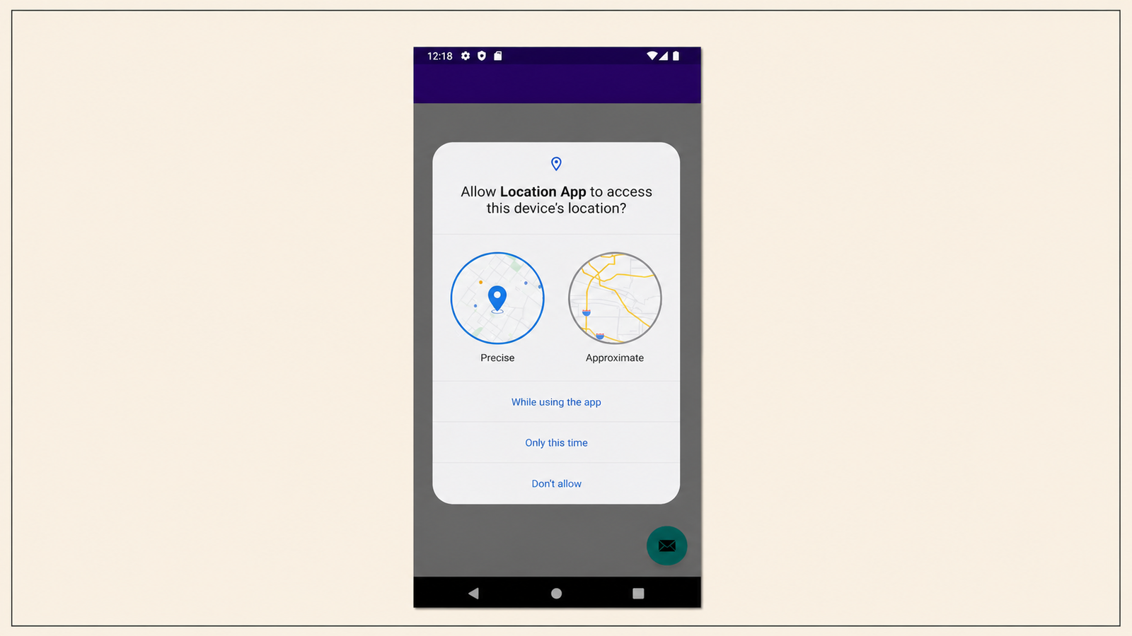
Step 1: Location permission with immediate payoff. The location permission request appears immediately after the OTP verification step. The framing is not generic. The prompt tells the user that their location determines delivery time and which products are available. The connection between granting permission and receiving the product promise is explicit. A user who understands why permission is needed is more likely to grant it, and in Zepto's case the payoff is visible immediately: once location is granted, the app shows the delivery time promise and the available product surface in seconds.
For returning sessions, Zepto pre-fills the delivery address from the last order or infers it from location, which removes manual address entry from the flow entirely. The distinction matters for conversion: Baymard Institute research found that the average US checkout flow contains 23.48 form elements displayed by default. Every form field that Zepto does not require in the first session is a micro-friction point not deducted from the user's motivation. Pre-filled address inference is worth multiple percentage points in first-session conversion.
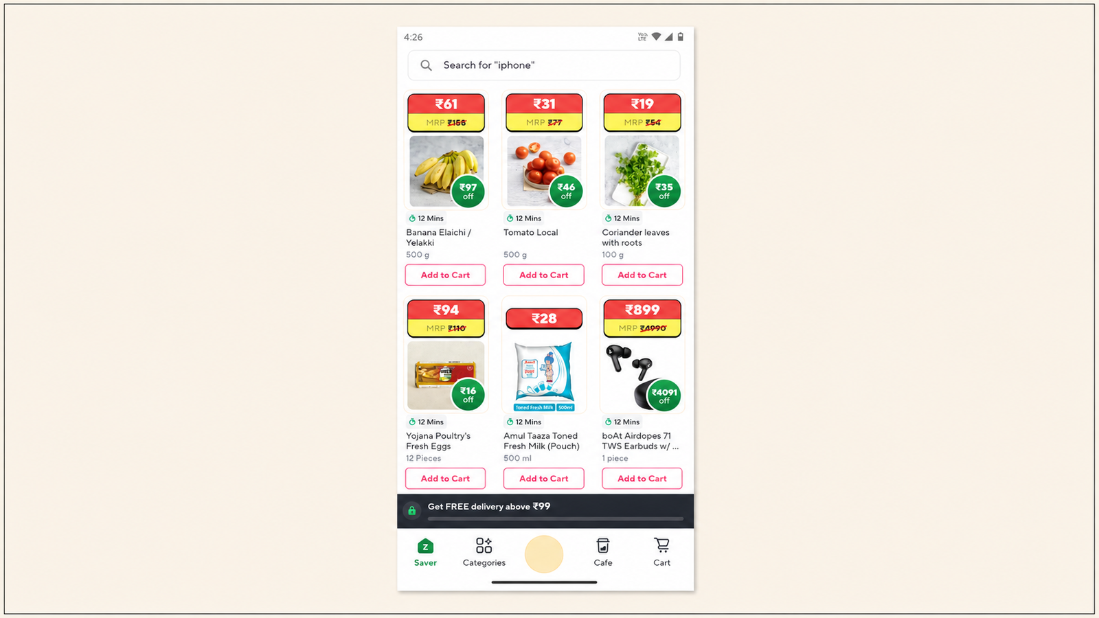
Step 2: The home screen as a decision surface. Zepto's home screen is not structured to introduce users to everything the app can do. It is structured to move users toward a purchase decision quickly. The hierarchy prioritises products above the fold rather than category navigation or editorial content. The search bar is prominent. The "Buy Again" carousel is visible on returning sessions. The promotional banners are product-led rather than brand-building.
A redesign study noted that friction in how users navigate product categories or repeat purchases was the primary usability issue in Zepto's purchase flow. The redesign recommendations included bold "Buy Again" and "Quick Picks" section headers, a search shortcut with smart suggestions for frequently purchased items, and reduced scroll fatigue by grouping essentials upfront. These changes are directionally what effective quick commerce home screen design looks like: lead with what the user is most likely to want, put the fastest path to those products at the top, and compress the distance between "I opened the app" and "I can see the product I want."
A key element of the home screen's function as a decision surface is the delivery time promise displayed persistently at the top. Zepto's 10-minute delivery promise functions as a time-pressure mechanism before the user has even engaged with the product catalogue. The user is reminded constantly that the delivery window is short, which reinforces purchase urgency throughout the session.
Step 3: Product selection with friction-reduced detail pages. Zepto uses overlay product detail screens rather than full-page navigation for product details. This keeps the category or search results page visible behind the overlay, reducing the navigation cost of going back after viewing a product. The overlay shows the essential decision information: product image, weight or quantity, price, discount, and an "Add to Cart" button. The goal is a decision in under 5 seconds per product.
A heuristic evaluation of Zepto noted that the overlay product detail screen deviates from the industry-standard full-page model and recommended moving to a full-screen view. The counterargument from a conversion perspective is that the overlay reduces the step count between product view and cart addition. The full-page model adds a navigation step. In a 3-minute first-order experience, each additional navigation step costs meaningful time and creates a decision point where the user might exit.
Step 4: Cart with transparent total and time pressure. The cart screen serves two functions: summarising the order and removing objections before checkout. The time pressure cue ("Arriving in 10 minutes") is visible in the cart view. The delivery fee is shown before checkout so there is no surprise fee revelation at payment. First-order discount is applied automatically, visible in the cart total, without requiring a coupon code entry.
A UX evaluation noted that the cart total was not visible upfront in earlier versions of Zepto's cart screen, requiring users to scroll to see the total. This is a conversion-critical issue because price surprise at checkout is one of the most consistent drivers of cart abandonment. A cart total visible without scrolling removes one of the most common abandonment triggers at the step immediately before payment.
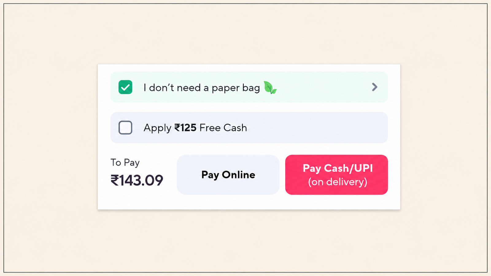
Step 5: Checkout with pre-filled payment and no re-authentication. For first-time users, Zepto's checkout requires payment method selection. UPI options are presented prominently because UPI is the dominant payment method for quick commerce purchases in India. For returning users, the last-used payment method is pre-filled. The checkout requires no re-entry of address, no re-authentication, and no additional form fields beyond payment confirmation.
The OTP login model means no password creation at account setup. A new user signs up with a phone number and an OTP, which is the same authentication pattern they use for UPI payments. There is no cognitive switch between the app's authentication model and the payment model, which reduces the perceived security friction at payment.
Friction Removal Architecture: The Specific Mechanisms
The 3-minute first order is not an accident of simple product design. It is produced by a specific set of friction-removal mechanisms, each of which targets a step where first-time users most commonly drop off.
Saved address inference. The moment location permission is granted, Zepto uses GPS coordinates to determine the delivery zone and pre-populate the address. The user does not type an address on a first order. For returning users, the last delivery address is the default, requiring zero input. One of the most consistent findings across e-commerce UX research is that manual address entry is a high-drop-off point, particularly on mobile where typing accuracy is lower and the form is harder to navigate than on desktop. Eliminating manual address entry from the first-order flow removes the highest-friction form completion step.
First-order offers triggered at cart, not at session start. Most promotional mechanics in e-commerce apps fire at session start or on the home screen. Zepto applies the first-order discount automatically in the cart. This placement is deliberate. A user who sees a discount before they have selected any products is in a different psychological state than a user who sees the discount when they are looking at their cart total and deciding whether to complete the order. Discount visibility at the cart step directly addresses the price-sensitivity moment. It is objection removal at the moment of the objection, not marketing at the moment of exploration.
Social proof in the product surface, not in a dedicated review section. Product ratings and review counts appear on the product card in the category surface, not only on the detail page. A user who can see that a product has 4.7 stars and 3,200 reviews at the category level does not need to navigate to the detail page to get the trust signal they need to add it to the cart. The trust signal meets the user at the point of decision rather than requiring an additional navigation step to access it.
Smart cart defaults. For returning users with order history, Zepto can pre-populate the cart with frequently purchased items or present a "repeat last order" option. This is the strongest possible compression of the product selection step: the user's most common purchase decision is made for them. The repeat order option converts at a significantly higher rate than the browse-to-cart flow because it eliminates the discovery step entirely for users who already know what they want.
The Drop-Off Step and Recovery
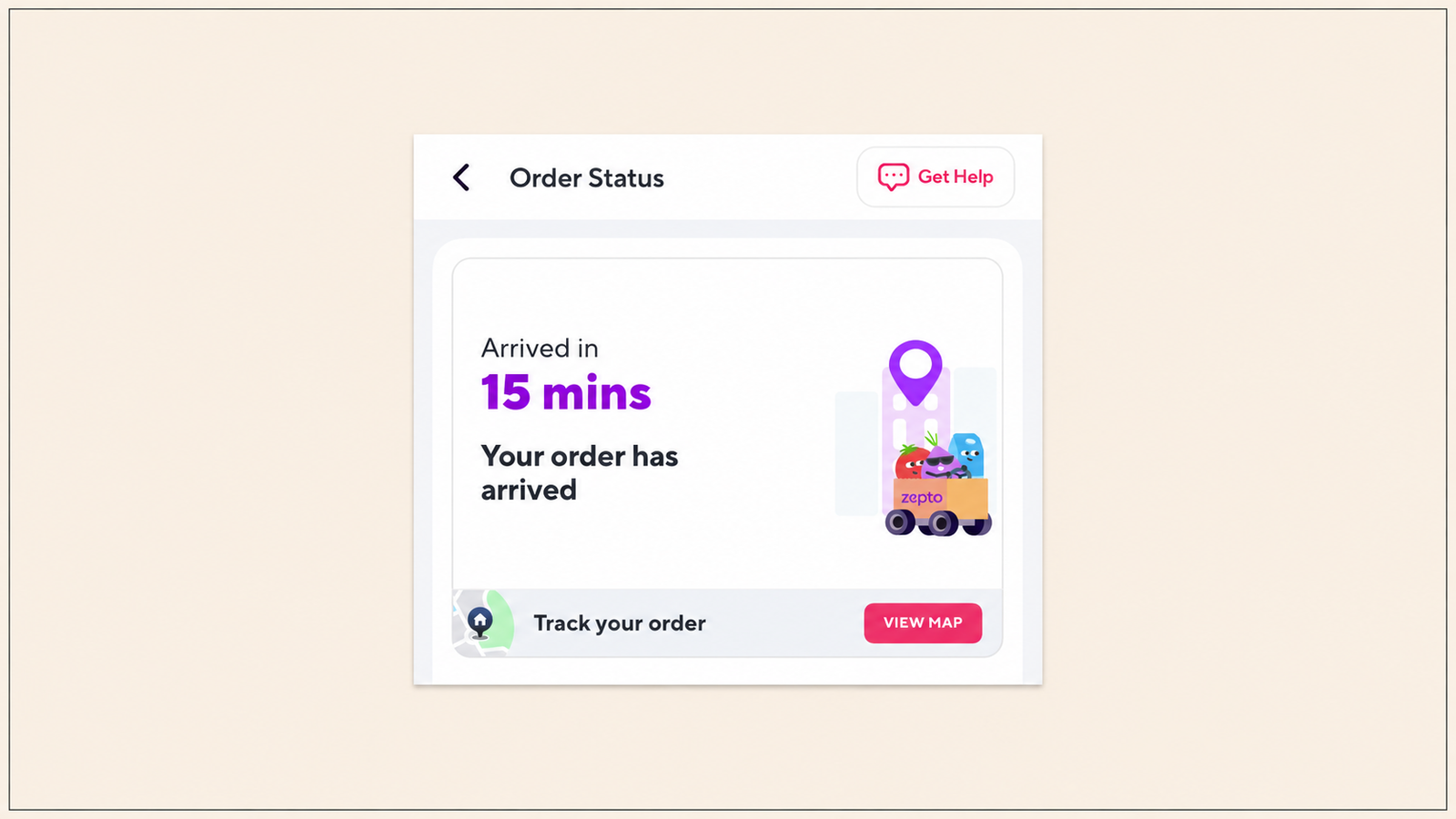
In any first-session e-commerce flow, there is one step where the highest percentage of users who entered the flow exit without completing it. For Zepto, and for most quick commerce apps, that step is the payment screen for first-time users who have not previously linked a payment method.
A user who opens the Zepto app for the first time, selects products, reaches the cart, and then encounters a payment screen where they need to add a payment method for the first time faces a context switch. They went from browsing to paying, and paying requires steps they did not expect to take in the same session: entering a card number, or going through a UPI app link flow, or setting up a wallet. Each of these steps extends the session beyond the 3-minute frame and creates an exit opportunity.
Zepto's mitigation at this step is the UPI payment prominence. UPI linking is faster than card entry because most Indian smartphone users have a UPI handle linked to their bank account already. The UPI flow for a first payment on a new app is typically 4 to 6 taps: select UPI, enter UPI ID or select from phone-linked handles, confirm on the UPI app, return to Zepto. That is faster than card entry and faster than adding a digital wallet. Positioning UPI as the primary payment option for first-time users is the correct choice for the Indian market where UPI handle penetration is high among the urban demographic Zepto serves.
The in-app nudge that fires at the payment step for users who pause or show hesitation is a time-pressure reinforcement: the delivery timer visible from the cart step is visible through checkout. A user who has been looking at a 10-minute delivery promise throughout their session and then pauses at payment is being reminded that their order can still arrive within the window if they complete payment now. The urgency is not manufactured. The dark store system genuinely begins preparing orders before payment is confirmed in some implementations. The timer reflects a real operational reality, which makes it more effective than countdown timers in conventional e-commerce that have no operational basis.
After the Order Is Placed: Gamification as the Retention Hook
The first confirmed order is the activation moment. What happens in the 10 minutes between order confirmation and delivery is the retention moment, and most quick commerce apps waste it entirely.
Zepto does not. The post-order confirmation screen is the entry point to a gamification layer that converts the delivery wait into an engagement window. The user is already in the app, already invested, already watching a timer tick down. That attention is available to a mechanic that deepens the relationship before the first order even arrives.
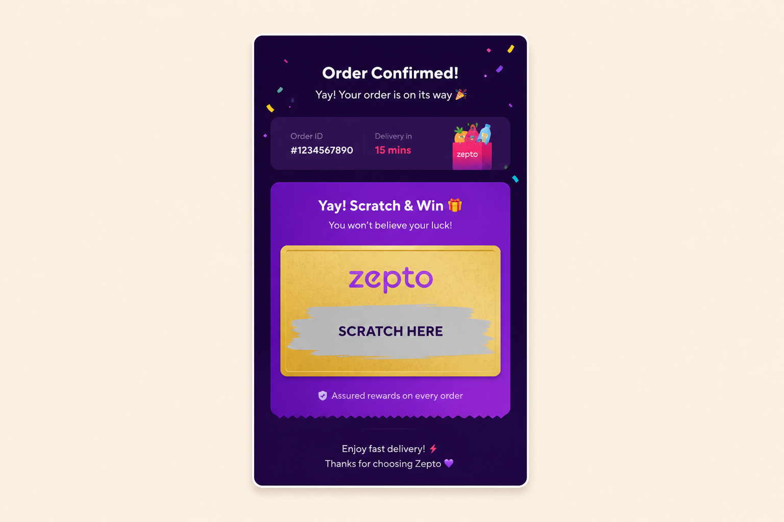
The scratch card at order confirmation. Zepto's scratch card mechanic fires immediately after an eligible order is confirmed. Scratch cards exploit variable ratio reinforcement, the same psychological mechanism that makes unpredictable rewards more powerful than guaranteed ones. The user just completed a purchase. They are in a positive emotional state. The scratch card delivers a variable reward at the peak of that state. The dopamine response peaks during anticipation of the reveal, not the reveal itself. A user who wins a discount on their second order has a direct financial reason to return. The first order and the second order are connected by the scratch card rather than separated by the gap between purchase occasions that most users never return to fill.
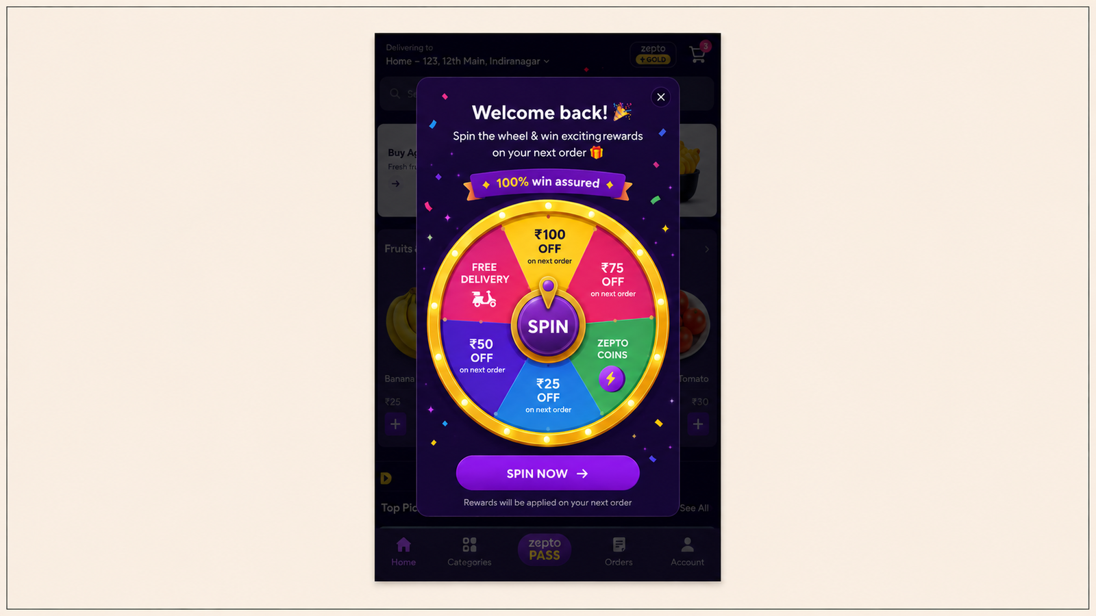
The spin-the-wheel mechanic for re-engagement. Beyond the post-order scratch card, Zepto deploys spin-the-wheel at specific re-engagement moments: when a user who has been inactive for a defined window returns to the app, and during high-volume commercial periods like IPL season or festive campaigns. The spin-the-wheel format works here because it delivers value before a purchase action is taken. A lapsed user who returns and is immediately offered a spin has received something valuable from the session before deciding whether to browse or buy. That pre-purchase value shifts the emotional context from "I'm considering whether to order" to "I already got something from this session." Spin-the-wheel outperforms scratch cards in acquisition and re-engagement contexts because it does not require a prior qualifying action to fire. For Zepto, where a lapsed user is likely already using a competing app, the spin delivers immediate value before they close the app and open Blinkit instead. The prize pool (next-order discounts, free delivery, Zepto Coins) connects directly to a purchase decision rather than delivering generic brand rewards.
Zepto Pass and streak mechanics. For users who progress past the first order, Zepto Pass and streak-based engagement mechanics serve the Day-7 and Day-30 retention problem. A user who has placed orders on consecutive days has built a streak. Losing the streak requires a deliberate decision to break a pattern that is already established. Streak mechanics use loss aversion to motivate consecutive-day behaviour, which is among the most powerful habit formation tools in mobile engagement. The streak does not need to be prominent to be effective. Its presence changes a daily ordering decision from a discrete choice to a pattern the user is reluctant to interrupt.
Coins and the rewards ecosystem. Zepto Coins, earned on eligible orders and redeemable against future orders, create a persistent switching cost through the endowment effect: a user with an accumulated coin balance is not evaluating Zepto against Blinkit on pure product and delivery speed. They are evaluating it against Blinkit plus the value they would forfeit by switching. The endowment effect makes an accumulated balance a retention asset independent of its face value. A user with 240 Zepto Coins is psychologically anchored to Zepto in a way that a user with zero coins is not.
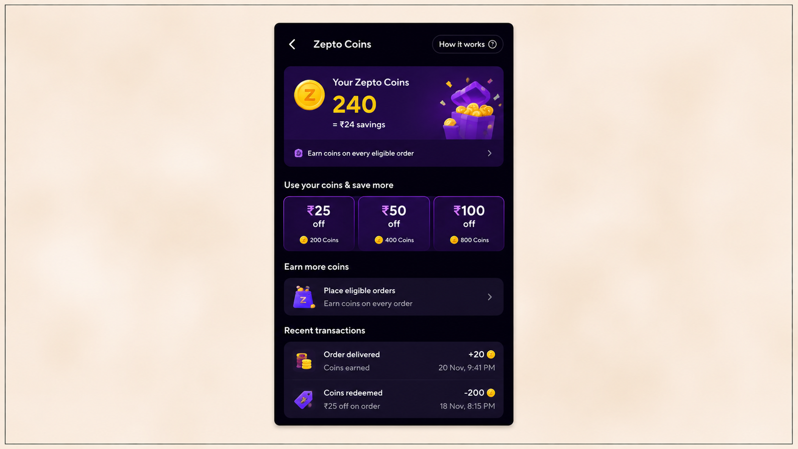
The post-order window is the moment of highest user attention and lowest competition for that attention. A gamification mechanic that fires here meets the user at their emotional peak. Any subsequent re-engagement nudge competes with a user who has returned to their other activities. Digia Engage's gamification module deploys scratch cards, spin-the-wheel, and coin mechanics as native in-app components triggered by order confirmation events, without engineering tickets after initial SDK integration. The trigger fires within 100ms of the qualifying event, which preserves the emotional immediacy that makes post-order gamification effective.
The First Screen as an Activation Surface
The home screen in most e-commerce apps serves multiple masters. Marketing wants promotional banners. Product wants feature discovery surfaces. Category management wants editorial sections. The result is a home screen that is a compromise between several agendas rather than a single-purpose screen optimised for the user's immediate intent.
Zepto's home screen is closer to a single-purpose decision surface than most e-commerce home screens. The elements that appear above the fold are chosen for their contribution to the path from app open to cart addition, not for their contribution to brand storytelling or feature discovery.
The delivery time display at the top is not a promotional message. It is information the user needs to decide whether to order now or wait. The search bar is prominent because a significant percentage of first-session users arrive with a specific product in mind rather than a browse intent. The category grid is compact and leads with the highest-frequency purchase categories (fruits and vegetables, dairy, snacks) rather than alphabetically ordered or editorially curated.
The promotional banner, where present, is product-led. It shows a specific product or category with a specific price or discount, not a brand campaign image. The user can tap a promotional banner and be in the relevant product surface in one tap. There is no intermediate editorial page between the banner and the products.
This hierarchy reflects a specific understanding of why Zepto users open the app. They are not there to explore. They have a purchase intent, usually specific, and the home screen's job is to resolve that intent into products in the cart as fast as possible.
In-App Nudges at First-Session Drop-Off Points
Zepto applies contextual nudges at the specific steps where first-session users most commonly pause or exit. The nudge strategy is not broadcast. It is moment-specific.
Location permission step. A brief explanation of why location access is needed appears before the system permission dialog. This is the pre-permission education pattern that consistently produces 40 to 60% higher permission acceptance rates than showing the system dialog without context. A user who understands that location determines delivery time and product availability has a clear reason to grant permission.
Home screen for first-session users. A subtle first-order offer callout is present on the home screen, typically a banner or badge on the first-order discount. This is not an interstitial overlay that blocks product browsing. It is a persistent signal that first orders come with a price benefit. The placement in the browsing surface rather than a blocking modal keeps the user in the product exploration context while reinforcing the financial incentive to complete a purchase.
Cart step for users who view the cart but do not proceed. A nudge reinforcing the delivery time and the first-order discount fires when a user views the cart and then navigates away without proceeding to checkout. The nudge is a persistent cart summary in the navigation bar or a brief bottom sheet that summarises the cart contents and restates the delivery promise and the discount. This is cart recovery operating within the session rather than relying on a push notification to recover the session after the user has left the app.
Payment step for users who pause. The delivery timer, visible throughout the session, serves as a passive urgency nudge at the payment step without requiring an active notification. For users who remain on the payment screen for more than a defined dwell time, a brief prompt may surface confirming that the order can be placed and arrive within the promised window if payment is completed now.
These nudges share a design principle: they fire at the step where the user is experiencing decision uncertainty, they provide specific information (delivery time, discount value, cart total) that reduces that uncertainty, and they do not interrupt the user mid-task. For the full suppression logic that determines when in-app nudges should and should not fire, the Digia Engage suppression framework covers which session states block delivery and which create the highest-receptivity moments.
Transferable Principles for Non-Quick Commerce Apps
Zepto's onboarding architecture is quick commerce-specific in its timing constraints. The principles that produce it are not.
The critical path audit. Map every step between app open and first win (in Zepto's case, confirmed order; in a fintech app, first investment; in a fitness app, first completed workout). For each step, ask whether the step collects information required for the first win or information that could be collected after the first win. Every step in the second category delays the first win without serving the user.
Location or context inference replaces manual input wherever possible. Zepto infers delivery address from GPS coordinates. A fintech app can infer the user's savings goal category from the onboarding flow's most popular options and pre-select it. A food app can pre-fill cuisine preferences from the user's location data and the most popular choices in that area. Manual input steps have a consistent conversion cost. Any reduction in manual input improves conversion at that step.
Surface promotional incentives at the decision moment, not the browse moment. Zepto's first-order discount appears at the cart step. A D2C app's first-order coupon is most effective at the checkout step, not the home screen. The decision moment is when price sensitivity is active. Surfacing incentives before the user has reached the decision moment removes the incentive from the context where it most reduces friction.
The home screen as a conversion surface, not a discovery surface. Most apps build home screens that serve multiple purposes. Each additional purpose the home screen serves reduces its effectiveness at the primary purpose. For apps where first-session conversion is the most important metric, the home screen should be structured to accelerate the path to the first conversion event, with everything else secondary to that goal.
Time pressure that is grounded in reality. Zepto's delivery timer works because the delivery is genuinely fast. Manufactured countdown timers with no operational basis are a dark pattern that users recognise and discount. Time pressure nudges work when the urgency is real. For apps that have a genuine time-sensitive element (a flash sale, a limited availability item, a schedule-dependent service), surfacing that time element at the decision moment is legitimate and effective. For apps without that element, manufactured urgency produces short-term conversion at the cost of long-term trust.
The First-Session Audit Exercise
The fastest way to apply Zepto's onboarding principles to a different app is a step-count audit:
Open the app on a fresh device with no account. Set a timer. Go through the flow to first win. Count every step. Note every field that requires manual input. Note every screen that does not directly advance the user toward the first win. Note every permission request that appears before the user has experienced any value. Note every piece of information collected that could be deferred to after the first win.
The gap between that step count and the minimum steps theoretically required to deliver the first win is the friction surplus. Each element of the friction surplus is a candidate for removal or deferral.
The second pass of the audit is timed. How long does the first-session flow take for a user with average mobile proficiency who encounters no errors? If that number exceeds 3 minutes for a quick commerce app, or 5 minutes for a fintech activation flow, or 10 minutes for an e-commerce first purchase, the flow has more friction than the product's user base will tolerate before their first-session motivation expires.
Key Takeaways
Quick commerce has near-zero tolerance for first-session friction because the category promise is speed and first-session non-converters rarely return to place a second-session order.
Zepto's critical path runs from location permission to home screen to product selection to cart to checkout. Each step is compressed to its minimum viable friction, with manual input eliminated or pre-filled wherever the data is already available.
The home screen is a decision surface, not a discovery page. The hierarchy prioritises the fastest path to cart addition over editorial content, feature education, or promotional brand messaging.
First-order offers fire at the cart step, not at session start. Incentive placement at the decision moment reduces price-sensitivity friction precisely where it is most active.
The highest drop-off risk in a Zepto first session is the payment step for users adding a payment method for the first time. UPI prominence reduces this friction for the Indian urban demographic Zepto serves.
The four transferable principles are: audit the critical path and remove or defer every non-prerequisite step, replace manual input with context inference wherever possible, surface promotional incentives at the decision moment rather than the browse moment, and structure the home screen around the first-session conversion goal rather than competing product objectives.
Further Reading
From Digia Engage:
- How to Build an In-App Onboarding Flow That Gets Users to Their First Win — the first win mapping exercise and its correlation with Day-7 retention
- The Anatomy of a Great In-App Onboarding Tour — tour step structure, format selection, and step count limits for first-session guidance
- When NOT to Show a Nudge: Building a Suppression Logic — the suppression framework that determines when in-app nudges accelerate conversion versus interrupt it
- Mobile App Retention Rate: What It Is and What's Pulling It Down — the Day-1 retention context for why first-session conversion matters as much as it does
- In-App NPS Surveys: How to Get a 30% Response Rate — collecting post-first-order feedback at the highest-receptivity moment in the session
External Sources:
- UX Case Study: Improving the User Experience of the Zepto App — Medium, Design Bootcamp (Zepto's target user profile, cart-to-purchase flow analysis, redesign recommendations)
- Heuristic Evaluation of Zepto: UX Case Study — Medium (OTP verification flow, cart total visibility issue, overlay product detail screen analysis, home screen inconsistencies)
- Fixing the Purchase Flow: A Zepto App UX Case Study — Medium (user interview findings on category navigation friction, "Buy Again" carousel rationale, smart search design for repeat purchases)
- Product Teardown: Zepto New User Onboarding and First Order — NextLeap (phone number plus OTP onboarding flow, user persona analysis, first-order critical path)
- Quick Commerce 2025: Why Zepto Clone Apps Are Rising — White Label Fox (Zepto's $3.6B valuation, 300+ dark store network, customer retention rates above traditional e-commerce)
- Average Ecommerce Conversion Rate: Industry Data for 2026 — Red Stag Fulfillment (food and beverage 6.11% category conversion rate, industry-by-industry benchmark data)
- Mobile App Conversion Rate Benchmarks and Tips for 2026 — UXCam (25% of app installs lead to only a single session; install-to-purchase conversion benchmarks by industry)
- 50 E-commerce Conversion Rate Statistics for 2026 — Envive AI (Baymard Institute 70.19% cart abandonment rate, 23.48 form elements in average US checkout, $260 billion in recoverable lost orders)
- eCommerce Mobile Conversion Rate Best Practices — AppBrew (mobile apps convert 3x higher than mobile web; users view 4x more products per session in apps)
- 2026 eCommerce Benchmarks: Average Conversion Rates — Speed Commerce (Baymard 23.48 form elements in checkout; IRP Commerce December 2025 benchmark data)
The in-app nudge system used at Zepto's key first-session drop-off points, permission pre-education, first-order offer callout at the cart step, and cart recovery before session exit, is configurable in Digia Engage without engineering tickets after initial SDK setup. Event-based triggers fire within 100ms of qualifying user actions. Book a demo to see how the trigger and suppression layer works for a quick commerce or e-commerce first-session flow, or read the in-app nudges guide to understand which nudge formats work at each drop-off point.