





TL;DR: Most onboarding tours are built to explain. A well-built tour moves. Every step has one job: get the user to the next action. The data on tour abandonment makes the distinction expensive to ignore. Tours with more than five steps see 63% abandonment. Static tooltips are dismissed in under 3 seconds 76% of the time. User-triggered tours outperform session-start tours by a factor of 2 to 3 times. This article covers the four components every tour step needs, when each tour format applies and where each fails, the step count problem, progressive versus front-loaded triggering, the design specifics that affect completion, how to test a tour, and the mistakes that are slow to diagnose because they look like engagement problems until they are measured step by step. Sourcing note: All statistics are attributed throughout. Where claims draw on established UX research principles without a single cited study, that is noted.
A product tour that walks a new user through every major feature before they have touched any of them is a lecture. The user is not there for a lecture. They opened the app because they wanted something, and they will leave if the gap between opening and getting it is occupied by text-heavy overlays pointing at interface elements they have not yet had a reason to care about.
Research from the Baymard Institute shows that 78% of users abandon traditional product tours by step three. Amplitude's 2024 Product Analytics Report, analyzing behavioral data from 1,247 B2B applications, found that 76.3% of static tooltips are dismissed within 3 seconds. Only 18.4% of tooltip interactions lasted long enough to suggest actual reading. The users were not engaging with the tour. They were clearing it out of the way.
The problem is design architecture, not content quality. The copy can be clear, the visuals can be sharp, the feature being highlighted can genuinely matter, and the tour will still fail if its structure places the wrong content at the wrong moment in the wrong format. What follows is the anatomy of a tour that does not fail.
The Four Components Every Tour Step Needs
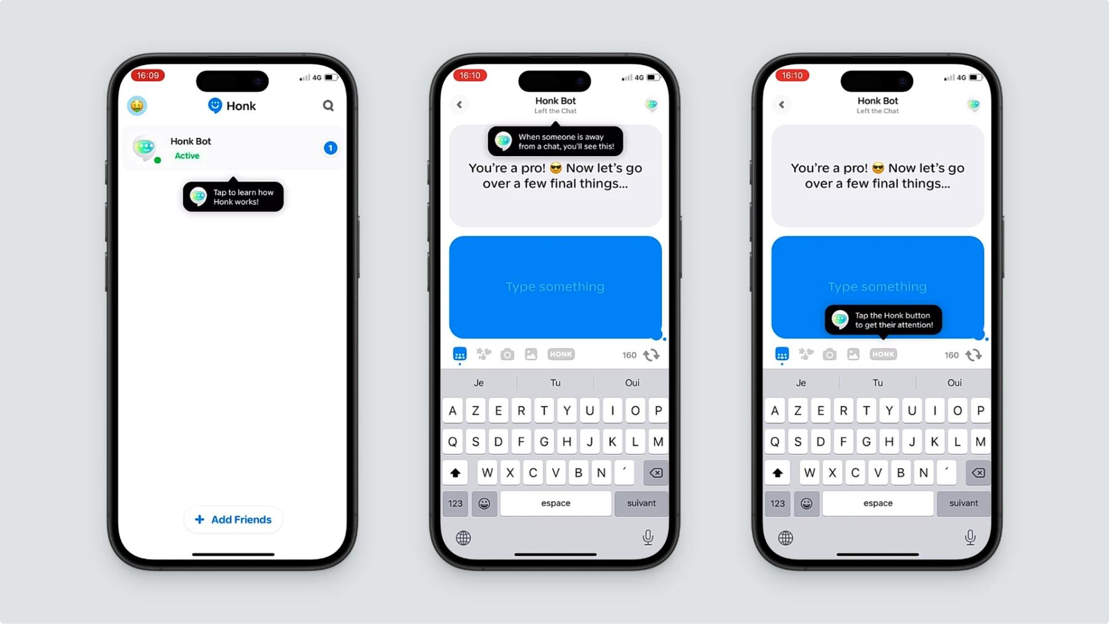
Each step in an onboarding tour is a micro-communication. It has a very small amount of the user's attention available to it, typically well under 10 seconds before the user decides to read further or dismiss. That constraint means every step either earns its place with a tight structure or gets skipped.
The four components that make a step earn its place:
Hook. The first sentence of a tour step needs to answer one question before the user asks it: why should I pay attention to this right now? The hook is not a feature name. It is a relevance signal. "This is your portfolio summary" is a label. "Here's where you'll see your returns update in real time after your first investment" is a hook. The second version tells the user why this screen matters to them, not just what it is called. A hook that fails to establish relevance in the first clause loses the user before the step has communicated anything useful.
Step. After the hook establishes relevance, the step instruction tells the user exactly what to do. One action. Not a list of things this feature can do, not a menu of options they might want to explore. One specific action that moves them closer to the first win. "Tap Invest to make your first SIP" is a step. "You can use this screen to set up SIPs, view your portfolio, check fund performance, and compare options" is an explanation that belongs in a help article, not a tour step.
Confirmation. After the user completes the action the step directed them toward, they need confirmation that the action did something meaningful. This can be a brief message, a screen state change that visually confirms the action, or a small animation that signals completion. Confirmation closes the loop between action and outcome. Without it, users complete the action and feel uncertain about whether it worked, which increases hesitation at the next step.
Bridge. The bridge tells the user what comes next and why it matters. "Next: link your bank account to fund your first investment" connects the current step to the step that follows and gives the user a reason to continue rather than explore on their own or close the tour. The bridge is what transforms a series of separate tooltips into a coherent flow. Tours without bridges feel like a collection of disconnected annotations. Tours with bridges feel like a guided path to a specific outcome.
All four components should fit within the word count that mobile tour steps can support. Tooltip copy should aim for under 140 characters. That is not a soft guideline. It is a hard constraint imposed by screen real estate, reading speed, and user patience. A step that requires 280 characters to make its point is a step that needs to be split into two steps or rethought as a different format.
Tour Format Options: Use Case and Failure Mode for Each
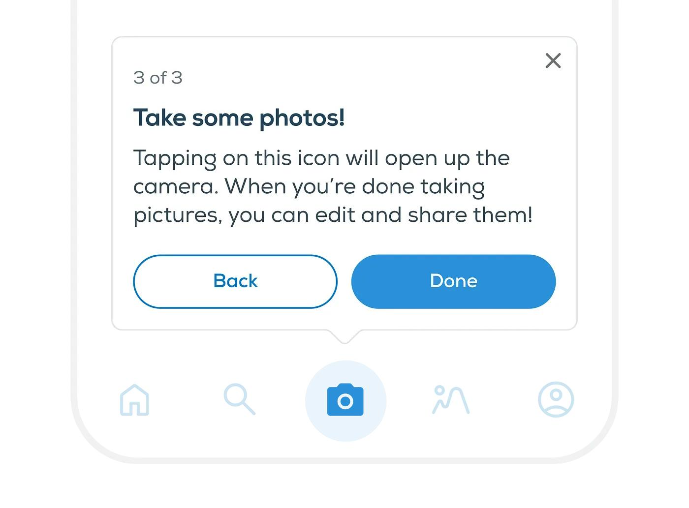
The format decision determines how a tour step is delivered. Each format has a job it does well and a failure mode that appears when it is applied to the wrong context.
Spotlight overlays. A spotlight dims everything on the screen except one element, focusing the user's attention on a specific button, section, or interface component. Spotlights work well for directing action at a precise interaction point during a flow the user is actively engaged in. They fail when they are used on screens the user has not yet had a reason to reach. A spotlight on a portfolio analytics tool, delivered before the user has made a first investment, is highlighting something the user has no frame of reference for. The spotlight creates attention without context, which produces dismissal rather than understanding.
Tooltips. A tooltip attaches a brief annotation to a specific UI element. It appears near the element it refers to and is typically dismissed with a single tap. Tooltips work for focused explanations of specific interface elements at the moment the user is interacting with them, or immediately before their first interaction. Tooltips fail when they appear as a series of sequential steps at session start, before the user has begun to interact with the product. In sequence mode, the user is not using the product. They are watching annotations about it.
Coach marks. A coach mark typically combines a spotlight with a tooltip: the background is partially dimmed, one element is highlighted, and a brief explanation is attached. When presented as a series during onboarding, most new users skip through coach marks without retaining the information, because they arrive before the user has a need for the content being explained. Coach marks used at the first point of interaction with a specific feature, rather than at session start, perform significantly better because the user has a context in which the explanation is relevant.
Checklists. An onboarding checklist presents a series of tasks the user needs to complete to reach the first win. It is persistent rather than sequential: the user can complete tasks in any order and return to incomplete ones. The average checklist completion rate across 188 companies studied by Userpilot was 19.2%, with a median of 10.1%. Checklists work best in contexts where setup is genuinely multi-step and users benefit from seeing their progress across all prerequisites. They fail when the tasks are not genuinely necessary for activation, because a checklist of optional steps reads as friction rather than guidance. Users who complete an onboarding checklist are 3 times more likely to become paying customers, which reflects the correlation between setup completion and genuine product engagement, not the checklist format itself.
Full walkthroughs. A full walkthrough sequences the user through a structured series of steps covering a specific workflow or feature set. It is the most controlled onboarding format and the most demanding of user attention. Full walkthroughs work for workflows where every step is genuinely necessary, where skipping any step produces confusion downstream, and where the user arrived with the explicit intent to set up something specific (as in KYC flows, account linking, or initial configuration in fintech apps). They fail when applied to exploratory product introductions where the user has not yet committed to a specific goal.
The Step Count Problem
The data on tour abandonment by step count is consistent across every source that has measured it, and the numbers are not gradual. They are cliff-shaped.
Tours with five or more steps see 63% abandonment rates. Tours with more than ten steps see abandonment above 81%, per Pendo's research across 847 B2B SaaS applications. The steepest abandonment occurs at steps 3 to 4, with 48% of users leaving at this transition point. The industry average for the first step transition (stage 1 to stage 2) is roughly 38% drop-off, meaning more than a third of users who start onboarding do not make it past the second screen.
Top-performing tours in the top 1% of completion rates did not exceed five steps, per Chameleon's 2025 benchmark report across product tours, checklists, and modals. The step count limit is not an aesthetic preference. It is the point at which the user's motivation to continue runs out before the tour's demands on their time do.
The design principle that explains this pattern is cognitive load. Working memory can hold approximately 7 plus or minus 2 information chunks simultaneously, per cognitive psychology research on memory capacity. An onboarding tour that delivers ten pieces of information in sequence before the user has done anything in the product is filling working memory with data the user cannot yet connect to experience. Each step adds to the load. By step four, most users are not processing the content anymore. They are clearing the overlays.
The fix is not to compress ten steps of content into five steps. It is to question whether steps 6 through 10 are genuinely prerequisite for the first win. In most tours, they are not. They are explanations of features the user will encounter naturally through use. Those explanations belong at the point of first interaction with each feature, triggered by the user's action, not at session start as part of a front-loaded sequence.
Progressive Versus Front-Loaded Tours
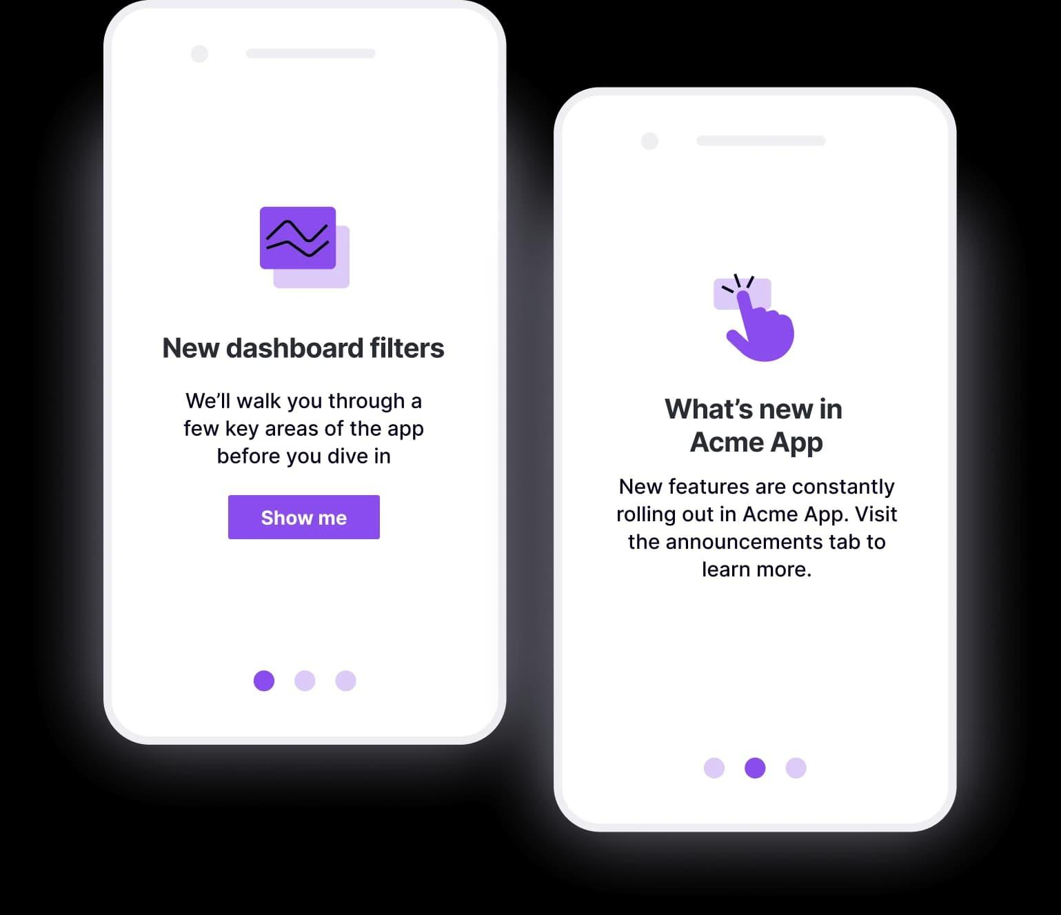
A front-loaded tour fires all its steps at session start, in a predetermined sequence, before the user has interacted with the product. A progressive tour fires individual tour steps at the moment the user first interacts with the feature being explained.
User-triggered or contextually timed tours dramatically outperform delayed session-start tours by a factor of 2 to 3 times, per Chameleon's 2025 benchmark data. The mechanism is relevance: a tour step that fires when the user has just navigated to a specific screen is explaining something the user is actively looking at, in a context where the explanation is immediately applicable. A front-loaded tour step about the same screen fires before the user has any reason to care about it.
The practical implementation for a progressive tour: define the trigger event for each tour step. The investments tab tour step fires when the user first navigates to the investments tab. The portfolio analytics tour step fires when the user first opens their portfolio view after making an investment. The KYC re-engagement step fires when the user returns to the app and has not yet completed KYC. Each step fires in context, with the specific feature or screen visible, at the moment the explanation is relevant.
This architecture requires event-based trigger infrastructure. Digia Engage's in-app nudge and widget system fires within 100ms of qualifying events, which is the technical requirement for progressive tour steps that need to appear at the precise moment of first interaction rather than after a navigation delay. A tour step that fires 2 seconds after the user navigates to a screen is not a contextual step. It is a delayed pop-up.
Contextual Versus Forced
The distinction between contextual and forced onboarding is less about format and more about timing relative to user intent.
A forced tour interrupts a user who is mid-task to explain the task they are doing. The user has already navigated to the investments screen with an intent to invest. The tour overlay stops them and explains what the investments screen is. They already know. They navigated there on purpose. The explanation is correct but the timing is adversarial.
A contextual tour fires before the user's first attempted action on a screen, at a moment when they are orienting rather than executing. The difference in timing is small, often a matter of seconds, but the difference in user experience is significant. In orientation mode, explanation is welcome. In execution mode, explanation is friction.
72% of users abandon apps during onboarding if it requires too many steps, and every extra minute of onboarding time lowers conversion by approximately 3%. The forced tour adds to the time cost without adding to the user's goal progress. The contextual tour adds time only when the user is not yet ready to act, which makes the time feel purposeful rather than obstructive.
The test for whether a tour step is contextual or forced: does the user already know what they intend to do on this screen? If yes, the step is forced. If no, or if the user has just arrived and has not yet oriented, the step is contextual.
Design Specifics That Affect Completion
Tour completion is not just a function of content quality. The visual and interaction design of each step either supports or undermines completion independent of what the step says.
Overlay opacity. Spotlight overlays require a background dim that clearly separates the highlighted element from the rest of the screen, while remaining light enough that the user can see what the rest of the screen contains. An overlay that is too dark removes context entirely, making the highlighted element feel isolated and creating disorientation when the overlay is dismissed. An overlay that is too light fails to direct attention. A background opacity of 50 to 70% is the range that maintains context while creating clear directional focus.
Arrow placement. Tour step arrows should point at the specific element being discussed, not at the general area where the element is located. An arrow that points to a quadrant of the screen rather than a specific button or field tells the user "look around here," which creates search behavior rather than directed action. The arrow tip should touch or nearly touch the element it references.
Copy length per step. Under 140 characters per tooltip is the target. Only 18.4% of tooltip interactions last long enough to suggest actual reading occurred. That means most tooltip copy needs to communicate its essential point in the first 60 to 80 characters, with the remaining characters providing context for users who read further. Lead with the action or benefit, not the feature name.
CTA copy for tour steps. "Next" is the most common CTA in onboarding tour steps and the most useless. It tells the user that something will follow, which they already knew. "Show me" performs better because it frames the advance as a revelation rather than a sequence. "Got it, what's next?" performs better than "Next" because it confirms understanding before advancing. The best CTA for a step that ends in a user action is not a button at all. It is the action itself: the tour advances because the user completed the step, not because they tapped a navigation button.
Progress indication. Users are 40% more likely to complete processes when they can see their progress. A progress indicator in an onboarding tour serves two functions. First, it tells the user how much time they are committing to, which reduces the anxiety about an open-ended process. Second, it creates a completion pull, what behavioral psychology calls the Zeigarnik effect: tasks that have been started are more difficult to abandon than tasks that have not begun. A tour where the user can see they are 3 of 5 steps through is harder to abandon than a tour with no visible endpoint.
How to Test Onboarding Tours
Most teams test onboarding tours by comparing overall completion rates between variants. That tells them which variant more users finished. It does not tell them where each variant succeeded or failed, which means the winning variant cannot be meaningfully improved in the next test cycle because the team does not know what it got right.
The measurement framework that actually produces actionable results:
Step-level drop-off rate. Track the percentage of users who reached each step and did not advance to the next. Calculate this per step, not as an aggregate. A tour with 60% overall completion might have a 40% drop at step 3 and near-zero drop everywhere else, which identifies the precise problem rather than the average performance. The step with the highest drop-off rate is the highest-priority optimisation target, regardless of where it appears in the sequence.
Correlation between each step's completion and the activation event. The activation event is the first win: the specific action that predicts Day-7 retention in your retained user cohort. Track whether users who completed each step are more or less likely to reach the activation event. Addressing the top abandonment point in an onboarding funnel improves overall completion by 10 to 15%, per Appcues data. But the more consequential improvement is finding the step whose completion most strongly predicts the activation event, and optimising that step's conversion rate above all others.
What variants to run. The highest-value test for any tour step is a timing test: the same content, delivered at session start (front-loaded) versus at first interaction with the relevant feature (progressive). This test directly measures the performance gap between the two architectures. After the timing test, the next highest-value test is a copy length test: the same step with full-length copy versus a compressed version at the 140-character threshold. After that, test CTA copy. Test one variable at a time.
What "winning" means. A variant wins when it produces a higher rate of users reaching the activation event, measured against a holdout group that received no tour. A tour variant that produces a higher completion rate but an identical activation rate is not a better tour. It is a more engaging obstacle to the first win. Behaviour-triggered contextual guidance produces 2.5 times higher engagement and 38% better 90-day retention compared to static approaches. Retention improvement against a holdout group is the criterion that actually matters.
Common Mistakes
Too many steps. The data is clear and the threshold is low. Tours of more than five steps see majority abandonment before completion. The team that argues for a six-step tour because each step is genuinely important is not solving the problem. If all six steps are important, the answer is to trigger steps 4, 5, and 6 progressively at later interaction points, not to include them in the initial sequence.
Explaining features the user has not yet reached. A tour that covers the portfolio analytics screen before the user has made a first investment is explaining a feature in the absence of the context that makes it meaningful. The user cannot evaluate the explanation because they have no experience to connect it to. The step wastes its slot in the sequence and creates the impression that the tour is out of sync with where the user actually is in the product.
Skippable tours with no recovery path. Making a tour skippable is correct. Users who prefer to explore independently should be able to do so. The mistake is building a skippable tour with no way for users who skipped it, and then got confused, to access the guidance they declined. Users want to explore and find answers when they need them. A persistent help launcher, a guided tour access point in the app's settings or help menu, and contextual tooltips that fire on first interaction with complex features are the recovery infrastructure that skippable tours require. A tour without a recovery path produces a subset of users who skipped, got lost, and had no route back to guidance.
Mixing instructional content with action prompts. A tour step that tells the user what a feature does and then asks them to do something with it in the same step is asking the user to hold the explanation in working memory while executing an action. The explanation crowds out the execution focus. The stronger pattern is to keep explanation and action in separate steps, or to make the explanation so brief (under 50 characters) that it does not compete with the action for cognitive resources.
Topics Not in the Brief That Teams Should Know
The skip and recover pattern as a design feature. Most teams treat the skip option as a graceful exit. The better framing: the skip option is the beginning of a self-directed path, and the recovery infrastructure is the design work that path requires. A user who skipped the tour and later encounters a feature they cannot figure out needs a one-tap route to the relevant tour step, not the full tour from the beginning. Deep-linked help, accessible from within the feature itself, converts the skip decision from a retention risk into a user experience preference that the product respects.
Tour fatigue for returning users. A user who has used the app for 30 days should not see the same onboarding tour step that fires for new users. Tour step targeting must filter by lifecycle stage. A tour step visible only to users who have not yet completed the relevant action, and suppressed for users who have, is a well-targeted contextual tip. The same step with no lifecycle filter is a repeated interruption for engaged users that will eventually be suppressed by them at the system level.
Accessibility requirements for tour overlays. Screen readers need to be able to parse the content of tour overlays. An overlay that is not accessible via VoiceOver or TalkBack is excluding users who depend on those tools. Nielsen Norman Group's guidance on instructional overlays notes that the visual style of a hint must make unmistakably clear that it is an annotation rather than an interactive element, which applies directly to accessibility: a coach mark that cannot be distinguished from a tappable button by a screen reader user is a barrier, not guidance.
The second session onboarding layer. First-session onboarding covers the path to the first win. Second-session onboarding covers the path to the second win, the feature or outcome that deepens the user's investment in the product past the initial activation moment. Teams that design a first-session tour and stop there are leaving the Day-7 retention problem unsolved. The contextual tips and feature discovery nudges that appear in sessions 2 through 5 are part of the onboarding architecture, even if they do not look like a tour.
Key Takeaways
The data on tour abandonment is not ambiguous. Tours beyond five steps see 63% abandonment. Static tooltips are dismissed in under 3 seconds 76% of the time. User-triggered tours outperform session-start tours by 2 to 3 times. The architecture failure that produces these numbers is the front-loaded, feature-explanation tour, delivered at session start, before the user has a context in which the content is useful.
Every tour step needs four components: a hook that establishes relevance before the user dismisses it, a step instruction that specifies one action, a confirmation that closes the loop between action and outcome, and a bridge that connects the current step to the next. Steps that omit any of these four components are annotating the product rather than guiding toward it.
The format decision determines how a step is delivered. Spotlights work for directing action at a specific interaction point. Tooltips work for focused, contextual explanations at first interaction. Coach marks work at the moment a feature is first needed. Checklists work for multi-step setup with genuine prerequisite structure. Full walkthroughs work for compliance-required flows. Each format fails when applied outside its appropriate context.
Progressive tours, triggered by user actions at first interaction with each feature, outperform front-loaded tours on every measured outcome. The triggering infrastructure for progressive tours requires event-based delivery within the same interaction window as the qualifying event, not a delayed batch.
Tour measurement should track step-level drop-off and the correlation between each step's completion and the activation event, not just overall completion rate. A variant wins when it produces a higher activation rate against a holdout group, not a higher completion rate in isolation.
The three most expensive mistakes are tours with too many steps, tours that explain features the user has not yet reached, and skippable tours without recovery paths for users who skipped and then needed the guidance.
Further Reading
From Digia Engage:
- Mobile App Onboarding: Activation Patterns and Retention — the activation framework that tour design serves, including the first win mapping exercise
- How to Build an In-App Onboarding Flow That Gets Users to Their First Win — the first win definition, three failure modes, and the design patterns that compress time to value
- Progressive Disclosure in Mobile UX — the three progressive disclosure mechanisms and their contexts
- Onboarding Patterns: Progressive Disclosure vs Front-Loaded Setup — the structural decision between progressive and front-loaded onboarding architectures
- When NOT to Show a Nudge: Building a Suppression Logic — suppression rules that prevent tour steps from firing in wrong contexts
- Digia Engage Nudges — event-based trigger architecture for progressive tour delivery within 100ms of qualifying events
External Sources:
- Why Most Product Tours Fail and How to Implement Contextual Onboarding — SaaS Factor (Baymard 78% step 3 abandonment; Amplitude 76.3% dismiss in 3 seconds; Pendo 63% abandonment at 5+ steps; contextual 2.5x engagement lift)
- The Chameleon User Onboarding Benchmark Report 2025 — Chameleon (top 1% tours stay under 5 steps; user-triggered tours 2-3x outperformance; tour abandonment patterns)
- 100+ User Onboarding Statistics for 2026 — UserGuiding (72% abandon apps with too many onboarding steps; checklist completers 3x more likely to convert; products with quick win retain 80% more users)
- Customer Onboarding Checklist Completion Rate: 2025 Benchmark Report — Userpilot (19.2% average checklist completion; 10.1% median; fintech highest at 24.5%)
- How to Measure Onboarding Success: 10 Metrics That Matter — UserTourKit (38% drop-off at first step transition; step-level diagnostic measurement methodology)
- User Onboarding Metrics and KPIs: The Complete Guide — Appcues (drop-off rate formula; addressing top abandonment point improves completion 10-15%)
- Essential Guide to Mobile User Onboarding — Appcues (tooltip copy under 140 characters; hotspot pattern; mobile-specific tooltip guidance)
- Choosing the Right User Onboarding UX Pattern — Appcues (tooltip use case and failure modes; 1 to 3 step tooltip guide for ease-of-use aha moments)
- Instructional Overlays and Coach Marks for Mobile Apps — Nielsen Norman Group (visual distinction between annotation and interactive element; ultra-short text requirement)
- Customer Onboarding Statistics for 2026 — SHNO (72% abandonment from too many steps; 3% conversion drop per extra minute of onboarding time)
- How to Measure Onboarding Completion Rates — Getmonetizely (40% more likely to complete with progress indicators; users who adopt 3+ features have 40% higher retention)
- User Onboarding Best Practices — Netcore (coach marks in sequence mode cognitive load failure; Dropbox context-dependent nudge triggering)
Progressive tour steps triggered by user events, spotlight overlays, tooltips, and checklists are all configurable in Digia Engage from the dashboard without engineering tickets after initial SDK setup. Event-based triggers fire within 100ms of qualifying user actions, which is the delivery window that contextual tour steps require to feel native rather than delayed. Book a demo to see a progressive tour flow configured for a specific activation goal, or explore the nudges product page for the full trigger and targeting specification.