
TL;DR: Bottom sheets are one of the highest-leverage UI surfaces in a mobile app, and most teams are not testing them systematically. This article covers five experiments that produce measurable conversion lifts: trigger timing, CTA count, copy length, animation entry, and message personalization. For each experiment: hypothesis, UI variation, trigger conditions, expected impact, and the metrics worth tracking. Plus the two pitfalls that will waste months of testing time.
Why Bottom Sheets Deserve Their Own Testing Program
Most A/B testing on mobile apps targets onboarding flows, paywall copy, or home screen layouts. Bottom sheets, the surfaces that drive upsells, feature discovery, cart nudges, and permission requests, typically get treated as afterthoughts. One variant gets built, deployed, and left running until someone notices it underperforming.
That's a missed opportunity.
According to mobile UX research, bottom sheets achieve 25 to 30% higher engagement rates than traditional modals because they're less intrusive and easier to dismiss. Teams that run this experiment see a 15 to 40% jump in engagement on the bottom sheet variant, especially for promotional and contextual campaigns, because the format stops creating friction that was killing the offer before users even read it.
The format is already doing a lot of the heavy lifting. The question is whether the execution inside that format is doing its share.
These five experiments are sequenced deliberately. Run them in order where possible, because each one builds on what the previous test establishes. And read the pitfalls section before you run any of them.
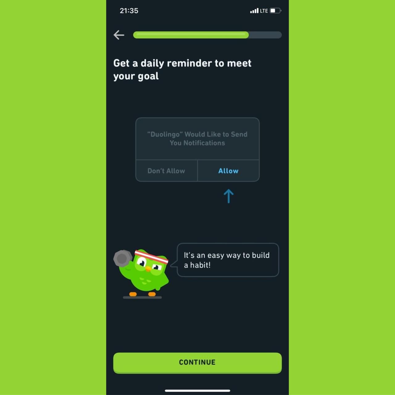
Experiment 1: Delayed Trigger vs. Immediate Trigger
The hypothesis: A bottom sheet that fires after a user has completed one meaningful action converts better than one that fires the moment an event triggers.
What most teams do: They set the trigger to fire immediately on the qualifying event. User lands on a product page, bottom sheet fires. User completes onboarding step 1, bottom sheet fires. The logic is that immediacy equals relevance.
The logic is wrong for most cases.
Popup and overlay timing research points to a consistent finding: showing any prompt within the first 10 to 15 seconds of a session increases bounce rate by up to 35%. Mobile users spend the first 15 to 30 seconds of any screen interaction reorienting, finding where they are and what they came to do. A bottom sheet in this window fires at a moment when the user's goal is already established and the nudge is an interruption, not an assist.
Event-based triggers fired on real behavioral signals consistently outperform time-based or immediate triggers. The difference is intent alignment: an immediate trigger fires at a moment convenient for the system, while a delayed or behavioral trigger fires at a moment meaningful to the user.
UI variation:
- Control: Bottom sheet fires immediately on trigger event (e.g., user opens the invest tab).
- Variant A: Bottom sheet fires after a 15 to 30 second delay on the same event, allowing the user to orient.
- Variant B: Bottom sheet fires after the user completes one action on the screen (e.g., scrolls to a specific section, views a product detail), not on a time delay.
Variant B is generally the stronger test because it gates on behavior rather than time. A user who has scrolled to the fund details section of an investment app is in a different intent state than a user who just opened the tab.
Trigger conditions for Variant B: Use an event-based trigger that fires after a secondary action within the session, not the first. For e-commerce, this might be "user views the same product for the second time in the session." For fintech, "user views portfolio returns and scrolls past the 60% mark."
Expected impact: Mobile users optimize timing for different trigger types, with mobile conversions improving by up to 38% when trigger timing aligns with user intent. Moving from immediate to behavioral triggers typically produces a 2x to 4x improvement in click-through, because the user's current goal becomes adjacent to the bottom sheet's ask.
Metrics to track:
- Dismissal velocity (average time to dismiss). Dismissals under 2 seconds signal the bottom sheet is not being evaluated.
- Click-through rate on the primary CTA.
- Completion rate of the target conversion event within the same session.
- Dismissal rate as a percentage of total impressions.
Experiment 2: Single CTA vs. Two Options
The hypothesis: Offering two options on a bottom sheet, one primary and one secondary, increases overall engagement without meaningfully reducing primary CTA conversion.
The tension: Choice architecture research generally supports the idea that more options reduce conversion at any individual option. A page should have one primary CTA with a clear visual hierarchy, supported by secondary CTAs that don't compete for attention. Overloading a surface with equal-weight CTAs increases cognitive load and decision paralysis.
But bottom sheets are not landing pages. Users arrive at a bottom sheet with an already established task context. A secondary option, designed as a visual subordinate to the primary, can serve a different function: it gives users who are not ready for the primary action a next-best path rather than a forced choice between "do this" and "dismiss entirely."
In practice, this matters most when the primary CTA is high-commitment. "Upgrade Now" or "Make Your First Investment" carries more friction than "Learn More" or "Remind Me Later." A two-option bottom sheet can capture users who are considering but not yet ready, where a single CTA forces those users to dismiss.
UI variation:
- Control: Single primary CTA. e.g., "Activate Auto-Invest."
- Variant: Primary CTA retained as the dominant element. Secondary CTA added below or beside it with lower visual weight. e.g., "Activate Auto-Invest" (primary, full-width button) and "See How It Works" (secondary, text link or outlined button).
The key design constraint: the secondary CTA must be visually subordinate. Same size buttons at equal weight produce competition and harm the primary CTA. The secondary option should feel like a step down in commitment, not an alternative path of equal standing.
Trigger conditions: This experiment produces the clearest signal when the bottom sheet is running on users who have visited the relevant screen at least twice without converting. These are consideration-stage users. First-time visitors may not need the second option at all, and including it may introduce unnecessary complexity at a moment when they're still forming an opinion.
Expected impact: High-converting landing pages using CTAs at multiple points, with a single primary and secondary supporting options, see significantly higher overall conversions than single-CTA layouts. The distinction is hierarchy: the secondary option supports the primary rather than competing with it. In bottom sheet testing, two-option variants tend to outperform single-option variants on total engagement rate (primary + secondary CTA combined), while primary-CTA conversion rate may decrease slightly. Whether the trade-off is worth it depends on which downstream metric matters more for the specific campaign.
Metrics to track:
- Primary CTA conversion rate (compared individually).
- Total engagement rate (primary + secondary CTA combined).
- Secondary CTA click-through rate. If this is high relative to primary, the audience may need more education before committing to the primary action.
- Downstream completion rate for users who took the secondary path.
Experiment 3: Short Copy vs. Expanded Benefit Explanation
The hypothesis: Adding 2 to 3 lines of benefit-focused copy above the CTA increases conversion for high-commitment actions, where users need a reason to act, while reducing conversion for low-friction actions where brevity is more effective.
What most teams skip: The assumption that shorter always converts better on mobile. This is true for low-friction, familiar actions. A user who already knows what "Enable Auto-Invest" means doesn't need an explanation. But a user encountering a feature for the first time, or being asked to upgrade to a paid tier, often lacks the context to evaluate whether the action is worth taking. They dismiss not because they're uninterested but because they don't have enough information to decide.
Short copy performs well in low-stakes situations or when users already know and trust the brand. Long copy is more effective for higher-priced items, technical products, or when trust needs to be established before the main offer is introduced. On mobile, "long copy" in a bottom sheet is not a full product page. It's 2 to 4 lines that preemptively answer the question the user is asking before they dismiss.
UI variation:
- Control: Headline + CTA button. No supporting copy. e.g., "Unlock Bill Split" with a "Get Started" button.
- Variant A: Headline + 2-line benefit statement + CTA. e.g., "Unlock Bill Split. Split any payment with up to 10 people in two taps. No separate app, no chasing for repayment. Get Started."
- Variant B: Headline + objection-handling statement + CTA. e.g., "Unlock Bill Split. Pre-approved for your account. Takes 30 seconds to set up. Get Started."
Variant B tests whether addressing friction directly (time cost, eligibility concern) converts better than explaining the benefit. This varies by app category and user cohort. Fintech users often respond better to friction removal than to benefit promises, because trust is the primary barrier.
Trigger conditions: Segment this test by user familiarity. Run the short-copy control on users who have visited the feature page before. Run the expanded benefit variant on users who have never interacted with the feature at all. The copy length that converts an informed user may not be the copy length that converts a first-time visitor.
Expected impact: The test outcome is not predetermined. Research on in-app messages shows that content aligned with the user's intent state drives higher conversion than content that optimizes for brevity alone. For high-commitment actions with low familiarity, expanded benefit copy outperforms short copy in most verticals. For low-commitment actions or users with prior feature exposure, short copy wins. The experiment is designed to find which regime your specific feature and audience falls into.
Metrics to track:
- CTA click-through rate segmented by first-time vs. returning visitors to the relevant feature.
- Time spent on the bottom sheet (a proxy for reading). If time is consistently under 2 seconds, neither variant is being read, and the timing experiment from Experiment 1 should be re-examined.
- Downstream conversion to full feature activation or purchase.
- Dismissal rate with scroll event (user scrolled the bottom sheet content). Indicates the expanded copy is being engaged with.
Experiment 4: Static Entry vs. Animated Entry
The hypothesis: A bottom sheet with a purposeful entry animation (slide-up with a subtle spring, or a staggered content reveal) increases dwell time and CTA engagement compared to an instant static appearance.
Why animation matters beyond aesthetics: Research on UI animation shows that smooth transitions guide users, allowing them to focus on key information rather than struggling to orient with static displays. Movement captures attention at the moment of appearance. A static bottom sheet that appears instantaneously gives the user no signal to orient toward it. An animated entry creates a natural attention cue.
The case for animation in bottom sheets specifically is well-documented. Websites with animated CTAs see click-through rates jump by 15 to 40%, and animations capturing attention can increase task completion rates by up to 50%. The same mechanism applies to in-app surfaces. Users are 60% more likely to return to an application that uses engaging animations. The attention signal created by motion carries into engagement with the content that follows.
The risk is overengineering. A bottom sheet animation that takes more than 300 to 400ms to complete starts to feel like a loading delay. Overly aggressive animations can feel like delays or unnecessarily drain battery life on mobile. The goal is a natural, purposeful entry that signals "something useful just appeared" rather than "something is loading."
UI variation:
- Control: Bottom sheet appears statically at full position instantly on trigger.
- Variant A: Slide-up animation over 200 to 250ms with a spring ease (slight overshoot and settle). This is the standard Material Design bottom sheet behavior and feels native to Android users.
- Variant B: Staggered content reveal. The sheet container slides up first (150ms), then the headline fades in (50ms delay), then the body copy (50ms delay), then the CTA button (50ms delay). Total animation sequence: under 350ms. Creates a reading sequence that guides the user's eye.
Variant B is the more aggressive test. It explicitly engineers the reading order of the content by using animation timing to direct attention. The hypothesis is that users who are guided through headline, benefit, and CTA sequentially are more likely to complete the reading and less likely to dismiss reflexively.
Trigger conditions: This experiment is format-only. Keep copy, CTA, and trigger timing identical across control and variants. You want to isolate the impact of animation from any content or timing effect.
Expected impact: Users who engage with animated UI elements interact with the triggered experience 25 to 30% more than with static equivalents. The improvement is not uniform across all content types. Animated entry has the strongest positive impact on promotional content and feature discovery, where the animation serves as a signal that something valuable appeared. It has lower marginal impact on operational bottom sheets (error confirmations, required permission requests), where the user's intent is task completion rather than content evaluation.
Metrics to track:
- Dwell time on the bottom sheet (time from appearance to first interaction or dismissal).
- CTA click-through rate.
- Scroll events within the bottom sheet (for expandable sheets). Animation that successfully captures attention typically produces more scrolling behavior.
- Dismissal velocity. A well-animated entry should increase average dismissal time compared to the static control.
Experiment 5: Generic Message vs. Personalized Message
The hypothesis: A bottom sheet whose headline and body copy reference the user's specific activity or status converts at a meaningfully higher rate than one with generic benefit language directed at all users.
The scale of the gap: An e-commerce business using targeted personalization gets 6x to 7x more purchases than businesses delivering generic messaging. Personalized push notifications drive 344% higher engagement than generic ones. These numbers are from push notification studies, but the mechanism applies directly to in-app surfaces: a message that references what a user has actually done feels like a relevant response rather than a broadcast.
For bottom sheets specifically, personalization doesn't require deep machine learning. It requires using available user-level data to change 5 to 10 words in the copy.
UI variation:
- Control (Generic): "You're one step away from your first investment. Start with as little as ₹500."
- Variant (Personalized): "You've checked the Nifty 50 fund three times this week, [Name]. Start with as little as ₹500 today."
The variant uses session history (3 views of a specific fund) to make the message feel like an observation rather than a campaign. The CTA and offer are identical. Only the headline framing changes.
More complex personalization variants include:
- Cohort-based copy: Users who completed onboarding yesterday receive "You're all set. Here's what 70% of users do on day 2." Users who have been active for 30 days without upgrading receive "30 days in and still on the free plan. Here's what you're missing."
- Behavior-based objection handling: A user who previously dismissed this bottom sheet receives a different opening: "Still thinking about it? Here's what changed." A first-time viewer receives the standard benefit-led copy.
Personalization consistently improves conversions by delivering relevant nudges at high-intent moments, with apps that personalize experiences seeing higher activation rates, better retention, and increased purchases. Apps with personalized onboarding flows see 40% retention lifts over generic flows.
Trigger conditions: This experiment requires user-level data to be accessible at render time. If your bottom sheet platform can reference session events or user attributes, the variant is achievable without engineering a custom solution. If it can't, personalization at this level requires either a tooling change or a static cohort segment approach (all users in "considered but not converted" segment see one variant, all users in "first encounter" segment see another).
Expected impact: The conversion improvement from personalization is the largest of the five experiments when implemented correctly. Real-time personalization that surfaces a message at the exact moment a user is most likely to act produces substantially higher engagement than static broadcast messaging. A conservative expectation for well-executed personalization in a bottom sheet context is a 2x to 3x improvement in downstream conversion. The upper bound in some verticals, particularly fintech and e-commerce, is significantly higher.
Metrics to track:
- CTA click-through rate segmented by personalization variant.
- Downstream conversion to target action (purchase, feature activation, upgrade).
- Repeat dismissal rate. If personalization is working, users who dismissed the first time should show lower repeat-dismissal rates on the follow-up variant.
- Engagement rate by user segment (new vs. returning, active vs. at-risk). The conversion delta between personalized and generic is usually larger for at-risk users.
Two Pitfalls That Invalidate Most Bottom Sheet Tests
Pitfall 1: Running multiple experiments simultaneously on the same surface
This is the most common and most damaging mistake. Teams launch timing changes alongside copy changes alongside animation changes in the same sprint, then try to interpret the aggregate results.
The result is not an A/B test. It's a multivariate test without a multivariate analysis structure. You can't attribute a conversion change to copy when the timing and animation also changed in the same variant. Statistically valid experimentation requires isolating one variable at a time, defining the key performance indicators, and ensuring statistical significance before moving to the next variable.
Run each experiment sequentially. Start with Experiment 1 (timing), because timing affects the quality of all subsequent experiment results. A bottom sheet firing at the wrong moment will produce misleading data about copy and animation performance, because the audience it's reaching has a systematically different intent state than the audience reached by correctly timed delivery.
Pitfall 2: Measuring the wrong event
Bottom sheet experiments fail at the analysis stage when teams track impression-level metrics (CTR on the bottom sheet CTA) without connecting them to downstream conversion events (the actual feature activation, purchase, or upgrade).
A bottom sheet CTA click is not a conversion. It's an expression of intent. A user who clicks "Activate Auto-Invest" and then exits the activation flow without completing it did not convert. Measuring CTR as the primary success metric overestimates the bottom sheet's actual contribution to revenue or activation.
The correct measurement structure is: impression rate (how many eligible users saw the sheet), click rate (how many engaged with the CTA), and downstream completion rate (how many completed the actual target action within a defined window, typically 24 to 48 hours). Attribution matters here too. A user who clicks and completes the action in the same session is a direct conversion. A user who clicks, dismisses, and completes the action 18 hours later may have been influenced by the bottom sheet or by something else entirely.
Define the attribution window before the experiment runs. Don't change it based on which version of the window makes the results look better.
Key Takeaways
Bottom sheets are a testable, iterative surface. The five experiments here address the five most impactful variables in sequence.
Trigger timing (Experiment 1) affects the quality of all other experiment results. Run it first. A behavioral gate that fires after a meaningful action outperforms time-based and immediate triggers in most cases.
CTA count (Experiment 2) is context-dependent. A two-option structure increases total engagement for consideration-stage users. For first-time visitors with a simple, low-friction ask, a single CTA keeps the decision clean.
Copy length (Experiment 3) is not a universal optimization. Short copy wins for familiar, low-commitment actions. Expanded benefit explanation wins for first-time encounters with high-commitment features. Segment by user familiarity before calling a winner.
Animated entry (Experiment 4) captures attention at the moment of appearance and increases dwell time. Keep total animation duration under 350ms. The staggered content reveal variant is worth testing for any bottom sheet where reading order affects the persuasion sequence.
Personalization (Experiment 5) produces the largest conversion delta of the five experiments. It requires user-level data accessible at render time. Even simple personalization, referencing a specific action the user took rather than speaking generically, produces measurable lift over broadcast copy.
Running multiple experiments simultaneously invalidates the results of all of them. Measuring CTR instead of downstream conversion produces misleading data about what's actually working.
Further Reading
From Digia Engage
- Bottom Sheets vs Modals: Pick the Right Mobile UX Format
- Why Most In-App Nudges Fail (And How to Fix Their Timing)
- Designing Non-Annoying Nudges: Frequency, Placement, and Context
- In-App Nudges: Tooltips, Bottom Sheets, Persistent Banners
Sources
- Bottom sheets achieve 25 to 30% higher engagement rates than traditional modals - Plotline, Best Examples of Mobile App Bottom Sheets (November 2025)
- Teams running bottom sheet vs. modal experiments see 15 to 40% jump in engagement - Digia Engage, Bottom Sheets vs Modals (May 2026)
- Mobile conversions improve by up to 38% when trigger timing is optimized for mobile users - Alia, Popup Timing
- Short copy performs well in low-stakes situations; long copy is more effective for high-friction asks - CrazyEgg, Long Copy vs Short Copy (May 2025)
- Eliminating friction proactively removes conversion blockers ("Pre-approved, no documents required") - Plotline, Mobile App Bottom Sheets
- Websites with animated CTAs see click-through rates jump by 15 to 40% - Educational Voice, Animation Conversion Rates (February 2026)
- Animations capturing attention can increase task completion rates by up to 50% - MoldStud, Psychology of Motion in UI Animation (February 2025)
- E-commerce businesses using targeted personalization get 6x to 7x more purchases than those delivering generic messaging - CleverTap, 25 Strategies to Increase App Conversion Rate (January 2026)
- Personalized push notifications drive 344% higher engagement than generic ones - Kirro, App Conversion Rate Optimization (March 2026)
Want to run bottom sheet experiments without waiting on a dev sprint? See how Digia Engage handles event-based triggers and no-code bottom sheet testing, or book a demo.