
Table of Content
- Why most fintech “engagement examples” are misleading
- What makes a fintech engagement pattern actually good
- Fintech engagement patterns at a glance
- The 15 fintech engagement patterns
- The “single source of truth” transaction receipt
- Pending-state timelines with an explicit “next update” promise
- Failure recovery that tells users what not to do
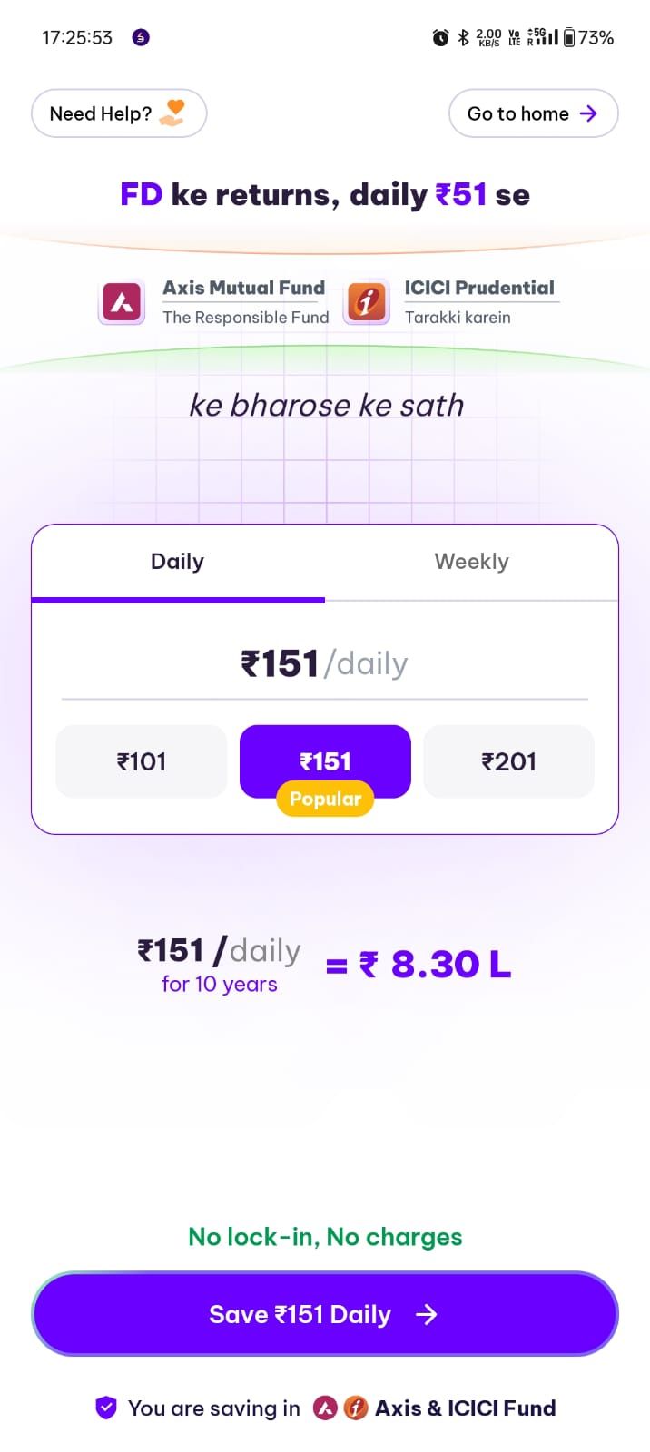
- “One-tap repeat” for trusted, repeatable actions
- Smart “resume where you left off” onboarding
- Progressive disclosure at trust-critical decision moments
- A preference center that actually governs messaging
- “Explain the why” for verification and data requests
- Confirmation messages that reduce panic, not increase it
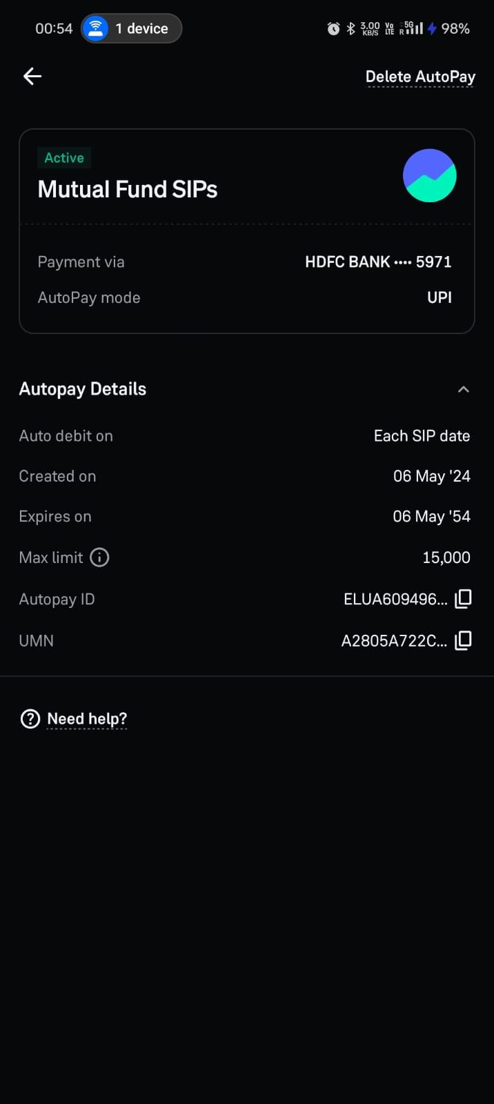
- Autopay and recurring plans as engagement engines
- “Next best action” based on state, not marketing
- Calm, transparent dispute and resolution tracking
- Seasonal and lifecycle education that leads directly to action
- Risk-aware friction that feels fair
- Release-safe experience adjustments for state-critical screens
- How to apply these patterns without turning your app into spam
- Practical implementation approach (two core actions + top failure states)
- Summary: what actually works in fintech app engagement
- FAQs
Most fintech “engagement examples” articles are useless because they confuse activity with value. They celebrate clever nudges, shiny gamification, or aggressive notification tactics without asking the only question that matters: did the user complete a high-stakes financial job with more confidence and less friction?
This article is part of a broader pillar on mobile app engagement, where we examine how engagement is often misunderstood as activity rather than meaningful, outcome-driven behavior especially in fintech environments shaped by trust and risk. While the pillar establishes the foundations of engagement, this piece focuses on practical engagement patterns that translate those ideas into real product decisions.
In this article, we break down what makes a fintech engagement pattern actually effective, and explore 15 high-impact patterns that improve core action completion, reduce uncertainty, and preserve trust. We will look at patterns such as receipts, pending timelines, failure recovery, repeat actions, onboarding continuity, messaging control, and dispute tracking along with when to use them, why they work, what to measure, and how to apply them without creating noise, pressure, or unintended risk.
How to judge whether a fintech engagement pattern is actually good
Good fintech engagement moves users through a state, not toward a notification
In fintech, users rarely need “more reasons to open the app.” They need clarity about what state they’re in and what action to take next. The best engagement performance patterns are state-aware and outcome-driven. They show the user what’s happening, what’s next, and how to complete the job safely.
Good fintech engagement reduces support, retries, and anxiety
If a pattern increases opens but also increases retries, complaints, or opt-outs, it’s not working. It’s generating noise. You should judge patterns by whether they improve completion, reduce friction, and preserve trust signals.
Fintech engagement patterns at a glance
| Pattern | Trigger Example | Core Impact | Trust Signal | Risk Level |
|---|---|---|---|---|
| Single Source Receipt | Payment complete | Reduces repeated status-checking | Fewer disputes and “missing payment” complaints | Low |
| Pending Timelines | Transfer pending | Reduces anxiety-driven app opens | Fewer support contacts about pending transactions | Low |
| Failure Recovery | Payment failed | Reduces retry loops and repeated attempts | Higher successful recovery without escalation | Low |
| One-Tap Repeat | Bill pay repeat | Increases repeat usage of the core action | Error rates remain stable (no increase in mis-sends) | Medium |
| Resume Onboarding | Setup abandoned | Improves onboarding completion rate | Fewer duplicate submissions and fewer “stuck” users | Low |
| Progressive Disclosure | Fee commitment | Reduces drop-offs at decision points | Fewer complaints about fees, limits, or surprises | Low |
| Preference Center | Messaging received | Keeps opt-outs and fatigue under control | Better long-term trust and lower uninstall risk | Low |
| Explain Why Verification | ID requested | Improves verification completion rate | Lower abandonment due to “why do you need this?” concerns | Low |
| Panic-Reduction Confirm | Transfer done | Reduces repeat checking after completion | Fewer post-transaction support contacts | Low |
| Autopay Engine | Repayment repeat | Builds predictable repeat behavior | Fewer missed payments and late-payment escalations | Medium |
| Next Best Action | First transfer | Increases second and third core-action completions | Less friction in the next step of the journey | Low |
| Dispute Tracking | Issue reported | Improves resolution follow-through | Lower churn after disputes and fewer repeat contacts | Medium |
| Lifecycle Education | Paycheck deposit | Improves education-to-action conversion | Opt-outs stay stable because content is relevant | Low |
| Risk Friction | New beneficiary | Improves completion of high-risk actions safely | Fewer false positives and fewer unfair blocks | High |
| Release Adjustments | Provider incident | Reduces incident-driven retries and confusion | Faster recovery and fewer escalations during incidents | Medium |
Now lets discuss the patterns individually
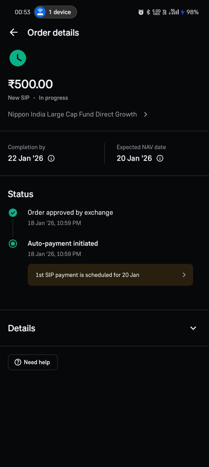
The “single source of truth” transaction receipt
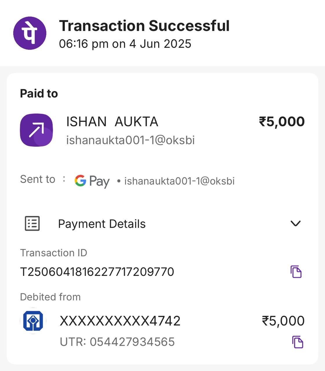
When it triggers
Any time a payment, transfer, deposit, withdrawal, or repayment completes.
What it does
The product generates a clear, stable receipt screen and history entry that includes a timestamp, reference ID, method, parties, status, and expected settlement behavior if relevant. It is easy to share for proof, and easy to find later.
Why it works
Users reopen fintech apps to confirm reality. A trustworthy receipt reduces repeat checking, reduces disputes, and makes the app feel dependable. This pattern is engagement because it increases future successful usage by reducing uncertainty.
What to measure
Receipt view rate after completion, repeat status checks within 10 minutes, support contacts about “did it go through,” and dispute initiation rates.
\What to avoid
Receipts that change wording over time, missing reference IDs, or hiding key details behind extra taps.
Pending-state timelines with an explicit “next update” promise
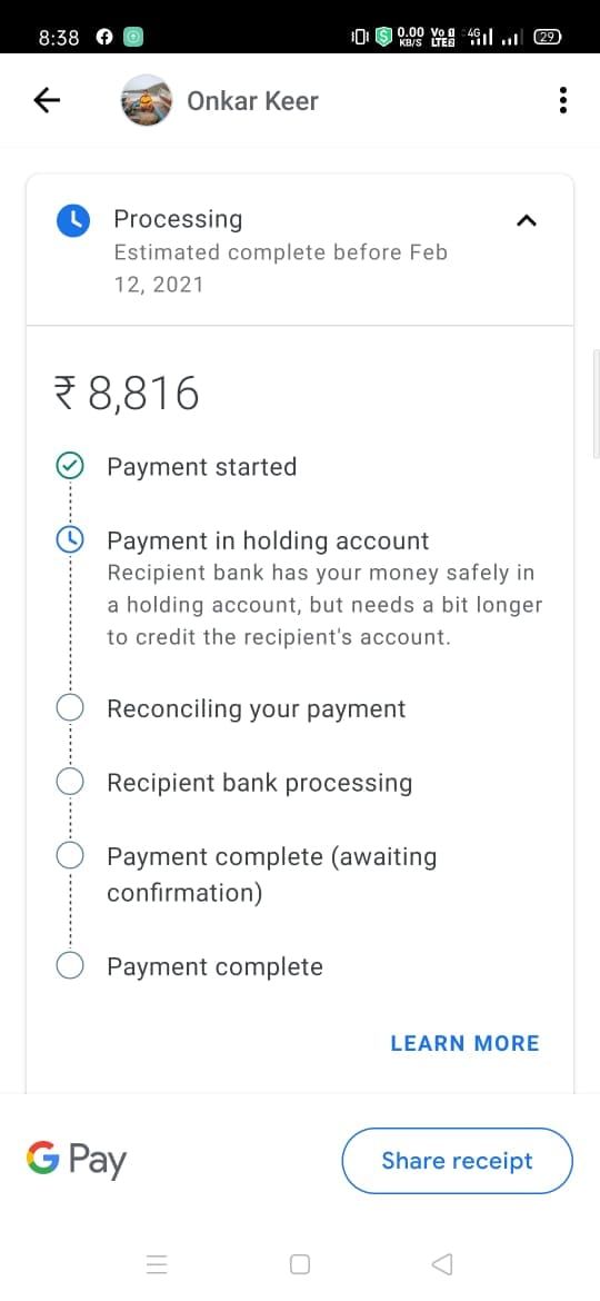
When it triggers
Any time an action enters a pending state (verification pending, transfer pending, claim under review).
What it does
Instead of a vague “pending,” the product shows what pending means, what the system is waiting on, and when the user can expect the next meaningful update. If user action is required, it is explicit.
Why it works
“Pending” is where trust goes to die. This pattern reduces anxiety-driven opens and prevents users from retrying actions that make things worse.
What to measure
Pending duration distribution, repeat opens during pending, retry attempts during pending, and support contacts.
What to avoid
Fake promises (“will complete soon”) and timelines you can’t meet. If you can’t predict, be honest and explain the dependency.
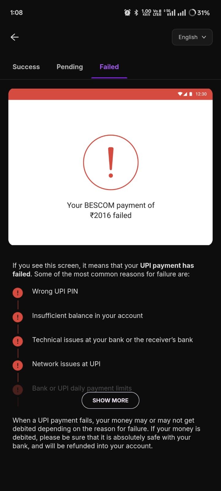
Failure recovery that tells users what not to do
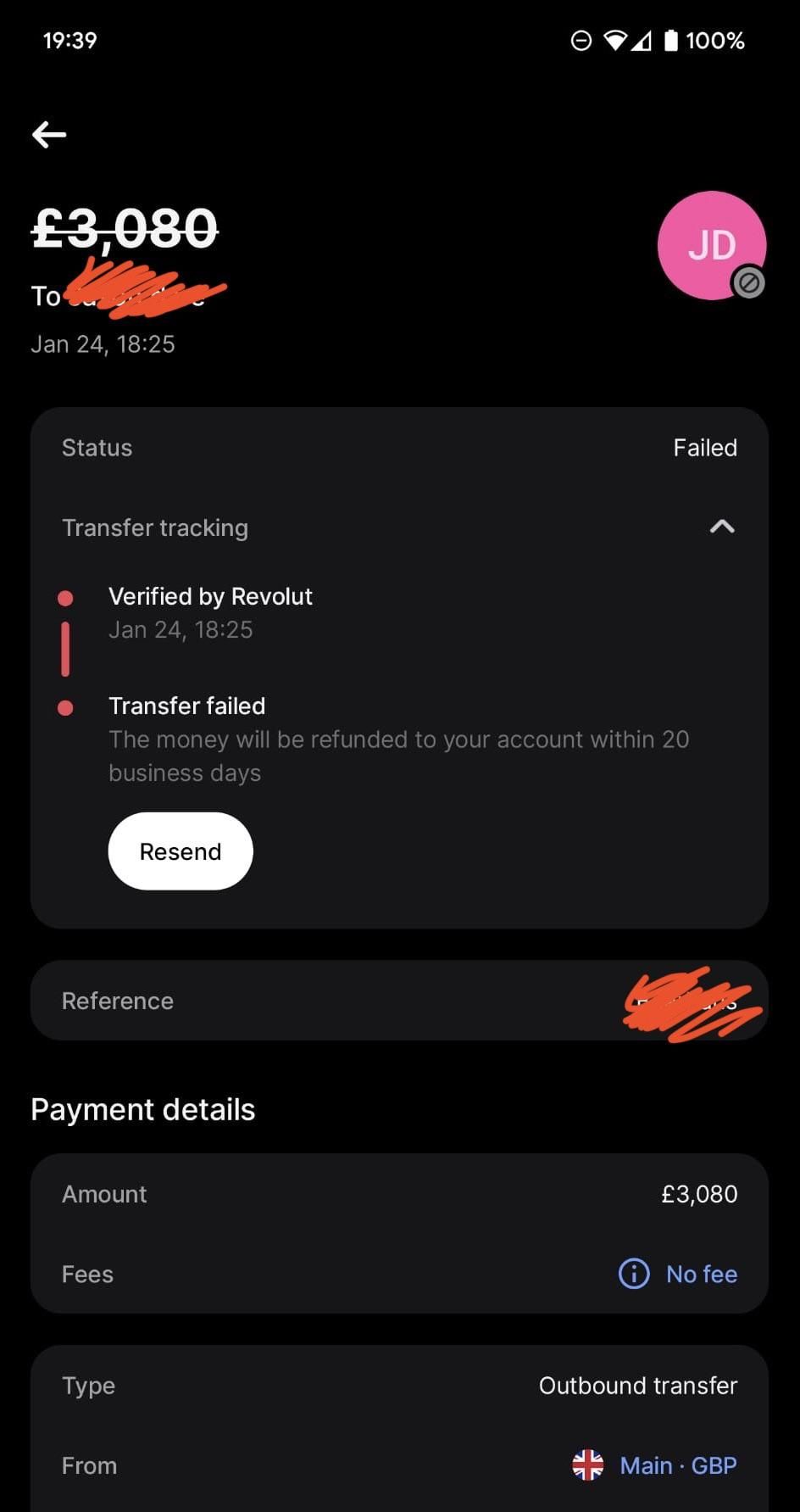
When it triggers
Any failed payment/transfer/authorization or any failed verification step.
What it does
The product explains the failure in plain language, gives a next best action, and explicitly warns against harmful retries when appropriate. It also offers a fast path to resolution (alternative method, later retry, or support escalation with context).
Why it works
Users default to panic behavior in money flows. They retry, they spam buttons, they change details randomly. Clear “don’t do this” guidance prevents compounding errors and reduces downstream disputes.
What to measure
Retry loop frequency, successful recovery rate, time-to-recovery, and support contacts per failure.
to avoid
Generic error codes, blame-shifting language, or “try again later” without context.
“One-tap repeat” for trusted, repeatable actions
When it triggers
When a user repeats the same action regularly: paying a bill, transferring to a known recipient, topping up, making a repayment.
What it does
The product surfaces a safe, one-tap repeat action with pre-filled details, plus a review step appropriate to risk (amount, recipient, method). It makes the happy path fast while keeping a confirmation that prevents accidental transfers.
Why it works
The biggest driver of engagement is making the core action easy to repeat. Convenience creates habit, especially for predictable, recurring jobs.
What to measure
Repeat rate of core action, time-to-complete, and error rates on repeat flows versus manual flows.
What to avoid
One-tap actions without safeguards for amount/recipient confirmation. Speed without control is a trust leak.
Smart “resume where you left off” onboarding
When it triggers
When onboarding includes multi-step verification, linking, funding, or setup that users abandon mid-way.
What it does
The product saves progress, returns the user to the exact step with context, and removes redundant steps. It also explains what was completed and what remains.
Why it works
Most fintech drop-off happens during setup. Users don’t abandon because they hate your app; they abandon because the process is exhausting or confusing. Resuming reduces the psychological cost of returning.
What to measure
Onboarding completion rate, time-to-first-value, reactivation rate of incomplete onboarding users, and duplicate document submissions.
What to avoid
Restarting users from step one, or losing progress because the app treats state as “session-only.”
Progressive disclosure of trust-critical information at decision moments
When it triggers
When users are about to commit to fees, limits, timing, interest, penalties, or risk.
What it does
Instead of hiding important information in long documents, the product surfaces the relevant facts at the moment of choice, in plain language, with links to detail for those who want it.
Why it works
Users don’t read policy pages. They do, however, remember surprises. Surfacing the right information at the right moment prevents churn, disputes, and complaints later.
What to measure
Drop-offs at decision points, dispute/complaint reasons tied to “fees/limits,” and post-transaction satisfaction.
What to avoid
Burying terms until after commitment. That might convert today and destroy trust tomorrow.
A preference center that actually governs messaging
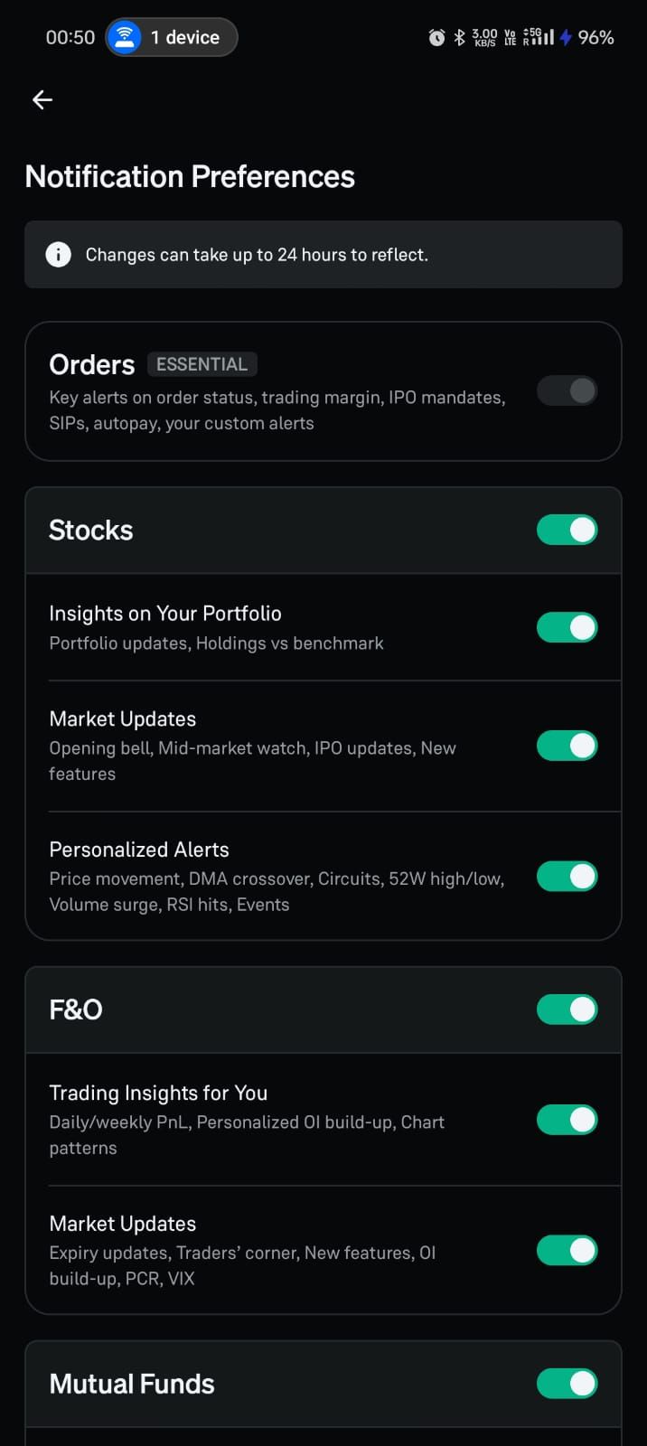
When it triggers
When users receive any non-essential messages, and ideally during onboarding.
What it does
The product lets users control what they receive (transactional, security, educational, promotional), how often, and through which channels. It enforces those preferences reliably.
Why it works
In fintech, messaging is sensitive. Giving users control increases long-term engagement because it prevents fatigue and protects trust.
What to measure
Opt-in and opt-out rates, message-driven completions, uninstalls after campaigns, and spam reports.
What to avoid
A preference center that exists but isn’t honored. That is worse than not having one because it signals dishonesty.
“Explain the why” for verification and data requests
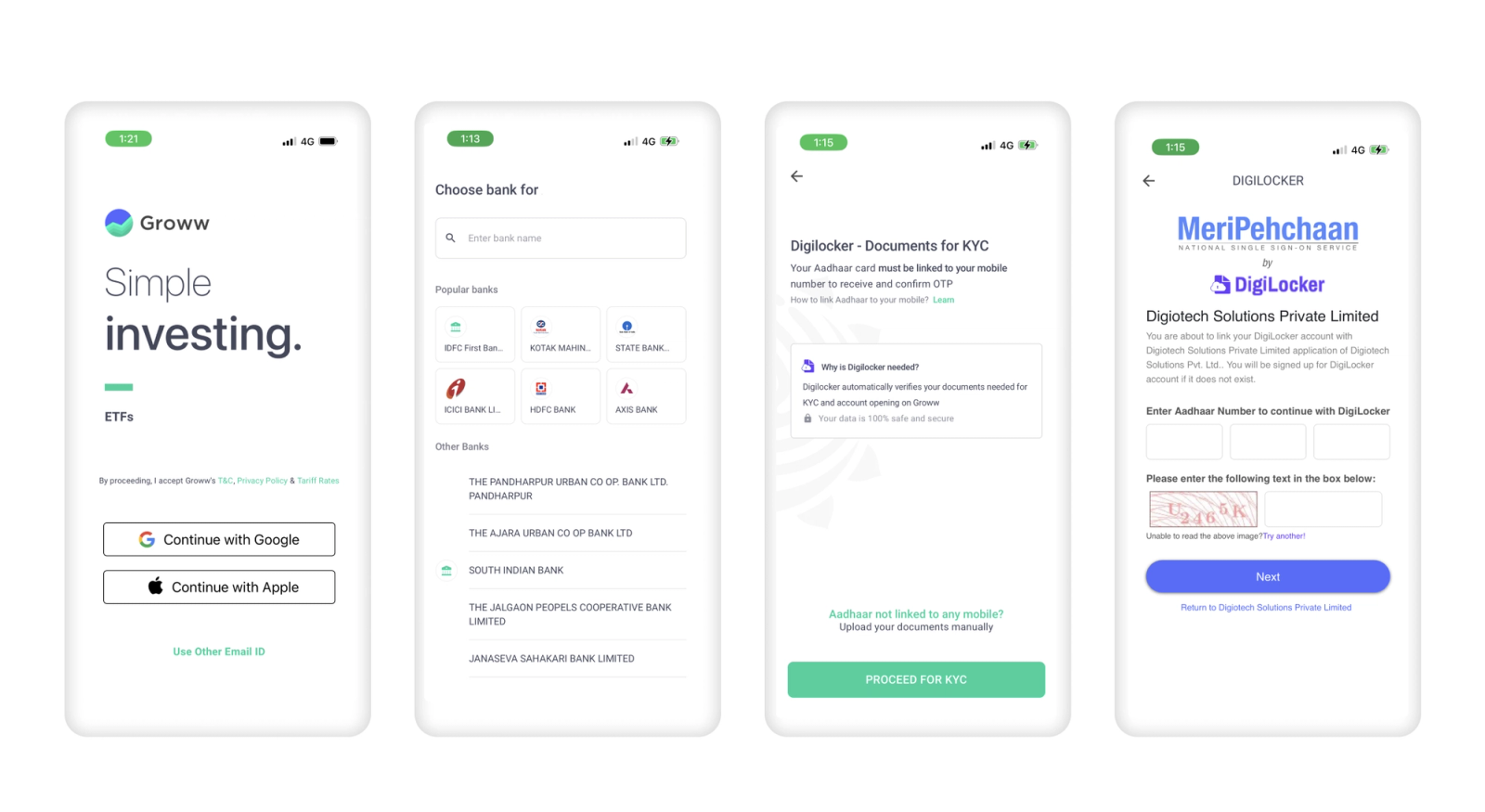
When it triggers
Any time you ask for identity documents, biometric checks, bank linking, or permissions.
What it does
The product explains why the data is needed, what it enables, how it is protected, and what happens if the user doesn’t complete it. It also shows progress and expected review time if applicable.
Why it works
People abandon fintech onboarding when it feels invasive or endless. Explaining “why” turns friction into trust-building.
What to measure
Drop-off at verification prompts, completion rate by step, time-in-step, and support questions about “why do you need this?”
What to avoid
Vague language (“for your safety”) without specifics, or requesting permissions that are not clearly connected to value.
Confirmation messages that reduce panic, not increase it
When it triggers
After high-stakes actions: transfers, repayments, claims, card freezes, password changes.
What it does
The product confirms what happened, what changes, and what the user should do next (usually nothing). If the system is processing, it clearly states that processing is underway and where to track it.
Why it works
Fintech users fear silent failures. Clear confirmations reduce obsessive checking and prevent unnecessary support outreach.
What to measure
Repeat opens immediately after the action, “status check” frequency, and support contacts post-action.
What to avoid
Ambiguous confirmations like “submitted” without telling the user whether money moved yet.
Autopay and recurring plans as engagement engines
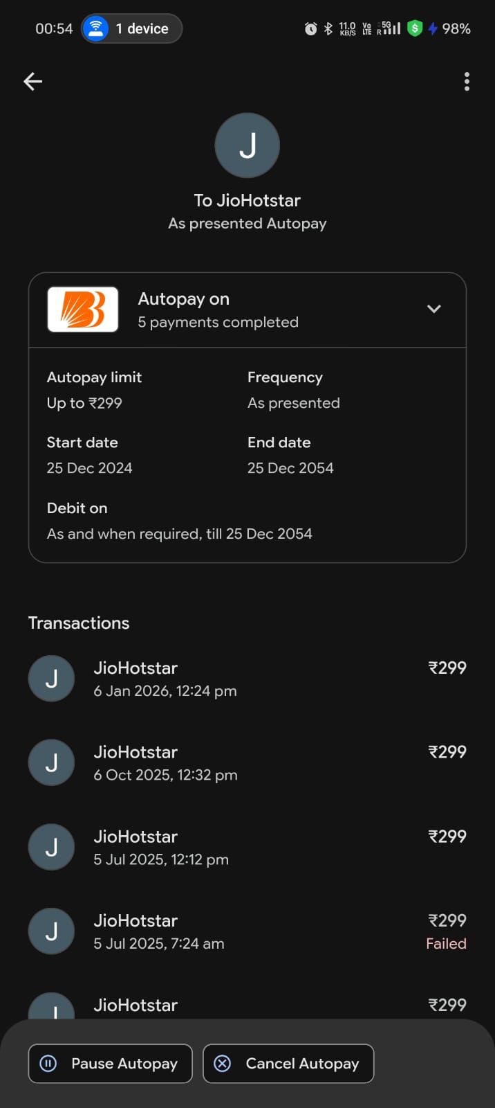
When it triggers
When a user repeats payments, repayments, or investments.
What it does
The product offers a recurring option at the moment repeat intent is clear, explains how it works, and provides controls (pause, change, cancel) with reminders that aren’t manipulative.
Why it works
Recurring behavior is the cleanest form of engagement because it creates predictable value without constant prompting. It also reduces missed payments and last-minute panic.
What to measure
Autopay adoption, autopay success rates, cancellation reasons, and impact on retention and support volume.
What to avoid
Making cancellation hard or hiding controls. That turns a helpful feature into a trust violation.
“Next best action” based on state, not based on marketing
When it triggers
When a user completes an action or reaches a new state (e.g., first transfer completed, first repayment done, first claim submitted).
What it does
The product suggests a state-appropriate next step that genuinely helps the user, such as saving a beneficiary, setting a reminder, enabling autopay, or learning how disputes work. It is not a random cross-sell.
Why it works
Users are most receptive immediately after successful completion. A helpful next step improves repeat usage and reduces future friction.
What to measure
Next-action adoption, repeat core action rates, and downstream drop-offs.
What to avoid
Cross-selling before trust is earned, or suggesting irrelevant actions that signal you don’t understand user intent.
Calm, transparent dispute and resolution
When it triggers
When a user reports a problem: failed transfer, missing refund, merchant dispute, claim escalation.
What it does
The product provides a clear case timeline, required steps, expected updates, and a way to submit information without repeating the story. It makes escalation predictable.
Why it works
Resolution is part of engagement. Users don’t churn just because something went wrong; they churn because they feel abandoned and powerless. Transparent resolution increases trust and future usage.
What to measure
Time-to-resolution, repeat contacts per case, satisfaction after resolution, and churn after disputes.
What to avoid
Sending users into support channels without context, forcing them to re-explain repeatedly, or hiding status.
Seasonal and lifecycle education that leads directly to action
When it triggers
When there’s a predictable lifecycle event (first paycheck, first credit statement, first investment deposit, renewal window).
What it does
The product delivers short, relevant education tied to the user’s state and provides an immediate action path (set autopay, set a goal, fund an account, renew coverage).
Why it works
Education only drives engagement when it is timely and directly connected to a user action. Otherwise it’s content marketing inside an app.
What to measure
Education-to-action conversion, repeat rates, and opt-outs.
What to avoid
Long content dumps or generic advice that doesn’t connect to a next step.
Risk-aware friction that feels fair

When it triggers
When a user attempts a high-risk action (new device, new beneficiary, unusual amount, suspicious behavior patterns).
What it does
The product applies step-up verification and explains why in non-accusatory language. It keeps the user informed and provides a clear route to completion.
Why it works
Users tolerate friction when it feels justified and transparent. They churn when friction feels random or punitive. Fair risk friction preserves trust while preventing losses.
What to measure
Step-up pass rates, abandonment at step-up, false positives, and subsequent retention.
What to avoid
Silent blocks or vague “something went wrong” messaging for risk events.
Release-safe experience adjustments for state-critical screens
When it triggers
When you need to change critical guidance quickly: payment failures, verification requirements, policy changes, provider incidents.
What it does
The product can update copy, ordering, help surfaces, and recovery paths quickly without waiting for long app store release cycles, while keeping core logic secure and auditable.
Why it works
Fintech engagement breaks when user state and UI guidance drift apart. Fast, controlled updates prevent long periods of confusion and support spikes during incidents.
What to measure
Time-to-mitigate for incident-driven UX changes, reduction in retries and contacts during incidents, and completion recovery.
What to avoid
Uncontrolled changes without governance. Speed without auditability can create compliance and trust problems.
How to apply these patterns without turning your app into spam
The fastest way to ruin good patterns is to treat them as messaging tactics rather than product design. Most of the patterns above work even with minimal notifications because they reduce uncertainty inside the app itself. When you do use messaging, tie it to state and user intent, and judge it by outcomes and trust signals, not by opens.
A practical way to implement this is to pick two core actions, identify the top three failure states for each, and then apply patterns that make those states obvious and recoverable. If you make “pending,” “failed,” “needs verification,” and “under review” feel clear and controllable, you will see engagement improve without adding noise.
Summary: what actually works in fintech mobile app engagement
The engagement patterns that win in fintech are not the loudest. They are the ones that make the product feel reliable. They reduce retries, reduce support, reduce anxiety, and increase successful completion of core actions. If you use the 15 patterns above as a checklist and you measure them against outcomes and trust signals, you will build engagement that lasts instead of engagement that spikes and disappears.