TL;DR: Swiggy didn't accidentally grow its repeat order rate from 4.14 to 4.50 monthly orders per user in three years. It was by design. A massive part of the engine here's UX, and this breakdown looks at one specific piece of it: the app's brilliant use of bottom sheets to shrink the gulf between a happy customer and their next purchase. We're going to map every major trigger in the flow and explain the psychology behind each placement.
A quick word on sources. Where I cite specific numbers, I identify the origin. But Swiggy doesn't publish internal A/B test data on conversion rates, so the analytical framework is built from what's publicly available, observable app behavior, their DRHP disclosures, and published UX case studies.
The Number That Matters
Swiggy's 2024 IPO prospectus is telling. Amid all the typical IPO metrics you'd expect to see, like revenue growth and MAU figures, there's one specific number that really reveals the company's core strategy.
Average monthly order frequency per transacting user moved from 4.14 times in FY22 to 4.48 times in FY24 to 4.50 times in Q1 FY25.
Just three decimal places of improvement over three years. It doesn't sound like much. But the math underneath is huge, Swiggy processed 577.7 million orders in FY24 across 14.29 million monthly transacting users, and on that scale, every tiny sliver of an order per person adds up to tens of millions more orders annually. The CEO, Sriharsha Majety, told Inc42 the goal is actually 110 million active users who transact at least 15 times a month on the platform. Swiggy's whole growth strategy is about closing that gap between 4.50 and 15.
The easy explanation for getting more repeat orders always points to discounts, loyalty programs, and notifications. Swiggy One, push campaigns, wallet credits, all real, all measured. But that view misses the point entirely, because the reason a user actually follows through on a repeat order in that split second has almost nothing to do with a discount trigger. It's a UX event. The discount might have started the session, but it's the bottom sheet that converts it.
This piece focuses on how that system works.
Fourth piece in Digia’s Engagement and Lifecycle lineup. Earlier ones laid out the setup - Server Driven UI for Engagement. Then came tackling update delays - no more waiting on app store releases. After that, a method for picking display styles - think bottom slides instead of pop-ups. Here, you see it all running wide, live inside an Indian consumer app where product details rule.
Why Repeat Orders Are a UX Problem, Not Just a Marketing Problem
Before we break down where to put bottom sheets, we need to ask a basic question: why does this format even matter for getting customers to order again?
Repeat orders in food delivery are a decision fatigue problem. Period. The first time a customer orders biryani from a restaurant they found on Swiggy, they're exploring, scrolling, comparing, reading reviews, picking items, and plugging in delivery details. That initial order is a high-effort, high-engagement experience that requires serious mental horsepower.
The second time? It's different. The user already knows what they want. The restaurant, the dish, the address, the payment method, all of it's locked in. The decision has already been made. Now, the only thing standing between their craving and the next order is just the number of clicks required to make it happen.
This is where the UX format is a huge deal.If the path from "I want that biryani again" to "order placed" means five taps through the profile menu, the order history, a restaurant page, adding items to the cart. And Then checkout, people will abandon that journey far more often than they complete it, since every extra step introduces friction and gives them a reason to second-guess their choice.
But what if that same path is just one tap? A bottom sheet appears at just the right moment with the order history surfaced, a big "Reorder" button, and the checkout already filled in. The conversion rate on that impulse skyrockets.
Research from SennaLabs on food delivery UX backs this up. One platform introduced one-click reorder options and simplified its checkout, cutting order completion time by 40% while increasing total orders by 25%. The customers' tastes didn't change. Just the friction.
Swiggy's design team figured this out years ago. Back in 2017, during a major app revamp, VP of Design Srinath Rangamani said the redesign focused on a single vertical swipe because "users often don't get a chance to peruse the entire menu because of the limited one-handed gestures we're accustomed to." That core idea, slash the friction for repeat users, has since become a system built across the entire app, and you can see it in the product today.
And what's the main tool for cutting down that friction? The bottom sheet.
Understanding Why Bottom Sheets Are Structurally Right for This
Swiggy's repeat order problem is pretty specific. A user is in the app, they're hungry, and there's this one moment where the system can either get them what they want fast or just create enough friction to make them give up.
So the UX for that moment can't be a modal. It just can't. A modal would interrupt whatever the user is doing, demand their full attention, and frame the reorder prompt as some huge decision, which it isn't. This is supposed to be a simple, low-effort continuation of behavior they've already established, not a major event. Framing it as an interruption undermines the very ease that makes the feature valuable.
An inline card won't work either. A card in the home feed is visible, sure, but it has to compete for attention with everything else on the screen. It's just too easy to scroll past. For a reorder prompt to actually convert when a user is hungry and already in the app, it needs to be noticeable without being interruptive.
This is where a bottom sheet nails it. It hits the right balance for this exact problem, and it's because of a point from the last article in this series: it extends the user's context instead of just interrupting it. The screen they were looking at stays visible. The sheet basically says, "hey, here's something relevant to what you're doing", in this case, "you're looking for food, and here's the absolute fastest way to get your usual order."
There's also a mobile ergonomics argument. Bottom sheets are thumb-native. On a 6-inch smartphone held in one hand (the way most modern food ordering happens), the bottom quarter of the screen is by far the easiest part of the display to actually interact with. Putting the reorder button at the bottom of that sheet places it exactly where the user's thumb naturally rests. Modals center their action buttons mid-screen, forcing you to reach. Bottom sheets don't.
Five Places Bottom Sheets Drive Repeat Orders in Swiggy
Here's a breakdown of how Swiggy uses its bottom sheets to get people to reorder. I've mapped these placements from the current app, checked them against published UX analyses, and even looked at Swiggy's own design documentation.
1. The Post-Delivery Moment: Rating + Reorder
The most important moment in this whole loop? The screen you see right after your food arrives.
Once your order arrives, Swiggy flashes a confirmation screen: delivery time, a charming illustration, and that great little dopamine hit from seeing "your food is here." This is the peak emotional moment. The user just got exactly what they wanted, so satisfaction is sky-high and the psychological hurdle to placing another order, whether it's for right now or next week, has practically vanished.
This is where Swiggy asks for a rating. Smart. But inside that rating flow, there's a clever nudge: the app knows what you just ate, knows you're about to rate it, and then shows your previous order details in a way that makes reordering a one-tap affair. The same bottom sheet used for the rating interaction is also the frame that keeps all the context in view, the restaurant, the dishes, everything about the meal you just finished.
None of this is an accident. This post-delivery screen is Swiggy's single best chance to build loyalty, because it directly links the great feeling of getting your food with the action of ordering again, all in one smooth flow. A big pop-up modal would just feel pushy here when you're supposed to be relaxing. But a bottom sheet? It gently slides in with the rating prompt and then reveals the "Order Again" option, perfectly matching the calm, satisfied vibe of the moment.
So the UX principle is simple. You hit them with positive reinforcement and a reorder prompt in the same breath, using a design that matches their emotional state, satisfied and relaxed, with no sense of urgency.
2. The Home Screen Reorder Strip and Bottom Sheet Trigger
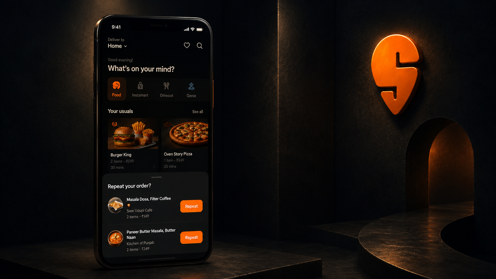
When a past customer opens the Swiggy app, the home screen knows. It personalizes immediately, showing previous orders, the restaurant they last picked, the specific dishes, and even the delivery time. Tapping the "Reorder" tag on these cards makes a bottom sheet slide right up.
This isn't just a simple reminder. That bottom sheet actually pre-fills the cart with your last order while also checking the restaurant's current availability and providing a new estimated delivery time. You go straight to checkout. No scrolling the menu. No re-selecting anything.
The timing is everything. This reorder prompt appears the instant a user opens the app, which is a moment that correlates almost perfectly with a real intent to eat (if you're opening Swiggy, you're probably hungry). That bottom sheet meets the craving at its peak.
This whole feature is no accident. GrowthX's analysis of Swiggy's model calls an "active user" someone who orders at least three times in 15 days. That reorder strip on the home screen is designed specifically to convert casual users into core ones by making the second and third order almost effortless, reinforcing the exact habit loop that Swiggy's CEO has identified as the company's main goal.
The psychology here's habit stack compression. Think of it this way: the system takes a behavior the user has already decided to repeat and strips away every possible new decision, making the habit cost almost no mental energy to reinforce each time.
3. The Item Add Sheet: Eliminating Menu Context Switching
When you tap to add an item on Swiggy, you don't go to a different screen. A bottom sheet just slides up. This is a design choice with massive conversion implications, a detail many apps get wrong.
The alternative pattern is a disaster. Forcing a user into a separate cart view takes them off the menu page, which breaks their browsing context and introduces a perfect friction point for them to abandon the order entirely. They might review the cart, feel the total is too high, and simply leave.
But the bottom sheet keeps the user on the menu. Simple. They can see what they added, confirm it, and immediately continue browsing and adding more items to build a larger order. While the cart is always accessible (the sticky bottom bar shows a running total), it's never forced on you as an interruption.
This matters. A lot. Baymard Institute's food delivery research found that many users are just returning to reorder from their favorite restaurants, but finding their preferred meals is "surprisingly difficult," which makes a quick ordering experience a much longer slog. Swiggy's design reduces this friction by keeping the browsing flow unbroken while still giving confirmation.
For repeat customers, this pattern is everything. Someone who has ordered from a restaurant before knows roughly what they want, and the item add sheet lets them fly through four or five items quickly, watch the running total, and proceed to checkout without ever leaving the menu. The modal alternative would interrupt the flow on every single item add, completely disrupting the momentum and converting far fewer of those multi-item sessions.
4. Coupon and Offer Application
Swiggy puts its coupon application in a bottom sheet at checkout.
It's a really smart UX decision. The alternative, a separate screen for applying offers, pulls the user completely out of the checkout flow. And we all know what happens then: people get distracted and abandon their carts. By keeping coupon application inside a bottom sheet that just overlays the payment page, Swiggy pulls off two things at once: it lets users apply discount codes without ever leaving the checkout state and kills a friction point that would otherwise cost conversions.
This matters. For repeat orders, this is especially important because returning customers are more likely to be Swiggy One members or have wallet credits ready to go. The offer sheet shows them relevant promotions contextually, presenting discounts available at that exact moment in a dismissible format that doesn't block the order if they decide to skip it.
What's the psychology here? It's loss aversion, timed perfectly. Seeing "you have ₹50 off available" inside a non-interruptive sheet gently nudges you to use the offer without the anxiety a full-screen demand would create. It's clever.
5. Address Selection and Delivery Instructions
When a user has multiple saved addresses, the app handles selection in a bottom sheet. No screen navigation needed.
This is a big deal for repeat orders. A user who flips between their office and home, a very common habit for Swiggy's urban demographic, previously had to navigate deep into settings or a totally separate address screen just to switch delivery locations. It was a pain. But now? The address bottom sheet pops up right before checkout, showing every saved address for a one-tap selection.
For Swiggy's power users (those ordering 4+ times per week), this friction reduction adds up fast. An 8-second address selection in a bottom sheet versus 25 seconds navigating to a settings page doesn't sound like much for one order. But across hundreds of repeat orders a year? It makes using Swiggy feel dramatically easier than the competition, which builds the exact kind of platform stickiness that its DRHP calls out as a key competitive moat.
The Numbers Behind the Pattern
It would be straightforward to invent Swiggy-specific before/after conversion stats here. They do not exist in the public record, and this article will not fabricate them.
What does exist is the macro trajectory and credible industry benchmarks that explain it.
From Swiggy’s DRHP (primary source):
| Metric | FY22 | FY23 | FY24 | Q1 FY25 |
|---|---|---|---|---|
| Avg monthly order frequency | 4.14x | 4.34x | 4.48x | 4.50x |
| Monthly Transacting Users | — | — | 14.29M | — |
| Annual Transacting Users | 35.09M | 43.34M | 46.84M | — |
| Food Delivery GOV | — | — | ₹24,717 Cr | — |
| Total orders delivered | — | — | 577.7M | — |
Just look at the order frequency trend. It's the loudest signal in the data, showing consistent improvement for three straight years right when Swiggy's product team was pouring resources into these specific UX patterns. Big changes like the 2017 app revamp (that's when the vertical swipe menu appeared), the massive design system buildout with its 200 components that cut QA time by 40% (thanks, Obvious.in), and the switch to a server-driven UI all show up in that climbing order frequency line.
From food delivery UX research (attributed):
- Food delivery platforms that introduced one-click reorder and simplified checkout reduced order completion time by 40% and increased total orders by 25% (SennaLabs food delivery UX analysis)
- 68% of mobile users prefer checkout flows with fewer clicks; conversion rates improve with click reduction (Moldstud food delivery UX research)
- Repeat order rate for food delivery apps in India is estimated at 60–65%, with power and core users driving the majority of GOV (GrowthX Swiggy engagement analysis)
What the industry research tells us about format:
- Cart abandonment rates in excess of 60% exist in Swiggy's own user segments (documented in product case studies by former team members). Contextual bottom sheets at key decision moments are the primary UX tool for reducing this.
- Contextual in-app prompts at natural task completion points outperform modal-triggered prompts by meaningful margins in food delivery contexts - the mechanism is friction reduction at the moment of established intent, not persuasion of unconvinced users.
The stat that matters most isn't some format-specific conversion rate. It's the direction of Swiggy's order frequency trend over time. For three consecutive years, the platform with arguably the most sophisticated in-app UX in Indian food delivery, which uses bottom sheets pervasively at every key repeat-order moment, has consistently grown how often people order. The format isn't the only variable. But it's a load-bearing one.
The Design Philosophy Behind It: Frictionless Habit, Not Constant Persuasion
Swiggy gets repeat orders right. Their design philosophy is something most growth teams talk about, but almost none of them can actually pull it off.
What's the principle? Simple. For people who have already decided to use your product, your only job is to get out of their way, not try to sell them all over again.
Every bottom sheet in Swiggy's repeat order flow exists just to lower the cost of acting on a decision that's already been made. Total execution. Think about the user who opens the app at 12:45 PM on a Tuesday, sees their go-to biryani spot, and hits "Reorder", that person has already made up their mind. The bottom sheet that pre-fills their cart for a three-tap checkout isn't doing persuasion work; it's just getting the job done.
This is where other apps get it wrong. The ones that fail at repeat orders treat every single session like it's the customer's first time, a brand new conversion problem. They bombard you with modals on open asking you to try fresh restaurants, interrupt your checkout with clumsy cross-sell prompts, and even add extra confirmation screens as if you might suddenly change your mind about your own habits.
They're misreading the room. Each of these patterns completely misunderstands what the user wants in that moment. For someone deep in the middle of a habitual, almost-mindless reorder session, any interruption just adds a frustrating layer of friction they didn't ask for. The bottom sheet format, however, sends a totally different signal: "I see you're busy; here's what you need right at the edge of your screen." That's the right message.
A modal is basically a shout. It says, "stop what you're doing and pay attention to me." That's just not the right message for a regular. And it's why Swiggy's main interruption tool, the full-screen promotional overlay, only really appears on app open for new users or people they're trying to win back, not in the established reorder flow. The two paths use different formats because they're two completely distinct conversations.
What Swiggy’s SDUI Architecture Makes Possible
When it comes to server-driven UI in India, Swiggy is at the top of its game. A 2025 case study of the company's SDUI architecture shows how their backend generates UI layouts as JSON, which the app then renders on the client side without ever needing an App Store update. The result is total control. Their team can instantly modify the content, timing, and context for all those bottom sheet triggers, the reorder suggestion on the home screen, the post-delivery prompt, the offer application sheet, without pushing a new build.
This capability is the key. Because the team can experiment with bottom sheet timing and content without a release cycle, Swiggy can:
- Test different reorder prompt triggers (post-delivery vs next-session-open) and measure order frequency impact within days
- Personalise the bottom sheet content per user segment (show restaurant name to power users who know it; show dish image to core users who think food-first)
- Adjust coupon offer presentation in the checkout sheet based on Swiggy One membership status and wallet balance
- Run format experiments comparing bottom sheet vs inline reorder strips without committing to either format permanently
This is server-driven engagement architecture applied to actual business outcomes. The SDUI layer is the infrastructure that makes it possible to constantly improve a repeat order funnel, all without burning sprint cycles on every single experiment.
What This Means for Product and Growth Teams
Swiggy is building one of the world's most complex hyperlocal platforms. Your team probably isn't. But the UX principle? It's totally portable.
Does your app have a key user behavior you want to encourage? Think of things like repeat purchases, feature re-engagement, subscription renewals, or even just getting people to open the app more frequently throughout the week. If so, Swiggy's repeat order pattern is for you:
That moment right after someone completes an action (think of it as the post-delivery high) is the single most important point in your entire engagement funnel. Why? The user just got value. Their satisfaction is at its peak. So the chance they'll do that same thing again has never been higher. What you show them in that specific window, both the format and the actual content, is what decides if they follow through.
Throwing up a modal right then completely misreads the room. A modal basically screams "pay attention to this now!" right when the user is feeling relaxed and satisfied after getting what they wanted. A bottom sheet, on the other hand, is much more subtle: it whispers "here's something useful for later, when you're ready," which perfectly matches that post-completion vibe.
So few apps get this right. I'm talking about the equivalent of the home screen reorder strip, where you put established behaviors front and center the moment someone opens the app. Most apps treat their home screen like a brochure for new users, all about discovery. But Swiggy treats it as a shortcut for the regulars, because your existing users are the ones who generate the frequency that actually makes the business work.
And then there's the item add sheet idea. It's simple. You keep users in their current context when they're taking small actions, which is the kind of tiny friction removal that adds up to massive gains in conversion over time. Seriously, every single screen navigation you can cut out of a common task is another percentage point you've just earned in retention.
The three questions for your own audit:
- What do your returning users do most? Now, look at how they get there, is that path as direct as it could be, or are you making them take navigational steps you could simply cut out with contextual bottom sheets?
- What happens on the screen right after a user completes a key action? Are we using that moment to guide them to the next step, or is it just a dead end they have to figure out how to back away from?
- So, how does your reorder path actually work? Is it an interruptive, modal-style popup, or is it more of a continuation, like a bottom sheet? If you're using an interruption, you're likely losing conversions from the very users who were already planning to take that action in the first place.
Key Takeaways
- Swiggy’s average monthly order frequency grew from 4.14x in FY22 to 4.50x in Q1 FY25, delivering 577.7 million orders in FY24 alone. The UX of the repeat order flow is a structural contributor to that trajectory.
- The repeat order problem is fundamentally a decision fatigue and friction problem, not primarily a persuasion problem. Users who have ordered before have already decided. The UX’s job is execution, not conversion.
- Bottom sheets just fit here. They're great for repeat order flows because they extend context without actually interrupting it, they say "here's something relevant" rather than demanding you "stop and pay attention." That kind of interruption is a flow-killer for users who are on autopilot, just trying to place a quick, habitual order.
- Swiggy deploys bottom sheets at five key repeat-order moments: post-delivery rating/reorder, home screen reorder strip trigger, item add confirmation, offer application at checkout, and address selection.
- The post-delivery moment is the single highest-leverage placement because it combines peak satisfaction, established order context, and low deliberation friction in one interaction.
- Swiggy’s SDUI architecture means these bottom sheet experiences can be experimented with, personalised, and iterated without release cycles - which is the operational infrastructure that makes sustained improvement in order frequency possible.
- No Swiggy-internal A/B test data on format-specific conversion rates is publicly available. The analytical case in this article is built from DRHP-filed engagement metrics, observed app behavior, and attributed industry UX research.
Further Reading
From Digia
- What is Server-Driven UI for Engagement (And Why It Matters)
- Eliminating Mobile App Release Dependency for Engagement Experiments
- Bottom Sheets vs Modals: Choosing the Right Interruption Layer
External Sources - All Claims Sourced
- Swiggy DRHP / IPO Filing (order frequency, MTU, GOV data) - Business Standard
- Swiggy IPO: Key Strengths and Financials - Upstox / RHP Data
- Swiggy SDUI Architecture Case Study - Medium / Vidit Savaliya
- Design System for Swiggy - Obvious.in (UI component and QA reduction data)
- Swiggy Revamps App Interface with Personalized Preferences - DQ India (VP Design quote)
- UX/UI for Food Delivery Apps: Improving Order Efficiency - SennaLabs (reorder UX stats)
- Swiggy Engagement & Retention Analysis - GrowthX
- Food Delivery Takeout UX Research - Baymard Institute
This article is part of Digia's Engagement and Lifecycle series. Next: Breaking Down CRED's Subtle In-App Nudges - how restraint in engagement design drives premium conversion.
Running repeat order experiments in your app? See how Digia Nudges and Widgets work without release cycles or book a demo.
Running repeat order experiments in your app? See how Digia Nudges and Widgets work without release cycles or book a demo.