
TL;DR: CRED has built one of the most studied engagement stacks in Indian fintech, not by being aggressive, but by being deliberate. Every nudge in the app is designed to feel earned rather than imposed. This breakdown maps the specific nudge patterns CRED uses, the psychological mechanisms underneath each one, and the design philosophy that ties them together. Sourcing note: CRED does not publish internal conversion metrics. What follows is built from CRED's own published design documentation, the Copper and NeoPOP design system records, observed app behaviour documented across multiple UX case studies, and attributed behavioural psychology research. No CRED-internal A/B test data is cited.
Open a typical Indian fintech app. Within three taps you have seen a push notification about loan pre-approval, a modal overlay promoting a credit card offer, a bottom navigation badge demanding your attention, and an in-app toast telling you your cashback is waiting.
None of this is engagement. It is anxiety manufacturing dressed up as personalisation. The apps doing this are not building habits but they are training users to dismiss notifications reflexively, to close modals before reading them, and to associate the app itself with the sensation of being sold to.
CRED does not do this.
CRED's engagement strategy is built on a principle that sounds simple and is surprisingly difficult to execute: the nudge should feel like it belongs to the experience, not like it was placed on top of it. When it works, users do not experience CRED's nudges as nudges at all. They experience them as the app being good at its job.
This article breaks down exactly how that is achieved - the specific mechanisms, the design decisions, the psychology, and the infrastructure that makes it operational. It is the fifth in Digia's Engagement and Lifecycle series, following the bottom sheets vs modals framework and the Swiggy repeat order breakdown. Those articles were about execution at scale and this one is about execution with restraint, a different and equally important capability.
Why CRED's Nudge Strategy Is Worth Studying
Before the patterns, here is some context on why CRED is the right app to study for this.
CRED is a members-only platform requiring a CIBIL score of 750 or above for access. According to the App Store listing, it is trusted by over 14 million creditworthy members. MoneyControl reported in 2024 that the MAU figure plateaued around 13 million across 16 consecutive months, which is not a growth story, but it is a remarkable retention story. An app that keeps 13 million high-income users engaged without being able to grow the acquisition funnel by definition through credit score gating has to earn every session through product quality, not volume.
That constraint changes the engagement calculus entirely. Typical consumer apps can afford aggressive engagement tactics because they have large, replaceable user bases. If 5% of users churn because of a pushy modal, you acquire 5% more. CRED cannot do that. The addressable market is structurally limited by credit score. Every engagement decision therefore has to be optimised for long-term trust and habit formation, not short-term click-through.
This is why the CRED engagement model matters: it was built under constraints that forced sophistication. The lessons are portable to any premium or high-trust vertical like B2B SaaS, wealth management, healthcare, professional tools - where users are sophisticated, options are plentiful, and aggressive engagement destroys the trust premium you have spent acquisition budget building.
CRED's design team has said as much publicly. From their design manifesto on cred.club: "design should inspire creativity, design should bring out emotions, design should delight, design should seek a purpose beyond the most obvious." That is not just copywriting but it is a constraint specification for the product team.
The Architecture Behind CRED's Nudge Stack
Before the specific patterns, it is important to understand the infrastructure.
CRED has shipped four generations of its design system: Topaz (2018, flat minimalism), Fabrik (2019, skeuomorphic), Copper (2020, neumorphism), and NeoPOP (2022, bold geometric). Each generation is documented in detail on CRED's design page.
The critical detail from the Copper generation, confirmed in CRED's own blog post from 2020: "what Copper achieved was that we successfully managed to create and ship a framework that was extensible to the extent that several key products on the app could now be controlled entirely via our centralised content management system 'heartbeat'."
Heartbeat is CRED's server-driven UI layer. It is the equivalent of what we covered in the first article in this series which is a backend-controlled system that allows the team to configure what UI appears, when it appears, and to whom, without requiring an app release.
This matters for understanding CRED's nudge strategy because it means the timing, content, and format of nudges can be iterated rapidly. A nudge that underperforms can be revised in hours. A nudge that converts well for a specific user segment can be narrowed to that segment without touching app code. The subtlety of CRED's nudge execution is not just a philosophy but it is a capability that the infrastructure makes operationally feasible.
NeoPOP, the current generation, went further: it was open-sourced for iOS, Android, Flutter, and Web, making the same component quality available to the broader developer community. The framework's component and grid masonry is described as "crafted to create beautiful, unique permutations of interface elements" that are "extensible, API backward compatible and highly measurable, which makes experimenting on our product exponentially effective."
Measurable experimentation is not incidental. It is the feedback loop that has allowed CRED to iterate its nudge strategy toward restraint rather than away from it.
Six Nudge Patterns CRED Uses: And the Psychology Behind Each
1. The Reward Reveal Animation: Dopamine Before Demand
The most studied and imitated element of CRED's engagement stack is the post-payment reward reveal sequence.
After a user pays their credit card bill through CRED, the app does not immediately redirect to a confirmation screen. Instead, it plays a Lottie-based animation which is coins accumulating, a reward unlocking, a visual celebration of the completed payment. This was present from the Topaz design era and remains a core interaction pattern. CRED's design documentation describes Topaz as having "one of the most sophisticated native implementations of Lottie-based animations yet, marking a definitive new trend in the way motion design was used in traditional apps."
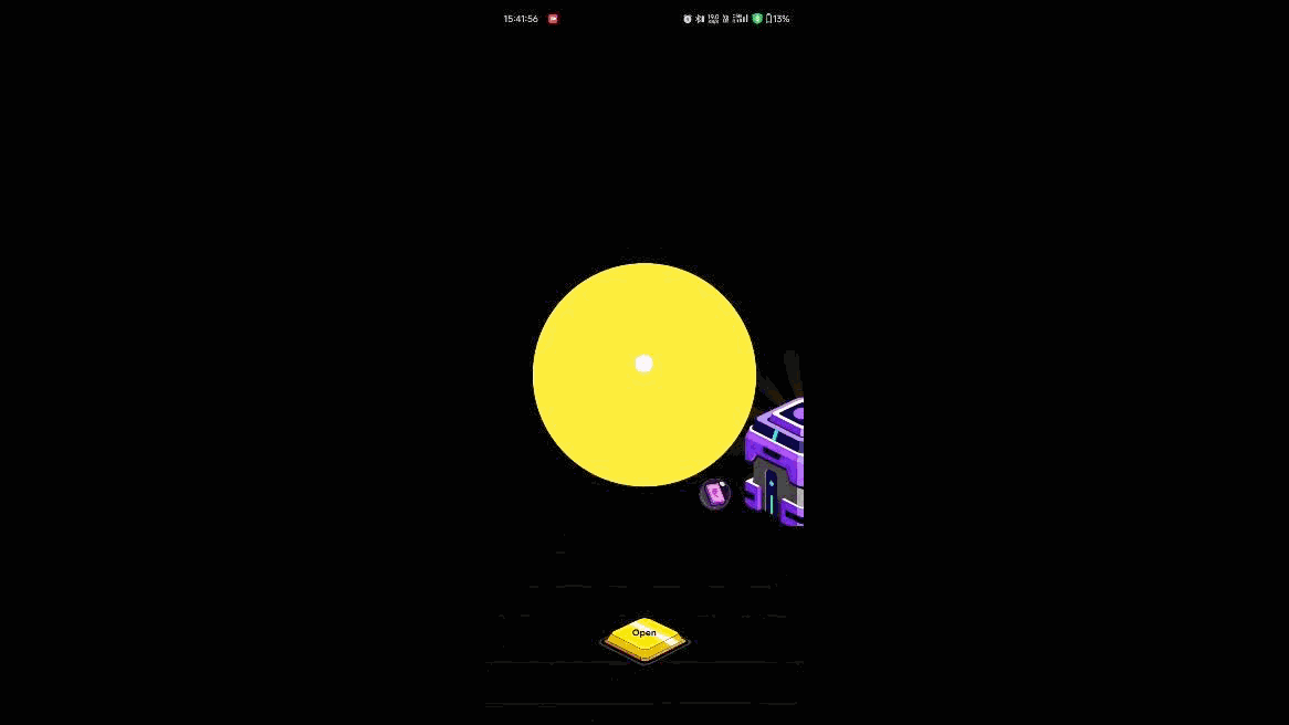
The psychological mechanism is behavioral conditioning - specifically, variable ratio reinforcement. The user completes the payment (the behaviour) and receives a reward reveal (the reinforcement). The variable element is what the reward is: sometimes it is a modest coin credit, sometimes it is a cashback offer, sometimes it is access to a jackpot experience. The variability is what makes it habit-forming.
But the nudge function of this animation goes beyond the immediate reward. It creates an emotional state (delight, anticipation) at the exact moment when CRED then surfaces the next engagement opportunity: the CRED store, the jackpot feature, or a cashback offer from a partner brand. The animation is not decorative. It is the warm-up act for the next nudge, ensuring the user is in a receptive emotional state before anything is asked of them.
Most apps reverse this sequence: they show the ask first, then the reward. CRED shows the reward first, then the ask. That ordering difference is the entire model.
2. Bill Due Nudge: Loss Aversion Without the Alarm
CRED's bill payment reminders are among the most tactfully calibrated notification sequences in Indian fintech.
The app sends reminders in a progressive sequence as the due date approaches. The tone does not escalate into urgency but it escalates into specificity. The early reminder is informational: your bill is due on [date]. The mid-cycle reminder adds context: the amount due, the card, and a direct path to payment. The final reminder brings in loss framing without alarm: missing this payment affects your credit score.
That last message is doing significant psychological work. It is not saying "you will be charged a penalty" (fear). It is saying "your credit score which is the thing that got you access to CRED in the first place is at risk" (loss aversion applied to identity, not money). For CRED's user base of 750+ CIBIL score holders, the credit score is not just a number. It is a signal of financial identity. The nudge connects the payment action to the preservation of something the user already values about themselves.
This is not aggressive and the users who sees this nudge is almost certainly going to pay their bill. The nudge is not trying to convince them to pay but it is ensuring the payment happens through CRED rather than directly through the bank's app. The mechanism is identity reinforcement, not fear-based persuasion.
The format matters too. These nudges come as push notifications with specific, actionable copy, not as in-app modals that interrupt the current session. The channel matches the urgency: push for time-sensitive payment reminders, in-app for browsing-state engagement. CRED does not deploy high-interruption formats for low-urgency content. The format calibration itself is a nudge principle.
3. The Discover Tab Animation: Motion as a Pointer
Confirmed by UX Planet's analysis of CRED's design patterns: "CRED uses subtle animation to nudge the user to tap on the discover icon."
This is one of the more elegant micro-nudge techniques in the app. Rather than using a badge (the standard engagement hack like a red number on a tab to trigger anxiety), CRED uses a subtle motion on the navigation icon itself. The animation says "there is something here" without the alarm-state that badges produce.
The psychological difference is significant because notification badges trigger what researchers call "attentional capture" but the motion nudge captures attention without the threat signal. It creates curiosity rather than obligation.
This is particularly appropriate for a fintech app as finance is a domain with inherent anxiety. Users approach credit card and payment apps with a background level of financial stress. Any engagement mechanic that amplifies that stress is working against the product's emotional positioning. CRED's motion nudge says "go explore" rather than "you have an unresolved item." The distinction between invitation and demand is not semantic but, it is psychologically distinct.
The navigation tab system itself is worth noting. CRED's selected tab illuminates; the unselected tab dims. This is neumorphic tactility applied to navigation: the visual sensation of pressing a button rather than tapping a flat screen. It is a physical metaphor that makes navigation feel responsive without requiring audio or vibration. The nudge toward exploration is baked into the interface's physical-world metaphor, not layered on top as an overlay.
4. The CRED Store and Cashback Merchandising: Desire Without Push
The CRED store: the section where members can redeem coins for products, experiences, and cashback from partner brands which is a masterclass in ambient engagement nudge design.
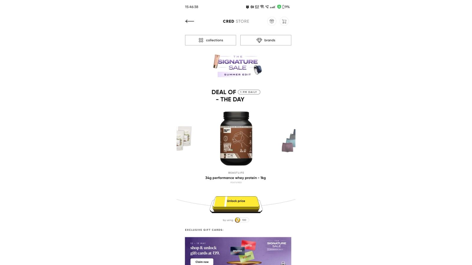
The products are presented in catalog-style, with premium visual treatment and copy that reads nothing like promotional text. As one analysis of the app experience noted: "look at the descriptions... the presentation deserves applause - almost at the stage of just redeeming your coins and buying that product."
The nudge mechanism here is not an overlay or a push, it is a combination of scarcity signalling (limited-availability partner offers), social proof (exclusive access framing), and high-quality visual merchandising that makes browsing feel like free time rather than shopping. Users who open the CRED store to check their coins often exit having engaged with partner offers they did not intend to explore. This is ambient discovery as an engagement system which is equivalent of a well-curated physical store where you entered for one thing and left with three.
The key design decision enabling this: the CRED store does not feel like a conversion funnel. There are no countdown timers, no "only 3 left" urgency labels on most items, no modal pop-ups pushing the premium offer. The premium feel of the product presentation does the work that most apps try to do with manufactured urgency. CRED's user base is high-income and advertisement-literate, they would dismiss manufactured urgency immediately. The authentic premium presentation is the nudge, and it works precisely because it does not feel like one.
5. The Credit Score Check Loop: Re-engagement Without Offer Fatigue
One of CRED's most structurally clever engagement mechanics is the credit score monitoring feature.
CRED offers members free access to their CIBIL score through a soft inquiry, meaning the check itself does not affect the score. Members can refresh their score at any time. This creates a natural, self-initiated engagement loop: users periodically open the app to check their score, independent of any payment due or offer to be claimed.
The nudge layer sits on top of this organic re-engagement: after a score check, the app surfaces contextually relevant insights ("your credit utilisation is at X%, here's what that means") and, where appropriate, product offers tied to the score ("based on your score, you qualify for CRED Cash at X% interest rate").
This is a textbook example of what behavioural economics calls "commitment and consistency" applied to product engagement. The user who opens the app to check their score is already in a financial self-reflection mode. They have demonstrated, by opening the app for a non-transactional purpose, that they are currently engaged with their financial health. The subsequent nudge toward a financial product meets them exactly in that mental state, not creating the state, but responding to one the user has already entered voluntarily.
The Zeigarnik effect reinforces this. Users who see their score and find it slightly below a desirable threshold (700 if they are at 695, 750 if they are at 740) will naturally want to understand what will improve it. CRED's contextual insights feed directly into that incomplete loop which is creating engagement not by inserting a new problem but by providing resolution to a problem the user has already noticed.
6. Swipe-to-Dismiss: Respecting the User Enough Not to Force
The most understated nudge in CRED's stack is not a nudge at all in the conventional sense. It is the swipe-to-dismiss mechanic on cards throughout the app.
Confirmed in a UX design analysis: "Note how the 'Remind me later' and 'Dismiss' buttons are presented after swiping the card and not while scrolling the feed."
This is a profound design decision. On most apps, dismissal options (the ability to say "no, not now" to a piece of content) are either absent (modal lock-in) or available but deemphasised (small grey "X" buttons placed deliberately out of reach). CRED makes dismissal a natural gesture: swipe the card. The options appear only after the gesture, so the user who is not interested can dismiss in one fluid motion.
Why does this constitute a nudge strategy? Because it changes the entire emotional register of the content that precedes dismissal. When dismissal is easy and accessible, the content being dismissed does not feel imposed. It feels offered. The user who swipes to dismiss a credit card offer has had a fundamentally different experience than the user who had to hunt for an X button at the top of a modal. The former registers the offer as "not for me right now." The latter registers the modal as "an annoyance that was blocking me."
Over time, the swipe-dismiss mechanic trains the user that CRED respects their agency. That trust, accumulated across dozens of sessions, is what makes CRED's occasional higher-priority nudges like a genuinely time-sensitive offer, a credit score alert, land without the resistance that identical content would generate in apps that have not earned that trust.
The Philosophy CRED Has Actually Executed
These six patterns are not isolated design decisions. They reflect a coherent philosophy that CRED's design team has articulated clearly and executed consistently.
The philosophy has three components.
First: design for the emotional state, not just the action. Every nudge in CRED's stack is designed to match the user's emotional context at the moment of delivery. The reward animation creates delight before the next ask. The bill reminder uses identity-based loss aversion rather than financial fear. The discover animation creates curiosity rather than obligation. The store presentation creates desire without manufactured urgency. In each case, the nudge is not dropped into an arbitrary moment but, it is calibrated to an emotional state that either already exists or has been deliberately created by the preceding interaction.
Second: restraint earns permission. The swipe-to-dismiss pattern and the avoidance of badge-count anxiety for casual engagement are investments in user trust. They cost potential short-term clicks (a badge would produce more taps on the discover tab than a subtle animation), in exchange for long-term permission. Users who trust an app's judgment about when to ask for their attention are significantly more receptive when the ask is made. CRED's nudges work in part because users have been trained, over many sessions, to believe that a CRED engagement prompt is likely to be relevant and non-threatening. That belief is the product of sustained restraint.
Third: the system, not the campaign, is the strategy. CRED's engagement is not primarily driven by campaign-level decisions like what offer to show which segment on which day. It is driven by the cumulative experience of the product itself. The reward animation is not a campaign. The swipe-to-dismiss is not a campaign. The credit score check loop is not a campaign. They are systemic decisions baked into the product experience that produce engagement as an ongoing output, without requiring a campaign manager to configure them.
This is the hardest part to extract and replicate. Campaign-level nudges are configurable. Systemic nudges require design and engineering conviction sustained across multiple product cycles. It is why CRED's approach is widely cited and infrequently replicated.
What This Model Cannot Do (and Where It Shows)
CRED's MAU plateau at approximately 13 million over 16 months through 2022–2024 is directly related to the structural ceiling of its user acquisition model and not to failures of engagement design. But it does reveal a genuine constraint in the subtlety-first approach.
CRED's nudge strategy optimises for depth of engagement with existing members, not breadth of acquisition. The same restraint that makes retained users trust the app makes the app's feature expansion feel slower and less urgent than a more aggressive platform might achieve. CRED added UPI payments, CRED Cash lending, and store commerce over time, but the feature adoption nudges for these expansions are subtle, and subtle adoption nudges require more time to reach critical mass.
This is the explicit trade-off: aggressive feature adoption campaigns would likely have accelerated adoption of CRED Cash and the store. They would also have damaged the premium positioning that makes CRED worth using in the first place. You cannot simultaneously be the high-trust, premium-feel app for sophisticated users and the app that runs countdown timer modals for loan offers. CRED chose the former and accepted the adoption velocity cost of that choice.
For product teams reading this: the CRED model is not universally applicable. If your product needs rapid feature adoption across a large, mixed-intent user base, restrained nudge design will be suboptimal. If your product serves a premium, sophisticated, or high-trust-sensitive segment where the quality of the relationship with the user directly determines LTV, CRED's model is the closest published playbook you will find.
What Growth Teams Can Actually Extract
Extract the emotional sequencing logic. Before any nudge, identify the user's current emotional state. The question is not "what do I want the user to do?" It is "what is the user feeling right now, and what nudge is consistent with that state?" CRED's reward animation succeeds because it creates the right emotional state before the ask. Most nudges fail because they ignore the emotional state entirely and show the ask into whatever context the user is in.
Extract the restraint-as-trust-investment principle. Every time you make a nudge dismissible in a way that respects user agency, you are building a future permission credit. The apps that accumulate the most permission have earned that attention through sustained restraint. This is measurable: track the ratio of engaged dismissals (swipe, "not now") to frustrated dismissals (force-close, notification kill). A high ratio of engaged dismissals means your nudge is relevant but poorly timed. A high ratio of frustrated dismissals means your nudge is a problem.
Extract the system vs campaign distinction. Map your engagement patterns into two categories: campaign nudges (configured, scheduled, targeted) and systemic nudges (baked into the product flow, not requiring configuration). CRED's highest-performing nudges are systemic. Most engagement teams invest almost entirely in campaign nudges. A meaningful investment in systemic nudge design, the post-completion animation, the swipe-dismiss pattern, the motion-based discovery cue, will compound across every user session without ongoing configuration cost.
Extract the backend-driven format capability. CRED's heartbeat CMS and Digia's equivalent server-driven engagement architecture exist for the same reason: to make nudge iteration fast enough to actually learn from. If your nudge strategy requires a release cycle to test a format or timing change, you cannot iterate fast enough to find the optimum. The release dependency problem applies to nudge design as directly as it applies to any other engagement experiment.
Do not extract the aesthetic without the philosophy. The dark theme, the neumorphic buttons, the Lottie animations, these are implementations of the CRED philosophy, not the philosophy itself. Copying CRED's visual aesthetic onto an aggressive, badge-heavy, modal-first engagement stack produces something worse than either: a product that looks premium but behaves cheap, where the visual language creates an expectation of restraint that the engagement mechanics immediately violate. The aesthetic and the philosophy have to be aligned, or neither works.
Key Takeaways
- CRED's nudge strategy is built on restraint as a compounding asset, not as a sacrifice of conversion. Trust accumulated through non-aggressive engagement creates permission for higher-stakes nudges when they matter.
- The reward reveal animation (post-payment) is CRED's most structurally important nudge: it creates a dopamine state via variable reinforcement before any product ask is made. The sequence is reward → receptive state → ask, not ask → reward. Most apps invert this.
- Bill payment reminders use identity-based loss aversion (your credit score, which defines your CRED membership) rather than financial fear (penalties). The psychological target is identity preservation, not alarm.
- The discover tab animation nudge uses motion to create curiosity rather than badge counts to create obligation. The distinction between invitation and demand matters psychologically, especially in an anxiety-adjacent domain like personal finance.
- Swipe-to-dismiss is a trust investment, not a conversion sacrifice. Apps that make dismissal easy and dignified are building long-term permission that pays out in every future engagement.
- CRED's heartbeat CMS: their server-driven UI layer, shipped with the Copper design system in 2020, is the infrastructure that makes rapid nudge iteration possible without release cycles.
- The model has a documented ceiling: 13 million MAU plateau through 2022–2024, structurally driven by credit score gating. Restraint optimises for depth of engagement with a defined user base, not breadth of acquisition.
- No CRED-internal conversion data is publicly available. The patterns described are built from CRED's design documentation, observed app behaviour, and attributed behavioural psychology research.
Further Reading
From Digia
- What is Server-Driven UI for Engagement (And Why It Matters)
- Eliminating Mobile App Release Dependency for Engagement Experiments
- Bottom Sheets vs Modals: Choosing the Right Interruption Layer
- How Swiggy Uses Bottom Sheets to Drive Repeat Orders
- Amazon's Embedded UI and Add-On Conversion (up next)
External Sources - All Claims Attributed
- CRED Design Manifesto and Design System History - cred.club (Topaz, Fabrik, Copper, NeoPOP, heartbeat CMS documentation)
- CRED Goes Copper - Design System Announcement - CRED Blog (dark mode choice, neumorphism, heartbeat CMS)
- Design the Nudges - CRED Discover Animation - UX Planet (confirmed discover tab animation nudge)
- Why CRED Has an In-cred-ible Design - Muzli / Muskan Raina (swipe-to-dismiss pattern, neumorphic navigation)
- CRED MAU Plateau - 13 million over 16 months - MoneyControl / Chandra R. Srikanth (MAU data)
- Gamification in CRED - CustomerGlu (UX breakdown, dark theme psychology, button tactility)
- Inside the CRED App Universe - AppSaware (store merchandising UX, design language analysis)
- CRED App - Trusted by 1.4 crore+ members - Apple App Store listing
- NeoPOP Open Source UI Framework - cred.club
This article is part of Digia's Engagement and Lifecycle series. Next: How Amazon Drives Add-Ons Using Embedded UI Components — upsell embedded so deep in the flow it reads as service, not sales.
Building a nudge strategy that earns trust instead of burning it? See how Digia Nudges work without release cycles or book a demo.