
Most Mobile app engagement content treats widgets like growth tools. Add a carousel. Add a checklist. Add a “next best action” card. Add more nudges.
That framing misses the real failure mode: engagement widgets don’t usually fail because the idea is wrong. They fail because they change the performance profile of the most sensitive moments in the product. When you add latency or jank at the wrong step, you don’t just slow the app down. You change user behavior.
And the behavior change is predictable.
When feedback is late, users retry. When state is unclear, users recheck. When the UI stutters, users stop exploring. When submission feels uncertain, users abandon or contact support. Those are “engagement performance patterns,” but they are performance-driven engagement patterns.
This article is part of a broader pillar on mobile app engagement, where we examine how engagement is shaped not just by user behavior, but by product systems, mobile app engagement metrics, and design decisions. While the pillar establishes that engagement is often misinterpreted as activity rather than meaningful progress, this piece focuses on a specific but critical layer: how UI and performance patterns especially engagement widgets can distort engagement itself.
In this article, we explore why engagement widgets often fail in practice, introduce the core mental model of delay → uncertainty → behavioral patterns, and break down how performance at the widget level influences user actions like retries, rechecks, and abandonment. We will also map common widget failure modes, explain why metrics like CTR can be misleading, define performance budgets and guardrails, and outline how to design and ship engagement widgets as systems that improve outcomes without creating hidden engagement debt.
The core story: delay creates uncertainty, uncertainty creates patterns
If you want a simple mental model to carry through every widget decision, it’s this:
“Users don’t abandon slow experiences. They abandon uncertain experiences.”
Uncertainty is the mechanism. Performance is the trigger.
A 300–700ms delay at the wrong moment doesn’t register as “slow.” It registers as “did my action register?” That subtle shift is the start of everything that follows: rage taps, repeated submissions, re-open loops, and then support tickets.
That’s why widget performance is not a “nice to have.” It is a product integrity constraint. If the widget makes the product feel uncertain, it will reduce completed core actions per session, which is what retention is made of.
What to optimize: the widget, not the screen
Most teams measure performance as screen-level metrics: app start time, API p95, screen load time.
Widgets break that model because they introduce micro-latencies inside a screen. The screen might “load,” but the thing the user came to do inside the screen is delayed.
So the right unit of analysis is widget-level behavior:
- How long until the widget is usable (not visible)?
- How long from tap to feedback?
- How often does the widget cause extra network calls on the critical path?
- How often does the widget produce retries, duplicates, or recheck loops?
When you measure widgets this way, you start seeing why some “high CTR” widgets correlate with worse retention.
The widget-level failure modes that create engagement debt
Below is the map you should keep around when deciding whether a widget is “working.” This table is the point of the article.
Widget performance failure map
| Widget | Typical performance failure | What users do next (engagement pattern) | Guardrail metric (the one that matters) | Best fallback behavior |
|---|---|---|---|---|
| Next Best Action card | waits on personalization/eligibility before becoming actionable | bounce or aimless navigation | time-to-first-actionable (p95) | render default action + refine async |
| Quick actions bar | disabled until API returns; no immediate feedback on tap | rage taps, abandon | tap-to-feedback (p95) + double-tap rate | optimistic feedback + idempotent submit |
| Recommendation carousel | image-heavy; jank on scroll; blocks main thread | stop scrolling; shorter sessions | dropped frames on home + scroll hitch rate | placeholders + lazy load below fold |
| Onboarding checklist | each step triggers network; step transitions feel slow | “I’ll do it later” drop-off | step-to-step latency (p95) | reorder steps so offline/instant steps come first |
| In-app inbox | loads all messages synchronously; slow skeleton | repeated open/close to refresh | inbox time-to-meaningful (p95) | show cached last messages instantly |
| Search widget | suggestions depend on network; typing lags | fewer searches; fewer results explored | input latency + keystroke-to-results | local suggestions + async network refine |
| Status timeline | “processing” state with no progress; slow to update | recheck loops; support contacts | time-in-unknown-state + reopen rate | explicit states + SLA range + receipt ID |
| Trust proof block | loads after-the-fact (late), shifts layout | hesitation; drop at decision point | layout shift + time-to-trust-content | reserve space; render instantly, update later |
| Referrals widget | calls eligibility/reward status on home critical path | home feels heavy; lower open-to-action | extra requests on first paint | move to post-success screen; prefetch in background |
This is the difference between “engagement UI” and “engagement systems.” The widget is not just content. It is a performance decision that shapes behavior.
Examples where widgets “win” on clicks and still hurt engagement
Quick actions that create rage taps
A team adds a quick actions bar on the home screen: “Pay,” “Transfer,” “Recharge,” “Scan.” Usage goes up. CTR looks great.
But support starts seeing “it didn’t work” tickets. Payment ops sees more duplicates. Engineering sees repeated submits. Retention quietly slips among users who try money-moving actions.
The cause is typically simple: the quick actions are not truly “quick.” They are gated by an eligibility call or account state refresh. The UI renders, but the buttons are dead for 500–1200ms. Users tap and see no feedback, so they tap again. By the time the app reacts, you have taught the user that the app is uncertain.
If you want the widget to increase engagement safely, you need two things at once: instant tap feedback and safe retry semantics. That means the UI responds immediately and the backend treats repeated submits as the same intent, not new intents. Without that pairing, “performance” becomes “duplicate transactions,” and the widget becomes a trust leak.
Carousels that reduce exploration by making the UI feel heavy
Recommendation carousels are everywhere because they are easy to ship and easy to measure. The trap is that they are frequently the cause of scroll jank, especially if they pull image-heavy content, animate aggressively, or trigger network calls on scroll.
Users rarely think “this carousel is slow.” They think “this app feels heavy.” And when an app feels heavy, people stop exploring. Session depth drops. The feed becomes something they glance at and exit, rather than browse and act.
This is why “carousel CTR” is a misleading success metric. The more meaningful metric is how the widget changes scroll behavior and downstream completions. If dropped frames increase on the home feed and session depth decreases, the widget is not improving engagement. It is converting attention into fatigue.
The fix is not “remove the carousel.” The fix is to treat it like a budgeted component: reserve layout space, load placeholders, lazy-load below fold, and reduce the number of images that decode on the main thread. If you can’t make it smooth, it doesn’t belong on the critical path.
Status timelines that either build trust or create recheck loops
A status widget looks innocent: “Processing…” after a transfer, verification, booking, refund, or delivery.
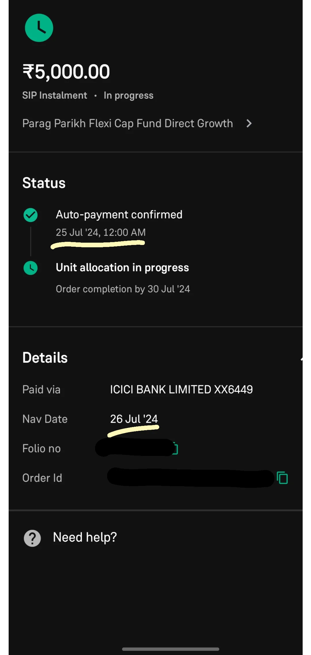
But “Processing…” is not a status. It is an ambiguity generator. It is exactly the kind of uncertainty that causes recheck loops. Users reopen the app to see if something changed. They refresh repeatedly. Some retry. Support gets “is it stuck?” tickets. Engagement dashboards may even show “more sessions,” but those sessions are anxious behavior, not healthy engagement.
A proper status timeline widget fixes performance-driven uncertainty by making state resolution legible. It separates “we accepted your intent” from “we completed the outcome,” gives a reference ID, and sets expectation with time ranges. Even if the backend is slow, the product feels dependable, because the user understands what is happening.
This is one of the few engagement widgets that can simultaneously reduce support load and improve retention, but only if it is designed as a state machine, not a spinner.
The widget performance budgets that prevent backfires
Founders and CTOs need something enforceable. “Make it fast” is not enforceable. Budgets are.
You should attach budgets to the widgets that sit on your critical engagement surfaces (home, search, checkout, primary action screens). The budgets do not need to be perfect. They need to exist, and they need to be tied to guardrails.
Here is a practical starter set that works for most mobile apps:
| Widget moment | Recommended budget | Why it matters |
|---|---|---|
| Tap → visible feedback | under 100ms target; monitor p95 | prevents rage taps and duplicate attempts |
| Widget usable (not just visible) | under 500ms p95 | avoids “dead UI” and early bounce |
| Added network calls on critical path | 0–1 incremental calls | fewer calls beats faster calls |
| Scroll performance on feed screens | minimal hitching at p95 | prevents exploration collapse |
| Time in “unknown state” after submit | near zero; must become explicit quickly | reduces recheck loops and support |
The moment you introduce a widget that violates these budgets, you should expect engagement distortion and trust debt. The budgets won’t solve everything, but they stop you from shipping engagement surfaces that are structurally incapable of compounding.
What to measure so you don’t get fooled by CTR
If you only measure widget CTR, you will ship harmful widgets.
Every engagement widget should be evaluated with two metrics: one “action metric” and one “quality/trust metric.” For founders, this prevents you from optimizing activity that creates hidden costs.
Action metrics that are actually meaningful:
- completion rate of the core action the widget routes into
- time-to-complete for that action (p95)
- successful core actions per weekly active user
Quality/trust metrics that catch backfires:
- double-submit rate and retry loops
- time in ambiguous states (“processing” with no progression)
- support contacts per flow
- opt-outs and dismissals for overprompting widgets
If a widget increases taps but also increases retries or support contacts, it is not an engagement win. It is a reliability leak.
How to ship widgets without making the app heavier
This is the operational part founders and CTOs care about. If you do not have a rollout and fallback posture, you will keep shipping engagement features that make the product feel worse.
Use feature flags or remote config so you can throttle exposure quickly when guardrails trip. Avoid putting eligibility and personalization calls on the first paint of home. Prefer cached “last-known-good” content with asynchronous refinement. Where actions are involved, make retry semantics safe by design. Where outcomes are delayed, make state legible immediately with explicit transitions and receipts.
These are not “UX niceties.” They are how you prevent performance from turning into engagement debt.
Where Digia fits in
Most teams split responsibilities in a way that guarantees these problems persist. Product owns widgets. Engineering owns performance. Analytics owns dashboards. Support owns fallout.
Digia fits by treating engagement widgets as systems with measurable behavioral consequences.
That means Digia helps teams identify the few widgets that sit on core action paths, define performance budgets and guardrails for those widgets, and instrument the right signals at the widget level so you can see the uncertainty patterns early: rage taps, retries, duplicates, recheck loops, and the flows that drive support load.
Then Digia Studio helps redesign the widget behavior so it stays valuable even under imperfect conditions. Not by polishing UI, but by improving state clarity, safe retries, and fallbacks that keep the product certain when latency appears. When you treat widgets this way, you stop shipping “engagement UI” and start shipping “engagement infrastructure.”
Closing: the real definition of a high-performing engagement widget
A high-performing engagement widget is not one that gets clicked.
It is one that reduces time-to-core-action without increasing uncertainty, retries, or support.
If you want engagement that compounds, the most important question to ask before shipping any widget is not “will it increase taps?”
It’s this: “What performance debt will this widget create, and what user behavior pattern will that debt trigger?”
Answer that honestly, attach budgets, instrument the guardrails, and engagement stops being a gimmick. It becomes a reliable system.