
TL;DR: Most teams collect feedback wrong. They interrupt users mid-task, survey them on their first session before they have any real opinion, and use formats that feel foreign to the app. This guide covers the timing rules, trigger conditions, format choices (rating widget vs NPS vs emoji vs open text), and design principles that make feedback feel like part of the product, not an intrusion into it. It also covers the most common mistakes, because those account for most of the wasted effort in in-app feedback programs.
Why Timing Is the Entire Game
Before touching format or placement, get the timing right. Every other decision in your feedback setup flows from this one.
In-app surveys triggered at the wrong moment are not just unhelpful. They actively damage the data you collect. A user asked to rate their experience mid-checkout is not rating their experience with your product. They are rating the interruption. That distinction matters if you want feedback that leads to real product decisions.
Research from Refiner's 2025 In-App Survey Response Rate Report, which analyzed 1,382 in-app surveys with over 5 million views, found that mobile app surveys averaged a 36.14% response rate compared to 5 to 15% for email surveys. That gap does not come from format or question wording. It comes from context: in-app surveys reach users during an active session, while email reaches them hours later, out of context, competing with everything else in their inbox.
That same context advantage disappears the moment you fire a survey at the wrong point in the session. The rules below are not suggestions. They are the conditions under which feedback stays meaningful.
The Four Timing Rules for In-App Feedback
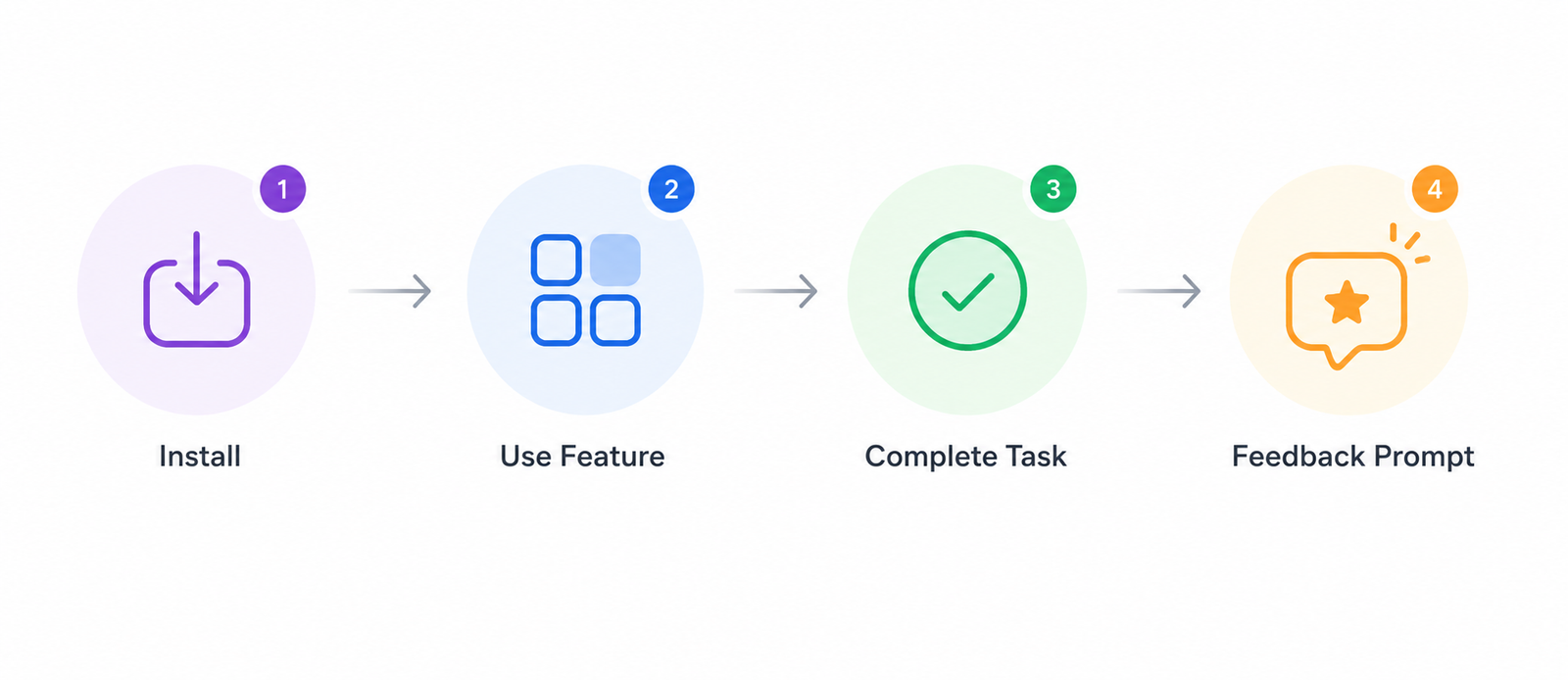
Rule 1: Never survey on the first session. A user who has opened your app once has not experienced it. They have seen it. There is no meaningful sentiment to capture yet. Triggering NPS or a feedback widget on session one produces scores that reflect novelty and first impressions, not the product value that actually drives retention or churn. Wait until the user has had at least three sessions and has completed at least one core action.
Rule 2: Trigger after a completed action, not before or during. Post-action is the highest-signal moment in the session. The user just accomplished something. The experience is fresh. Their cognitive load is at its lowest because the task is done. Trigger your feedback prompt after a successful payment, a feature workflow completion, an onboarding milestone, or a task resolution. The data collected at this point reflects real product value, not task friction.
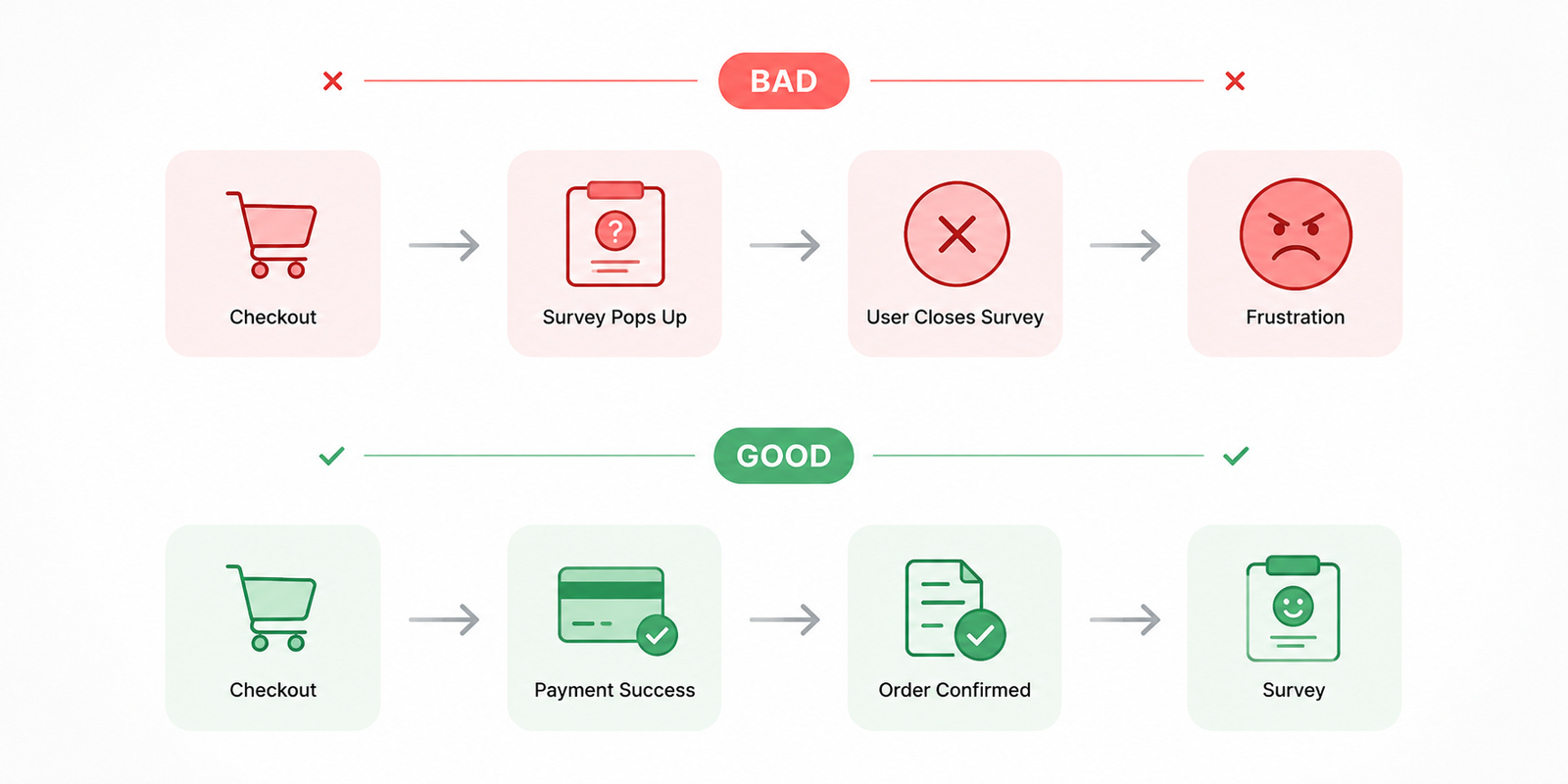
Rule 3: Never interrupt a critical flow. Checkout, onboarding setup steps, payment entry, form completion: these are moments where a feedback prompt creates friction that directly threatens conversion. A frustrated user trying to close a modal during checkout will give a score that reflects that interruption. More importantly, you risk the conversion itself. No piece of feedback is worth a dropped transaction.
Rule 4: Set a frequency cap per user. One feedback request per user per 90 days is the standard starting point for most consumer apps. Userpilot's 2026 user feedback guide identifies over-surveying as the primary driver of declining response quality over time: users who see the same prompt repeatedly either dismiss it automatically or submit low-effort responses to make it go away. Both outcomes corrupt your dataset.
Choosing the Right Feedback Format
The format you choose determines what kind of signal you get. Each type is built for a specific situation, and mixing them up wastes both the user's time and yours.
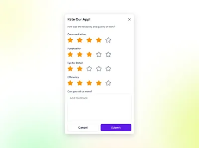
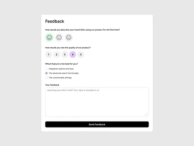
Rating widgets (star or numeric scale) work best for feature-level feedback immediately after a specific interaction. They are fast to complete, produce quantifiable data, and are easy to embed at natural pause points like task completion screens or order confirmations. The limitation: a rating alone tells you the sentiment but not the reason. Use them when you have enough volume to find patterns across scores, or when you already have a hypothesis about what is driving satisfaction or dissatisfaction.
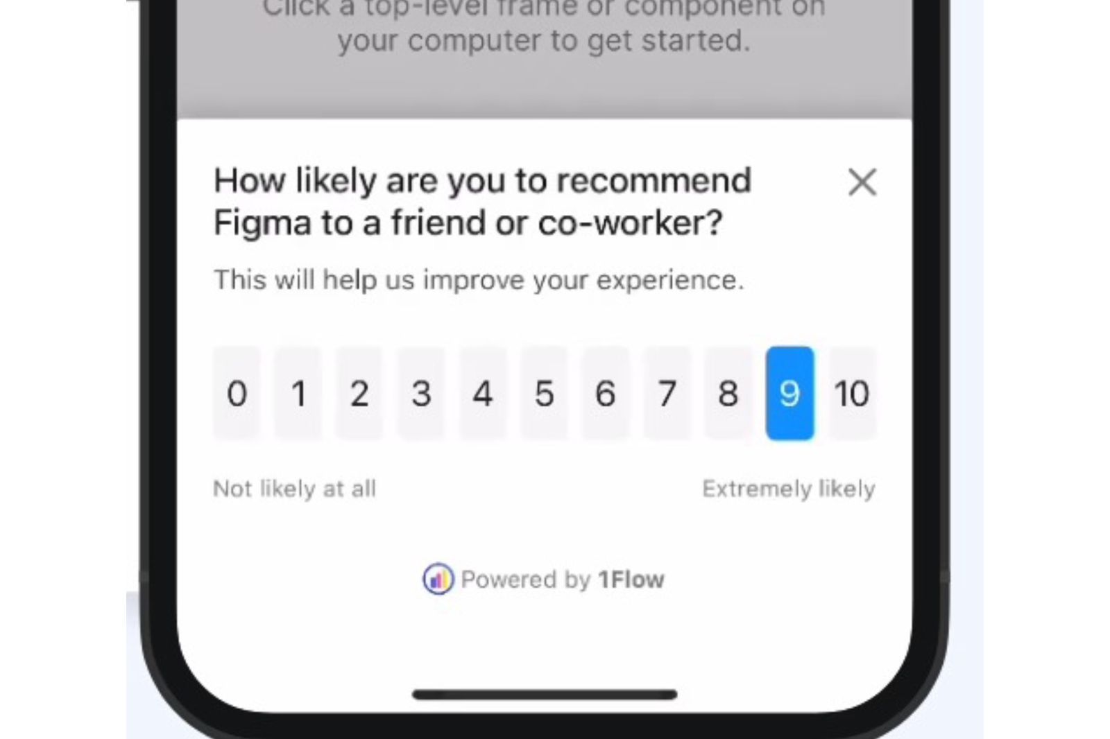
NPS (0 to 10 scale) measures relationship-level loyalty, not interaction-level satisfaction. It belongs on a cadence, not on individual feature triggers. The right moment for NPS is after multiple sessions, after a milestone that confirms the user has experienced meaningful product value. Digia Engage's own data shows in-app NPS hitting 30% or higher response rates on consumer mobile apps, compared to a 3% baseline for email NPS. For a deeper look at how in-app NPS compares to email NPS on timing, placement, and data quality, see In-App NPS vs Email NPS: Response Rates, Timing & Best Practices.
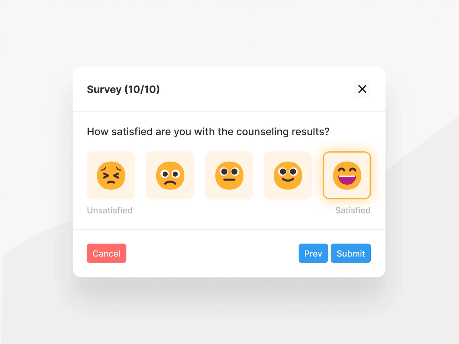
Emoji feedback is the fastest format for capturing broad sentiment without breaking the flow. Post-task emoji prompts (three to five options, no follow-up required) work well for high-volume, high-frequency interactions where you want directional signal at scale without the cognitive overhead of a scale rating. Uber's post-ride feedback, Expedia's in-app check-in survey, and Duolingo's lesson feedback all use this model for a reason: the tap-and-done interaction takes under three seconds and generates almost zero session friction.
Open-text input produces the richest feedback but the lowest response rate and the highest effort from the user. It belongs at the end of a short survey as an optional follow-up ("What's the main reason for your score?"), or as a persistent always-available widget for users who want to report something specific, like a bug or a feature request. Do not make open text the primary collection mechanism at scale. You will get responses from your most frustrated users and your most enthusiastic ones, and that skewed sample will mislead product decisions.
Making Feedback Feel Native
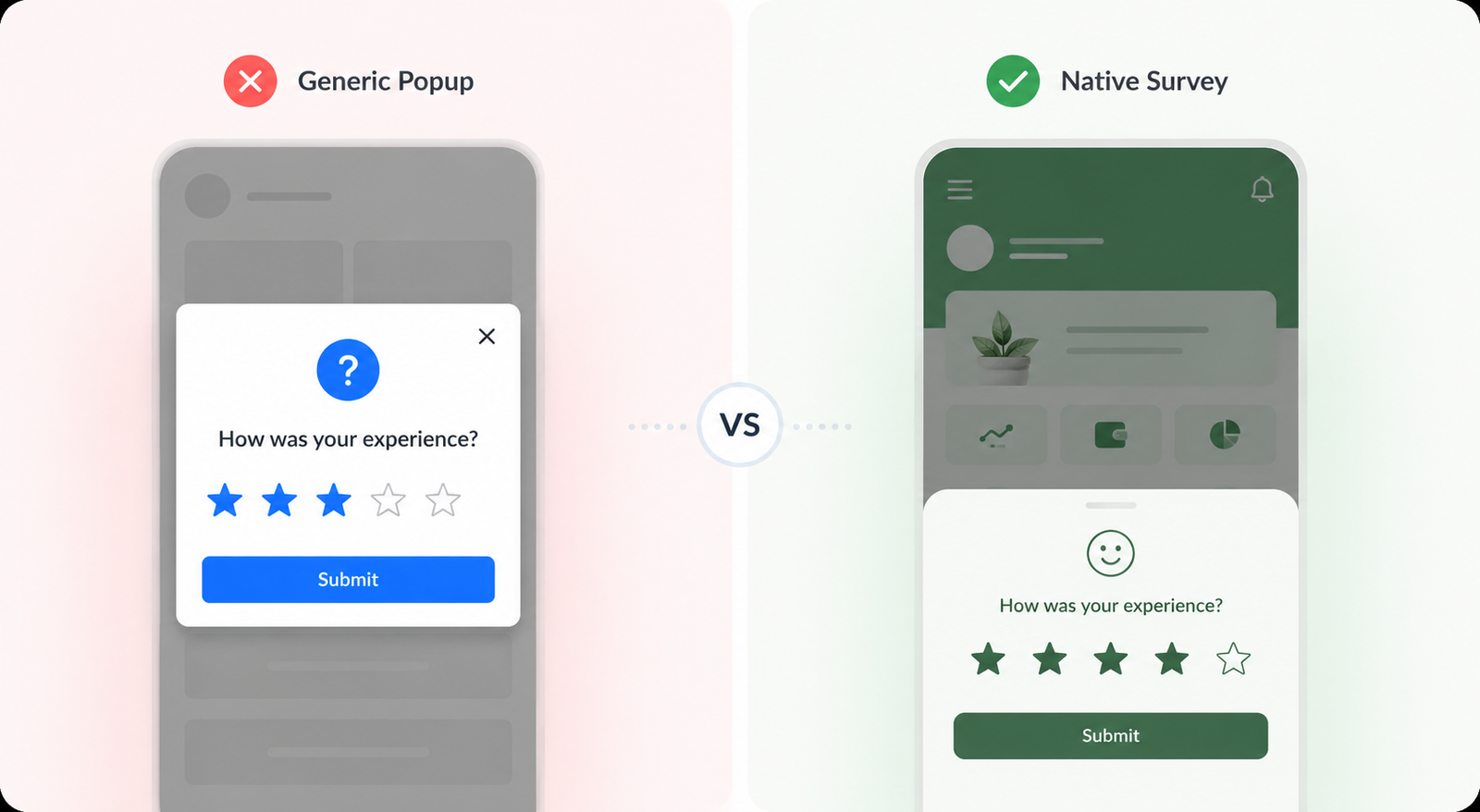
A feedback prompt that looks visually foreign to your app is a prompt users will not trust. The visual mismatch signals that the survey comes from a different product, which creates friction and lowers both response rate and response quality.
Four design principles apply here:
Match your app's visual language. The widget's typography, colors, border radius, and interaction patterns should match the rest of the product. A cookie-cutter modal styled for a generic SaaS tool will look out of place inside a fintech or media app. Refiner's 2025 placement research specifically identifies native visual styling as a measurable factor in response rate.
Keep the tap target large enough for mobile. A 0 to 10 NPS scale on a small bottom sheet with cramped spacing creates accidental selections. Spacing, tap target size, and the dismiss button all need to be designed for one-handed mobile use, not ported over from a desktop web format.
Always include a dismiss option. Users who do not want to respond should be able to close the widget without feeling blocked. Forced engagement with a feedback prompt generates noise, not signal, and trains users to ignore or dismiss future prompts faster. A "Remind me later" option for users mid-task also preserves response quality by reaching them at a better moment.
Position it at a natural pause point in the layout. Bottom sheets, post-action confirmation screens, and inline placements embedded into summary screens all work well. Center-screen modals produce the highest raw response rates (42.6% in Refiner's 2025 data) but create the most session disruption. The right choice depends on which matters more for your product at that specific moment.
What Not to Do: The Common Mistakes
Surveying on session one. Covered above, but worth repeating: the feedback is noise. A user with one session has not formed any real sentiment about your product.
Using a generic email survey as the primary feedback channel. Retently's 2025 survey response rate study found that in-app surveys operate in "an entirely different range" than email, with email response rates consistently capped even with optimization. For consumer mobile apps, in-app is now the primary channel and email is the fallback for users who dismiss the in-app prompt.
Asking too many questions at once. Short in-app surveys outperform long ones by a measurable margin. Single-question surveys perform well. Four to five question surveys perform best overall, according to Refiner's 2025 data. Anything longer than five questions should be reclassified as a research study, not an in-app survey.
Collecting feedback and doing nothing visible with it. Users stop responding when they stop seeing evidence that their feedback matters. As Elliott Risby, co-founder and UX Designer of Frill, puts it: "We had a feedback widget for over a year before we realized it was working against us. Users had stopped bothering because nothing ever visibly happened with what they submitted." Connecting feedback to a visible roadmap or a follow-up communication closes this loop.
Triggering feedback on every screen. Survey fatigue is real and fast-moving. Quackback's 2026 analysis shows that re-surveying too soon is one of the primary reasons response rates fall over time. A user-level frequency cap is not optional.
How In-App NPS Works on Mobile
In-app NPS fires during an active session based on a behavioral event or timing condition. The user receives the 0 to 10 scale question inside the app, responds in context, and optionally adds a follow-up comment. No inbox required. No context switch.
The mechanics that separate effective from ineffective in-app NPS are trigger precision and follow-up design. Trigger on "completed 3 sessions AND completed core action X," not on "opened the app." The follow-up question should be optional, limited to a single open-text field, and specific: "What's the main reason for your score?" produces more actionable data than "Any other comments?"
For mobile teams setting up in-app feedback across multiple formats, including NPS, emoji feedback, and quizzes, Digia Engage's Surveys feature handles event-based triggers, frequency caps, and native styling from one dashboard, with no app release needed. Campaigns fire in under 100ms. For context on how feedback triggers fit into a broader in-app engagement strategy, see how in-app nudges work and Digia's Insights and Feedback use case page.
Key Takeaways
In-app feedback on mobile produces response rates 2 to 4 times higher than email, but only when the timing, format, and placement are right.
Trigger conditions are the highest-leverage variable in your setup. "After 3 sessions and a completed core action" beats every other configuration tested in the research. First-session surveys produce noise, not signal.
Format choice should match the signal you need. Rating widgets and emoji feedback give directional data fast. NPS measures loyalty on a cadence. Open text gives depth but needs to be optional.
Native visual styling is measurable in its effect on response rate. A widget that looks foreign to the product will underperform a native-styled one at the same trigger point.
Frequency caps are mandatory. One feedback request per user per 90 days is the standard starting point. Users who see the same prompt repeatedly stop engaging with it.
Closing the feedback loop is what keeps users responding. If feedback disappears into a dashboard and nothing changes, response rates will fall over time.
Further Reading
From Digia Engage:
- In-App NPS vs Email NPS: Response Rates, Timing & Best Practices - Full comparison of in-app vs email NPS, including placement data, response rate benchmarks, and a practical setup checklist
- What Are In-App Nudges and How Do They Work? - Trigger logic, format types, and session timing for in-app experiences
- Surveys & Feedback Feature - How Digia Engage handles in-app NPS, emoji feedback, and quizzes without an app release
- Insights and Feedback Use Case - How mobile teams collect and act on in-app feedback across the user lifecycle
Sources
- Refiner In-App Survey Response Rate Report 2025 - 1,382 surveys, 5M+ views, response rate and placement data
- Refiner In-App Feedback Best Practices, January 2026 - Timing, targeting, and survey design guidance
- Retently Survey Response Rate Study 2025 - Channel-by-channel response rate data, in-app vs email comparison
- Userpilot User Feedback Guide 2026 - Behavioral targeting, trigger conditions, and over-surveying analysis
- Frill: Why In-App Feedback Beats Every Other Channel - Closing the feedback loop and always-available widget design
- Zonka Feedback: Top In-App Feedback Tools 2026 - Feedback type classification, trigger type definitions
- Quackback: How to Improve Survey Response Rates 2026 - Survey fatigue and re-surveying effects
- Braze: In-App Surveys Best Practices, November 2025 - Trigger moment selection and format guidance
- Amplitude: A Guide to Collecting In-App Feedback, April 2026 - Format types, response rate optimization, and feedback loop design
- Doorbell.io: In-App Feedback Methods Guide - Format comparison across NPS, emoji, star rating, and open text
In-app surveys on Digia Engage fire in under 100ms, require no app release, and are configurable from one dashboard for iOS, Android, React Native, and Flutter apps. Book a demo to see how it works inside your own product.