





TL;DR
- Feature adoption problems are almost always misdiagnosed as awareness problems. Teams run tooltips and tours, users click through them, and adoption does not move.
- The real problem is almost never that users do not know the feature exists. It is that they do not have a reason to use it at the moment they first encounter it.
- There are three root causes of adoption failure. The discovery gap means users are not finding the feature. The value gap means users find it, try it once, and do not return. The timing gap means the feature is discoverable and valuable but fires before the user has the context to benefit from it.
- Each cause requires a different fix. Awareness campaigns fix discovery gaps. Activation sequence design fixes value gaps. Contextual trigger logic fixes timing gaps. Running the same awareness campaign at all three is why adoption does not move.
- The article covers a six-step framework: define what adoption actually means for this specific feature, map the discovery path, identify the aha moment, build the activation sequence from first exposure to second use, suppress the wrong users, and measure the four-stage funnel.
- The measurement standard is not an adoption rate improvement. It is a retention lift in the adopter cohort compared to an eligible non-adopter holdout group. A campaign that moves adoption metrics without moving retention has moved the wrong number.
Only 12% of a product's features attract the majority of user engagement. The rest exist, they were built and shipped, they are visible somewhere in the product, but most users never use them more than once if they use them at all. The average core feature adoption rate across the industry sits at 24.5% per the Product Metrics Benchmark Report 2024, which analysed 181 SaaS companies. That means for most features in most apps, three quarters of the active user base are not engaging with what the product team built.
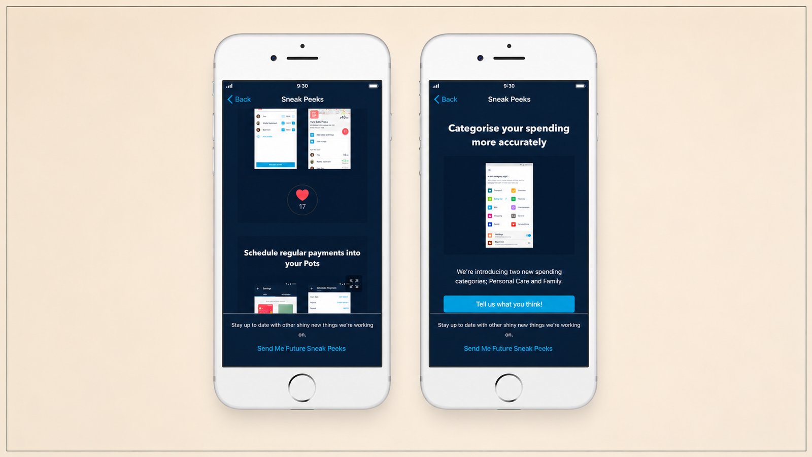
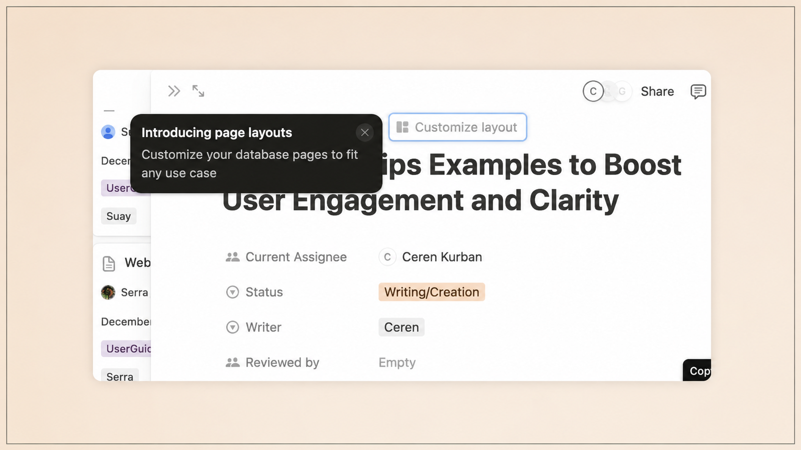
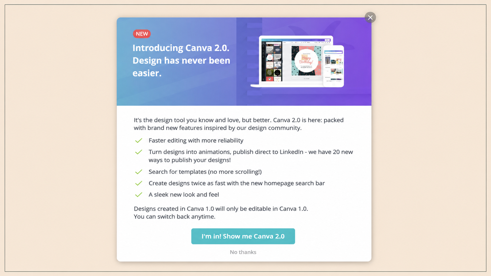
The reflexive response is a feature announcement campaign. A tooltip pointing at the feature. A push notification. A "What's New" badge. An onboarding tour step that highlights the feature's existence. These interventions generate awareness. A user who clicks a "What's New" badge and reads about a feature has discovered it. A user who applies it three times in the first two weeks has adopted it. Those are different things, and the distance between them is where most feature adoption investment goes to waste.
Why Feature Adoption Fails: The Three Root Causes
Before choosing an intervention, the team needs to diagnose which of the three root causes is actually present. Each one looks similar in the surface metrics but requires a completely different fix.
The discovery gap. The feature exists but users are not finding it. This is the one case where awareness campaigns are the correct response. The diagnostic signal: users who do find the feature show reasonable engagement and return rates, but overall adoption breadth is low because most users never reach the feature's entry point. If breadth is low, the problem is discovery: run a targeted in-app onboarding flow or feature announcement for users who have not encountered the feature yet.
The value gap. Users find the feature, try it, and do not return. This is the most common misdiagnosis in feature adoption. Teams run more awareness campaigns when the feature's discovery rate is already adequate. The diagnostic signal: activation rate is acceptable (users are trying the feature) but second-use rate is low. When users activate but do not return, the feature delivered enough value to try but not enough to keep. Three signals point to a value gap: users complete the workflow once but never repeat it, time between first and second use is long and inconsistent, and the feature's retention cohort diverges sharply from the product's overall retention cohort.
The timing gap. The feature is discoverable and genuinely valuable, but users encounter it at a moment when they do not have the context or the immediate need to use it. A user who encounters the portfolio analytics feature in a fintech app on Day 1, before they have made any investments, has no frame of reference for it. The same user encountering it on Day 14, after their first three investments, would find it immediately useful. The timing gap is the most underappreciated of the three causes, and it is the one that contextual in-app triggers are specifically designed to address.
Most failed feature adoption campaigns suffer from the timing gap dressed up as a discovery gap. Teams send feature announcements to everyone in their active user base when the feature is most relevant for a specific subset of users at a specific lifecycle moment.
The Awareness-vs-Adoption Distinction
The distinction between awareness and adoption is worth spending time on because conflating the two produces the specific failure mode this article is about.
Awareness is a state of knowledge: the user knows the feature exists. Awareness is produced by tooltips, banners, push notifications, "What's New" modals, and feature tours. It can be generated quickly, cheaply, and at scale. It is also entirely possible to generate high awareness rates for a feature that sees almost no adoption, because awareness and adoption measure different things.
Adoption is a behaviour: the user uses the feature, finds it valuable, and uses it again. Adoption is not produced by announcements. It is produced by the user having a reason to use the feature at the moment they first encounter it, receiving enough value from the first use to motivate a second, and having a path back to the feature that does not require deliberate effort to navigate.
In-app prompts delivered at the right moment are far more effective than static banners, driving 3 to 5 times higher feature adoption compared to email announcements alone. The multiplier is not about the format. It is about the timing. A contextual prompt that fires when the user is on the screen adjacent to the feature, immediately after completing the action the feature enhances, delivers awareness at the moment adoption is possible. An email announcement delivers awareness when the user is not in the product at all.
Teams that optimise for awareness metrics (tooltip impression rates, feature page views, announcement open rates) and report them as adoption proxies are measuring the wrong thing and building false confidence in campaigns that are not producing the outcome they were designed for.
Step 1: Define Adoption for This Feature
The first step in any feature adoption framework is defining what adoption actually means for the specific feature being addressed. This sounds obvious and is almost universally skipped.
The definition of "adopted" differs by feature type. For a recurring utility feature (a payment reminder in a fintech app), adoption means using it at least twice in the first 14 days. For a one-time setup feature (connecting a bank account), adoption means completing the setup once. For a discovery feature (a product recommendation engine in an e-commerce app), adoption means returning to it across multiple sessions. Setting the wrong adoption definition produces the wrong intervention.
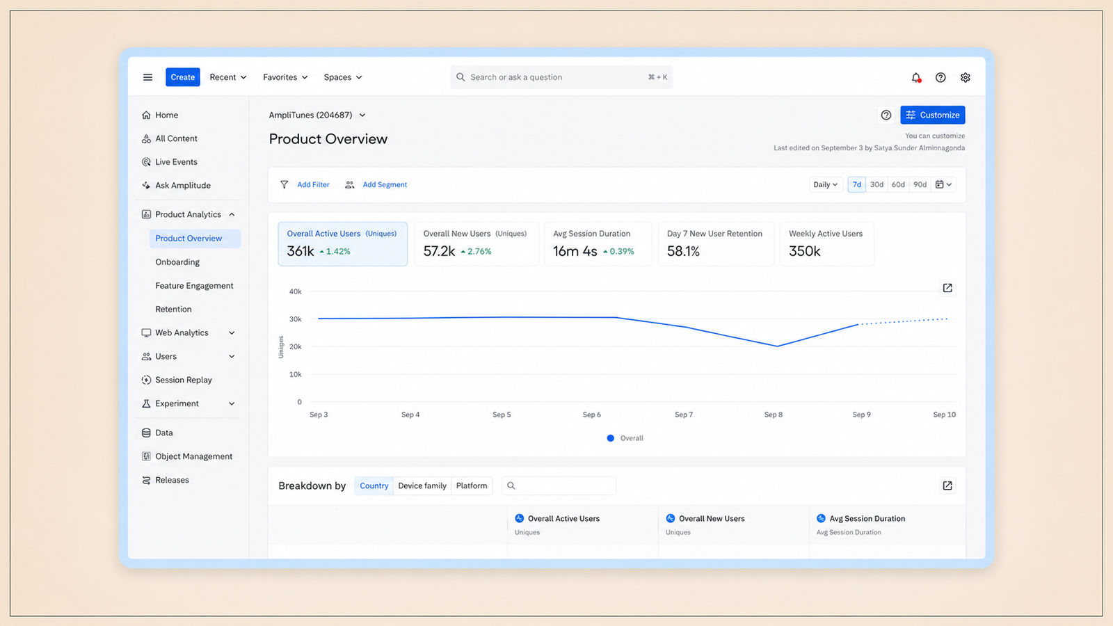
Users who create three or more reports in their first two weeks are far less likely to churn. That becomes the real adoption target, not just a vague "used the feature" checkbox. Finding the specific usage threshold that correlates with retention is the correct way to define adoption, not picking an arbitrary "used at least once" metric.
The practical exercise: pull the event data for the feature and compare the behaviour of users who retained at 30 days against users who churned at 30 days. The usage pattern that most distinguishes retained users from churned users, in terms of the feature in question, is the adoption definition worth building toward.
Step 2: Map the Discovery Path
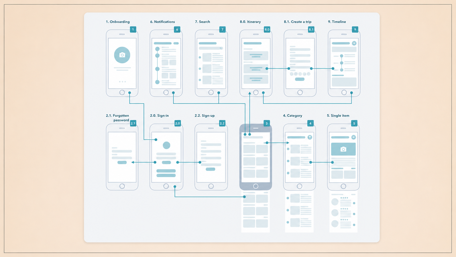
Once adoption is defined, the next step is understanding how users currently encounter the feature. This is a navigation analysis, not a content analysis.
Users who do discover the feature may show high engagement, but if overall adoption breadth is low, check the UI analytics: are users even reaching the feature's location? If users are not navigating to the feature's screen, the awareness campaign is solving a problem that does not exist. The problem is that the feature is not on a path most users travel.
The discovery path audit has four questions. First, what is the entry point to the feature, and how many taps does it take to reach from the home screen? A feature that requires three taps to reach from the most common session start point will see lower discovery than a feature reachable in one. Second, are there any natural trigger moments in the existing user flow where the feature would be immediately relevant? A portfolio rebalancing feature in a fintech app is most naturally discovered immediately after a user views their portfolio allocation. Third, what percentage of active users pass through the screens adjacent to the feature's entry point in a typical session? If 80% of sessions never pass through the section of the product where the feature lives, awareness campaigns sent to the full active user base are targeting the wrong moment. Fourth, what do power users who have adopted the feature do differently in their navigation pattern from users who have not adopted it?
Sephora's virtual artist AR feature had a discovery problem, not a value problem. After implementing a targeted in-app messaging strategy using push, content cards, and in-app messages, segmented to users who had viewed a makeup product page but had not used the feature, they saw a 28% increase in AR feature adoption, a 16% uplift in usage per user, and a 48% increase in overall feature traffic. The fix was not in the feature itself. It was in the communication around it. Segmenting the campaign to users who had demonstrated adjacent intent (viewing makeup products) rather than broadcasting to all active users is the discovery path insight applied to campaign targeting.
Step 3: Identify the Aha Moment for This Feature
The aha moment is the specific point in the user's first interaction with a feature at which they receive enough value that they would notice its absence. It is the moment that converts a user who is trying the feature into a user who has a reason to return to it.
The aha moment is not the same as the first use. A user can use a feature once without experiencing the aha moment if the first use does not deliver the outcome that makes the feature valuable. A user who opens the SIP calculator in a fintech app and sees a projection of their savings in 10 years has experienced the aha moment. A user who opens the SIP calculator, fills in one field, and exits because the next step was unclear has not.
Identifying the aha moment for a specific feature requires analysing the difference between users who returned to the feature for a second use and users who did not. The action that most commonly precedes a second use, within a first session, is the aha moment candidate. For a fintech app's investment feature, the aha moment is typically completing the first investment and seeing the transaction confirmed in the portfolio. For a fitness app's workout tracker, it is completing the first workout and seeing the session summary. For a language app's new vocabulary feature, it is completing the first vocabulary quiz and seeing the score.
The feature adoption funnel moves through four stages: Exposed (user sees the feature), Activated (user takes the first action), Used (user completes the workflow), and Used Again (user returns). Low activation might point to discoverability issues, while high activation paired with low second-use rate signals a value gap. The aha moment is the event that needs to fire between Used and Used Again.
Once the aha moment is identified, every preceding step in the first-use flow should be evaluated against whether it accelerates or delays the user's path to that moment. Steps that delay it are candidates for removal or deferral.
Step 4: Build the Activation Sequence
The activation sequence is the in-app journey from first exposure to second use. It is not a single nudge. It is a series of contextual interventions, each triggered by a specific user action, that guides the user toward and through the aha moment and then pulls them back for a second use.
The activation sequence has four components:
The discovery trigger. An in-app nudge that fires when the user is in the context most adjacent to the feature's entry point, at the session moment when they are most likely to have the problem the feature solves. This is the trigger that converts a user who would have walked past the feature into a user who tries it. The trigger fires on a specific event (completing a transaction, viewing a product, reaching a specific session depth), not on a schedule or at session start.
The first-use guide. Once the user enters the feature, contextual guidance at the first interaction point that removes the friction between feature entry and aha moment. This is a tooltip or a single-step guide at the precise action point, not a multi-step tour of the feature's full capability. The guide answers one question: what should I do right now to see this feature's value?
The aha moment reinforcement. Immediately after the user hits the aha moment, a confirmation that makes the value explicit. Not a generic success message. A specific message that connects the action to the outcome: "You just set up your first SIP. Your projected balance in 10 years at this rate is X." This message closes the loop between effort and value, which is what creates the return intention.
The second-use trigger. A contextual nudge that fires two to four days after the first use, at a session moment when returning to the feature would be natural. For a portfolio analytics feature, the second-use trigger fires when the user opens the app after a market movement that would make portfolio analysis relevant. For a savings goal feature, it fires when the user's account balance crosses a threshold. The second-use trigger is what converts a one-time user into an adopter.
In-app video tutorial content is the highest-converting first-use format for features with any complexity above a single tap, producing significantly higher completion rates than text-based guides because it shows the feature in use rather than describing it. For the first-use guide component, video that demonstrates the feature in the actual app UI performs better than text tooltips alone.
Step 5: Suppress the Wrong Users
Not every user needs every feature. A nudge campaign for an advanced investment analytics feature sent to users who have not yet made a first investment is not just ineffective. It is actively damaging because it creates a negative first impression of the feature by presenting it without the context required to understand its value.
Feature adoption campaigns need suppression logic on two dimensions: lifecycle stage and behavioural readiness.
Lifecycle stage suppression ensures the campaign only fires for users who are at the right point in the product journey to benefit from the feature. An SIP calculator nudge should suppress for users who have not yet completed KYC, because the SIP feature is not accessible to non-KYC users regardless of how compelling the nudge is. A portfolio rebalancing nudge should suppress for users who have not yet made three or more investments, because the feature only makes sense when there is a portfolio to balance.
Behavioural readiness suppression ensures the campaign fires for users who have recently performed the adjacent action that creates readiness for the feature. A savings goal feature is most relevant to a user who has just made a deposit. A comparison tool in an e-commerce app is most relevant to a user who has just viewed two similar products. Behavioural readiness suppression is what converts a generic awareness campaign into a contextually targeted one.
Limiting active in-app campaigns to two to three features at a time reduces the risk of guidance fatigue. Static banners see 8 to 12% engagement in the first week, dropping to 2 to 3% by week three as users grow immune to them. Suppression logic is what keeps campaign quality high by ensuring users only receive nudges for features they are genuinely positioned to adopt. Volume without targeting is what produces the immunity effect.
Step 6: Measure and Iterate
Feature adoption measurement requires a four-stage funnel, not a single adoption rate metric. Each stage produces a different diagnostic signal.
Exposure rate. The percentage of active users who see the feature's entry point or a discovery nudge for the feature. Low exposure rate is a discovery gap. The fix is in navigation (making the entry point more visible) or in targeting (getting the discovery nudge in front of the right users).
Activation rate. The percentage of exposed users who take the first action within the feature. Low activation rate with adequate exposure is a value gap at the entry point. The feature's first screen or first prompt is not compelling enough to pull users through. The fix is in first-use design: reduce steps, add the first-use guide, show the aha moment earlier in the flow.
Completion rate. The percentage of activated users who reach the aha moment. Low completion rate with adequate activation means users are starting the feature flow but abandoning before value delivery. The fix is in friction reduction: find the specific step where users drop off and remove it or add contextual guidance at that step.
Second-use rate. The percentage of users who completed the feature flow at least once and returned to use it again within 30 days. Low second-use rate with adequate first-use completion is a value gap at a deeper level: the feature worked once but was not valuable enough to create a return habit. The fix is in the second-use trigger and in whether the aha moment reinforcement made the value explicit enough.
The pre-post cohort method compares the behaviour of users who adopted the feature against users who were eligible but did not adopt, across the same time window. If users who adopt a new collaboration feature have 85% 30-day retention while non-adopters have 70%, you can claim a 15-percentage-point retention lift. Feature adoption measurement should connect to retention outcomes, not stop at the adoption funnel itself.
What "done" looks like in feature adoption is specific and quantifiable: a second-use rate above the threshold identified in Step 1, a measurable retention lift in the adopted cohort compared to an eligible non-adopter holdout group, and a time-to-adopt that is decreasing across successive cohorts as the activation sequence improves. Any campaign that does not produce at least one of these outcomes is not an adoption campaign. It is an awareness campaign producing awareness metrics while retention stays flat.
Topics Not in the Brief That Teams Should Know
Feature retirement as an adoption signal. Low adoption rates, when combined with low retention impact in the adopted cohort, are data the product team should act on. A feature that very few users adopt and whose adopters do not show meaningfully better retention than non-adopters is a candidate for retirement, not for a new adoption campaign. Most teams run more campaigns on low-adoption features rather than using the adoption data to inform product prioritisation decisions.
Power user analysis as a shortcut. The fastest way to identify the aha moment for a specific feature is to interview or observe users who have already adopted it. What did they do in their first session that others did not? What was the specific moment when the feature clicked? Power user patterns, reverse-engineered into the activation sequence, produce better adoption campaigns than campaigns built from first principles without behavioural data.
Feature adoption and its connection to NPS. Users who adopt three or more features consistently show higher NPS scores than users who use only core features. Feature adoption is one of the strongest leading indicators of Net Revenue Retention. The business case for feature adoption investment is not feature-level engagement. It is the connection between feature breadth and the retention outcomes that drive subscription revenue.
A/B testing the activation sequence, not the feature. Most feature adoption A/B tests compare two versions of a feature announcement. The higher-value test is two versions of the activation sequence: different trigger timing, different first-use guide format, different aha moment reinforcement message. The feature content is fixed. The activation journey is what determines whether the feature gets adopted.
Key Takeaways
Feature adoption fails for one of three reasons: users do not find the feature (discovery gap), users find it but do not return (value gap), or users find it at a moment when they do not have the context to use it (timing gap). Diagnosing which one is present determines the correct intervention. Awareness campaigns fix discovery gaps. Activation sequence design fixes value gaps. Contextual trigger logic fixes timing gaps.
Awareness and adoption are different things. A tooltip impression is not a first use. A first use is not adoption. Adoption is the second use and beyond, at a frequency that correlates with retention improvement in the adopter cohort.
The six steps are: define adoption as the specific usage threshold that correlates with retention improvement, map the discovery path to understand whether the feature is even on a route most users travel, identify the aha moment from the behavioural difference between users who returned and users who did not, build the activation sequence as a series of contextual triggers from first exposure to second use, suppress the wrong users using lifecycle stage and behavioural readiness criteria, and measure the four-stage funnel (exposure, activation, completion, second use) rather than a single adoption rate.
Feature adoption campaigns sent to the full active user base without lifecycle stage and behavioural readiness suppression generate immunity effects: static banners see 8 to 12% engagement in week one and 2 to 3% by week three. Suppression logic is what keeps campaigns effective rather than habituated-against.
The measurement standard for a feature adoption campaign is a measurable retention lift in the adopter cohort compared to an eligible non-adopter holdout group. An adoption campaign that improves adoption rate metrics without improving retention is improving the wrong number.
Further Reading
From Digia Engage:
- When NOT to Show a Nudge: Building a Suppression Logic — the suppression framework covering lifecycle stage and behavioural readiness suppression for feature adoption campaigns
- In-App Video for Feature Discovery: A Growth Team's Guide — the highest-converting format for the first-use guide component of the activation sequence
- The Anatomy of a Great In-App Onboarding Tour — step structure and format decisions for the feature discovery trigger and first-use guide
- How to Know If Your Personalization Is Actually Working — the holdout group measurement framework for confirming that adoption campaigns produce retention lift
- Mobile App Retention Rate: What It Is and What's Pulling It Down — the retention context for understanding why feature adoption breadth is a leading indicator of D30 retention
- Digia Engage Nudges — event-based trigger architecture for the discovery trigger, first-use guide, and second-use trigger components of the activation sequence
External Sources:
- Feature Adoption Guide: Metrics, Funnel and How to Improve — Appcues (awareness vs. adoption distinction; four-stage funnel definition; feature adoption as a leading indicator of NRR)
- Feature Adoption Metrics: The PM's Diagnostic Guide — Userpilot (breadth, depth, duration, and time-to-adopt as diagnostic metrics; step-specific drop-off analysis)
- How to Measure Feature Adoption: A Complete Framework for Product Teams — Contentsquare (four-stage funnel; pre-post cohort comparison for retention lift; value gap vs. discoverability gap diagnostic)
- Feature Adoption Metrics: Lessons from SaaS Founders — CodeStory (3 to 5x adoption lift from contextual in-app prompts vs. email; 8 to 12% banner engagement dropping to 2 to 3% by week three; billing SaaS dunning email adoption case study from 9% to 28%)
- Feature Adoption Rate: Calculate and Improve — Count (poor discoverability diagnostic; contextual prompt timing as the primary adoption lever; progressive feature introduction framework)
- Feature Adoption Metrics: 2026 Benchmarks — Artisan Strategies (24.5% average core feature adoption rate; 31% for HR products; interactive walkthroughs vs. traditional documentation comparison)
- Feature Adoption Metrics — Appcues (duration of adoption; breadth of adoption; time-to-first-key-action calculation method)
- Feature Adoption Rate: Definition, Formula and Benchmarks — Ideaplan (core feature benchmark 50%+; secondary feature 20 to 40%; power user analysis as the shortcut to identifying high-value workflows)
- What is Feature Adoption: Key Metrics and Best Practices — Chameleon (the Exposed, Activated, Used, Used Again funnel; advanced feature adoption focus for products beyond the core workflow)
- Mobile App Metrics: A PM's Diagnostic Guide — Userpilot (Sephora AR feature 28% adoption lift from contextual in-app messaging; 24.5% average core feature adoption benchmark from 100+ companies)
The discovery trigger, first-use guide, aha moment reinforcement, and second-use trigger components of the activation sequence are all configurable in Digia Engage as event-based nudges, without engineering tickets after initial SDK integration. Each trigger fires within 100ms of the qualifying event, which means the discovery nudge appears at the session moment of maximum contextual relevance rather than at session start or on a fixed schedule. Book a demo to see an activation sequence configured for a specific feature adoption use case, or explore the nudges product page for the full trigger and suppression configuration options.