





TL;DR
- Stories started on social media and got adopted everywhere by imitation. Most apps use the format because users are already familiar with it, not because the content actually fits it.
- That is a coincidence, not a strategy, and it produces mediocre results.
- When the format is used with intent, the right content, the right context, and the right CTA, it becomes one of the highest-engagement formats available in mobile.
- The article covers why stories work mechanically: autoplay, tap-to-advance, full-screen focus, and the completion loop.
- It covers why in-app stories need a different content strategy than social stories, because the intent is product engagement rather than social connection.
- It covers which content types belong in the format and which do not.
- It covers the design specifics that separate a 60% completion rate from a 15% one.
- It covers where teams get it wrong.
64% of users prefer content delivered in a tappable Story format over the scrolling article equivalent, according to Forrester Consulting research. That preference is not about the specific content shown in the format. It is about the format itself: full-screen, tap-driven, fast to consume, with no scrolling required and no ambiguity about what to do next. This is what makes stories a genuinely powerful engagement mechanic when the content matches the format's strengths.
The problem is that most apps that have added a stories carousel to their home screen did so because the format looked familiar and users already know how to use it, not because their content is genuinely suited to full-screen, sequential, tap-driven consumption. A stories rail full of static promotional banners is not using the format. It is wearing the format's UI without adopting its mechanics. In-app Stories customers see, on average, an 8% increase in conversion rate and a 64% higher conversion rate compared to banners, which is a meaningful gap, but that gap only opens up when the content inside the format is designed for the format, not repurposed from something else.
Why the Stories Format Works Mechanically
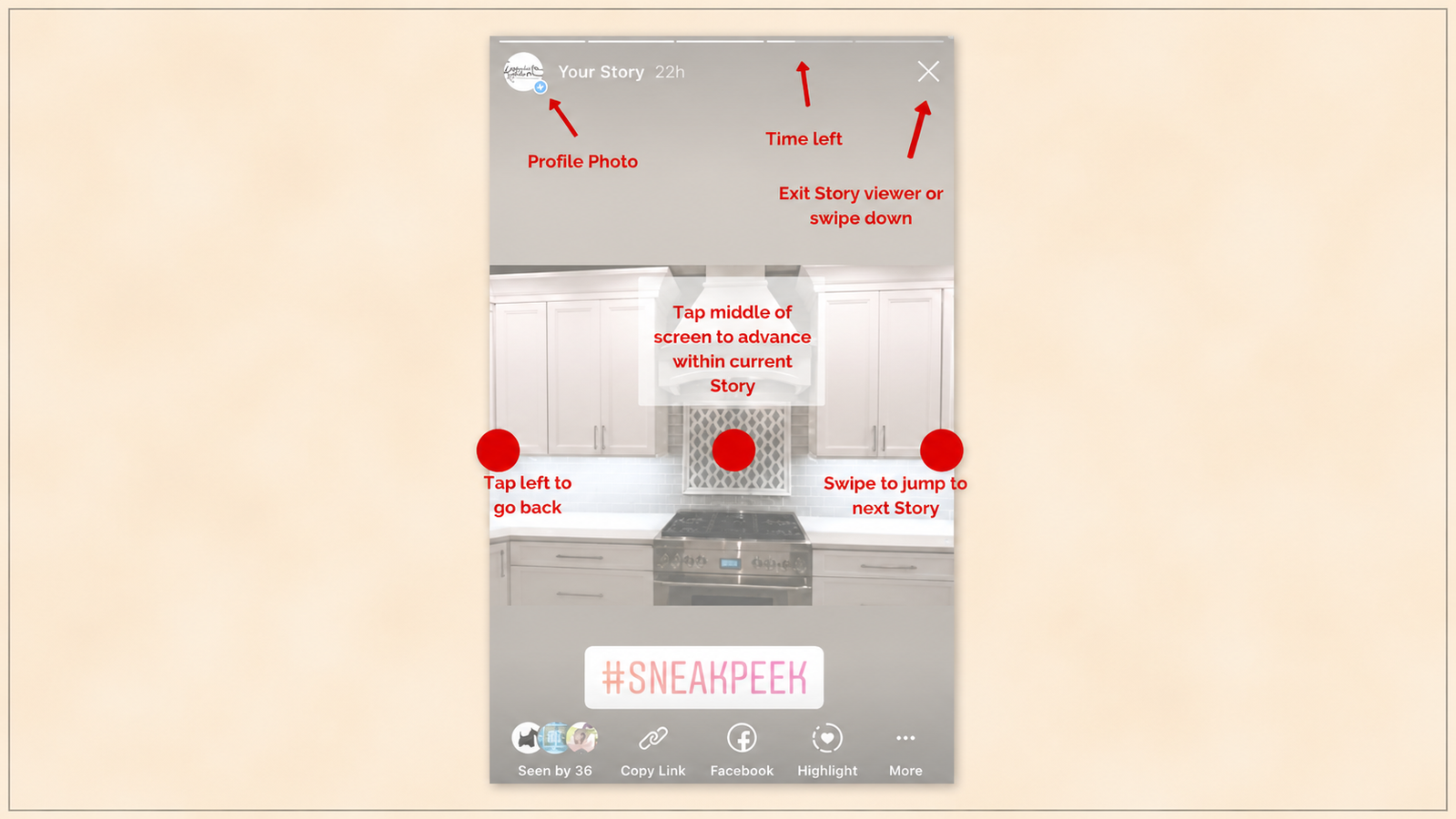
Four mechanical properties of the stories format do specific work on user attention. Understanding each one is the prerequisite for deciding what content belongs in the format and what does not.
Autoplay. Content advances without requiring the user to take an action to see the next piece. This removes the single highest-friction decision point in any content format: should I continue? Autoplay answers that question by default, in favour of continuing, unless the user actively intervenes. The mechanical effect is that consumption becomes the default state and stopping becomes the deliberate action, which is the inverse of a scrolling feed where continuing requires an active swipe and stopping is the default when attention lapses.
Tap-to-advance. The interaction model is binary and instant: tap the right side to move forward, tap the left side to go back, no reading of instructions required. In-app Stories are as easy to use as touch screens are easy to use, with virtually no learning curve. This zero-learning-curve property matters because it removes any friction between intent and action. A user who wants to skip a piece of content does not need to find a skip button. They tap. The interaction cost of engaging with the next piece of content is effectively zero, which keeps the consumption loop moving without interruption.
Full-screen focus. The format occupies the entire viewport, with no competing navigation elements, no adjacent content, and no visual distractions. The success of a mobile advertising campaign depends on choosing the right format, and full-screen formats deliver an immersive experience that fully occupies user attention. This is the mechanical property that separates stories from a banner or an inline card: nothing else on the screen is competing for the eye. Whatever message is in the story is receiving the totality of the user's visual attention for that moment, which is a scarce resource that almost no other in-app format can claim.
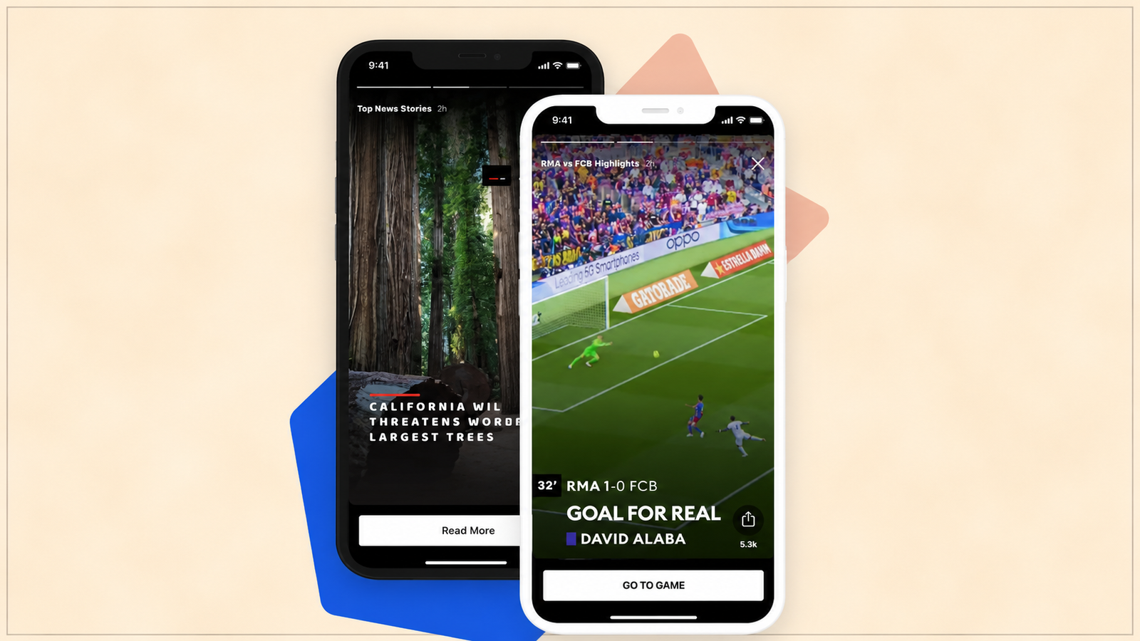
The completion loop. A stories sequence has a visible start and end, marked by progress indicators (typically thin bars at the top of the screen) that show how many pieces of content remain and how far through the current piece the user has progressed. This visible progress creates what behavioural psychology calls the Zeigarnik effect: a preference for completing started tasks over leaving them unfinished. A user who has watched 3 of 5 story segments experiences a mild but real pull to finish the remaining 2, a pull that a standalone piece of content with no visible sequence does not generate. The progress bar is not decoration. It is the mechanism that converts a single piece of content into a completion-driven sequence.
Together, these four properties produce an attention state that is unusually concentrated for mobile: the user is not deciding whether to continue, is not distracted by adjacent content, and has a visible incentive to finish what they started. This is the mechanical foundation the format has to offer. What content deserves that attention state is a separate question, and it is the question most apps get wrong.
Where In-App Stories Differ From Social Stories
Social media stories exist to sustain social connection: seeing what friends and creators are doing, maintaining social presence, and participating in a shared content culture. The intent is relational. The content that succeeds in that context (casual, personal, ephemeral, often unpolished) succeeds because it serves that relational intent.
In-app stories inside a product exist for a categorically different purpose: product engagement. That covers three specific sub-goals, each of which calls for different content.
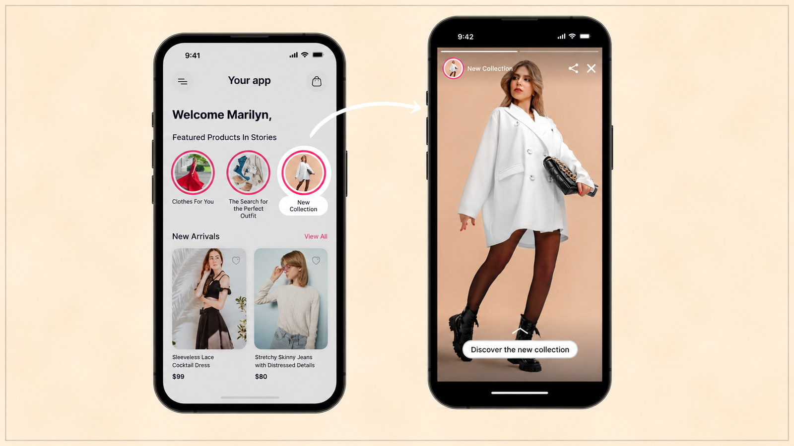
Conversion. Moving a user toward completing a specific commercial action: making a purchase, starting a subscription, adding a feature, completing a booking. The content here is closer to a compressed sales narrative than to a social update.
Education. Explaining a feature, a concept, or a process in a sequence that builds understanding step by step. This is closer to a mini-tutorial than to a personal update, and it benefits from the format's sequential structure in a way social content does not: each story segment can build on the previous one, the way a tutorial's steps build toward a completed task.
Retention. Reinforcing the value the user has already received, surfacing what is new since their last visit, or reminding them of progress made toward a goal. This is closer to a personalised recap than to a social feed update.
None of these three sub-goals is served well by content built for the social intent. A stories sequence that shows five slides of brand lifestyle photography, borrowed from the social content playbook, does not convert, educate, or retain, because it has adopted the format's visual style without adopting the intent that made the format effective in its original context. Marketers are empowered with a content layer that allows for direct communication and engagement opportunities from onboarding to retention, conversion to advocacy when the content is built for that specific purpose. The format is a delivery mechanism. It does not supply the content strategy.
The practical implication: before building an in-app stories sequence, name the specific sub-goal (conversion, education, or retention) the sequence is meant to serve, and build every segment in the sequence to serve that single goal. A sequence that tries to do all three (a bit of education, a bit of promotion, a bit of retention messaging) dilutes each segment's effectiveness and produces a sequence that does not clearly succeed at any of the three.
What Content Belongs in the Format
Given the mechanical properties above and the product-engagement intent, specific content types are strong fits for in-app stories, and others are weak fits regardless of how the format is styled.
Strong fit: sequential product discovery. Decathlon uses in-app Stories to transform its app into an interactive adventure, guiding shoppers through a dynamic journey of product discovery, achieving a 31% click-through rate. Sequential discovery, where each segment reveals a new product, feature, or option building toward a broader catalogue, works because the format's completion loop matches the content's natural sequential structure. The user is not just consuming content. They are progressing through a discovery journey with a visible endpoint.
Strong fit: feature education delivered in digestible steps. A new or underused feature explained across 3 to 5 story segments, each covering one specific aspect (what it does, how to access it, what the first action looks like), takes advantage of the format's tap-to-advance mechanic to let users control their own pace through the explanation while still benefiting from the sequential build. This is a stronger format for feature education than a single long tooltip or a static help article, because it breaks a multi-part explanation into digestible, individually-completable chunks.
Strong fit: financial and conceptual education. CRED Learn uses a storytelling-based model explaining the psychology of credit, rewards, and responsible repayment through short narratives. Concepts that are abstract or require building understanding step by step (how SIPs compound, what a credit score means, how insurance premiums are calculated) are well suited to the sequential structure of stories, where each segment can introduce one concept before building to the next. Groww and Zerodha include short educational snippets explaining risk, SIPs, or returns before users make investment decisions, using the same principle: complex financial concepts broken into a sequence that a user can move through at their own pace, with each segment digestible on its own.
Strong fit: personalised recap and progress reinforcement. A retention-focused stories sequence that shows what the user has achieved since their last significant session (savings accumulated, workouts completed, lessons finished) benefits from the format's full-screen focus: the achievement gets the user's undivided visual attention for a moment, rather than competing with other dashboard elements for a glance.
Weak fit: dense informational content requiring careful reading. Terms and conditions, detailed policy explanations, or content that requires the user to read carefully and retain specific details does not benefit from autoplay and tap-to-advance, both of which are optimised for fast consumption rather than careful reading. Content that needs deliberate, unhurried attention belongs in a format that does not autoplay past it.
Weak fit: content with no natural sequence. A single, standalone announcement or promotion, with no relationship to the segments before or after it, does not benefit from the completion loop mechanic, because there is no sequence to complete. Standalone content is better served by a single nudge or banner than by being forced into a multi-segment stories format that implies a sequence that does not actually exist.
Weak fit: content the user needs to reference later. Because stories are ephemeral by convention (viewed once, then gone, or difficult to re-access), content the user might need to return to (a specific number, a step-by-step process they will follow later, an address or reference code) is poorly served by the format. This content belongs somewhere persistent and searchable, not in a format the user consumes once and then loses access to.
Design Specifics That Separate High and Low Completion Rates
Beyond the content-fit decision, specific design choices within the format materially affect how far users progress through a sequence.
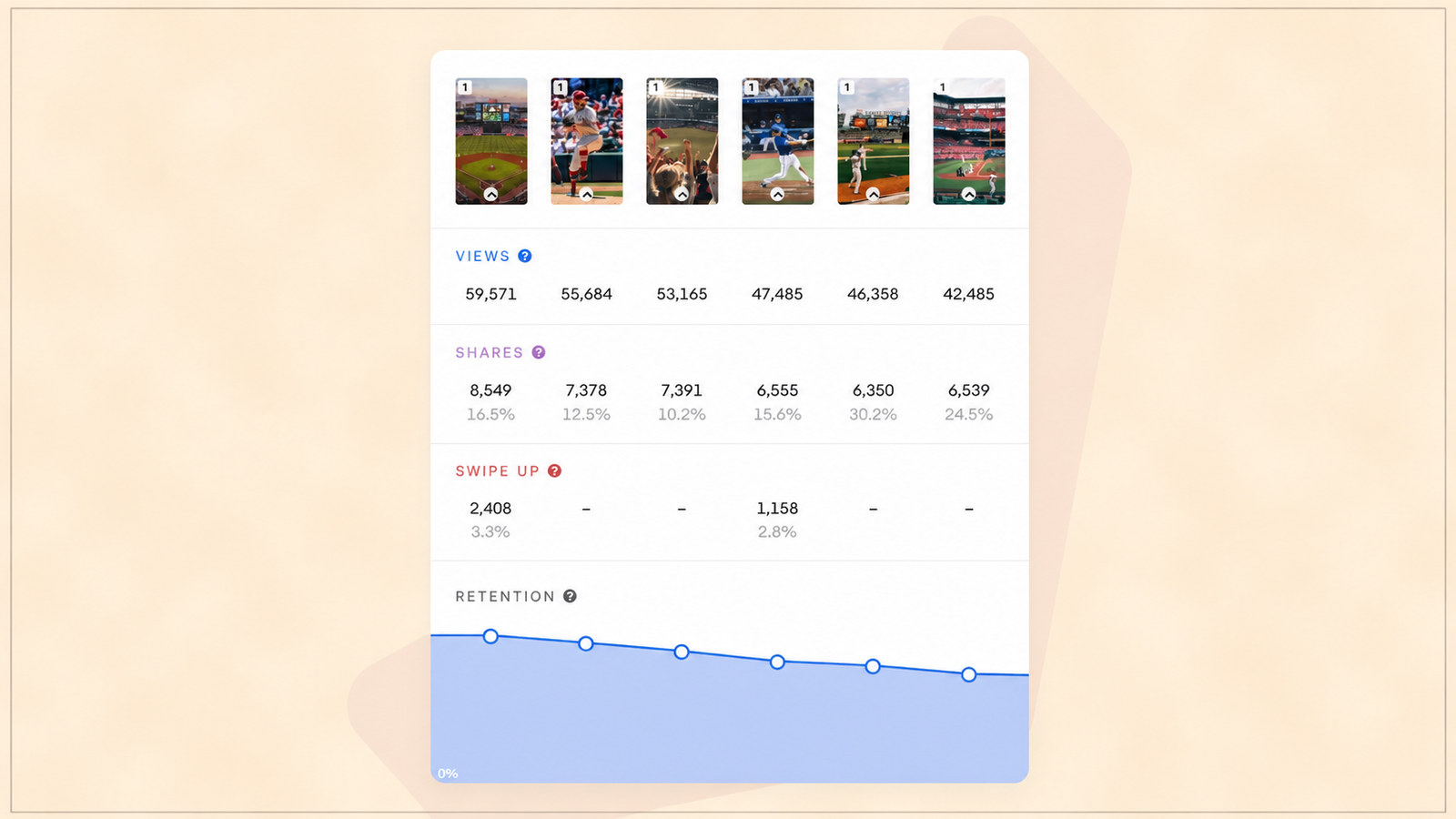
Segment count. Sequences of 3 to 5 segments perform best for product engagement use cases, long enough to build a coherent narrative or discovery journey, short enough that the completion loop stays achievable rather than becoming a chore. Sequences beyond 7 to 8 segments see completion rates drop sharply, for the same reason long onboarding tours see step-count dropout: the cost of finishing starts to exceed the perceived value of the remaining content.
Interactive elements within segments. Polls, emoji reactions, quizzes, and product tags increase engagement beyond passive viewing. New Look improved response rates by 50% by adding interactive story elements, which converts a passive viewing experience into an active one, and active engagement produces both higher attention retention within the sequence and useful zero-party data about user preferences that can inform future personalisation.
Direct action CTAs, not generic ones. Shoppable Stories with direct product tags and purchase capability outperform Stories that redirect to a separate page, because every additional navigation step between the story and the action costs completion. A story segment that ends with "Add to Cart" directly in the segment converts at a meaningfully higher rate than one that ends with "Learn More," which requires the user to leave the format, navigate elsewhere, and re-orient themselves before completing the action the story was building toward.
Personalised audience targeting. New Look's Stories drove CTRs up to 80% by combining audience segmentation with tappable CTAs, which means the same generic story shown to an undifferentiated audience underperforms a story sequence targeted to the specific segment for whom that content is genuinely relevant. A feature education sequence shown only to users who have not yet adopted the feature outperforms the same sequence shown to the full user base, because the segment that has already adopted the feature has no reason to complete a sequence explaining something they already know.
Visual pacing consistent with content complexity. A segment explaining a simple concept can hold the default autoplay duration (typically 5 to 7 seconds). A segment explaining something denser needs either a longer default duration or, more effectively, should be split into two simpler segments rather than compressed into one segment the autoplay timer moves past before the user has finished reading. Matching segment complexity to autoplay pacing is a frequently overlooked detail that directly affects whether users absorb the content or simply watch it pass.
Measuring Whether In-App Stories Are Working
The metrics that matter for in-app stories differ by which sub-goal (conversion, education, or retention) the specific sequence was built to serve.
For conversion sequences: track click-through rate to the CTA, and critically, conversion rate on the action itself, not just the click. Domino's saw a 64% higher conversion rate through Stories compared to banners, with 37% of viewers clicking through to the campaign detail page. The gap between click-through and completed conversion is where friction in the post-story flow becomes visible: a high click-through rate paired with a low completion rate indicates the story succeeded at generating interest but the destination it sent users to failed to close the loop.
For education sequences: track completion rate through the full sequence (not just the first segment) and, more importantly, the downstream feature adoption rate for users who completed the sequence compared to users who did not. A story sequence explaining a feature that produces high view rates but no corresponding adoption lift has not actually achieved its purpose, regardless of how the surface engagement metrics look.
For retention sequences: track whether users who view a personalised recap sequence show a different session return pattern in the following days compared to a matched holdout group who did not see it. For the holdout comparison methodology that isolates causal lift from selection bias, the personalization measurement framework covers how to build this comparison correctly.
Segment-level drop-off, not just sequence-level completion. Tracking which specific segment loses the most viewers within a sequence identifies the exact point where content, pacing, or relevance is failing, the same diagnostic principle that applies to onboarding tour step-level drop-off. A sequence with an 80% first-segment view rate and a 20% completion rate has a specific segment where the drop is concentrated, and that segment is the priority fix, not the sequence as a whole.
Where Teams Get In-App Stories Wrong
Using stories as a second home for banner content. The most common failure is repurposing existing promotional banner content into a stories format without redesigning it for the format's mechanics. A static promotional image with a headline, dropped into a story segment, gains nothing from autoplay, tap-to-advance, or the completion loop, because none of those mechanics interact with static promotional content the way they interact with sequential, building content.
No clear sub-goal. A sequence that tries to educate, promote, and retain within the same set of segments dilutes all three goals. Every segment in a sequence should serve the single sub-goal the sequence was built for.
Ignoring the exit path. Snapchat's 2018 redesign disrupted the routines millions of users had built around how content appeared and how Stories worked, and the backlash reached investors, with shares falling 22% after weaker-than-expected engagement. While this example is about a platform-level redesign rather than in-app content specifically, the underlying lesson transfers directly: once users have learned an interaction pattern for a format, changing that pattern without a clear reason breaks the mental model they built around it. In-app stories that inconsistently change their tap zones, exit gestures, or navigation between different sequences create the same friction at a smaller scale.
Overloading segment count. Sequences that try to cover everything in one pass, rather than being scoped to what fits comfortably in 3 to 5 segments, see the sharp completion drop-off described earlier. The discipline to cut content down to what the format can carry, rather than stretching the format to carry everything, is what separates high-performing sequences from ones that lose the majority of viewers before the end.
No suppression logic for frequency. A stories rail that repeats the same sequence to a user who has already completed it, or that fires a new education sequence every session regardless of whether the user needs it, trains users to ignore the format entirely. The same suppression discipline that applies to nudges and surveys applies here: a sequence should be shown once per relevant lifecycle moment, not on every session regardless of relevance.
Topics Not in the Brief That Teams Should Know
Zero-party data collection through interactive story elements. Storyly's interactive components (polls, quizzes, emoji reactions) empower marketers with zero-party data for audience segmentation. A story sequence with a single embedded poll asking about a user's investment goal or shopping preference collects declared preference data at a moment when the user is already engaged in a fast, low-friction interaction pattern, making it one of the highest-completion-rate contexts for preference collection available in an app.
The vertical video feed as an adjacent but distinct format. Some platforms distinguish between traditional stories (sequential, tap-through, ephemeral) and a vertical video feed (swipe-based, continuous, TikTok-style). The fundamental distinction is psychological as much as mechanical: swipe up says "continue this journey elsewhere," while tap through says "let's explore together right here". Teams should not assume the two formats are interchangeable. Sequential product education fits the tap-through model better; broad content discovery across many unrelated pieces fits the swipe model better.
Accessibility considerations for autoplay content. Autoplay and fast pacing, the same properties that make stories effective for fast consumption, create accessibility barriers for users who need more time to process content, including users with cognitive disabilities and users relying on screen readers. Every story sequence should support a pause option and should never rely solely on autoplay timing to deliver information the user cannot get by tapping back or holding to pause.
Regulatory constraints on financial storytelling. For fintech apps using stories to explain investment concepts, return projections, or credit products, the same regulatory constraints that apply to any financial marketing communication apply inside the stories format. A sequence explaining SIP compounding cannot imply guaranteed returns, and a sequence about credit products must include required disclosures, even when the format's fast, snackable nature creates pressure to simplify past the point of compliance. Compliance review for financial stories content should follow the same process as any other regulated communication, not a lighter one because the format feels casual.
Story sequences as a discoverable library, not just a rail. Beyond the home screen rail, some apps maintain an accessible archive of past educational story sequences that users can return to and rewatch, which addresses the "content the user might need to reference later" weak-fit case by making the sequence persistently accessible rather than ephemeral, without abandoning the format for content that genuinely benefits from the sequential, tappable structure.
Key Takeaways
Stories work mechanically because of four properties: autoplay removes the decision to continue, tap-to-advance removes interaction friction, full-screen focus eliminates competing attention, and the visible completion loop creates a Zeigarnik-effect pull to finish what was started.
In-app stories serve product engagement (conversion, education, retention), not social connection, which means the content strategy has to differ fundamentally from social stories even when the visual format looks similar. Content built for social intent, borrowed wholesale into a product context, underperforms because it has adopted the format's style without its purpose.
Strong content fits are sequential product discovery, feature education broken into digestible steps, financial and conceptual education, and personalised progress recaps. Weak fits are dense reference content, standalone announcements with no sequence, and anything the user needs to access again later.
Design specifics that separate high and low completion rates: 3 to 5 segments as the sweet spot, interactive elements that convert passive viewing into active engagement, direct-action CTAs rather than redirects, audience-targeted rather than generic content, and pacing matched to content complexity.
Measurement should track segment-level drop-off, not just sequence completion, and should connect each sequence's metrics to its specific sub-goal: conversion rate for commercial sequences, downstream feature adoption for educational ones, and holdout-compared session return patterns for retention ones.
The most common execution failures are repurposing banner content without redesigning for the format, mixing multiple sub-goals within one sequence, overloading segment count, and firing the same sequence repeatedly without suppression logic.
Further Reading
From Digia Engage:
- In-App Video for Feature Discovery: A Growth Team's Guide — the video format's completion rate benchmarks and design patterns, a complementary format to stories for feature explanation
- The Anatomy of a Great In-App Onboarding Tour — the same step-count and completion-loop principles applied to guided tours rather than stories
- How to Know If Your Personalization Is Actually Working — the holdout group methodology for measuring retention-focused story sequence impact
- When NOT to Show a Nudge: Building a Suppression Logic — the frequency and suppression discipline that prevents story sequences from becoming ignored
- How to Increase Feature Adoption in Mobile Apps: A 6-Step Framework — the downstream adoption metric that education-focused story sequences should be measured against
External Sources:
- Why the Stories Format Is Transforming Mobile User Engagement for Brands — The Drum (Forrester 64% preference for tappable Story format; Domino's 64% higher conversion vs. banners)
- What Is In-App Story? — Storyly (Decathlon 31% CTR; New Look 80% CTR and 50% response rate lift; zero-learning-curve interaction design)
- Top 7 Storyly Features for eCommerce Success — Storyly (Footasylum 18% CTR increase and 8% conversion boost; 64% higher conversion vs. banners; shoppable video mechanics)
- Swipe or Tap? Pick the Right Format for Mobile Campaigns — Storyly (psychological distinction between swipe-up and tap-through interaction models)
- Mobile Web and App Ad Formats: Strategies for Success — Adjust (full-screen immersion as an attention-capture mechanism; format-to-audience-intent alignment)
- Storyly Software Reviews — Software Advice (zero-party data collection through interactive story components; verified user CTR data)
- Fintech Content Strategy in India: How Apps Educate Users — Billcut (CRED Learn storytelling model; Groww and Zerodha in-app micro-learning; RBI Financial Literacy Report 2025 trust data)
- Mobile App Design Fails: 5 Famous App Mistakes — DesignRush (Snapchat 2018 redesign case study; interaction pattern disruption consequences)
Sequential in-app content formats, stories, video, and progressive tours, are all configurable in Digia Engage as native components with event-based triggers, audience targeting, and frequency suppression, deployable without engineering tickets after initial SDK integration. Book a demo to see how a story sequence can be configured for a specific conversion, education, or retention goal, or read the in-app video guide for the adjacent sequential content format.