
TL;DR: Retention rate is the single number that summarises every product failure in aggregate. It measures whether users came back, and when they did not, it points to the specific phase of the experience that failed them. Most teams either do not know their retention benchmarks by vertical, or they know them and misdiagnose the cause. This article covers what each retention interval measures, what the benchmarks actually look like by industry in 2025 to 2026, how to read a retention curve for diagnostic signals, the three root causes of low retention and how to tell them apart, the in-app engagement levers that move each interval, how to calculate retention correctly, and the business case for treating a 5-point D30 improvement as a higher priority than most acquisition optimisations. Sourcing note: All benchmarks are attributed to their primary sources throughout. Where sources disagree on specific figures, the range is noted.
Downloads are not a business. Retention is. A mobile app that acquires 100,000 new users in a month and retains 6% of them at Day 30 has 6,000 users contributing long-term value. An app that acquires 40,000 and retains 20% has 8,000. The second app wins on the metric that compounds into revenue, despite spending less on acquisition.
The average app loses 77% of its daily active users within the first three days after install, and 90% within the first 30 days. Those are not outlier numbers for poorly built products. They are the median condition of the mobile app ecosystem in 2025. Every team that thinks their retention is fine because users are downloading needs to read that figure again.
Retention rate is not a vanity metric to track alongside DAU. It is the fundamental signal of whether the product is delivering enough value for users to come back on their own. Every other engagement metric, session length, feature adoption, push notification open rate, is downstream of this one. If retention is weak, everything built on top of it is being built on sand.
What Retention Rate Actually Measures at Each Interval

Retention rate at Day N is the percentage of users who installed the app on a given date and returned to the app exactly N days later. A cohort of 1,000 users who installed on Monday, with 250 of them opening the app on Tuesday, produces a Day-1 retention rate of 25%.
The three standard intervals measure three fundamentally different things:
Day 1 retention measures whether the first session delivered enough value to justify a second one. A user who installed, opened, encountered friction or confusion, and never returned failed the first-session test. Day 1 retention is almost entirely an onboarding question. Did the user reach the product's core value proposition fast enough? Did they understand what they were supposed to do next? Was there a moment in the session that made returning feel worthwhile? Adjust's benchmark data puts median D1 at 26% across all verticals. Below 20% at Day 1 means the app is failing at its first impression for the majority of new users.
Day 7 retention measures whether an initial usage habit formed. A user who returned on Day 1 and Day 7 is a user who found a reason to make the app part of a recurring behaviour. Adjust's benchmark data puts median D7 at 13%. This interval is where onboarding transitions into in-app experience. The user has seen the product. The question is whether the product gave them a reason to keep coming back across the days between sessions 2 and 7. This is where re-engagement design matters: contextual nudges, progress indicators, streak mechanics, and personalised feature discovery are the tools that move the D7 number.
Day 30 retention measures whether the app has become part of the user's routine. The industry median across all app categories is approximately 6 to 7%, which means 93 to 94% of users are gone within a month. A Day-30 retention rate above 10% puts an app in the top tier for most categories. Above 15% in categories like fintech or e-commerce is exceptional. This interval is where product-market fit becomes visible in data. An app that has found genuine, recurring utility in users' lives retains at a meaningfully different rate than one that has found a novelty that fades.
The intervals are sequential diagnostics, not independent metrics. A team that improves D30 without addressing D1 is working on the wrong problem. D30 retention can only be improved by retaining users past D1 and D7 first. The chain runs in one direction.
Industry Benchmarks: The Numbers by Vertical
Comparing retention across categories is not informative. A health and fitness app does not compete with a banking app for users' attention in the same context. Their retention benchmarks reflect different usage frequencies, different emotional stakes, and different product architectures. The only meaningful comparison is your app against the benchmark for your specific vertical.
Banking and fintech apps see the strongest long-term retention numbers because the product is tied to money. Users who have linked an account, moved funds, or completed a transaction have skin in the game. Banking apps produce a combined D1 retention rate of 30.3%, D7 of 17.6%, and D30 around 11.6%, according to Sendbird and Plotline benchmark data. Non-banking fintech apps (investment, insurance, budgeting) see lower rates: approximately 22.7% at D1, dropping more steeply to around 4.5% to 5.8% at D30 per Statista and AppsFlyer data. The gap between banking and non-banking fintech reflects the switching cost difference. Once money is involved and infrastructure is linked, users rarely leave.
E-commerce and shopping apps produce D1 retention around 24.5% for general shopping apps and 33.7% for marketplace apps, with D30 around 5.6% and 8.7% respectively, per Statista and Sendbird data. Shopping is episodic. A user who buys something in week one does not necessarily have a reason to open the app in week two unless there is a specific purchase intent. The DAU/MAU ratio is a less useful metric here than repeat purchase rate over 60 or 90 days. Teams that track standard D30 retention for e-commerce apps and compare it to fintech benchmarks are making a category error. Marketplace apps retain more users than general shopping apps because diverse inventory creates more reasons to return.
Gaming shows the widest variance of any category. D1 retention runs 27 to 33% depending on genre, which is above average because games create immediate engagement loops. But D30 collapses to 2.3 to 5.4%, with a Day-1 to Day-7 drop that is steeper than any other major category. The bimodal distribution is extreme: the top 10% of games retain users for months because of deep monetisation systems built around the users who stay. The median game loses almost everyone in the first week. If you are building or evaluating a gaming app, the mean benchmark is nearly meaningless. Percentile positioning matters far more.
Health and fitness runs at 20 to 27% at D1 and approximately 3 to 7% at D30, according to Statista and Sendbird. Motivation decay drives this curve. Users who downloaded a fitness app in January are acting on a behaviour intention that fades. The apps that outperform in this category are ones that restructure the habit loop around social accountability or daily ritual, making the app session about something other than motivation.
Education apps post some of the weakest D30 numbers: approximately 2% at D30, per AppsFlyer data. The exception is apps that turn discrete content consumption into a daily game, the Duolingo model, which uses streak mechanics and loss aversion to retain users at rates far above the category average.
Productivity and utilities start low and stay low: D1 around 17 to 18%, D7 around 7%, D30 in the 4 to 6% range. These apps face a specific challenge. Users who successfully complete the task the app was downloaded for, organise a file, set a reminder, convert a document, have no obvious reason to return until the next instance of the same task arises. Retention here is almost entirely a feature breadth and habit frequency problem.
One consistent finding across every category: the single most predictive metric for D30 retention is D1 completion of a meaningful first action. Research confirms that the most predictive metric for long-term retention is completion of a meaningful first action in the first session. Not whether the user came back on Day 1. Whether they did something valuable in their very first session.
How to Read a Retention Curve
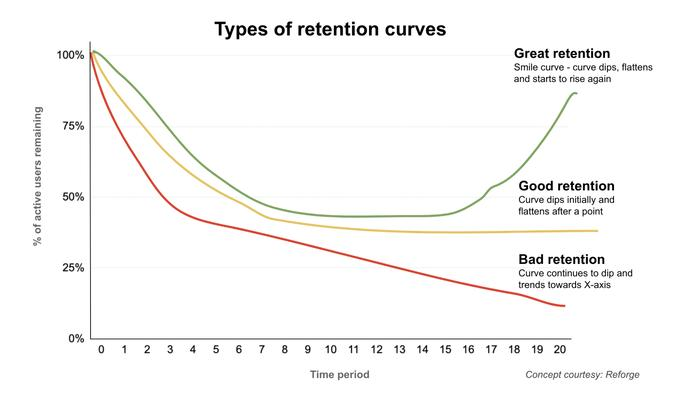
A retention curve plots the percentage of a cohort that is still active at each interval from Day 0 to Day 30 or Day 90. The shape of the curve tells you where the failure is concentrated.
A cliff at Day 1. When the retention curve drops sharply between Day 0 and Day 1, and then levels off more gradually, the primary failure is in the first session. The user did not find value fast enough to come back. The aha moment, the specific action that makes the product's value obvious and tangible, is either too far into the onboarding flow, too obscure in the interface, or not present at all. This curve shape points directly to onboarding as the fix.
A gradual decline from Day 1 to Day 7. When D1 retention is reasonable but D7 retention has fallen by more than 60% of the D1 number, the user came back once but did not build a habit. The second and third sessions were not compelling enough to create return behaviour on their own. This shape points to insufficient re-engagement triggers and insufficient in-session value at the exploration stage.
A flat decline from Day 7 to Day 30. When D7 retention is acceptable but D30 has declined proportionally rather than dropping sharply, the product is retaining users who have a genuine usage need but losing users at a steady rate because the experience is not deepening their engagement over time. This is a personalisation and progressive value delivery problem.
A resurrection bump. Some retention curves show a slight uptick at Day 14 or Day 21. This reflects users who lapsed for a week, received a re-engagement campaign or push notification, and returned. Resurrection bumps are worth tracking because they reveal how much of your retention number is organic versus campaign-driven. An app whose D30 retention relies on the bump is more fragile than it looks. Remove the campaign, and the curve collapses.
The shape of the curve is the diagnostic. Teams that only look at the D1, D7, and D30 numbers without looking at the curve between them are missing the diagnostic signal.
The Three Root Causes of Low Retention
Most retention problems trace to one of three causes. The causes require different fixes, and misdiagnosing them is expensive.
Cause 1: Weak first-session value. The user did not reach the product's core value proposition in the first session. This produces a cliff at D1. The fix is always in the onboarding flow, not in the product's features. The features may be excellent. If the user never reaches them, the features are irrelevant to retention. Signs of this cause: D1 below 20%, onboarding completion rate below 50%, high drop-off at account creation or permission request steps.
Cause 2: Insufficient re-engagement pull. The user reached the core value but was not given enough reasons to return. This produces D7 retention that is a steep fraction of D1 retention, rather than a gradual decline. The fix is in the in-app experience between sessions: what the app offers the user when they return, whether that is new content, progress updates, a reward or streak mechanic, or a contextual prompt. Signs of this cause: D1 is acceptable (above 25%), D7 is below 8%, push notification opt-in rates are high but open rates are low.
Cause 3: Session friction. The user is willing to return but encounters enough friction in completing their goal that the app feels more like work than value. This produces a flat decline from D7 to D30 with no clear inflection point. The fix is in UX: navigation clarity, task completion speed, error handling, and load performance. Signs of this cause: session depth is low (users complete fewer actions per session than the product's design assumes they will), support ticket volume for navigation-related queries is elevated, uninstall surveys cite complexity or confusion.
The misdiagnosis that most teams make is treating a cause 1 problem with cause 2 solutions. Push notifications sent to users who failed D1 do not help, because those users did not find value in the first place. Sending them a notification about the value they missed presupposes they understood the value. They did not.
Common Misdiagnoses
Treating retention as a push notification volume problem. Push notifications can move D7 and D30 retention when users are already engaged and need a prompt to return. They do not fix a D1 problem, because users who dropped off after the first session are not waiting to be reminded. They left because the product did not deliver. More notifications to users who found the first session inadequate increases opt-out rates and uninstall rates, compounding the problem.
Treating retention as a pricing problem. Changing price points does not create product value. A user who did not find the free experience compelling enough to return will not find a discounted paid experience more compelling. Pricing adjustments affect conversion from free to paid, not baseline retention of the active user base.
Treating retention as a product-market fit problem prematurely. Product-market fit is a diagnosis that teams apply too broadly and too quickly. Many apps that appear to have a PMF problem have an onboarding problem. The product solves a real problem. Users who complete onboarding and reach the core product often retain at strong rates. The problem is that the majority of users never get there. Blaming PMF before auditing the first-session flow is skipping the diagnosis.
The highest-ROI investigation a retention team can run is a detailed first-session walkthrough on a fresh account. Not a design review. A live session, starting from install, going step by step through the onboarding flow, measuring the exact moment a new user without product knowledge would understand why this app is worth keeping.
In-App Engagement Levers by Retention Stage
The levers that move D1 are different from the levers that move D7, which are different from the levers that move D30. Running D30 campaigns at D1 problems is wasted effort.
What moves D1: Onboarding flow compression (fewer steps to first value), permission request staging (ask for permissions after demonstrating value, not before), guided first action (show the user what to do in their first session, not what the product can do), and immediate personalisation based on first preference input. The benchmark is time-to-first-value. Apps that get users to a meaningful first action within 3 minutes see significantly higher D1 retention than apps that require longer setup sequences. Apps that activate users within 3 minutes see nearly double Day 7 retention compared to those that do not.
What moves D7: Session hooks between Day 1 and Day 7 are the levers. These include daily streak mechanics (which use loss aversion to motivate return visits before the streak breaks), progress indicators that show the user what they have done and what comes next, in-app nudges that fire contextually when the user returns rather than on a fixed schedule, and feature discovery that surfaces the product's second-layer value to users who have only experienced the first layer. Calm, the meditation app, found that users who set daily reminders inside the app were three times more likely to be retained than users who did not, which prompted them to prompt all new users to set a reminder after their first meditation session. This is the D7 lever in its simplest form: creating a mechanism that pulls the user back on Day 2, which creates the habit that produces Day 7 retention.
What moves D30: Personalisation and progressive value are the D30 levers. A user who is 30 days into an app has demonstrated that they find it useful. What they are evaluating at Day 30 is whether the experience is getting better as the app learns more about them. In-app messages that are personalised to user behaviour, delivered through native in-app components rather than web-view notifications, produce a 30% lift in retention compared to unpersonalised messaging. Feature adoption campaigns that surface higher-value product features to users who have only used basic features create a reason for the experienced user to stay engaged rather than plateau. Gamification mechanics (loyalty points, milestone badges, tiered rewards) give users a longer-arc reason to return that goes beyond the immediate utility of the product.
How to Calculate Retention Correctly
The retention number your analytics tool reports may not match the number you would calculate from raw event data. The discrepancy is real and consequential, and understanding why it exists is necessary for trusting either number.
N-Day retention (the most common format) counts users who returned on exactly Day N. A user who installed on Monday and returned on Wednesday but not Thursday is counted as retained at D2 but not retained at D4, regardless of their subsequent behaviour.
Return-on-or-after retention counts users who returned on Day N or any day after. This is the format some analytics tools default to without making it obvious. A team comparing their N-Day metric to an industry benchmark that uses return-on-or-after is comparing different things. Return-on-or-after retention is always higher than N-Day retention because it is more permissive in what counts as retained.
The discrepancy with analytics tools usually comes from one of three sources: different definitions of "active" (did the user open the app, or did they complete a specific action?), different handling of users who return before Day N (some tools count Day N as "at least N days", not "exactly N days"), and identity resolution issues where the same user appears as multiple user IDs due to re-install or device-switching.
The return event definition matters as much as the interval: if you count a user as retained because they opened the app, but the app auto-opens due to a push notification, you are counting a notification open as retention. The retention number is inflated. The better definition is completing a meaningful product action, not just opening the app. This is the number that correlates with actual value delivery, not just session start.
To calculate retention from raw event data: take a cohort of users who installed on date X, filter for users who triggered a meaningful product action (transaction completed, content consumed, feature accessed) on exactly Day 1, Day 7, or Day 30 from their install date, and divide by the total cohort size. Compare this against your analytics tool's reported number. The gap between them is your data quality check.
The Retention-to-Revenue Connection: The Business Case in Numbers
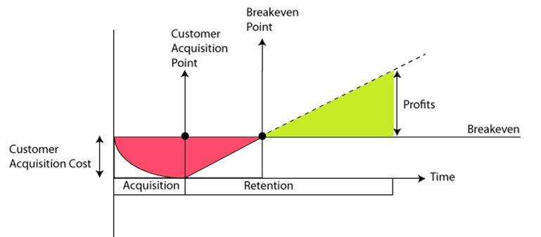
Retention improvement is not a product quality exercise. It is a revenue exercise, and the math favours it over most acquisition optimisation strategies.
Research from Bain and Company has consistently found that increasing customer retention by just 5% can boost profits by 25 to 95%. The mechanism is compounding: retained users accumulate LTV, require no re-acquisition cost, and convert on upsells at higher rates than new users.
Using the standard LTV formula (LTV = ARPU x gross margin divided by monthly churn), cutting monthly churn from 10% to 5% doubles average user lifetime, which doubles LTV. A 5-percentage-point improvement in D30 retention produces a 20 to 30% increase in LTV for subscription apps, per SEM Nexus analysis. That is a bigger lever than negotiating better CPIs with a media buyer.
The acquisition comparison makes the case more concrete. It costs 5 to 7 times more to acquire a new mobile app user than to retain an existing one. If your D30 retention is 6% (the industry median), you are spending the majority of your acquisition budget on users who deliver no long-term value. A team that improves D30 from 6% to 11% while keeping acquisition spend flat has effectively increased the productive yield of every acquisition dollar, because a larger fraction of installed users is now contributing to the long-term revenue base.
The compounding effect is what makes retention ROI outperform acquisition ROI over time. An acquisition channel delivers a fixed number of new users per dollar. Retention improvement applies to every user who has ever installed the app and might still be retained. The compounding runs forward from the date of improvement. An acquisition campaign stops delivering the moment the budget stops. Retention improvement persists.
The teams that understand this invest in retention infrastructure (onboarding optimisation, contextual in-app engagement, personalised re-engagement) before they scale acquisition. The teams that do not invest in retention until acquisition has already scaled spend months trying to fill a leaky bucket with more water.
Key Takeaways
Retention rate measures whether users came back. Each interval measures a different thing: D1 measures onboarding, D7 measures habit formation, D30 measures routine integration.
The industry median is approximately 26% at D1, 13% at D7, and 6 to 7% at D30 across all categories. Every vertical has its own benchmark. Fintech banking sits well above the median at D30. Gaming and health apps sit well below. Comparing across categories produces no useful signal.
The shape of the retention curve is the diagnostic. A D1 cliff points to onboarding failure. A steep D1-to-D7 decline points to insufficient re-engagement pull. A flat D7-to-D30 decline points to session friction or personalisation failure.
The three root causes of low retention are weak first-session value, insufficient re-engagement design, and session friction. Each requires a different fix. Applying a D7 solution to a D1 problem wastes money and time.
The most common misdiagnoses are treating retention as a push volume problem, a pricing problem, or a premature product-market fit problem. Most retention failures are concentrated in the first 24 hours and are diagnosable through a live first-session walkthrough on a fresh account.
Retention calculation discrepancies between raw event data and analytics tool reports usually come from different definitions of the return event, N-Day versus return-on-or-after methodology differences, or identity resolution failures. Define the return event as a meaningful product action, not an app open.
A 5-percentage-point improvement in D30 retention produces 20 to 30% LTV growth in subscription apps and compounds forward in a way that no acquisition channel optimisation can match at equivalent cost.
Further Reading
From Digia Engage:
- In-App Nudges: What They Are and How They Drive Engagement — the format and trigger options for contextual in-app nudges at each retention stage
- App Engagement Strategies That Actually Work — the full in-app engagement stack across D1, D7, and D30 levers
- Reducing Churn with Behavioral In-App Interventions — how to read churn signals in behavioural data before they appear in headline retention metrics
- Designing Non-Annoying Nudges: Frequency, Placement, and Context — the nudge design decisions that affect re-engagement without creating opt-out pressure
- When NOT to Show a Nudge: Building a Suppression Logic — when engagement interventions become friction, and how to prevent them from hurting the retention curve they are designed to protect
- How to Know If Your Personalization Is Actually Working — the holdout group measurement framework for confirming that in-app engagement changes are actually moving retention
External Sources:
- Retention Rates for Mobile Apps by Industry — Plotline (77% of DAUs lost within 3 days; 90% within 30 days; D1, D7, and D30 benchmarks by category)
- Mobile App User Retention Benchmarks Broken Down by Industry — Sendbird (Statista and AppsFlyer benchmark data by vertical; banking, fintech, gaming, health, entertainment, productivity)
- App Retention Benchmarks for 2026: How Your App Stacks Up by Industry — UXCam (AppsFlyer 2025 data; the most predictive metric for D30 is D1 first meaningful action; cohort retention versus aggregate retention distinction)
- 2026 Guide to App Retention: Benchmarks, Stats, and More — GetStream (marketplace app retention trends 2023 to 2024; fintech session growth data)
- What Is a Good App Retention Rate? Benchmarks by Category — Lovable (Adjust median D1 26%, D7 13%, D30 7%; vertical-specific benchmark breakdown)
- App Retention Rate: 2026 Benchmarks by Industry — Appcues (Bain and Company 5% retention improvement produces 25 to 95% profit lift; acquisition cost comparison)
- Retention Rate: Complete Definition and Calculation Guide — Amplitude (N-Day vs. return-on-or-after methodology; return event definition matters as much as the interval)
- Mobile App Retention — Business of Apps (in-app messages with personalisation produce 30% lift in retention; iOS vs Android retention comparison)
- Mobile App Retention Benchmarks Calculator — Core MBA (3-minute activation and double D7 retention finding; 5% every retention improvement producing 20 to 30% LTV improvement)
- App Growth Metrics: LTV-to-CAC Ratio Benchmarks for 2026 — SEM Nexus (cutting churn from 10% to 5% doubles LTV; retention as the highest-leverage LTV improvement over acquisition CPI negotiation)
- Mobile App Retention Benchmarks by Industry 2025 — Growth-onomics (education D30 at 2%; category-specific retention dynamics)
The in-app engagement campaigns that move retention at each stage, contextual nudges, progressive feature discovery, streak mechanics, and personalised re-engagement, are configurable in Digia Engage without engineering tickets after initial SDK integration. Book a demo to see how the trigger and targeting layer works for your specific retention interval problem, or read the in-app nudges guide to understand which formats fire at which moments in the user session.