


TL;DR: Progressive disclosure is the practice of revealing app complexity in layers, showing only what the user needs right now and making the rest available on demand. On mobile specifically, where screen space is tight and attention spans are short, showing everything at once is not thoroughness. It is friction. This article covers the mechanics of the three core progressive disclosure patterns (feature gating by action, reveal on scroll, and step-by-step contextual hints), where each one applies across onboarding and feature education, what happens when you hide too much, how to sequence disclosures against real user behavior signals, and how to measure whether any of it is working. Sourcing note: All data citations are attributed to their source and methodology. Where no published study exists for a specific claim, the article says so.
The Problem That Progressive Disclosure Solves
Most product teams build mobile apps with a bias toward comprehensiveness. The logic is reasonable on its face: users who can see all the features will understand the product's full value, and understanding the full value leads to better retention. The logic is wrong.
What users who see all the features at once actually experience is not comprehensiveness. It is cognitive noise. When too much competes for attention on a screen that is already small, users do not evaluate options and choose the best one. They feel overwhelmed and stop engaging. They pick the first thing that looks familiar and ignore the rest. They fail to discover the features that would have made the app genuinely useful to them.
The app's completeness is working against the user's understanding. Progressive disclosure exists to fix that inversion.
This is not a new idea. Jakob Nielsen introduced progressive disclosure as a formal interaction design pattern in 1995, establishing that interfaces should surface only the information relevant to the user's current step while making the rest available on demand. What has changed is the environment in which it applies. Mobile devices, with their constrained screen real estate, thumb-first interaction model, and session contexts that range from a focused five-minute task to an idle scroll, have made progressive disclosure not a best practice but a practical necessity.
This article is about how progressive disclosure works inside mobile app UI specifically, the three patterns used to implement it, where each pattern applies, where teams get it wrong, and how to measure whether the disclosure system is building user competence or just hiding things in ways that frustrate.
The Cognitive Load Problem: Why Feature-Rich Apps Feel Hard to Use
Before the patterns, there is a foundational question: why does showing everything at once fail? The answer is not that users lack intelligence or patience. It is that human working memory has a structural limit, and most feature-rich apps routinely exceed it.
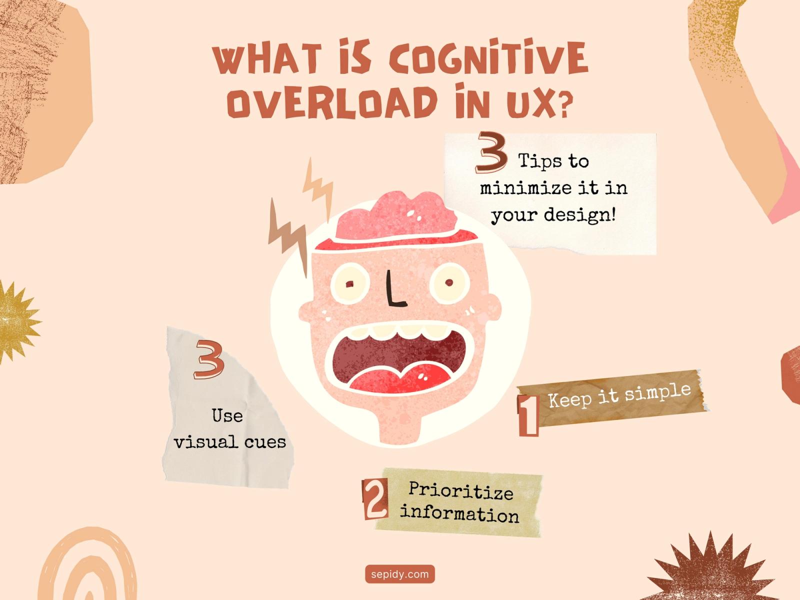
In 1956, cognitive psychologist George A. Miller published research establishing that the average person can hold approximately seven items, plus or minus two, in working memory at one time. More recent research by cognitive scientist Nelson Cowan suggests the functional limit without rehearsal may be closer to four chunks, not seven. The implication is significant: when an interface presents ten primary navigation options, twelve feature buttons on a home screen, or a form with fifteen fields visible simultaneously, it is not giving users more choice. It is exceeding the brain's processing capacity for the current interaction.
Cognitive load theory distinguishes between three types of mental effort. Intrinsic load is the effort required by the task itself, such as understanding how to transfer money in a fintech app. That cannot be eliminated because it is inherent to what the app does. Extraneous load is the mental effort created by poor design, such as deciphering confusing icons, hunting for buried features, or processing visual noise that has no functional value. That is the load UX design can and must eliminate. Germane load is the cognitive effort involved in learning and building mental models, the kind of processing that creates genuine product competence. Good design redirects mental energy from extraneous to germane: away from "where is this?" and toward "now I understand how this works."
Progressive disclosure is the primary mechanism for reducing extraneous load on mobile. By showing users only what is relevant to their current task or lifecycle stage, it clears the cognitive field so that the mental energy available in the interaction can go toward actual learning and action.
The data supports this directionally. Research cited by Nielsen Norman Group indicates that progressive disclosure can reduce task completion time by 20 to 40 percent while simultaneously improving comprehension. Products using progressive disclosure see approximately 35 percent fewer support tickets during onboarding compared to those displaying all features upfront, per Hotjar UX research. And Chameleon's dataset of 15 million interactions found that linear onboarding, where every feature is presented upfront in sequence, produces an average completion rate of 53 percent. Contextual, behavior-triggered disclosure brings that rate to 75 percent, with a 30 percent increase in paid conversions.
The performance gap between feature-dumping and progressive disclosure is not marginal. It is structural.
What Progressive Disclosure Actually Is
Progressive disclosure is a UX design technique that reduces cognitive load by gradually revealing more complex information or features as a user progresses through a product. Instead of presenting every option at once, designers surface only what is relevant to the user's current step, making the rest available on demand, through a subsequent action, a scroll, or a contextual trigger.
The word "gradual" is important and often misread. Progressive disclosure is not about hiding things indefinitely. It is about timing. The feature exists. The information exists. The question is when the user is ready for it, and that readiness is determined by what the user has already done in the app, not by a calendar schedule or an arbitrary session count.
The practical framing for mobile: every screen should answer one question the user is asking right now, and make the next question answerable from that screen without requiring navigation back to a menu. That is progressive disclosure in implementation terms. It is not about impoverishing the interface. It is about ordering it.
Where the principle breaks down is when teams treat it as a license to over-hide. Hiding features that users would find valuable if they were visible is not progressive disclosure. It is poor information architecture that happens to be defended by a respectable UX concept. The test for whether a disclosure decision is correct is not "does this reduce visual complexity" but "does this match when the user is actually ready to use this?"
Why Mobile Changes the Stakes
Progressive disclosure applies across platforms, but mobile creates conditions that make it significantly more consequential.
Screen real estate is structurally limited. A desktop application can surface secondary options in sidebars, hover states, or secondary columns without obscuring primary content. A mobile screen does not have that luxury. Every element shown competes directly with every other element for the same physical space. The triage required is not optional.
Interaction is thumb-first and asymmetric. The natural reach zones on a mobile screen are shaped by how a thumb moves across glass, not how an eye scans a grid. Features placed outside the comfortable thumb zone get fewer interactions not because users do not want them but because the interaction cost is literally higher. Progressive disclosure on mobile must account for this ergonomic constraint when deciding what to show where.
Sessions happen in context. Mobile users are not sitting at a desk with focused attention and a thirty-minute block. They are commuting, waiting, or multitasking. The cognitive bandwidth available for processing an unfamiliar interface is lower than in a desktop environment, which means the tolerance for extraneous load is lower too. An app that overwhelms a new user during their first mobile session on a commute will not get the benefit of a second calm desktop session to recover. First impressions in mobile are made in conditions that disadvantage the user.
Mobile sessions are shorter and more frequent. This changes what "learning over time" looks like. On desktop, a user might have one long session where they explore the app comprehensively. On mobile, learning happens across many short sessions. Progressive disclosure on mobile needs to be designed for the single-session unit of interaction, not a cumulative onboarding journey that assumes sustained attention.
These four constraints compound. They make the mobile environment one where an excess of information at the wrong moment does not just reduce conversion. It ends the session.
The Three Core Patterns
Progressive disclosure is implemented through a small number of well-defined UI patterns. Three of them do the heavy lifting across the majority of mobile use cases: feature gating by action, reveal on scroll, and step-by-step contextual hints. Each addresses a different dimension of the disclosure problem and applies to different points in the user journey.
Pattern 1: Feature Gating by Action
Feature gating by action means that a feature becomes accessible or visible only after the user has completed a prerequisite action. The gate is behavioral, not temporal, and that distinction matters. The user earns access to the next layer of the interface not by waiting but by doing.
This pattern is rooted in the learning science principle that context of use is the best precondition for learning about something. Teaching a user about feature B before they have completed feature A means teaching them something they have no mental frame for yet. After they have completed feature A, feature B becomes meaningful because they now understand the domain it operates in.
Where it works well: Fintech apps use this pattern extensively for compliance and trust-building reasons that also happen to align with UX. A KYC-gated investment feature, for example, is not just a regulatory requirement. It is a natural disclosure gate: the user who has verified their identity has demonstrated commitment to the product, understands their account context, and is at a point in the relationship where a more complex feature (investing) is both appropriate and expected. The gate teaches by pacing.
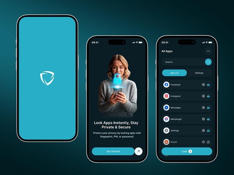
Canva implements feature gating by action at the design tool level. New users can create content immediately without configuring anything. Brand Kit, advanced collaboration, and template publishing features become accessible and are surfaced in context only after a user has engaged with the core creation workflow. The disclosure is tied to demonstrated competency, not to a session count.
Where it fails: Feature gating fails when the gate is not connected to the user's natural progression. If a user needs feature B to accomplish the task they came to the app to do, and feature B is gated behind feature A which they have not been guided toward, the gate creates frustration rather than structured learning. The gate must sit between things the user would naturally do in sequence, not between things the product manager decided to sequence for business reasons.
The practical implementation question is: what event proves the user is ready? That event should be the trigger for revealing the next layer, not a timer, and not a nudge campaign that fires because a day has passed.
For teams using an in-app engagement platform like Digia Nudges, event-based triggers firing within 100ms of a qualifying action mean the disclosure can land precisely when the user is in the state that makes it relevant, without requiring an engineering build for each new disclosure rule.
Pattern 2: Reveal on Scroll
Reveal on scroll is the pattern where information or features load progressively as the user scrolls down a screen rather than appearing all at once on initial load. It is the mobile-native solution to the desktop web's "above the fold" challenge, applied to long-form content, dashboards, and feature-heavy list screens.
This pattern works because it converts a spatial constraint (one screen) into a temporal one (the user sees what they need when they are ready to scroll to it). The primary action, the most important information, or the first step in a workflow occupies the top of the screen. Everything subsequent is available but not competing for immediate attention.
Where it works well: News and content apps rely on this pattern at the feed level because it is the right match for exploration behavior. The user is browsing, not completing a specific task. Revealing content incrementally as they scroll matches their intent. Shopping apps use the same pattern for product listings.
Dashboard screens in fintech and productivity apps benefit from this pattern at the information hierarchy level. A balance summary at the top, recent transactions below, and investment portfolio detail below that is a structured reveal that matches how users actually prioritize information in a financial context. Showing the full portfolio breakdown at the same visual weight as the balance creates noise; sequencing by importance creates a hierarchy that users can navigate without cognitive cost.
Where it fails: Reveal on scroll creates friction when it hides information the user needs to make a decision on the primary view. In a checkout flow, for example, if the user needs to see the total price and the shipping options together to decide whether to proceed, hiding one requires a scroll that interrupts the decision process. The pattern should not be applied to screens where multiple pieces of information need to be compared simultaneously to complete the primary task.
The failure mode is using this pattern as a layout convenience rather than as an intentional hierarchy decision. If the scroll reveal order does not match the natural order in which users process information, it adds interaction cost without adding clarity.
Pattern 3: Step-by-Step Contextual Hints
Contextual hints are the most direct form of progressive disclosure: a tooltip, coachmark, spotlight, or inline banner that surfaces at the precise moment a user is about to encounter a feature for the first time. The hint does not appear on a schedule. It appears because the user navigated to the relevant screen, tapped near a feature they have not yet used, or completed an action that logically precedes the feature being introduced.
Nielsen Norman Group's research on instructional overlays in mobile apps establishes that contextual hints, when well-timed and clearly differentiated from interactive elements, are more effective than upfront tutorials because they meet users in the actual context of use. A tooltip that fires when the user is about to interact with a new button teaches in the moment of intent. A five-screen walkthrough at app launch teaches in the moment of arrival, before the user has any intent to attach the information to.
Where it works well: Google Pay uses this pattern precisely. Rather than teaching UPI transfers to all new users in a welcome tour, tooltips appear at the specific moment a new user navigates to the contacts or QR scan screen for the first time. The feature explanation arrives when the user is already oriented toward using it. The moment of teaching and the moment of use overlap.

Plotline's research on coachmarks and spotlight UI in mobile apps documents that these tools improve feature adoption by 40 to 60 percent when implemented strategically, with the qualifier "strategically" doing significant work. Jar's increase in GoldX feature adoption via spotlight nudges is cited as a concrete example of this pattern producing measurable adoption change.
The implementation distinction between a coachmark and a spotlight matters in practice. A coachmark is a visual pointer that highlights a specific element with contextual information, directing attention without requiring a tap-through. A spotlight illuminates a feature and includes a direct call-to-action, which can redirect the user to the relevant page or trigger an action. Coachmarks are appropriate for awareness and explanation. Spotlights are appropriate when the intent is adoption.
Where it fails: Contextual hints fail at scale in two ways. First, when they are deployed as a spray-and-pray layer on top of an interface that was not designed for them. Showing tooltips over every element of a cluttered interface does not progressively disclose: it progressively adds noise on top of noise. Second, when they are timed to session events rather than interaction events. A hint that fires two seconds after app open, before the user has oriented to the screen, is not contextual. It is just early.
The design principle that Nielsen Norman Group applies to instructional overlays is worth stating plainly: the visual style of a hint must make unmistakably clear that it is an annotation rather than an interactive element. Users who cannot distinguish between a coachmark and a tappable button will tap the coachmark expecting a result and experience confusion when the result does not come.
Where to Apply Progressive Disclosure
The three patterns above are mechanisms. The following are the contexts where those mechanisms produce the most significant outcomes.
Onboarding
Onboarding is the highest-stakes application of progressive disclosure in mobile because it is the context where the gap between what the user knows and what the app expects them to know is largest. A new user has no mental model of the product, no established usage patterns to anchor new information to, and very limited tolerance for friction before they decide the app is not worth the effort.
The design failure most common in onboarding is the front-loaded tour: a five-to-eight-screen walkthrough that describes features before the user has any context for why those features matter. Users skip these. When they do sit through them, NN/g research finds that multi-level disclosure beyond two layers causes navigation confusion, and linear tours that cram eight to twelve steps into a pre-use sequence violate this consistently.
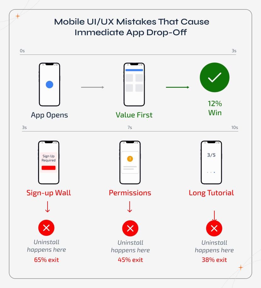
Progressive disclosure in onboarding means getting the user to a first success as quickly as possible using the minimum set of features required for that success, and revealing additional features only when the natural next step in the user's workflow creates the need for them. The test for an onboarding flow is not "have we explained everything" but "how fast does the user reach their first meaningful outcome?" Users who experience their app's core value within the first session retain at dramatically higher rates than users who do not, regardless of category.
For a fintech app, the first success might be seeing their balance and recent transactions. Everything else, including investment features, card controls, and UPI integrations, can wait until the user has confirmed the primary value proposition. For a productivity app, the first success is completing a single unit of work. For a content app, it is finding something worth watching or reading.
The disclosure sequence in onboarding should be driven by the journey to first value, not by the completeness of the feature introduction.
Complex Flows
Complex multi-step flows, such as a KYC verification, an insurance application, an investment setup, or a payment instrument configuration, are where progressive disclosure does its most mechanically important work. These flows contain steps that are objectively cognitively demanding. The intrinsic load is high. Progressive disclosure's job here is to ensure that no extraneous load is added on top of the necessary complexity.
The practical implementation is one question per screen. Each step in the flow should present a single decision or input requirement, with the context needed to answer it and nothing else. Shipping all steps of a long form on one screen, as a way to show the user "how much is left," adds extraneous load. Breaking the same form into sequential single-question screens reduces it, even though the total number of inputs is identical.
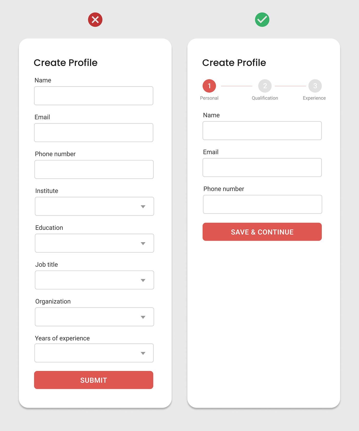
Research on checkout UX from Gapsy Studio documents that 18 percent of users abandon orders because checkout is too long or complicated as a result of poor UX. The multi-step progressive flow directly addresses this abandonment driver by making the form feel shorter and more manageable, not by removing required steps.
In practice, the difference between a complex flow that users complete and one they abandon is often not the length. It is whether each step feels like a natural consequence of the step before, and whether the user can see their progress without having to hold all remaining steps in working memory simultaneously.
Feature Education
Feature education is distinct from onboarding in that it involves introducing specific features to users who are already familiar with the app's core workflow. These users are not new. They have established patterns. Progressive disclosure for feature education means the introduction of new or underused features in the moment when the user's behavior creates a natural bridge to them.
The failure mode in feature education is the feature launch nudge sent to all users on a campaign schedule, regardless of whether the user is in a context where the feature is relevant. This pattern delivers the nudge when the calendar says to deliver it, not when the user is oriented toward the problem the feature solves.
The correct approach is event-based: a feature that improves the checkout experience should be introduced when a user who has not tried it navigates to the checkout screen. A feature that automates a recurring task should be introduced when a user has completed that task manually for the third time. The trigger is the user's behavior, not the campaign manager's schedule.
This is the version of feature education that Digia Engage's Feature Adoption use case is built around: surfacing the right feature at the moment in the user's session when their behavior has created the context for it to be relevant.
The Risk of Over-Progressiveness: When Hiding Things Creates Confusion
Progressive disclosure is not a universal good. It can be applied incorrectly in ways that create exactly the confusion it is designed to prevent. The failure mode is worth understanding precisely because "we're using progressive disclosure" is sometimes invoked to defend an interface that is simply bad at giving users what they need.
Hiding frequently needed features creates interaction cost, not clarity. If a user regularly needs to access a feature but that feature is buried two levels into a disclosure hierarchy because it was deemed "advanced" during design, the user pays an interaction cost on every session. VERSIONS' research on progressive disclosure states this directly: "Hiding frequently used features. If data shows users regularly access a 'hidden' feature, it probably shouldn't be hidden." The disclosure architecture must be informed by actual usage data, not by assumptions about what is primary or secondary.
Over-progressive disclosure creates a discovery deficit. If a user never finds a feature they would have valued because it was hidden too many layers deep and no contextual trigger ever surfaced it, the result is an app that the user perceives as having less value than it actually has. The user leaves not because the feature does not exist but because the disclosure system failed to create the bridge between their need and the feature that addresses it.
Hiding without communicating that more exists creates confusion rather than simplicity. Progressive disclosure requires signaling. The user who can see that there is more to find, through a "See all options" label, a visual indicator, or a contextual prompt, can choose to explore. The user who cannot tell whether there is more will either assume the app is limited or spend time hunting for things that are not where they expect them. UXcel's research on progressive disclosure risks identifies this as the primary danger: hiding advanced options too far without adequate signaling that they exist.
The practical test: does the disclosure architecture serve the user's ability to discover things they will want, or does it serve the product team's desire for a simpler-looking interface? Those two goals are not the same, and when they conflict, the user's discovery ability should win.
The quality check for any progressive disclosure decision is whether the timing of the disclosure matches the timing of the user's readiness. A feature revealed when the user needs it is well-disclosed. A feature hidden when the user needs it because it was categorized as "advanced" is just a usability failure with a respectable name.
How to Sequence Disclosures Based on User Behavior Signals
The sequencing of disclosures is where the theory of progressive disclosure meets the operational reality of building a disclosure system that adapts to actual user behavior rather than assumed behavior. Most apps use one of two approaches to this sequencing, and only one of them works.
Schedule-based sequencing fires disclosures based on time elapsed since install or session count. "Day 3 users get the investment feature introduction. Day 7 users get the portfolio analytics introduction." This approach is predictable and easy to build, and it is wrong in practice because it conflates time in the app with readiness to use a feature. A user who has logged in every day for three days but has not yet completed a transaction is not in the same state as a user who completed five transactions in their first day. Both receive the same Day 3 disclosure, and both experiences are miscalibrated.
Behavior-based sequencing fires disclosures based on what the user has actually done. The trigger for introducing a feature is a specific user action, not a time interval. This approach is harder to build but produces accurate sequencing because user behavior is a much better proxy for readiness than elapsed time.
The behavior signals that sequence disclosures well across most app categories are:
Task completion events. When a user completes a task for the first time, it creates a natural bridge to the next adjacent task. A user who has completed their first transfer is ready to learn about recurring transfer scheduling. A user who has published their first piece of content is ready to learn about analytics. The completion of the prior step is the signal that the user has the mental model required to benefit from the next disclosure.
Repeated manual action. When a user performs the same manual action multiple times, it is a signal that they have not discovered the feature that would automate or simplify it. Three manual repeat orders without discovering the repeat-order shortcut is a trigger for introducing that shortcut. This pattern requires the analytics infrastructure to detect repetition, but it produces disclosures that feel almost telepathic because the feature arrives exactly when the user is most aware of needing it.
Screen visits without conversion. A user who visits a feature's home screen multiple times without ever completing the feature's primary action is encountering friction at some point in the flow. That pattern is a trigger for a contextual hint about the obstacle, not for a nudge about the feature's benefits. The user already knows the feature exists; they are not completing it. The disclosure at this point should address the barrier, not repeat the introduction.
Return after absence. A user who has been absent for a period and returns carries context about what they were doing before they left. A disclosure that reconnects them to their last active workflow reduces reorientation time and lowers the re-engagement friction. This is not feature education. It is context restoration, and it is a form of progressive disclosure because it reveals only the relevant historical context rather than requiring the user to reconstruct their position in the app from scratch.
Lifecycle stage transitions. The move from new user to established user to power user is not cleanly marked by a session number, but it is marked by behavioral signals: first successful transaction, first repeated usage pattern, first multi-feature session. When the app can detect these transitions through instrumented events, it can adjust the disclosure layer accordingly, stopping orientation nudges when they are no longer needed and introducing expansion nudges when the user's behavior signals readiness for them.
Building a behavior-based disclosure system requires two things that most teams underbuild: event instrumentation that captures the specific user actions that indicate state transitions, and a nudge delivery infrastructure that can fire against those events in real time rather than in the next campaign cycle. Digia Engage's event-based architecture fires nudges within 100ms of a qualifying event, which matters for contextual sequencing because a disclosure that arrives 30 seconds after the triggering event may arrive after the user has already moved on from the state that made it relevant.
Measuring Success: The Metrics That Actually Matter
Most teams measure progressive disclosure success by proxy, looking at onboarding completion rates or session length and inferring that the disclosure system is working if those numbers are going in the right direction. That inference is often wrong. A user can complete onboarding and never find a valuable feature. Session length can increase because users are confused and searching, not because they are engaged.
The metrics that directly measure whether a progressive disclosure system is building user competence are more specific.
Feature discovery rate measures the percentage of users who have encountered a specific feature, calculated as the number of users who have navigated to or interacted with a feature's entry point divided by the total number of users who have passed the logical point in their journey where that feature should have been discovered. A low feature discovery rate does not tell you whether the feature is valuable. It tells you whether the disclosure architecture is successfully creating the bridge between the user's journey and the feature. Feature exposure is the first stage in any feature adoption funnel, and a feature that users are never exposed to cannot be adopted regardless of its quality.
Task completion rate measures the percentage of users who complete a specific meaningful action in the app. It is a direct indicator of whether the progressive disclosure at that step is reducing friction or creating it. A sharp drop-off in completion rate at a specific step indicates either a UX barrier at that step or a disclosure gap, where the user does not have the information they need to proceed. Identifying which one requires session replay alongside the funnel data.
Time to first value (TTFV) measures the median time from first app open to the first meaningful outcome, whether that is a completed transaction, a published piece of content, a first matched item, or whatever the app's core value event is. Progressive disclosure's primary job in onboarding is to reduce TTFV by removing the orientation overhead between arrival and first value. Users who reach the activation event in their first session retain at dramatically higher rates than those who do not. TTFV is the metric that directly tracks how well the disclosure sequence is serving that goal.
Return usage rate after feature introduction measures whether users who encounter a feature via disclosure return to use it again in subsequent sessions. A feature that is discovered but not used again is a feature the disclosure surfaced before the user was ready for it, or a feature the user tried once and found unhelpful. Distinguishing between those two explanations requires cohort analysis: if the return rate improves when the disclosure is delayed to a later behavioral trigger, the timing was the problem. If it stays flat regardless of disclosure timing, the feature itself is the problem.
Support ticket volume for disclosed features is a leading indicator of whether the contextual hints are providing sufficient explanation. Products using progressive disclosure see approximately 35 percent fewer support tickets during onboarding. If a specific feature, despite being introduced via a contextual hint, is generating support tickets about how to use it, the hint is either not reaching the user at the right moment or not providing sufficient context to make the feature understandable without additional help.
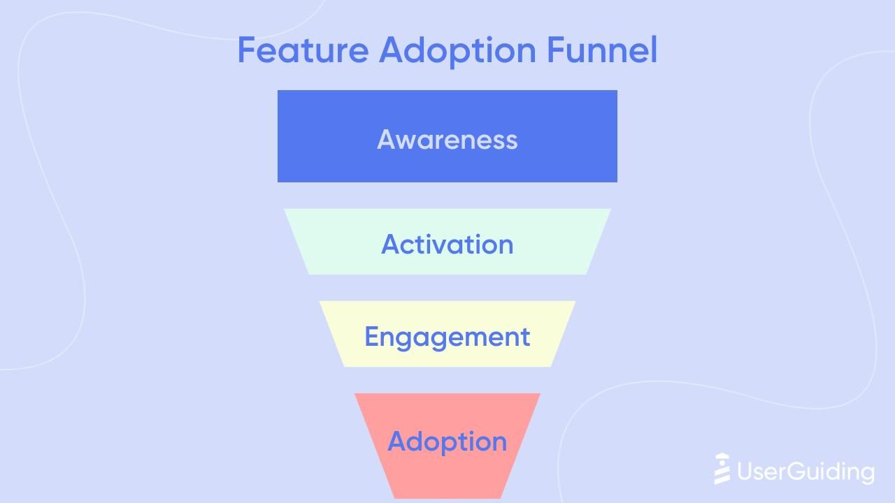
Disclosure-to-adoption funnel is the metric framework that ties all of these together. The adoption funnel for any feature runs through four stages: exposed (the user has seen a disclosure about the feature), activated (the user has taken their first action within the feature), used regularly (the feature is part of the user's standard workflow), and retained (the user returns to the feature over time). Each stage transition has a rate. The disclosure system's job is to move users through the exposed-to-activated transition efficiently. If that rate is low, the sequencing is off. If the activated-to-used-regularly rate is low, the feature itself or its design is the problem. The funnel makes visible which part of the system is failing.
Key Takeaways
- Progressive disclosure is not about making an app look simpler. It is about timing the delivery of complexity to match when the user is ready for it. The interface's job is to sequence understanding, not to defer it indefinitely.
- The cognitive load problem is structural. Human working memory handles approximately four to seven chunks of information at once. An interface that exceeds this threshold at any given moment is not giving users more. It is reducing their ability to process any of it. Reducing extraneous load through progressive disclosure redirects that cognitive capacity toward germane processing: actual learning.
- Mobile changes the stakes because screen space is constrained, session contexts are short and unpredictable, and interaction is thumb-first. These conditions lower the tolerance for extraneous cognitive load and make the timing of disclosure decisions more consequential than in desktop environments.
- The three core patterns address different disclosure problems. Feature gating by action teaches through earned access and works best when the gate sits between things users would naturally do in sequence. Reveal on scroll converts spatial constraints into temporal pacing and works best for content hierarchies and long-form information. Contextual hints teach in the moment of intent and work best when they fire against specific interaction events rather than session schedules.
- Over-progressiveness is a real failure mode. Hiding features that users regularly need creates interaction cost, not clarity. Hiding features too deep without signaling that they exist creates discovery deficits. The test for any disclosure decision is whether the timing of the disclosure matches the timing of the user's readiness, not whether it reduces visual complexity.
- Behavior-based sequencing outperforms schedule-based sequencing because user behavior is a better proxy for readiness than elapsed time. The trigger for a disclosure should be a specific user action, not a campaign calendar date.
- The metrics that directly measure disclosure quality are feature discovery rate, TTFV, task completion rate, return usage rate after feature introduction, and the exposed-to-activated conversion in the feature adoption funnel. Aggregate session length and onboarding completion are too blunt to diagnose specific disclosure failures.
- No universal benchmark exists for the right disclosure sequence or timing across app categories. The behavior signals and transition events that indicate readiness are app-specific and must be calibrated against actual user data, not assumed from industry patterns.
Further Reading
From Digia
- Onboarding Patterns for Mobile Apps: Progressive Disclosure vs Front-Loaded Setup: the structural onboarding decision that determines which disclosure pattern fits your app
- Designing Non-Annoying Nudges: Frequency, Placement, and Context: the operating rules for nudge systems, including suppression logic and lifecycle-adaptive frequency
- Breaking Down CRED's Subtle In-App Nudges That Drive User Engagement: how restraint and well-timed disclosure build trust in a high-stakes fintech context
- Bottom Sheets vs Modals: Choosing the Right Interruption Layer: the format decision once you have determined what to disclose and when
- Digia Nudges: event-based nudge triggers for contextual disclosure at 100ms latency, without engineering dependency
- Feature Adoption: how to surface the right feature at the moment when user behavior creates the context for it
External Sources: All Claims Attributed
- Progressive Disclosure: Nielsen Norman Group (original pattern definition by Jakob Nielsen, 1995; task completion time reduction of 20–40%; comprehension improvements)
- Instructional Overlays and Coach Marks for Mobile Apps: Nielsen Norman Group (contextual hints vs. upfront tutorials; visual differentiation requirements for coachmarks)
- Miller's Law: Laws of UX (working memory limit of 7 ± 2 items; chunking principles)
- Miller's Law in Psychology: The Magic Number 7: Neurolaunch (Cowan's revised estimate of four chunks; practical implications for navigation menus)
- Progressive Disclosure in Onboarding: userTourKit (Chameleon's 15-million-interaction dataset; linear onboarding 53% completion vs. contextual 75%; 30% paid conversion increase, sourced from Userpilot 2025)
- SaaS User Activation: Proven Onboarding Strategies: SaaS Factor (NNg task completion time reduction 20–40%; Hotjar 35% fewer support tickets; limit of 3–4 choices per step)
- Progressive Disclosure UX: Making Experience Convenient: Gapsy Studio (18% checkout abandonment due to overly long or complicated checkout UX)
- How to Use Coachmarks and Spotlight UI in Mobile Apps: Plotline (coachmarks and spotlights improve feature adoption by 40–60% when implemented strategically; Jar GoldX adoption case study)
- Progressive Disclosure: The Art of Revealing Just Enough: VERSIONS (extraneous vs. intrinsic cognitive load; hiding frequently used features increases interaction cost)
- Progressive Disclosure in UX Design: Types and Use Cases: LogRocket (cognitive overload leads to frustration, confusion, and decreased performance)
- Feature Adoption Metrics: The PM's Diagnostic Guide: Userpilot (four-stage feature adoption funnel: exposed, activated, used, used again)
- Mobile App Metrics I Actually Track as a PM: Userpilot (users who reach the activation event in their first session retain at dramatically higher rates; TTFV benchmark: under 50% of new users reaching activation event indicates a friction problem)
- What is Progressive Disclosure in UX?: UXPin (definition; progressive disclosure for onboarding, complex tasks, limited screen space)
- Mobile App Engagement Metrics to Track in 2026: Adapty (progressive feature disclosure tied to user journey; feature adoption optimization)
This article is part of Digia's Engagement and Lifecycle series. Previous articles covered nudge frequency, placement, and context, CRED's in-app nudge architecture, and bottom sheets vs. modals.
Building a disclosure system triggered by real user behavior, not campaign schedules? See how Digia Nudges work or book a demo.