
TL;DR: A nudge becomes annoying the moment the user experiences it as the app's agenda rather than their own. That experience is determined by three things: how often the nudge fires (frequency), where on the screen it appears and in what flow (placement), and whether it connects to what the user is actually doing right now (context). Getting any one of them wrong degrades the other two. This article covers the mechanics of each, why they interact, and what a nudge system built on all three looks like in practice. Sourcing note: Where specific benchmark data is cited, the source and methodology are attributed. Where no published study covers a specific claim, the article says so.
Most growth teams know what a good nudge looks like in isolation. The copy is clear, the design is clean, the CTA is unambiguous and they test it, it performs, they ship it.
Then they ship the next one. And the one after that. Each nudge individually fine. The cumulative experience: an app that will not leave the user alone.
Nudge annoyance is almost never a single-nudge problem. It is a system problem, the result of designing nudges in isolation rather than as a coherent set of signals operating across a user's entire relationship with the app. A nudge that would feel perfectly helpful in session three, feels like harassment in session thirty, not because the nudge has changed but because its relationship to the user's context has.
This article is about building the system rather than the individual nudge. Frequency, placement, and context are three independent variables with compounding effects on each other. Optimise one without the others and you will find the ceiling quickly. Optimise all three together and you get what the best-performing apps achieve: nudges that users process as the app paying attention, not as the app talking at them.
This is the fifth article in Digia's Engagement and Lifecycle series. The previous articles covered bottom sheets vs modals, inline banners vs overlays, CRED's nudge architecture, and Swiggy's repeat-order mechanics. This one is about the operating rules that govern a nudge system, not a single format or app.
Why Nudges Become Annoying: The Actual Mechanism
Before frequency, placement, and context, there is a more fundamental question: what is the psychological mechanism that makes a nudge register as annoying rather than helpful?
The answer is not "too many nudges." That is a symptom. The underlying mechanism is goal interference: the user experiences the nudge as an obstacle to, or a distraction from, whatever they came to the app to do.
A nudge that fires when the user has no active goal in mind, whether browsing, exploring, or in an idle state, has no goal to interfere with. It can be processed without friction because there is nothing it is getting in the way of. The same nudge firing when the user is mid-checkout, mid-search, or mid-form introduces friction not because the nudge itself is bad but because it is competing with a task the user has already committed cognitive resources to completing.
This is why identical nudge copy, identical nudge design, and identical nudge placement can produce completely different user reactions depending on when it fires. The variable is not the nudge; it is the user's current goal state.
The implication is significant: designing non-annoying nudges is primarily a problem of goal state detection, not creative quality. A well-written nudge that fires at the wrong moment will always feel more annoying than a mediocre nudge that fires at the right one. Teams that invest in copy and creative quality while neglecting timing and context are optimising the visible variable while leaving the most important one unaddressed.
Frequency, placement, and context are the three controls that determine whether a nudge interferes with the user's goal or aligns with it. Each operates differently. Each is addressable through product decisions rather than just copy decisions.
Frequency: The Data and What It Actually Tells You
The push notification literature on frequency is the most quantitatively well-documented part of this conversation, and it has direct implications for in-app nudge strategy even though the channels differ.
The average US smartphone user receives approximately 46 push notifications per day across all apps. This number has consequences. When every app is competing for attention in the same notification tray, users develop systematic filtering behaviour, not for irrelevant notifications specifically but for the entire channel. Android push opt-in rates dropped from 85% to 67% in a single year following the rollout of Android 13's explicit consent model, which aligned Android with Apple's opt-in policy. iOS rates declined slightly, bringing the combined average to 61%.
This is a channel-level consequence of excessive frequency across the industry. Individual apps did not each over-message enough to trigger the response. The collective behaviour of the entire app ecosystem created the condition, and each individual app now operates in a lower-trust, higher-friction attention environment as a result.
In-app nudges are different from push in one critical way: they are displayed to all active users regardless of push notification opt-in settings. The user who has silenced an app's push notifications still encounters in-app nudges when they open the app. This makes in-app frequency decisions more consequential, not less, because in-app is one of the few channels that cannot be turned off without uninstalling the app entirely.
The frequency data reveals a shape that most growth teams do not expect.
Below a minimum threshold, nudges hurt retention. 95% of users who opted in to push notifications but received no notifications in the first 90 days ended up churning. Zero engagement from the app is experienced as the app having nothing useful to say. Users who installed with an expectation of value and received silence interpreted it as confirmation that the product was not valuable.
Above a maximum threshold, nudges also hurt retention. Research consistently cited in engagement benchmarks shows that 3–6 push notifications causes 40% of users to disable push notifications entirely. Sending too frequently is not just annoying. It removes the channel from future use.
Within the band, frequency correlates with retention. OneSignal's 2024 mobile app benchmark data found that apps displaying 6–10 in-app messages weekly reported the highest average app session lengths across the dataset. This is not a universal prescription. It reflects the apps that had optimised frequency to match their user base, but it establishes that there is an optimal band, not a simple "less is more" rule.
The shape is a bell curve with steep drop-offs at both ends, not a straight line. Both extremes fail. The middle is not obvious. The optimal frequency for your app is not an industry benchmark. It is a function of your app's use frequency, your users' session depth, and how much of the nudge volume is contextually relevant vs. broadcast.
The Targeted vs. Broadcast Distinction
The most important frequency insight from the data: targeting changes the threshold. Broadcast messages, nudges sent to all users on a schedule regardless of behaviour, produce faster churn than targeted messages, even at identical absolute frequency. Apps sending broadcast messages lose over half their audience before session 11; apps sending targeted messages retain 39% past session 11, according to Business of Apps data.
The implication is that "how many nudges" is the wrong frequency question. The right question is: how many nudges that would have been relevant to that specific user in that specific session? A user who receives three targeted nudges in a session, each fired by their own behaviour, experiences a very different volume than a user who receives the same three nudges on a broadcast schedule timed to the campaign calendar. The former feels like the app noticing things. The latter feels like the app not caring whether those things apply to them.
The Frequency Cliff: When the Campaign Calendar Becomes the Enemy
The most common source of nudge over-frequency in consumer apps is not deliberate over-messaging. It is the campaign calendar.
Growth teams plan campaigns in isolation. A feature launch campaign. A seasonal promotion. A re-engagement sequence for lapsing users. A subscription upsell campaign. Each campaign is reviewed and approved individually. Each has a sensible frequency when considered alone.
The problem: they run simultaneously, and users are in all segments at once.
A user who is a new sign-up (receiving onboarding nudges), has just made their first purchase (receiving post-conversion nudges), has not used a specific feature (receiving feature adoption nudges), and is approaching a subscription tier boundary (receiving upsell nudges) may be in four active nudge campaigns simultaneously. Each campaign's manager considers their nudges reasonable. The user experiences the sum.
This is the frequency cliff: the point at which the cumulative nudge volume from multiple well-intended campaigns tips the user into dismissal behaviour. Once a user starts dismissing nudges habitually, not selectively but reflexively, it is very difficult to re-earn the attention. The user has reclassified the app's nudge system from "sometimes useful" to "background noise."
The structural fix is cross-campaign frequency governance: a global cap on the number of nudge impressions any single user can receive within a defined window, applied across all campaigns simultaneously, with priority logic that determines which nudge fires when the cap is reached. This requires a nudge platform with session-level suppression logic, not just per-campaign frequency settings. A campaign-level cap of one nudge per session is not the same as a user-level cap of one nudge per session. The former can be set in every campaign individually and still deliver four nudges in a session to a user who is in four campaigns.
Placement: Where the Nudge Lands Is Part of the Message
Placement has two dimensions that most teams treat as one: screen position and flow position.
Screen position is the physical location of the nudge on the device screen: top, centre, bottom, or anchored to a specific UI element. Flow position is where in the user's session journey the nudge appears: at session open, mid-task, after task completion, or at session exit.
Both dimensions affect how the nudge is processed. Neither is secondary to the other.
Screen Position
The ergonomics of mobile devices create a natural attention hierarchy on screen. Research from Nielsen Norman Group's eyetracking studies established that users develop scanning patterns around mobile screens and learn to filter specific positions that have consistently been used for promotional content. Positions that are always promotional become invisible over repeated exposure.
The practical screen position principles for in-app nudges:
Anchored-to-element nudges earn higher attention than positional nudges. A tooltip anchored to a specific button the user is about to interact with is processed as "information about this thing I'm doing." A banner at the top of the screen is processed as "promotional content from the app." Even when the copy is identical, the anchor relationship to a specific UI element changes the user's interpretation of the nudge's intent. Anchored nudges feel helpful; positional nudges feel promotional.
Bottom-of-screen placement carries lower interruption cost than top or centre on mobile. Bottom sheets and persistent bottom banners feel less intrusive because they do not obscure the primary content the user came to see. Top-of-screen banners are in the primary reading area. Centre-screen modals obscure everything. Position maps to interruption perception, and lower interruption perception produces lower dismissal rate regardless of content quality.
Placement should not compete with primary navigation. A nudge that fires over or adjacent to the app's tab bar or primary navigation elements creates accidental interaction, where users who tap to navigate hit the nudge instead. This is a direct source of rage taps and negative session experience. Nudge placement logic should include navigation element exclusion zones.
Position fatigue is real and compounding. If a specific screen position is used for promotional content across multiple sessions, users will begin to pattern-ignore that position, regardless of what is in it. This is the same mechanism as banner blindness applied to in-app nudges. The fix is position rotation, not randomisation, which confuses, but deliberate variation that prevents any single position from becoming associated exclusively with promotional intent.
Flow Position
Where in the session journey a nudge fires matters more than where on the screen it appears, because it determines the user's goal state at the moment of delivery.
The highest-converting flow positions, the moments when users are most receptive to a nudge, follow a consistent pattern across app categories:
Post-completion is the premium placement. The moment immediately after a user has successfully completed a meaningful action, a purchase, a payment, a content piece finished, or a form submitted, is the highest-receptivity window in the session. The user has just achieved something. Their emotional state is positive, their primary goal is satisfied, and their attention is briefly unanchored from any task. This is the window CRED uses for its reward reveal, Swiggy uses for its reorder nudge, and Paytm uses for its cross-sell. All three have converged on the same flow position independently because the data leads there.
Session-open is the second-best placement. When the user first opens the app, before they have committed attention to any specific task, they are in an exploratory state. A nudge at session open encounters no competing goal. The risk is that the user has not yet oriented to the session and does not yet know what they came to do. Nudges that fire too fast at session open (under 2 seconds) before the user has processed the current screen state feel disorienting. A brief delay, once the user has seen the current screen state, improves processing without sacrificing receptivity.
Mid-task is the most dangerous placement. Any nudge that fires while the user is actively executing a goal, filling a form, searching, browsing with a specific product in mind, or executing a transaction, competes with that goal directly. The nudge does not have to be about something irrelevant to annoy. A relevant upsell nudge that fires during a checkout flow tells the user: "before you complete the thing you wanted to do, deal with this." The task completion rate in that session will reflect the interruption.
Session-exit placement is underused. When a user has reached the natural end of their task, as the session depth is dropping, they are navigating back, or they are approaching the app's home state, a nudge that fires here encounters a user who has finished what they came to do and has a brief window of receptivity before they exit. Exit-intent nudge placement is far more commonly used in web than in native mobile, despite the same logic applying.
Context: The Variable That Makes the Same Nudge Feel Like Two Different Things
Frequency determines how much. Placement determines where and when. Context determines whether any of it lands.
Context is the relationship between the nudge content and the user's current situation. A nudge about a feature the user has never used is contextually relevant at the moment the user is about to encounter a problem that feature solves. The same nudge shown two sessions later, when the user has moved on from that problem, is not contextually relevant, even if technically targeted to "users who haven't used this feature."
The gap between targeting and context is where most nudge campaigns lose their effectiveness. Targeting is demographic and behavioural: users who match a segment definition. Context is situational: users who are in a specific state right now, in this session, on this screen.
There are three context dimensions that determine whether a nudge is experienced as helpful or intrusive:
1. Task Context: What Is the User Trying to Do?
The first and most important context question is the simplest: what is the user's current task? A user opening the payments screen has a different task than the same user opening the discovery feed. A nudge about a new payment feature is contextually relevant on the payments screen and contextually misaligned on the discovery feed. The screen the user is on, and the actions they have taken on it, are the most reliable proxy for their current task.
Most nudge systems target by user segment and fire by schedule. The highest-performing nudge systems target by user segment and fire by real-time event: what the user just did, which screen they just navigated to, what they stopped doing before completing it. The event-based trigger is what converts a targeted nudge into a contextual nudge. The segment narrows who could receive it; the event determines whether right now is the right moment.
Google Pay demonstrates this clearly. Rather than showing UPI feature tooltips to all new users on a schedule, tooltips appear at the specific moment new users navigate to the contacts screen or the QR scan screen for the first time, precisely when the feature being explained is the feature they are about to try. The tooltip meets the user at the moment of natural discovery rather than creating an artificial discovery moment.
2. Session Depth Context: How Deep into the App Is the User?
A user on their third ever session is in a fundamentally different contextual state than the same user on their hundredth session, even if their profile data looks identical. The third-session user is still building their mental model of the app. They are oriented toward understanding, not toward efficiency. Nudges that accelerate discovery, such as tooltips, coachmarks, and feature spotlights, match this context. Nudges that assume familiarity, such as upsell offers, upgrade prompts, and cross-sell suggestions, are contextually premature.
The hundredth-session user has established patterns. They know which features they use and which they don't. They do not need help understanding the app, and orientation nudges aimed at new users will feel condescending or irrelevant. What is contextually appropriate here is nudges that extend their existing behaviour: features adjacent to what they already use and offers relevant to their established usage pattern.
Smashing Magazine's UX research states this principle directly: "Start slowly, and evolve your notification frequency depending on how exactly a user actually uses the product. For every type of user, set up notification profiles: frequent users, infrequent users, one-week-experience users, one-month-experience users." (Smashing Magazine, 2025) Session depth context is not a static user property. It changes as the user ages in the product. A nudge strategy built on static segments will deliver the wrong context for an increasingly large proportion of the user base as time passes.
3. Emotional Context: What Did the User Just Experience?
This is the most underaddressed context dimension and the one most responsible for the gap between nudges that feel helpful and nudges that feel like the app is trying to take advantage.
Emotional context is set by the most recent meaningful event in the session. A user who just successfully completed a transaction is in a positive emotional state: open, accomplished, and briefly unanchored from their primary goal. A user who just failed to complete a transaction, whether through a payment decline, a form error, or a search returning no results, is in a negative emotional state characterised by mild frustration or confusion. A nudge that fires into the positive state lands differently than the same nudge firing into the negative state, even with identical targeting and placement.
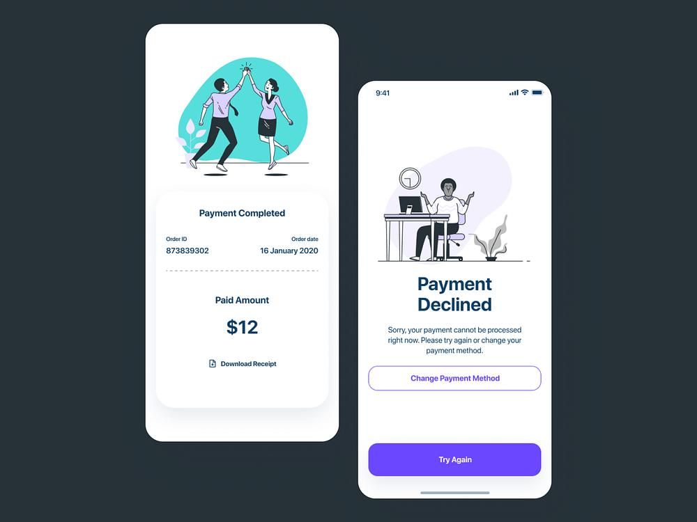
The most consequential application of emotional context in nudge design is in fintech. A user who has just been notified of a declined card, or who has encountered a KYC error during onboarding, is in an anxious state. A cross-sell nudge into that state, such as an insurance product offer or a credit line promotion, will not only fail to convert but will damage the app's trust positioning. Paytm's cross-sell architecture explicitly avoids this: their suppression logic prevents any promotional or cross-sell nudge from firing during an active transaction or within a short window following a transaction error.
Emotional context requires suppression logic, not just trigger logic. It is not enough to build good triggers for when to fire nudges. You need equally explicit rules for when not to fire them.
The Three-Axis Framework
Frequency, placement, and context are three dimensions of the same problem. They are not independent controls, since each one modulates the effects of the other two.
High frequency is tolerable when placement is excellent and context is consistently relevant. A nudge system that always fires at the right moment, in the right screen position, about something the user is directly relevant to, can sustain higher frequency without accumulating annoyance debt. This is why apps with strong engagement, where nudge relevance is high, can maintain more frequent nudge activity than apps with weaker personalisation.
Poor placement can be partially compensated by high contextual relevance. A nudge that fires at a screen position the user would normally filter, but that contains information directly relevant to what they are doing, will break through the positional filter because the content relevance overrides the pattern-ignore behaviour. This is not a reliable system, as it burns relevance credit on compensating for placement, but it is observable in practice.
Low contextual relevance amplifies the annoyance cost of any frequency level. A nudge system with poor targeting, firing broadcast content at schedule-driven intervals, will hit the annoyance threshold much faster than a targeted system even at lower absolute frequency. This explains the Business of Apps finding that broadcast message apps lose audience faster than targeted ones at identical frequency: the threshold is not just a function of how many nudges but how many nudges that didn't apply.
The practical implication: when optimising a nudge system, start with context, then placement, then frequency. Context improvements reduce the base annoyance cost per nudge, making frequency headroom available. Placement improvements reduce interruption cost, making context improvements more visible. Frequency adjustments are the fine-tuning on top of a foundation that context and placement have to build first.
Suppression Logic: The Infrastructure Most Teams Underbuild
Every nudge system has trigger logic, the conditions under which a nudge fires. Very few have equivalent suppression logic, the conditions under which a nudge explicitly does not fire, even if it would otherwise be triggered.
Suppression logic is what separates a nudge system designed around user experience from one designed around campaign delivery. Campaign-centric systems are built to maximise delivery; suppression is seen as a reduction in reach. User-centric systems are built to maximise relevant delivery; suppression is a mechanism for protecting relevance.
The suppression rules a mature nudge system should encode:
Mid-transaction suppression. No nudge fires while a payment, a form submission, or any other multi-step transactional flow is in progress. The user's full attention is on the transaction. Any interruption risks the transaction completing incorrectly or abandoning entirely.
Error-state suppression. When the user has just encountered an error, a 404, a payment failure, or a form validation error, no nudge fires until the user has either resolved the error or navigated away from it. An error state is a frustration state. Layering a promotional nudge on top of frustration compounds the negative experience.
Consecutive impression cap. No user receives more than N nudge impressions in a single session, regardless of how many campaigns they qualify for. The value of N depends on the app's session depth and use frequency, but the principle is universal: there is a per-session ceiling beyond which additional nudges produce net-negative outcomes.
Recency suppression. A user who dismissed a nudge should not receive the same nudge again in the same session, and should receive it again in a subsequent session only after a meaningful time gap. Immediate re-delivery of dismissed content signals to the user that the app either did not notice they dismissed it or did not care. Both interpretations damage trust.
Lifecycle stage suppression. Nudges designed for users at stage A of the lifecycle should be suppressed for users who have progressed to stage B. An onboarding tooltip firing for a user who has been in the app for 90 sessions is not just irrelevant. It is confusing, suggesting the app does not know who it is talking to.
The absence of suppression logic is often what produces the over-messaging experience that teams later try to solve by reducing total nudge volume. Reducing volume is the right instinct but the wrong intervention. The correct intervention is targeting suppression at the specific conditions that are generating friction, not across-the-board volume reduction that also removes nudges that are working.
Lifecycle-Adaptive Frequency: The System That Scales
Frequency that is appropriate for a new user is not appropriate for a retained user. This is not a controversial statement, but very few nudge systems operationalise it.
The lifecycle frequency model maps nudge volume to user age and engagement depth:
New users (sessions 1–10): High orientation frequency, zero promotional frequency. New users are processing the app. They need guidance: onboarding nudges, feature discovery cues, and contextual help that reduces time-to-value. What they do not need: upsell prompts, subscription upgrade nudges, cross-sell offers. They have not yet experienced the app's core value. Promoting before delivering that value creates a user who associates the app's nudge system with asking rather than helping. Promotional frequency for new users should be near zero, regardless of acquisition cost pressure to push conversion early.
Active users (sessions 11–50): Reduced orientation frequency, calibrated promotional frequency. The user has established usage patterns. Orientation nudges become noise, since they already know how the app works. Promotional nudges for features adjacent to their established behaviour have genuine contextual relevance. This is the window where feature adoption nudges, lifecycle nudges, and relevant upsell nudges have the highest conversion quality. Volume can increase here because relevance is higher; the user knows enough about the app to evaluate whether the nudge is useful.
Power users (sessions 50+): Near-zero orientation frequency, selective and highly personalised promotional frequency. Power users are the users most likely to churn if over-messaged, because they chose the app on merit and hold a higher standard for the experience. Orientation nudges aimed at them are insulting. Poorly targeted promotional nudges are friction they will tolerate less than a newer user who is still discovering whether the app is worth using. At this lifecycle stage, the volume of nudges should be low and the personalisation bar high. Every nudge a power user receives should feel individually relevant, not because they received targeted content from a segment but because the nudge was triggered by their specific, individual behaviour.
How to Build the Non-Annoying Nudge System
These principles are abstract until they are implemented. Here is what the practical implementation looks like across the three dimensions.
Frequency Implementation
Define frequency at two levels: the campaign level and the user level.
At the campaign level: each nudge campaign should have a maximum impression frequency, per session, per day, and per rolling 7 days, calibrated to the nudge type. Onboarding tooltips can fire more frequently (the user needs them repeatedly as they encounter each feature for the first time). Promotional offers should fire less frequently (repeat exposure without response signals disinterest, and re-firing is friction). Feature adoption nudges land in between: fire once or twice, then stop and let the user choose.
At the user level: implement a global frequency cap that is applied before any campaign-level decision. No matter how many campaigns a user qualifies for, the daily and session-level caps are applied first. When a user hits the cap, the highest-priority nudge (determined by a priority score assigned to each campaign) fires; the rest are held or discarded.
The discipline this requires: someone in the growth team must own the user-level cap and be empowered to enforce it against campaign-level pressure. Without ownership, the cap will be treated as a suggestion and exception-requested into irrelevance within two campaign cycles.
Placement Implementation
Build a placement taxonomy and assign each nudge type to the placement that matches its interruption cost and its conversion window.
Onboarding nudges → anchored to specific UI elements; fire on first encounter with each element, not on a schedule.
Feature adoption nudges → session-open or post-completion; fire at the start of a session where the user's behaviour has created a natural bridge to the new feature.
Promotional nudges → post-completion only (for user-state receptivity) or inline (for low-interruption discovery); never mid-task.
Re-engagement nudges → session-open; the user who opens after a period of absence has no task yet, and the re-engagement nudge can orient the session before a goal is set.
Error recovery nudges → after the error has been resolved or after the user has navigated away from the error state; not into the error state itself.
Build the placement logic before you build the campaigns. If the placement taxonomy is defined first, individual campaigns inherit their placement automatically from their nudge type rather than being placed by whoever is running the campaign that week.
Context Implementation
Context implementation requires event-based triggers, not schedule-based triggers.
Every nudge campaign should be triggered by a user event rather than a time interval. "User navigated to the payments screen for the first time" is a trigger. "User has been in the app for 7 days" is a schedule, not a trigger. The schedule-based system delivers the nudge when the calendar says to; the event-based system delivers it when the user's behaviour creates the right moment.
The events that create the highest contextual alignment:
- First visit to a specific screen → feature education nudge for that screen's primary action
- Completion of a specific action → nudge for the natural next step
- Second visit to a screen without completing the primary action → recovery nudge for the barrier they likely encountered
- X sessions without visiting a feature → feature re-introduction nudge (fired at session-open, not on the feature screen, because forcing a diversion mid-session is worse than introducing it as a session theme)
- Return after an absence of Y days → re-engagement nudge calibrated to what they were doing before they left
Digia Engage's event-based trigger architecture fires within 100ms of a qualifying event, which matters not just for speed but for contextual precision. A nudge that fires 30 seconds after the triggering event may arrive when the user has already moved on from the context that made it relevant. At 100ms, the user is still in the contextual state the trigger was designed to target. The timing of the infrastructure is part of what makes context-aware nudges feel native rather than scheduled.
Key Takeaways
- A nudge becomes annoying when the user experiences it as goal interference, the app's agenda competing with their own task. This is primarily a timing and context problem, not a copy or creative problem. Good copy in the wrong context will always feel worse than mediocre copy in the right context.
- Frequency is not a simple "less is more" variable. Below a minimum threshold, zero nudges correlates with churn. Above a maximum threshold, excessive nudges accelerate churn. The optimal band is narrow, highly specific to the app and the user segment, and dependent on how much of the volume is contextually targeted vs. broadcast.
- The distinction between targeted nudges and broadcast nudges changes the frequency threshold significantly. Broadcast nudges, sent to all users on a schedule, accumulate annoyance faster at lower absolute volume than targeted nudges fired by user events.
- Screen position placement and flow position placement are both determinants of nudge receptivity. The highest-converting flow position is post-completion (after the user's primary task is done). The highest-friction flow position is mid-task. Flow position matters more than screen position, but both accumulate over time and neither should be treated as fixed.
- Context has three dimensions: task context (what is the user doing?), session depth context (how experienced is this user?), and emotional context (what did the user just experience?). Emotional context is the most underaddressed and the most important for high-trust app categories.
- Suppression logic is as important as trigger logic. A complete nudge system defines explicitly when nudges do not fire: during transactions, in error states, after recent dismissals, and beyond the per-session cap, not just when they do.
- Frequency, placement, and context are not independent controls. Context improvements reduce the base annoyance cost of any frequency level. Placement improvements reduce interruption cost. Optimise in this order: context first, placement second, frequency last.
- Lifecycle-adaptive frequency is not a one-time segmentation. New users need high orientation volume and zero promotional volume. Active users need reduced orientation volume and calibrated promotional volume. Power users need near-zero orientation volume and highly selective personalised promotional volume. The relative volumes shift continuously as users age in the product.
- No universal benchmark exists for optimal in-app nudge frequency in native mobile apps. The data points in this article are drawn from push notification research (where frequency data is more extensive) and in-app message benchmarks (where they exist). The principles transfer; the specific numbers require calibration against your own user base and session data.
Further Reading
From Digia
- Bottom Sheets vs Modals: Choosing the Right Interruption Layer: the format decision once you have decided a nudge should fire
- Inline Banners vs Overlays: Impact on Conversion and UX Friction: the first-level format choice and how it relates to interruption cost
- Breaking Down CRED's Subtle In-App Nudges That Drive User Engagement: the most detailed available analysis of a nudge system built on restraint as a trust investment
- How Swiggy Uses Bottom Sheets to Drive Repeat Orders: post-completion placement in practice at high session frequency
- Eliminating Mobile App Release Dependency for Engagement Experiments: why frequency and placement decisions stay underdeveloped in systems that require a release cycle to test
- Digia Nudges: event-based nudge triggers, frequency controls, and suppression logic in Digia Engage
External Sources: All Claims Attributed
- The Great Push Notification Benchmark 2025: Batch (Android opt-in drop from 85% to 67%; in-app messages displayed regardless of push opt-in status)
- Push Notification Statistics (2025): Business of Apps, sourcing CleverTap and Helplama (46 daily notifications; 3–6 pushes causes 40% opt-out; broadcast vs targeted session retention data)
- 50+ Push Notification Statistics for 2025: MobiLoud (95% churn among users who opted in but received zero notifications in 90 days)
- Mobile App Benchmarks 2024: OneSignal (6–10 in-app messages weekly = highest session length)
- Design Guidelines for Better Notifications UX: Smashing Magazine (user notification profiles; lifecycle-adaptive frequency guidance)
- Banner Blindness: The Original Eyetracking Research: Nielsen Norman Group (positional pattern-ignore behaviour)
- How to Use Coachmarks and Spotlight UI in Mobile Apps: Plotline (coachmarks and spotlights improve feature adoption by 40–60% when implemented strategically)
- The Psychology of Nudges: Why the Smallest Design Element Can Shift the Biggest Outcomes: UX Magazine (Zeigarnik effect; default option acceptance rate data from Behavioral Public Policy)
This article is part of Digia's Engagement and Lifecycle series. Next: In-App Nudges - How to Trigger the Right Message at the Right Moment, covering the trigger architecture that puts frequency, placement, and context into production.
Building a nudge system with frequency governance and event-based triggers? See how Digia Nudges work or book a demo.