TL;DR: Overlays show higher conversion numbers in short-term, isolated tests. Inline banners show lower numbers in the same tests. Teams read that and choose overlays. Then they wonder why session completion drops, why users rate their app worse, and why the engagement team's reports look great while retention slowly deteriorates. The conversion rate you measure and the conversion rate that matters are not the same metric. This article separates them. Sourcing note: Where specific data is cited, the source is attributed. Where no independent study exists for a specific claim, the article says so directly. No numbers are invented to make a point.
Every growth team eventually runs the same experiment: swap an inline banner for a modal overlay, watch the click-through rate jump, and conclude the overlay wins.
The conclusion is wrong. Not because overlays don't produce more clicks, they actually do in controlled tests, for specific goals, under specific conditions. The conclusion is wrong because it measures the wrong thing. It measures what happened to the metric being watched while ignoring what happened to everything around it.
This matters because the choice between inline banners and overlays is not a campaign-level decision. It is a product-level decision with compounding consequences. Choose overlays where banners belong, and you are not just making one campaign slightly more aggressive. You are training your users session by session to associate your app with interruption. That training accumulates. It shows up months later in the numbers that matter: session depth, feature adoption, 30-day retention, and eventually, whether users recommend the app at all.
This article is of Digia's Engagement and Lifecycle series. If you have not read Bottom Sheets vs Modals: Choosing the Right Interruption Layer, that article covers the interruption layer comparison within overlay formats. This one is about a different and more fundamental choice: whether to interrupt at all.
First, What are Overlays And Inline Banners
These terms get used loosely, and loose definitions produce confused decisions. Let's be specific about what each format is and what it does structurally.
An overlay is a UI element rendered above the current screen layer. It interrupts the user's current task by placing content over the top of it. The user cannot continue what they were doing without either interacting with the overlay or dismissing it. Subtypes include full-screen modals, centre-screen lightboxes, bottom sheets (which are overlays that enter from the bottom edge), interstitials, and toast notifications. What they share: they layer content on top of the app's existing screen state.
An inline banner is a UI element rendered within the content flow of the screen. It exists at a specific position in the layout which is between two content blocks, within a list, embedded in a feed, and the user encounters it as they scroll or navigate. The user's task is not interrupted: the banner exists alongside the app's content, not over it. Subtypes include persistent in-feed banners, embedded content cards, horizontal strip banners, and native content units.
The structural difference is not aesthetic but it is architectural. Overlays demand attention by design as the underlying content is either obscured or dimmed, removing the option to ignore. Inline banners request attention by placement, they exist in the user's path and must earn attention through relevance and creative quality.
That structural difference is what drives the divergence in conversion data, UX friction scores, and long-term retention outcomes. Everything else in this article flows from it.
How Overlays Convert: The Honest Picture
Overlays work. The data is real, not cherry-picked by overlay advocates.
Analysis from Wisepops across more than a billion popup displays found that mobile overlays convert at approximately 4.98%, compared to 3.67% for desktop equivalents, a 36% higher conversion rate on mobile. Their top-performing 10% of mobile campaigns averaged 59.19% conversion.
Separate benchmark data from Popupsmart, drawing from 10,000+ campaigns, found the overall average popup conversion rate at 3.49%, with an interaction rate of 7.05%. Fullscreen formats delivered the highest conversion rates when timed correctly, at exit intent or at demonstrated high-intent moments.
Klaviyo's analysis of more than 80,000 businesses found overlay modal forms converting at 3.2% and slide-out overlays at 2.2%.
Getsitecontrol research found that popups with lead magnets converted at 7.73% on mobile which is more than double the 3.83% seen without a lead magnet.
The pattern across all this data: overlays produce higher raw interaction rates than any passive format. This is not surprising. A format that removes the option to continue without engaging will always capture more interactions than a format that doesn't. The question is whether those interactions are the right ones and what they cost.
The UX Friction Cost That Doesn't Show in the Dashboard
The overlay conversion rate tells you what percentage of users who saw the overlay did what the overlay asked. It does not tell you what percentage of users dropped out of the session because of it. It does not tell you whether the task the user came to complete was completed. It does not tell you whether the user who clicked the overlay CTA was actually interested, or just looking for the fastest exit. It does not tell you whether the user who dismissed the overlay carries a slightly higher level of ambient annoyance toward the app from that point forward.
These costs are real and they accumulate in specific, measurable ways.
Session completion drop. When an overlay fires mid-task like during checkout, during an onboarding step, during a content search, it introduces friction into a task the user was already executing. Baymard Institute's ecommerce UX testing found that overlays mid-flow were "met with even greater disdain" than banner formats from test participants, with negative reactions specifically noted when overlays appeared during active task completion. The user who abandons a checkout because an overlay appeared at the confirmation step is not visible in the overlay's conversion report. They are visible in your funnel drop-off data, but rarely attributed back to the overlay that caused it.
Rage taps and frustrated dismissals. UXCam's analysis of 670,478 mobile sessions found that 1.89% of sessions contained rage gestures on average. Overlays that fire unexpectedly, block touch targets, or obscure content the user was actively reading are a reliable source of rage taps. These events don't show up in overlay performance reports, but they represent a measurable degradation in the session experience.
Trust erosion in high-stakes contexts. In apps where user trust is load-bearing like fintech, health, payments - an overlay that fires at the wrong moment doesn't just annoy the user. It activates a threat signal. The user who is mid-transaction and suddenly faces an overlay offering a credit product is not in a receptive emotional state. They are in a completion-focused state, and the overlay has interrupted their path to completion. The behavioural consequence is not just dismissal, it can be abandonment of the transaction entirely, and sometimes abandonment of the session.
App rating sensitivity. Poor in-app experiences, particularly intrusive or poorly timed overlays, are consistently cited in negative app store reviews as a primary complaint. The relationship between UX friction and app rating is direct: users who experience intrusive overlays frequently enough will mention them by name in reviews. App store ratings affect both acquisition (conversion from store listing to install) and retention (whether existing users' social proof works in your favour). This cost is invisible in any overlay performance report.
None of this means overlays are the wrong choice. It means the conversion rate from an overlay test is an incomplete measure of the overlay's actual impact on the business.
Banner Blindness: When Inline Stops Working Too
The honest case for inline banners requires acknowledging their documented failure mode.
Nielsen Norman Group's eyetracking research - one of the most cited and replicated findings in UX has confirmed repeatedly that users develop what researchers describe as banner blindness: a learned behaviour of visually ignoring elements that resemble advertisements, regardless of whether they actually are advertisements. "Users almost never look at anything that looks like an advertisement, whether or not it's actually an ad," NN/G's research summary states.
The NN/G research extends to mobile with an important nuance. On mobile, inline ads are physically harder to avoid than on desktop because the proportional screen size of the element means users cannot scroll past without their gaze passing over it. Mobile inline banners inherently catch more eye contact than their desktop equivalents, but catching the gaze is not the same as earning engagement. Users who recognise the format as promotional exercise conscious or unconscious filtering even while looking at it.
What makes inline content susceptible to banner blindness, specifically:
Visual signalling of promotional intent. If an inline banner looks like an ad like stock imagery, promotional copy, high visual contrast against surrounding content, explicit CTA button, users will cognitively classify it as promotional and reduce engagement. The Gestalt law of proximity compounds this: content placed in the same screen area as known ad placements is assumed to be promotional, regardless of its actual nature.
Placement pattern fatigue. If the same screen position has been used for promotional content across multiple sessions, users will begin to pattern-ignore that position. This is why the same inline banner placement can see CTR decline over repeated exposures even when the content itself changes.
Misalignment with user task. An inline banner promoting a feature the user is not currently interested in, placed in a screen the user visits to do something specific, will be ignored regardless of how well it is designed. Relevance is the primary determinant of inline banner engagement, not creative quality.
The implication for growth teams: inline banners are not a friction-free alternative to overlays. They are a lower-friction format with a distinct failure mode. The failure mode of overlays is frustration and task interruption. The failure mode of inline banners is invisibility. Neither is acceptable, and the choice between them is not a choice between working and not working but, it is a choice about which failure mode you can tolerate given the goal and the context.
The Right Comparison: Session-Level Conversion, Not CTR
The reason overlay vs inline banner debates are unproductive is that they compare the wrong metric.
CTR (click-through rate) which measures what happened at the specific UI element being tested. It is a useful signal but an incomplete one. The metric that matters for growth teams is session-level conversion: did the session result in the outcome the app needed?
The difference is significant. Consider a checkout flow in an ecommerce app:
A user adds items to their cart and begins checkout. At the cart review screen, an overlay fires promoting a cart abandonment offer like 10% off if they complete the purchase. Overlay CTR: 8%. User completes the checkout after interacting with the overlay.
Now consider the same checkout flow. The same 10% off offer is embedded as an inline banner at the bottom of the cart review screen, visible as the user reviews their items. Inline CTR: 2.1%. User completes the checkout after noticing the banner while scrolling.
The overlay's CTR is 3.8x higher. But the session outcome is identical: the user completed the checkout. In both cases, the app got what it needed. The overlay produced more interactions with the promotional element but, it did so by interrupting the user during a task the user was already completing. The inline banner produced fewer interactions but zero additional friction. If a portion of the overlay group abandoned the checkout because the overlay fired at an inconvenient moment, the overlay's session-level conversion may actually be lower than the inline banner's, despite its higher CTR.
The measurement framework that changes decisions:
Rather than measuring per-format CTR in isolation, measure these four levels:
- Element interaction rate. Did the user interact with the specific format? (This is what most A/B tests measure.)
- Session task completion rate. Did the user complete the primary task they came to do, in sessions that included the format?
- Session depth. Did users who saw the format go deeper into the app (more screens, longer session) or shallower?
- 7-day and 30-day return rate. Did users who experienced the format return at a higher or lower rate than users who didn't?
Only when you have all four can you make a format decision that doesn't optimise one metric at the expense of others. Most teams have data for (1) and incomplete data for (2), (3), and (4). That incomplete data set is what produces the overlay-always-wins conclusion.
The Interruption Cost Model
To decide between inline and overlay, you need a way to estimate the interruption cost of each option given the specific context. Here is a practical model.
Interruption cost = (user task state) × (format intrusiveness) × (content relevance)
User task state is the primary variable. There are three states:
- Active task state. The user is mid-task - filling out a form, completing a transaction, searching for something. Interruption cost is highest here. An overlay in an active task state adds direct friction to a task the user initiated. An inline banner in an active task state is likely to be ignored (banner blindness risk high, but friction cost low).
- Browsing state. The user is exploring - scrolling a feed, browsing categories, navigating between sections. Interruption cost is moderate. An overlay can fire without blocking active task completion. An inline banner has better visibility because the user is not in goal-directed attention mode.
- Idle state. The user has reached a natural pause - app just opened, session just completed, waiting state. Interruption cost is lowest. An overlay in an idle state is the closest to justified.
Format intrusiveness runs on a spectrum: full-screen interstitial (highest) → centre-screen modal → bottom sheet → toast notification → persistent top/bottom banner → inline embedded content (lowest).
Content relevance modifies both. High-relevance content reduces the friction cost of high intrusiveness. A relevant overlay in an active task state is still interruptive, but users are more likely to process it and less likely to feel ambushed. Low-relevance content amplifies the friction cost of any format - an irrelevant inline banner is ignored; an irrelevant overlay is actively resented.
Apply the model: a full-screen overlay (high intrusiveness) fired during an active task state (high cost) with low-relevance content (amplified cost) = maximum UX friction, minimum conversion quality. This is what most overlay experiments actually measure when they report high CTR.
The same model in reverse: an inline banner (low intrusiveness) in browsing state (low cost) with high-relevance content (reduced blindness risk) = low friction, quality engagement, and session completion unaffected.
When Overlays Are the Correct Format
Overlays are not the wrong choice. They are the frequently-misapplied choice. Here is when they are right.
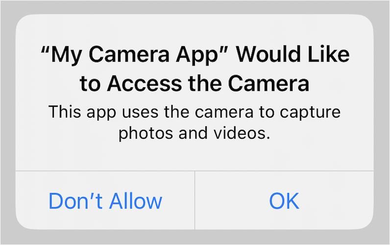
Binary decision moments. When the user must make a choice before proceeding like permissions, terms, destructive actions, critical alerts, an overlay is not only appropriate, it is the correct pattern. The interruption is the feature. The user cannot and should not proceed without addressing the decision. Using an inline banner for a permission request would be a worse design decision than using a modal.
High-value, high-relevance moments. An overlay announcing a feature the user has been waiting for, a personalised offer triggered by a specific user action, or a win-back prompt for a user who is about to lapse, in all of these, the overlay can earn its interruption cost because the content is directly relevant to the user's context. The relevance reduces the friction cost enough that the overlay's higher interaction rate is a genuine signal, not a forced engagement metric.
Exit intent. When the user is about to abandon a session or a flow, an overlay is appropriate because there is no active task to interrupt, meaning, the task has already been abandoned. Cart abandonment overlays, re-engagement prompts for users whose session depth has dropped to near zero: these are contexts where the interruption cost is minimal because there is nothing left to interrupt.
One-time critical communications. App updates with breaking changes, security alerts, service interruptions: content the user needs to see before they proceed. The overlay's force-to-acknowledge property is appropriate here.
What makes an overlay justified: the content is immediately relevant to the user's current state or intent, the user cannot reasonably be expected to encounter it passively (ruling out inline), and addressing it will improve the user's experience in the session they are in.
When Inline Banners Are the Correct Format
Promotional content the user has not signalled interest in. Upsell offers, cross-sell suggestions, feature promotions, subscription upgrades, or any content that the user has not explicitly requested and that is not directly tied to what they are currently doing belongs inline. The inline placement respects that this content is your priority, not the user's. It puts it in their path without forcing them to address it.
Content discovery. New features, new content inventory, seasonal campaigns, new product lines: content that users might value if they encounter it, but that is not tied to their current task. Inline carousels, embedded content cards, and in-feed banners serve discovery without the friction cost of interruption.
Persistent contextual cues. A persistent inline banner showing cart savings as the user browses, a progress indicator showing how close they are to a milestone, a tier upgrade nudge embedded in the header, these are contextual signals that add value precisely because they don't interrupt. The user can act when ready, or not at all.
Repeated-exposure campaigns. If you need to promote something across multiple sessions like a feature the user hasn't tried, a subscription tier they haven't upgraded to, inline is the right format. An overlay that fires repeatedly for the same content trains users to dismiss it faster and feel worse about the app with each dismissal. An inline banner that appears consistently creates passive awareness without accumulating friction debt.
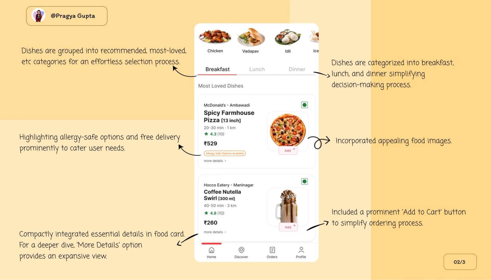
Ecommerce and transaction flows. In checkout flows, cart pages, and payment screens, the user's focus is on completing the transaction. Any overlay in this context interrupts a high-intent, high-value task. Inline banners within the cart summary, showing savings thresholds or add-on suggestions, participate in the task rather than interrupting it. Zomato's embedded upsell approach - inline components within the order flow rather than overlay interruptions is the canonical example of this working at scale.
How Indian Consumer Apps Navigate This
The apps in Digia's series have each made interesting and instructive choices about this trade-off.
Swiggy uses overlays precisely and sparingly. Post-order, the bottom sheet overlay fires, surfacing reorder nudges and Swiggy One upsells. The overlay earns its interruption because the task is done. During the ordering flow itself, upsell content is inline: embedded add-on suggestions on the restaurant page, inline cart threshold prompts. The format discipline is systematic: overlay post-completion, inline mid-task.
Zomato has been particularly studied for its inline upsell architecture. The Gold membership banner, the add-on suggestion, the bundle cross-sell, all are embedded within the order flow as inline components rather than overlay interruptions. The principle, as covered in the Zomato teardown: the upsell that allows the user to continue their primary task is the upsell that converts. Overlays that intercept the order at the moment of highest intent produce the highest short-term click-through and the highest drop-off from the ordering flow.
CRED applies the most rigorous format discipline. Its core engagement moments like reward reveals, bill reminders, the credit score loop, each map to precise user states. The reward reveal animation is a post-completion overlay (task done, emotional peak, appropriate interruption). The store merchandising is inline, scroll-encountered, never forced. The bill reminder arrives as a push notification rather than an in-app overlay specifically because its timing is tied to an external event (due date) rather than an in-app user state. The format choice in each case follows from the user state, not from the team's promotional priority.
Paytm navigates the highest-stakes version of this problem. Post-transaction cross-sell in a fintech context: the moment of highest receptiveness to a relevant offer is also the moment of highest trust sensitivity. Paytm's approach - contextual bottom sheet overlays positioned after transaction completion, with suppression logic during active payment flows that demonstrates the principle that the interruption cost model requires: overlay justified by user state (task complete), relevance maximised (contextually matched to transaction type), and trust protection by ensuring the overlay never appears mid-transaction.
The pattern across all four: the apps with the best engagement metrics use inline by default and overlays by exception. The exception is earned by the context, not asserted by the promotional calendar.
The Decision Framework
Before deploying either format, run through five questions. The answers determine the correct choice.
1. What is the user's task state when this fires?
- Active task in progress → inline only, or delay the format until task completion
- Browsing or exploratory → both formats are eligible, relevance determines
- Idle or post-completion → overlay is justified
2. How many times will this user see this content?
- Once or very few times → overlay risk is lower, relevance justifies the interruption
- Repeated across sessions → inline mandatory; overlays for repeated content accumulate friction debt faster than any other pattern
3. Is the content relevant to what the user just did or is about to do?
- Directly tied to the user's current action or intent → overlay can earn its interruption
- General promotional or discovery content → inline
4. What is the task completion risk?
- If the overlay fires and the user dismisses it, can they complete their primary task without friction? → If yes, proceed
- If the overlay fires and the user gets confused about how to dismiss it, or misreads the overlay as part of the task → inline
5. Does this content belong to you or to the user?
- Content the user asked for, or that directly helps them complete their task → overlay is available as a format
- Content you want the user to see that serves your commercial priority → inline; earn the user's attention, don't commandeer it
A useful shortcut: if you would feel justified showing this content as a push notification, it may earn an overlay. If it wouldn't justify a push, it doesn't justify an overlay either.
What Changes When You Can Test Both Without a Release Cycle
Most format decisions are made once and persist for months, not because the team has decided the initial format is correct, but because changing it requires an engineering sprint. The overlay that was shipped for a campaign in Q2 is still the overlay format in Q4, not because it is working, but because changing it is expensive.
This is where Digia's server-driven architecture directly changes the economics of format decisions. Both inline widgets and overlay nudges can be configured, deployed, and changed from the dashboard without a release cycle. This makes the comparison described in this article - session-level conversion, not just CTR, operationally feasible, because you can actually run both formats against each other on the same campaign and measure all four levels of conversion data.
With a release-dependent architecture, the practical consequence is that format experiments are rare and format decisions are made based on whoever had the strongest opinion in the planning meeting. With a server-driven setup, format decisions can be made based on data, at the speed the data produces it.
The more important implication: you can implement format escalation logic like inline by default, overlay triggered by a specific user signal, without requiring two separate releases or complex hardcoded branching. A user who scrolls past an inline banner twice without engaging can automatically trigger the overlay variant on the third exposure. That logic can be configured and revised in the dashboard. The result is a format strategy that is both more conservative (inline by default, less friction accumulation) and more effective (overlay only for users who have not responded to the lower-friction approach).
Digia's inline widget formats like grids, carousels, persistent banners, in-feed content blocks, and nudge formats like tooltips, bottom sheets, persistent banners, are both configurable from the same dashboard, allowing the format escalation strategy to be implemented without engineering involvement. For teams currently using CleverTap, MoEngage, or WebEngage, this layer works alongside the existing CEP: segment triggers and journey logic stay in the CEP, format decisions and content management happen in Digia.
Key Takeaways
- The comparison between inline banners and overlays is not an A/B test comparison between two formats. It is a structural decision about what kind of relationship the app is building with the user session by session.
- Overlays produce higher CTR in isolated tests. They also carry interruption costs like session completion drop, rage tap events, trust erosion in sensitive contexts, that rarely appear in the same report. Measuring only CTR from an overlay experiment is measuring one side of a two-sided equation.
- Inline banners carry their own failure mode: banner blindness. Users who see enough promotional content in a predictable screen location will pattern-ignore it regardless of relevance. The fix is relevance and contextual placement, not format replacement.
- The correct comparison metric is session-level conversion, not element CTR. Measure whether the session outcome you needed occurred, not just whether the user tapped the format.
- The interruption cost model provides a practical framework: overlay cost is highest in active task states and lowest in idle or post-completion states. Apply accordingly.
- Indian consumer apps that deliver the best engagement metrics like Swiggy, Zomato, CRED, Paytm, all follow the same format discipline: inline by default, overlays by exception, exceptions justified by user state.
- The decision framework reduces to five questions: user task state, exposure frequency, content relevance, task completion risk, and who the content primarily serves.
- Server-driven architecture changes the economics of format decisions. When both formats can be deployed and changed without a release cycle, format strategy can be driven by data rather than planning-room opinion.
- No independently published study directly compares inline banner vs overlay performance at the session level within native mobile apps. The data in this article draws from web and mobile overlay benchmarks, UX research on banner blindness, and observed patterns in published app teardowns. Teams building their own comparison should instrument all four measurement levels described above.
Further Reading
From Digia
- Bottom Sheets vs Modals: Choosing the Right Interruption Layer - if inline vs overlay is the first-level format decision, bottom sheet vs modal is the second-level decision within overlays
- How Swiggy Uses Bottom Sheets to Drive Repeat Orders - format discipline in a high-frequency ordering context
- Breaking Down CRED's Subtle In-App Nudges That Drive User Engagement - the most detailed published analysis of inline vs overlay format discipline in Indian fintech
- Eliminating Mobile App Release Dependency for Engagement Experiments - why format decisions stay underdeveloped when they require a release cycle to test
- Digia Widgets - inline widget formats available in Digia Engage
- Digia Nudges - overlay nudge formats available in Digia Engage
External Sources - All Claims Attributed
- Banner Blindness: The Original Eyetracking Research - Nielsen Norman Group (eyetracking research confirming banner blindness across engagement levels)
- Banner Blindness Revisited: Users Dodge Ads on Mobile and Desktop - Nielsen Norman Group, 2024 (mobile-specific eyetracking findings on inline ad avoidance)
- Ecommerce Mobile App UX Trends 2026 - Baymard Institute (overlay disdain in usability testing; horizontal scroll hijacking friction)
- Popup Conversion Benchmark Report 2025 - Popupsmart, 10,000+ campaigns (overlay format conversion benchmarks; fullscreen vs floating format comparison)
- 20+ Popup Statistics 2026 - Wisepops, 1B+ displays (mobile overlay CTR 4.98% vs desktop 3.67%; timing impact data)
- Should Marketers Use Pop-Up Forms? A Comprehensive Analysis - HubSpot / Klaviyo (overlay modal conversion at 3.2%; slide-out at 2.2%, from 80,000+ business analysis)
- 15 Website Popup Statistics - Getsitecontrol (lead magnet popup conversion lift data)
- Mobile App Conversion Rate Benchmarks - UXCam (rage tap incidence in 670,478 sessions)
This article is part of Digia's Engagement and Lifecycle series. Next: Designing Non-Annoying Nudges: Frequency, Placement, and Context.
Building an in-app format strategy that uses both inline and overlay without accumulating friction debt? See how Digia Widgets work without release cycles or book a demo.