


TL;DR:
- In-App is the lowest-friction channel in WebEngage's stack to get running. No push credentials, no certificate management. FCM and APNs setup aren't required either, working within minutes of SDK integration.
- Event based triggering, screen based triggering, attribute filtering, and frequency capping all held up under direct testing on a live Flutter e-commerce app.
- But the ceiling drops fast past the basics. Customization outside of code level HTML editing is shallow, and the dashboard's real time counters and full user and event lists disagree with each other for minutes at a time. On top of that, the gamification templates ship with placeholder deep links that fail silently, and personalization needs an easy to miss setup step before it works at all.
- None of this rules out the channel. Test it before building a campaign calendar around it, and know where a dedicated rendering layer picks up the parts WebEngage's in-app stack wasn't built to carry.
WebEngage's Spin the Wheel template ships with a button that goes nowhere. Tap it, and nothing happens. No error, just a dead link sitting inside one of the platform's flagship features. We found it because we built a real campaign with it instead of watching the demo.
Most platform evaluations never get past the demo. Docs get skimmed, the marketing page gets rewritten in different words. We did something else: In july 2026 we integrated WebEngage's Flutter SDK into a live shopping app and wired up screen and event tracking on the cart flow. Then we built and ran a series of In-App campaigns end to end on a real device in the India Data Center, across almost 70-80 sessions of testing, where we switched between 8 unique users.
The goal wasn't a feature list. It was finding out where the product holds up under real use and where a growth or product team gets stuck trying to ship something with it.
What We Tested
We tested in June 2026 - WebEngage's In-App channel renders contextual messages, banners, modals, and gamified templates directly inside a mobile app, triggered by real-time user behavior. The setup: a Flutter e-commerce app on Android, WebEngage's India Data Center, and a focused test surface on the Cart page.
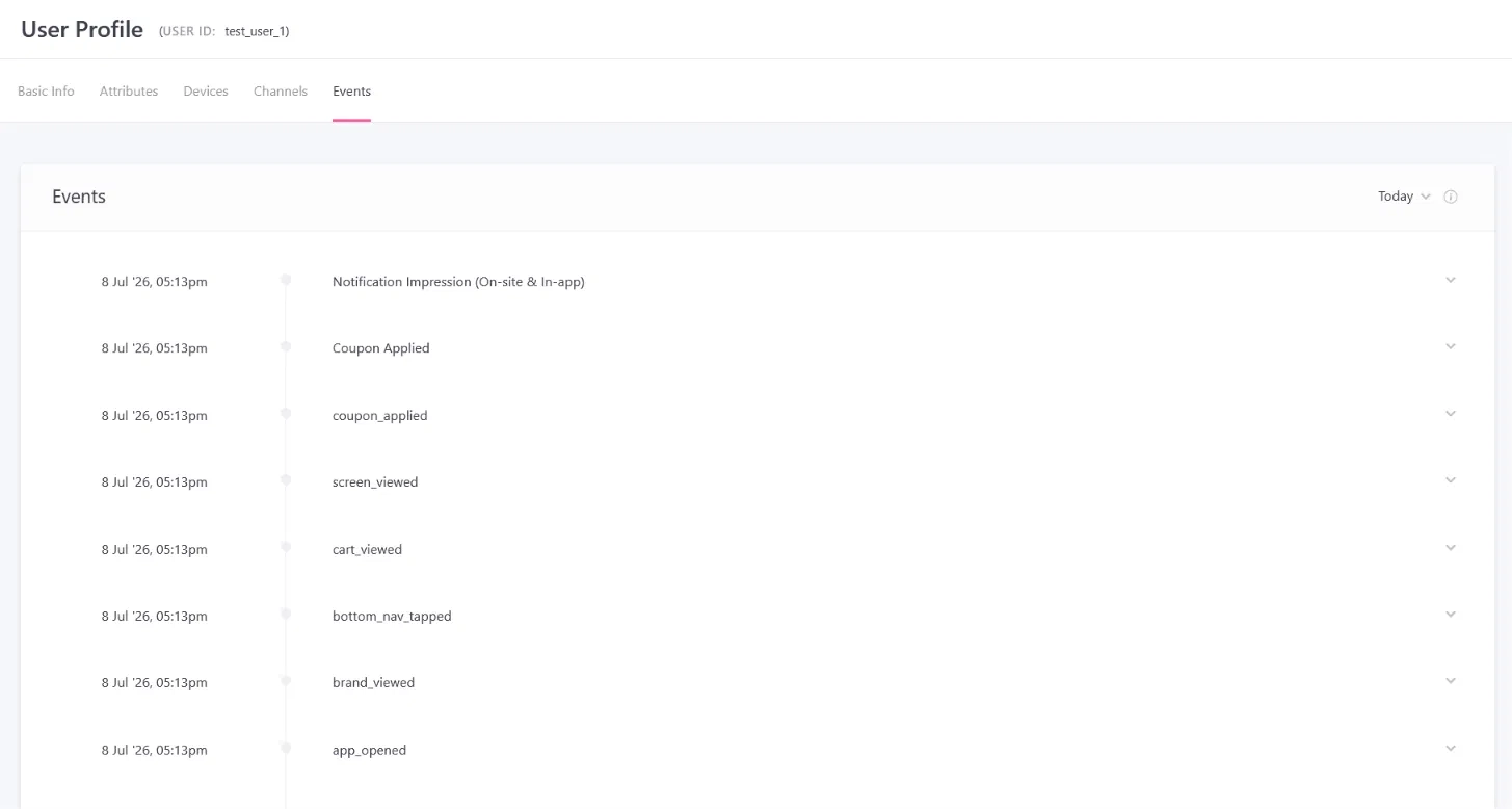
Screen views, quantity updates, coupon application, and checkout initiation, all instrumented as custom events and screen data. From there, we built and ran In-App campaigns against that data. Event triggered messages, screen triggered messages, single and combined attribute filters, frequency capping, A/B variations, and the built-in Spin the Wheel gamification template.
This is narrower than a full audit of WebEngage's platform. In-App is one channel among several that WebEngage offers. This piece stays inside that channel rather than wandering into Push, Email, SMS, or Journey orchestration, except where they intersect directly with In-App behavior.
What WebEngage In-App Does Well
Activation has close to zero setup cost.
Unlike Push, which blocked campaign creation entirely until Android and iOS push credentials were added, In-App messages work as soon as the SDK is initialized. No push credentials, no certificate management.
For a team trying to ship a first campaign quickly, this is a meaningfully lower bar than the channel most teams reach for first.
Event and screen based triggering both work as documented.
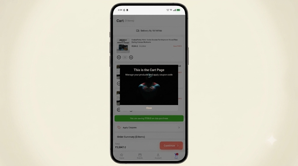
We tested triggering on a custom event, Coupon Applied, and separately on a screen view alone, Cart Page, with no event required, using the SDK's native screen tracking call. Both fired reliably and rendered on device.
Attribute filtering holds up, including combined conditions.
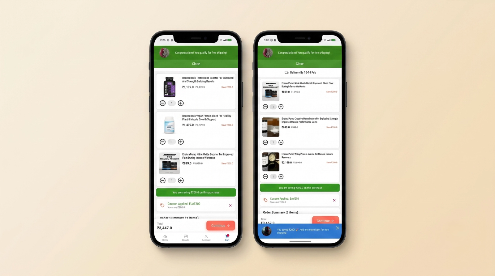
A single filter on cart value correctly gated message delivery. It stayed silent below the threshold and appeared above it. Stacking a second condition with AND logic, cart value and discount both above their thresholds, worked the same way.
For a channel this cheap to activate, having the targeting layer behave predictably isn't a given, and it's worth confirming before building campaign logic around it.
Frequency capping does what it says.
Set to once per day, a repeated trigger from the same identified user was correctly suppressed on the second attempt.
The gamification templates are a genuine differentiator, on paper.
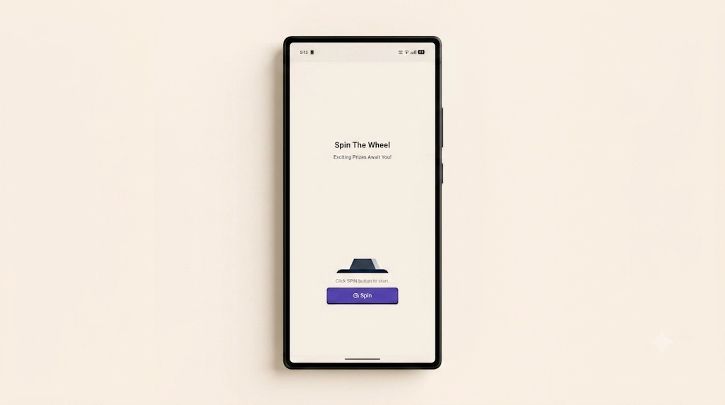
Spin the Wheel and Scratch Card ship as pre-built, customizable HTML, CSS, and JS in the message editor's code view. The prize weighting lives in a single data array, along with coupon codes per sector and win-or-lose logic. Straightforward to edit even without deep front-end experience.
Few platforms in this category ship gamified templates out of the box instead of as a paid add-on or a build-it-yourself exercise. Whether that template survives contact with a real app is a different question, and one of the findings below answers it directly.
A/B variation assignment is sticky per user, not per impression.
This is correct behavior, not a limitation. A user bucketed into Variation A on their first qualifying trigger stays in Variation A on every subsequent trigger. That's exactly what you want for a clean test, if the same person saw both variations across sessions, you couldn't attribute their behavior to either one.
It reads as a bug the first time you see it, worth stating plainly. If you're testing with a single hot restarted identity, you'll only ever see one variation no matter how many times you retrigger the event. Testing the split requires genuinely different user identities, not repeated triggers from the same one.
Where Growth Teams Get Stuck
Customization has a low ceiling outside of code.
The standard message templates, modal, banner, full screen, cover the basics. Anything past simple layout and copy changes pushes you into the HTML template editor, which is powerful but is a code editing surface, not a design tool.
A growth or marketing team without engineering support on hand hits a wall the moment a campaign needs something the standard templates don't already offer.
This matches a pattern in third party reviews. Research.com's review of the platform notes limited flexibility in automation workflows, restricting advanced segmentation and trigger customization.[1] G2's aggregated user feedback surfaces limited features as one of the most frequently cited complaints, alongside a steep learning curve tied to a confusing dashboard.[2]
Rendering errors surface at the edges, not the center.
The standard modal and banner templates rendered cleanly across every test. The gamification template didn't.
The Spin the Wheel template ships with a placeholder deep link, app://continue-shopping, hardcoded into the Continue Shopping button, a URI scheme essentially no app will have registered out of the box. Tapping it does nothing, silently.
Indicative of a broader pattern with the code based templates: pre-built for a generic app, not yours. The burden of noticing and fixing the mismatch falls entirely on you. It won't throw an error. It just quietly won't do what the demo implied it would do.
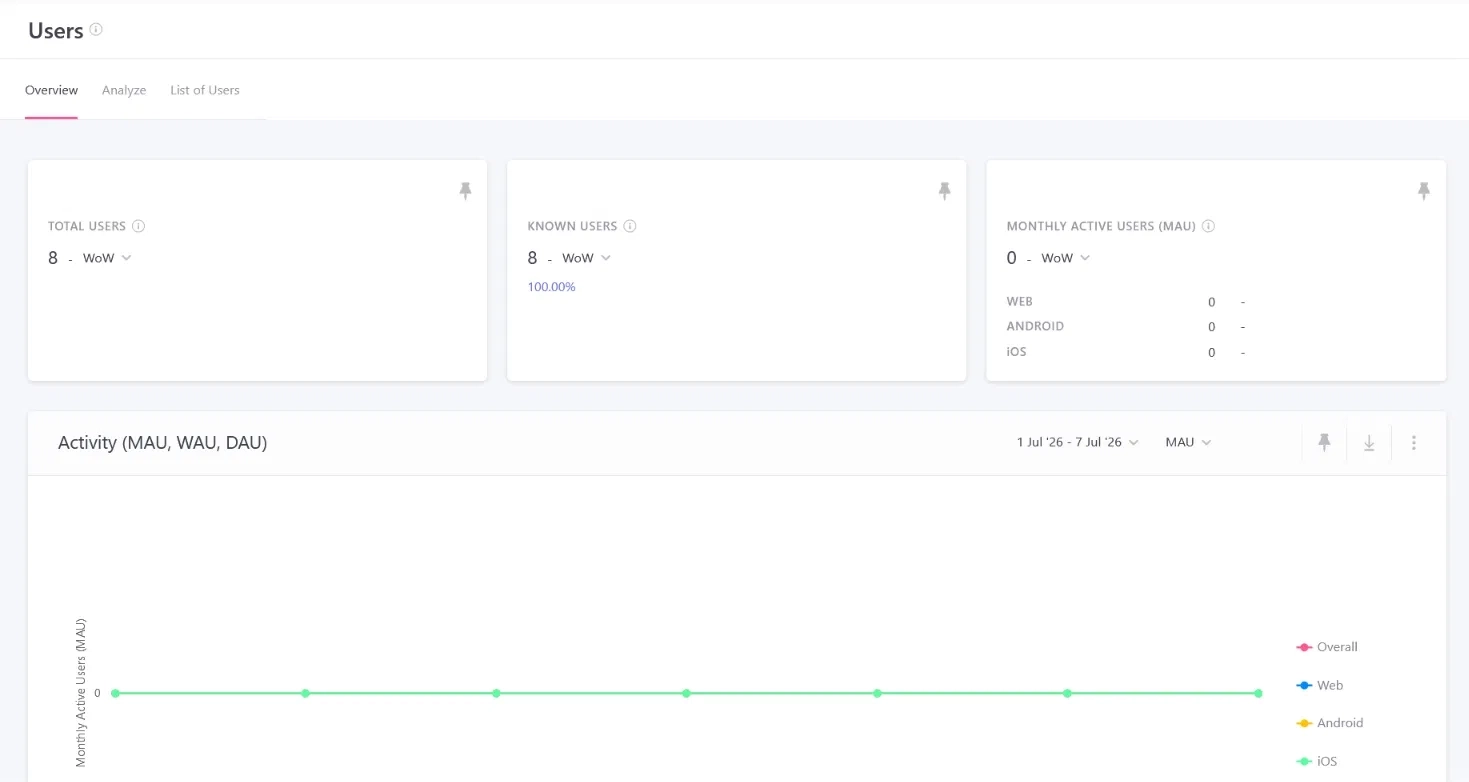
The dashboard's real time view and its full data views don't agree with each other.
During testing, the live user counter incremented within seconds of a session starting, but the full Users list stayed empty for 4-5 minutes afterward. It's also filtered to Known Users by default, which meant anonymous test sessions were invisible until the filter was switched manually.
Neither issue is necessarily a bug. WebEngage's own documentation separates real time monitoring from other analytics views.[5] But the practical effect during any hands on testing or QA cycle is the same. If you're validating a live campaign by watching the dashboard update in front of you, expect a lag between what the counter says and what the fuller reporting views show.
This lines up with a recurring complaint in independent reviews. Gartner Peer Insights user feedback cites message delivery issues and attribute and event limitations as consistent pain points, alongside basic analytics. A separate review on the same page flags sending and segmentation delays running into hours, alongside inaccuracy in data display.[3]
Personalization has a hidden setup step that isn't obvious from the message editor.
Event attributes don't become available as personalization tokens just because you're tracking them. The specific event has to be manually flagged for use in personalization under Data Management first. That's in a completely different part of the dashboard than where you'd naturally go to build the message. Skip that step, and the message editor won't offer the token at all, with no inline explanation of why.
Small piece of UI, but exactly the kind of tribal knowledge step that costs a team hours the first time and is invisible in every campaign after someone on the team learns it exists.
Channel specific setup gates interrupt workflows that have nothing to do with them.
Attempting to create a campaign while Push credentials aren't configured surfaces a blocking modal demanding you add them. That happens even when you have no interest in Push at all and are only trying to reach In-App.
Minor navigational stumble, not a functional gap, but the kind of dead end that costs a first time user a few confused minutes figuring out it's unrelated to the channel they wanted.
Other Known Issues Worth Knowing About
Pricing isn't public. Several independent reviews, including one on SoftwareSuggest, describe the model as steep for the number of active users or events tracked.[4] In practice, that discourages the kind of exploratory testing this piece is built on.
Support quality varies by tier, with lower plans reportedly limited to email only support. G2's aggregated data surfaces poor customer support as a recurring complaint, even though other reviewers praise the same team's responsiveness.
And a handful of advanced features, frequency capping, do-not-disturb controls, control groups, advanced analytics, are gated to specific plan tiers. Worth confirming against your own account before assuming a documented feature is available to you.
Why These Gaps Keep Showing Up
Look at the list above and a pattern emerges. The customization ceiling, the dashboard lag, the broken gamification deep link, the personalization setup nobody finds on the first try. Every one of them traces back to the same architectural choice.
WebEngage, like most customer engagement platforms in this category, was built around targeting and segmentation, with cross-channel delivery as the core investment on top of that. In-App messaging sits on top of that as one delivery channel among many, using the same infrastructure that also has to handle Push, Email, SMS, and Journey orchestration.
Rendering rich, on-brand UI inside a mobile app is a different discipline from deciding who should see a message and when. It requires its own component library and its own device-level rendering path, backed by a real time data pipeline for interaction tracking. Built as an extension of a channel stack, it can only ever be as flexible as that stack allows.
That's not a knock on WebEngage's targeting engine. Everything we tested on the targeting side, when a message fires and who qualifies, worked exactly as documented. The gap is specifically in what happens after the trigger fires, what gets drawn on screen, and how much of it you can change without opening a code editor.
WebEngage vs Digia Engage at a Glance
| Capability | WebEngage In-App | Digia Engage |
|---|---|---|
| Real-time analytics | Live counter updates within seconds, but the full Users and Events views lag behind by several minutes in testing | Dashboard reflects taps and dismissals as they happen, completions included, same numbers across every view |
| End-to-end in-app coverage | In-App is one channel inside a broader messaging stack alongside Push, Email, SMS, and Journey orchestration, not a dedicated experience layer | Onboarding, nudges, gamification, surveys, guides and inline campaigns all run from a single dashboard |
| Onboarding and tooltip customization | Fixed modal, banner, and full-screen templates. Anything past that requires the HTML template editor | Teams decide what a guide or tooltip looks like themselves, spacing, color, corner radius, animation, directly from the dashboard, no code required |
| Delivery rules and frequency capping | Frequency capping works at the campaign level, confirmed working in testing | Delivery rules and frequency capping configurable per component, independent of whatever trigger logic is running upstream |
| Ease of use for non-coders | Anything beyond the standard templates puts a developer between a growth team and a shipped campaign | Built as a visual, no-code dashboard a growth or marketing team member can use directly, without writing HTML |
How WebEngage and Digia Engage Fit Together
The split, in one line.
WebEngage stays exactly where it is. What changes is who owns the layer it was never built to carry, the part that decides what shows up on screen. Digia Engage runs as a direct integration on top of WebEngage, not a replacement for it.
What WebEngage doesn't have at all.
Some of this isn't a matter of degree. WebEngage doesn't have a no-code visual builder for its In-App templates at all. Past the standard modal and banner, the only way to change how something looks is the HTML editor, whether that's where a growth team wanted to be working or not.
How the handoff works.
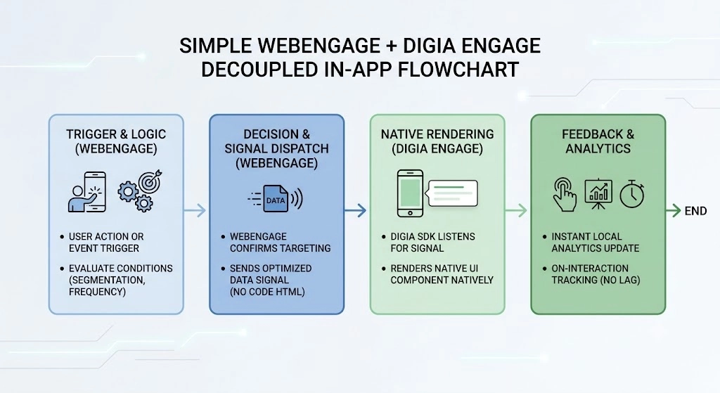
WebEngage keeps deciding who sees an in-app message and when. The event and screen triggers, plus the attribute filters, are the same ones tested above. Digia Engage sits underneath as the rendering layer, and takes over what appears on screen and how it behaves.
In practice, that split looks like this. A trigger fires from WebEngage based on a segment or event condition. Digia Engage receives that signal on device and renders the configured component natively, no WebView, no full-screen takeover for a message that was only meant to be a small banner.
Growth teams build and edit that component from a visual dashboard, dragging in layout and spacing, plus interaction patterns that match the app's own design system. That happens instead of hand-writing HTML for anything beyond a basic modal. The dashboard itself is built for marketers and growth managers, not developers. No HTML, no JavaScript, just visual controls anyone on the team can use.
Where the friction in this review disappears.
The dashboard lag disappears because Digia Engage's analytics update on the interaction itself, not on a batch cycle running behind a separate real time counter. A tap or a dismissal shows up in the dashboard as it happens, not several minutes later in a different view than the one you were watching.
The code-editor ceiling goes away because component structure and interaction patterns are configurable from the dashboard itself, not gated behind an HTML template that only a developer can safely touch.
Digia Engage also carries its own delivery rules and frequency capping, set per component rather than per campaign. A growth team can decide exactly how often a specific nudge, widget, guide, or survey is allowed to reappear for the same user, independent of whatever trigger logic WebEngage is running upstream.
Where the Combination Earns Its Keep
Some in-app use cases are perfectly fine on WebEngage's native templates. A simple promotional banner or a single-CTA announcement doesn't need a dedicated rendering layer. The use cases below are where that layer starts to matter.
Onboarding Flows That Actually Match Your App
Onboarding is where a user forms their first opinion of a product's quality. A tooltip or spotlight built from a generic template, different font weight, different button style than the rest of the app, reads as foreign even when the user can't articulate why.
With Digia Engage, teams decide exactly what a guide, tooltip, checklist, or nudge looks like themselves, spacing, color, corner radius, animation, directly from the dashboard. For more on what moves the needle in this flow, see how to build an in-app onboarding flow that gets users to their first win.
WebEngage doesn't have this feature at all. Past its standard templates, changing how a tooltip looks means going through the HTML editor, which puts every visual decision behind a developer. WebEngage's trigger logic still decides which users see which step and in what order. Digia Engage decides what that step looks like, and lets a non-technical team member be the one making that call.
Inline Quizzes and Surveys
WebEngage can trigger a message the moment a user completes a specific action. Digia Engage can render a quiz or an emoji feedback prompt at that exact moment, inline. Or a full NPS survey, with response collection built into the component itself rather than routed out to a separate web form.
The behavioral trigger gets the timing right, but it's the inline rendering that gets someone to finish it instead of dismissing it.
Analytics That Update When They Happen
This is the finding that shows up most directly in the testing above. A live counter that moves in seconds next to a full Users list that takes minutes to catch up isn't a minor cosmetic gap when you're trying to validate a campaign in real time.
Digia Engage's dashboard reflects interaction events as they're captured on device. The number you're watching during a live test and the number in your full report are the same number, not two views running on different clocks.
How the Split Pays for Itself
The argument against adding a second layer is usually complexity. Another SDK, another dashboard to manage. Fair concern, worth answering directly.
Setup for the WebEngage integration runs on top of the core Digia Engage SDK and typically adds well under an hour of engineering time. After that, growth teams work from the Digia Engage dashboard for in-app visual changes, without filing a new engineering ticket per campaign update.
Compare that to a team running entirely inside WebEngage's template system. Anything past a standard banner needs an HTML build and a QA pass across devices, then a release, before the campaign fires once. Run two or three of those cycles a month and the coordination overhead outpaces the setup cost of a dedicated rendering layer within a single quarter.
A Simple Framework for Deciding If This Matters to You
If your team's need is a contextual message on screen fast, based on a simple event or screen trigger, without touching push infrastructure, WebEngage In-App does that well on its own. The barrier to a first working campaign is low.
If your need extends further, four things start to matter:
- Fully custom visual templates without code.
- A dashboard number you can trust to the minute during a live campaign.
- Frequency capping set per component instead of per campaign.
- One place to run onboarding, gamification, surveys, and guides instead of stitching together several tools.
That's the point where pairing WebEngage's targeting with a dedicated rendering layer starts to close the gap this review surfaced.
Key Takeaways
- WebEngage's In-App channel activates with close to zero infrastructure setup, unlike Push, which is gated behind platform credentials.
- Core targeting mechanics, event triggers, screen triggers, attribute filters, and frequency capping, all held up under direct testing on a live app.
- The built-in gamification templates are a real differentiator on paper, shipping as editable HTML instead of a paid add-on, but the same templates ship with a placeholder deep link that fails silently if left unedited.
- Customization beyond the standard template set requires code level HTML editing, a real ceiling for teams without engineering support on hand, and one WebEngage has no no-code alternative for today.
- The dashboard's real time counters and its fuller reporting views can disagree for several minutes at a time, corroborated by independent reviews citing broader delivery and data display delays.
- Personalization tokens require a non-obvious, separate opt-in step per event before they're available in the message editor, a common first-time stumbling block.
- Pairing WebEngage's trigger logic with a dedicated rendering layer like Digia Engage addresses the customization ceiling, the analytics lag, the lack of a no-code dashboard, and the personalization setup step directly, without touching the targeting and segmentation work WebEngage already does well.
External Sources:
- WebEngage Review - Research.com - pros/cons summary citing limited automation flexibility and basic reporting
- WebEngage Reviews - G2 - aggregated user feedback on learning curve, limited features, and slow performance
- WebEngage Reviews - Gartner Peer Insights - user-cited cons including message delivery issues and basic analytics, plus reviewer accounts of segmentation and sending delays and data display inaccuracy
- WebEngage Pricing - SoftwareSuggest - third-party commentary on pricing model and trial/onboarding friction
- Analysing Live Stats - WebEngage Knowledge Base - WebEngage's own documentation distinguishing real-time monitoring from broader analytics views
Digia Engage is the in-app rendering layer for growth teams running WebEngage, MoEngage, or CleverTap. It covers nudges, widgets, inline surveys, gamification, onboarding, and in-app video from a single, no-code dashboard, with analytics that update as interactions happen rather than on a separate reporting delay. Book a demo to see how it sits alongside your existing WebEngage setup.