
TL;DR: Zomato promotes Zomato Gold subscriptions inside the cart and checkout screens using inline banners that match the surrounding UI. No modal overlays. No pop-ups that demand dismissal. The banner sits between scrollable content, renders the exact delivery fee the user is about to pay, and tells them precisely how much Gold would save on that specific order. The placement is deliberate: high intent, live price signal, zero interruption. This article breaks down the specific screen positions Zomato uses for inline upsell, the infrastructure (Kimchi) that lets them update these banners without app releases, the behavioral design principles that make the banners read as useful information instead of advertisements, and what growth teams at other consumer apps can pull from the playbook.
The Pop-Up Upsell Is a Design Tax
Most apps ask users to pay a design tax when they want to promote a paid feature. A modal drops over the screen. The user stops what they were doing. They evaluate whether to close it or read it. They close it. The modal has consumed attention that was about to convert into a purchase, redirected it toward an interruption, and left the user mildly annoyed.
The upsell happened, technically. A user saw a Gold membership prompt. But the user was mid-checkout, their delivery fee already in view, their order one tap away from confirmation. Stopping that flow to deliver a membership pitch trains users to dismiss faster and trust the interface less.
Zomato's inline banner approach treats the same pitch problem differently. The Gold membership prompt does not stop the checkout flow. It occupies a scroll position within the existing page layout, rendered as a content block with the same visual grammar as the rest of the screen. The user can scroll past it in under a second. They can also stop and read it, because the content is directly relevant to what is on their screen: the delivery fee they are about to pay.
The distinction matters. Pop-ups interrupt. Inline banners inform. Both are upsell tools. Only one of them works without training users to dismiss more quickly over time.
What Zomato's Inline Upsell Actually Looks Like
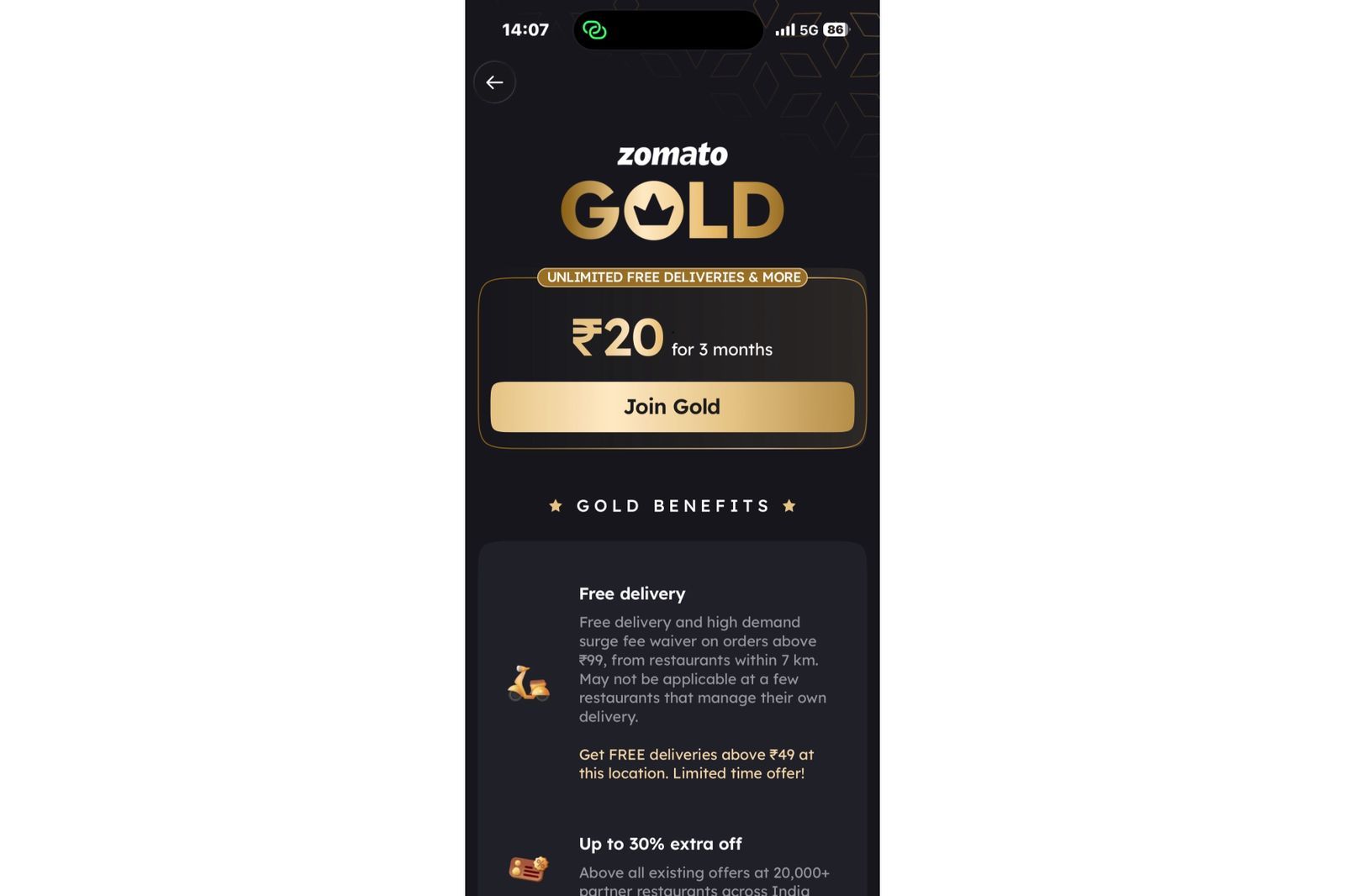
Zomato Gold, the platform's subscription program offering free delivery at restaurants within 7 km and up to 30% additional discounts at 20,000+ partner restaurants, is a high-value product that most food delivery platforms would push via a dedicated onboarding campaign or a pop-up during app launch. Zomato does neither of those things as its primary promotion mechanism.
The Gold membership banner appears inline at three specific moments in the ordering flow, each selected for maximum purchase intent.
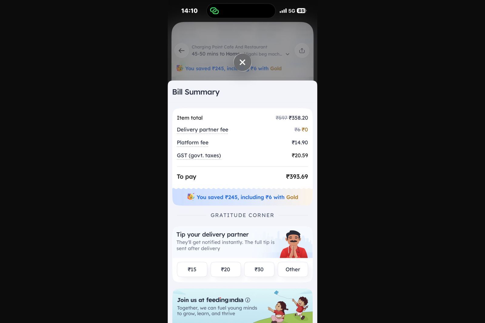
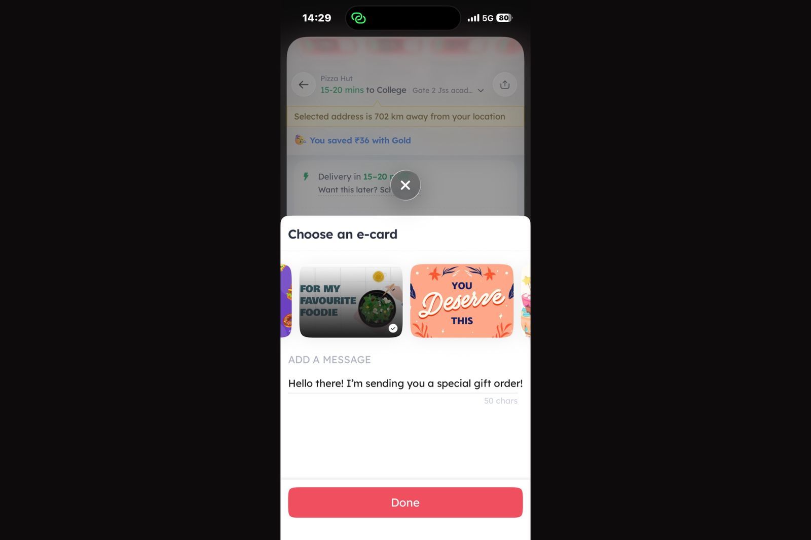
At the cart/checkout screen, before the user places an order, an inline banner renders between the order summary and the payment confirmation area. The banner displays the delivery fee for that specific order and calculates exactly how much the user would save on that order with a Gold subscription. The value proposition is not abstract. It is calculated for the exact order the user is completing.
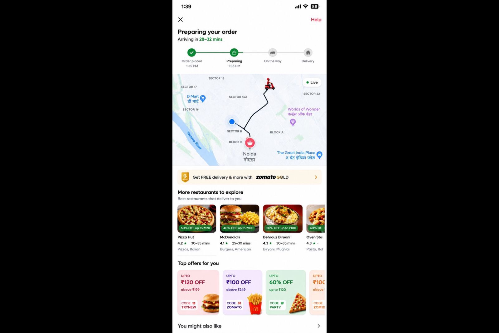
During live order tracking, after the user has placed an order and is watching their delivery on the map, a secondary row of restaurant cards and discount coupons from nearby restaurants appears in the feed below the tracking map. This is documented by users as a feature that surfaces repeat-purchase incentives while the user is still engaged with the app in a high-attention post-order state. One detailed user account from 2023 notes this specifically: the map is visible, the food is en route, and the app is already showing offers for the next order before the current one has arrived.
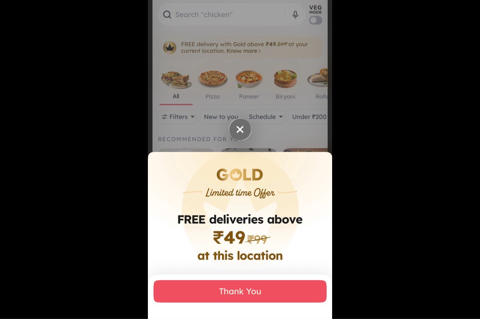
On the home screen, during eligibility windows, the banner appears as a scroll-level content card rather than as a blocking overlay. Users noted that the Gold membership prompt was surfaced as a home screen card with "Zomato Gold Flash Sale: Join at Just ₹1" phrasing at certain cadences, placed in the natural feed scroll rather than in a forced popup position.
The common design decision across all three placements: the banner lives inside the scrollable content of the screen, not above it.
Why Checkout Is the Correct Screen for a Subscription Pitch
The logic behind checkout placement is not complicated, but most apps do not follow it.
A user at the checkout screen has already made the decision to order. Their purchase intent is at its highest point in the entire session. They have chosen a restaurant, selected items, possibly applied a coupon code, and they are looking at a bill. Within that bill, the delivery fee is a specific, visible number that represents a direct and quantifiable cost.
An inline banner that appears at that moment and says "With Zomato Gold, this delivery would be free" is not a cold pitch. It is a response to information the user is already processing. The delivery fee is on the screen. The savings amount is calculable. The conversion moment and the upsell moment are the same moment.
Compare this to a Gold membership campaign that fires during app launch, before the user has even searched for a restaurant. At that point, the delivery fee is theoretical. The savings are hypothetical. The user has no pending cost to weigh against the membership price. The pitch asks them to do math they have no immediate reason to do.
RedSeer's 2024 India online food delivery report notes that 38% of order dropoffs happen at checkout when the minimum order value is higher than what the user planned to spend. The checkout screen is where financial tension is highest. An inline banner that offers a structural way to reduce that tension, framed around the specific numbers already visible to the user, lands in a moment of active financial decision-making rather than passive browsing.
The behavioral mechanism here is the concreteness effect: users respond more to specific numbers than to abstract categories. A banner that says "Save ₹30 on delivery for this order with Gold" converts better than one that says "Save on delivery with Gold membership" because the first banner responds to information already on the screen and the second requires the user to imagine a hypothetical.
The Three Design Decisions That Make the Banner Read as Content
Zomato's inline banners share three design properties that prevent them from reading as advertising even though they are, functionally, conversion prompts for a paid subscription.
They match the surrounding UI. The banner uses the same border radius, same padding, same color tokens, and same card elevation as the restaurant cards and deal tiles already on the page. There is no contrast signal that tells the user "this is promotional content." The visual system treats the Gold pitch as a content block of the same type as the surrounding content blocks. This is in direct contrast to most in-app upsell banners, which use a different background color, a badge or ribbon overlay, and heavier typography to signal "important offer." Those signals also signal "advertisement," which activates the user's mental ad-filtering behavior.
They contain real data, not marketing copy. The most effective version of the Zomato Gold inline banner shows the exact delivery charge for the current order and the exact amount that would be waived under a Gold subscription. There is no headline like "Upgrade for incredible savings" or "Get the best of Zomato Gold." The content is numerical and specific. Marketing copy activates skepticism. Specific data, especially data pulled from the user's current order context, activates evaluation. Evaluation is a precursor to conversion. Skepticism is a precursor to dismissal.
They are scroll-past-able. A modal requires an action to dismiss it. The user must tap "X" or "Maybe later" before they can continue. That friction is what makes modals feel like interruptions: they demand attention as the price of continuing. Zomato's inline banners do not. The user can scroll past without tapping anything. This removes the resistance that most users associate with in-app promotions. The banner has appeared, information has been processed at a subconscious level if not a conscious one, and the user continues their task without ever feeling stopped. Paradoxically, making the prompt easier to ignore also makes it easier to act on when the user is ready, because there is no adversarial dynamic between the banner and the user's goals.
The Kimchi Engine: How Zomato Updates Banners Without App Releases
The operational backbone of Zomato's inline banner strategy is a backend-driven UI system called the Kimchi engine, launched in 2022.
The Kimchi engine enables Zomato to push UI configuration changes to the app in real time without shipping a new app version. The placement of the Gold banner, the copy it displays, the personalization logic that determines which users see it, the savings calculation it shows, and the A/B variants being tested can all be updated from the backend. The app client renders whatever the server sends.
This matters for upsell strategy because placement and copy experiments require fast iteration cycles. If changing the position of the Gold banner from above the payment button to below the order items requires a sprint, an app store submission, and a review period, the team might run four experiments per quarter. If the same change is a dashboard configuration update, the team can run four experiments per week, learn what placement converts better, and ship the winning variant to all users before the original experiment would have cleared review.
The architecture is functionally a server-driven UI (SDUI) approach to campaign management. The server defines the layout. The client renders it. Post-redesign metrics from 2018 showed a 21% increase in page views and a 14-17% increase in transactions, and within that same design era, Zomato Gold crossed 200,000 enrollments. The Kimchi engine then extended the same design-without-deployment philosophy to real-time content updates and personalization.
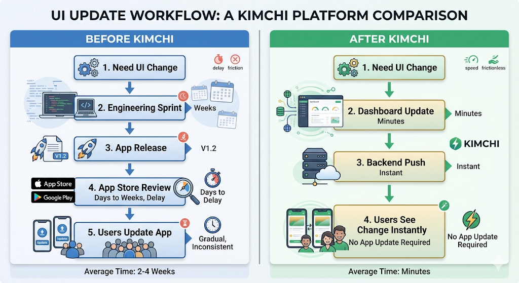
For growth teams at other apps trying to run inline banner experiments, the Kimchi architecture is the gap that prevents most of them from doing so. If your team needs an engineering sprint to change where a banner appears or what it says, the iteration cost is high enough that most experiments simply do not happen.
Personalization: Why Two Users See Different Gold Banners
Zomato's Gold membership pricing is not fixed. The price of the scheme is dynamic, likely dependent on the user's propensity to purchase, inferred from app activity data including number of app launches, time spent, device model, and location. A user who orders three times a week might see a different Gold membership price than a user who orders twice a month, because the platform has different confidence levels in each user's likelihood to convert and different expected revenue implications of the membership for each user.
The same personalization logic applies to the inline banner content. A user ordering a ₹500 meal with ₹49 delivery fee sees a different value calculation than a user ordering a ₹180 meal with ₹25 delivery fee. The banner that converts the first user might lead with free delivery. The banner that converts the second user might need to lead with the restaurant-level discount because the delivery fee savings alone are insufficient to justify the subscription cost.
This level of personalization in inline banner content requires the kind of real-time data access that only makes sense if the banner content is server-generated rather than statically configured in the client. The app sends the current order context to the server. The server calculates the relevant savings figures, selects the appropriate copy variant, and returns the banner content configured for that specific user in that specific order.
The result is a banner that feels contextually correct rather than generically promotional, which is the primary design quality that separates content from advertising.
The "Ordering for Your Loved Ones?" Pattern: Soft Upsell via Feature Reveal
Beyond the Gold membership prompt, Zomato uses a second category of inline upsell at checkout: feature reveals embedded as prompts.
A specific feature documented on the checkout screen reads "Ordering for your loved ones?" This is an inline prompt that reveals the gift ordering capability, where users can place an order to be delivered to someone else's address. The prompt is not selling a paid feature. It is revealing a free feature at the moment the user is most likely to use it, specifically when they have already decided to order food and might consider ordering for another person.
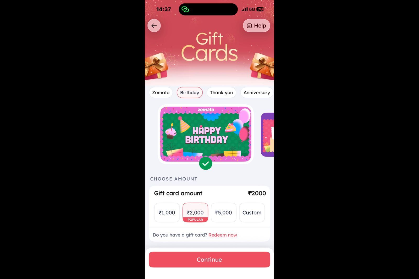
Zomato also offers gift cards, allowing users to send prepaid dining or food-delivery value to friends and family. Unlike the "Ordering for your loved ones?" feature, which facilitates sending a specific meal, gift cards provide recipients with the flexibility to choose when and how they want to use the credit. From a growth perspective, gift cards serve as both a gifting product and an acquisition channel, introducing new users to the platform through a trusted recommendation from someone they know.
The mechanism here is a feature discovery upsell rather than a subscription upsell, but the inline banner pattern is identical. The prompt appears within the checkout screen layout. It does not interrupt the primary order completion flow. It surfaces a contextually relevant option that the user might act on or scroll past without friction.
This pattern generalizes well. An app with a group ordering feature surfaces the group invite option during the early cart-building phase, when the user still has time to invite others, not at payment confirmation when it is too late. An app with scheduled delivery surfaces that option when the user changes their delivery address to a location that suggests a different schedule, an office address on a weekday morning. The feature reveal happens in the correct context, inside the natural flow of the screen, via an inline prompt that the user reads when it is relevant.
This is the broader principle of Zomato's inline approach: place the prompt where it is useful, in a form that does not stop the user, with content derived from what the user is already doing. The channel is the screen they are already on. The timing is the moment their behavior signals relevance. The format is a content block that matches the surrounding page.
The Behavioral Mechanics Behind Inline Over Interruptive
Zomato's inline banner strategy maps onto four behavioral science principles that explain why it outperforms interruptive upsell formats.
Minimal friction. The user does not have to take any action to continue their primary task. No tap to dismiss, no modal to close, no decision required about the prompt before they can proceed. This is the critical difference between inline and interruptive. Interruptive formats create a secondary decision point: "Do I engage with this or close it?" Inline formats do not. The user reads, evaluates, and either acts or scrolls. Their primary task is never blocked.
Contextual relevance. The prompt is calibrated to the current session state. The delivery fee shown is the delivery fee for this order, not a hypothetical average. The savings figure is the specific amount the user would save today, not an average over time. Behavioral science consistently shows that specific, concrete information processes faster and converts more reliably than abstract or general information. Zomato's Kimchi engine enables this by calculating the banner content from live session data.
High-intent placement. The user at checkout has already committed significant cognitive energy to the ordering decision. They are not browsing. They are completing a transaction. The peak-purchasing intent moment is also the peak-receptivity moment for a prompt that is directly relevant to the transaction in progress. Showing a Gold banner during app launch, before any purchasing intent has formed, is structurally weaker than showing it during the active purchase, when the exact number the banner is responding to is visible on the same screen.
Trust maintenance. The inline format does not look like a traditional advertisement. It reads as product information because it is delivered in the same visual format as the rest of the product. Users who trust a product interface are more likely to evaluate information from it on its merits rather than filtering it through ad-skepticism. The moment an in-app prompt starts looking like an advertisement, it triggers the same mental filtering that applies to banner ads on web pages. Zomato's inline banners avoid this trigger by design.
What Food Delivery Gets Right That Most Apps Get Wrong
Zomato's inline banner strategy works partly because of the specific economics of food delivery. Every order has a delivery fee. The delivery fee is a visible line item in every checkout. The subscription value proposition is calculable in real time from that line item. The upsell content derives directly from data that is already on the screen.
Most subscription-based apps do not have this level of in-session cost visibility. A music streaming app does not show you the per-song cost of not subscribing. A productivity app does not show you the per-export cost of staying on the free plan. The upsell case has to be made more abstractly, which makes the inline approach harder to calibrate to the same level of specificity.
But the underlying pattern transfers. The principle is not "show the delivery fee to sell Gold." The principle is: find the moment in your app when the cost of not having the paid feature is most visible or most felt by the user, and place the inline prompt at that exact moment with content derived from what the user is already experiencing.
For a productivity app, that moment might be when the user tries to export a file in a locked format and sees a "Upgrade to download as PDF" inline prompt right on the export dialog, with the specific file they are trying to export named in the copy. For a fitness app, it might be when a free-tier user reaches the end of a session and the inline prompt surfaces the session history comparison that requires the paid plan, showing specifically that this session is already locked from history on the free tier.
The format is the same. The content source changes. The behavioral principles are identical.
Where Zomato's Inline Banner Strategy Has Limits
The strategy works because Zomato Gold has a clear, session-specific value proposition. Free delivery on this order. Extra discount at this restaurant. The value is immediate and order-specific, which makes inline content at checkout both relevant and calculable.
When the value proposition is longer-term or more diffuse, the inline banner at checkout becomes less effective. A user who orders once a month is not going to find a Gold membership compelling based on one order's delivery fee. The math does not work. The same checkout banner that converts a heavy user who orders daily will not convert an occasional user, because the subscription payback period is too long to feel immediate at the checkout screen.
This is why Zomato's Gold pricing appears to be dynamic based on user behavior signals. The checkout banner may not even appear for users whose order frequency is too low to make the Gold economics work. Personalization logic that suppresses the prompt for low-frequency users prevents the wasted impression and also prevents the user from seeing an upsell that, if acted on, would deliver poor value and likely result in a cancellation.
The general principle for teams implementing inline upsell: show the prompt to users for whom the value proposition is immediately true. Suppress it for users for whom the value proposition requires long-term reasoning that a checkout screen cannot facilitate.
Key Takeaways
- Zomato places Zomato Gold membership banners inline within the checkout screen layout, not as pop-ups or modal overlays. The banner occupies a scroll position between existing content elements and does not block the user's primary task.
- The banner content is derived from the live order context. The delivery fee shown is the actual fee for the current order. The savings figure reflects the specific amount Gold would waive. This specificity, pulled from real session data, is the primary reason the banner converts better than static promotional content.
- Zomato's Kimchi engine (launched 2022) enables the placement, content, and targeting logic for these banners to be updated from the backend without shipping a new app version. This is the operational infrastructure that makes rapid inline banner experimentation possible.
- The banner design matches the surrounding UI. Same card style, same typography scale, same visual language as adjacent content. This prevents the ad-filtering behavior that users apply to visually distinct promotional elements.
- A second category of inline upsell at Zomato is the feature reveal prompt, such as "Ordering for your loved ones?" at checkout. These are not subscription pitches. They surface free features at the exact moment the user's behavior signals the feature is relevant.
- The strategy is most effective for users whose order frequency makes the Gold value proposition immediately calculable. Zomato likely suppresses the Gold banner for low-frequency users for whom the subscription economics do not work at current order cadence.
- Replicating this pattern requires a server-driven content layer that can receive session events, evaluate trigger rules, and return dynamic banner content without a code change for each iteration. Teams without this architecture are limited to static banners with slower experimentation cycles.
Further Reading
From Digia Engage
Inline Widgets covers how content blocks can be injected into any screen position within an app without modifying the app binary, enabling the same inline placement approach Zomato uses through the Kimchi engine.
In-App Nudges explains the behavioral event trigger system that fires contextual prompts based on what users are actually doing in their current session, which is the mechanism behind Zomato's checkout-triggered Gold banner.
Cross-Sell and Upsell Use Case covers the specific user flow patterns where in-app prompts surface the right offer at the moment of highest intent, including subscription upsell flows and feature discovery prompts.
Recovering Abandoning Users with Contextual In-App Prompts covers the related pattern of in-app prompts triggered by session behavior to recover users at the moment of drop-off, with specific detail on checkout abandonment recovery.
Book a product demo to see inline widget configuration, dynamic content fields, and behavioral event triggers set up live.
External Sources
Leo9 Studio: Zomato's Behavioral UI UX Design Transformed Through Market Research provides a detailed breakdown of Zomato's design evolution, including the Kimchi engine, personalization through AI match scores, and the post-redesign metrics (21% page view lift, 14-17% transaction increase, 200,000+ Gold enrollments) that followed the shift to behavioral design.
Product Revisit: My Zomato Order Story is a first-person user account documenting the specific inline prompts Zomato surfaces during an active ordering session, including the checkout-screen "Ordering for your loved ones?" prompt, the Gold membership banner, and the post-order restaurant feed within the tracking screen.
GrowthX: Zomato Business Model and Growth Strategy covers the referral mechanics for Gold membership, including the checkout-triggered referral prompt placement and an analysis of what works and what does not in Zomato's membership discovery flows.
Baymard Institute: Checkout Usability Research is the primary source for checkout UX benchmarks, covering form friction, price transparency, and the behavioral signals that precede checkout abandonment, all relevant to understanding why checkout is the optimal screen position for a delivery fee-based upsell.
Appcues: In-App Messaging covers the broader landscape of in-app message formats including banners, tooltips, modals, and slide-outs, with specific conversion evidence for inline banners as an upsell mechanism versus interruptive modal formats.
Digia Engage is a no-code in-app campaign platform for mobile growth teams. It supports inline widget injection, behavioral event triggers, and dynamic content fields, all managed from a dashboard without app releases. SDK integration takes under 20 minutes. See how inline upsell flows work inside the platform.