


TL;DR:
- Every consumer app team makes the same trade and most of them never price it. How much do you take from a user before you give them anything, and what do you give back when you finally do?
- Take too much and you lose people who would have converted. Take nothing and you have no basis for personalization, no retention channel, and a second session with nothing to offer.
- On August 4, 2026, we timed Spinny's Android app to find out what a deliberately expensive on-ramp actually buys. The price is 12 seconds of fixed brand animation, a login wall, a notification permission at screen four, and a three-question quiz.
- What comes back is a results page reading
2 cars matched your preferencesdirectly aboveFrom 269 used cars in Jaipur, with the reasoning exposed as filter chips and the sort preselected onRecommended. - The three quiz answers survived a complete uninstall and reinstall, which is what converts a one-time friction cost into a permanent asset.
- The trade works because used-car buying is high-consideration and low-frequency. A buyer who cannot assess the product themselves gains more from a verdict than from a catalogue.
- This breakdown prices each piece of the ask, shows what the payoff is engineered to do, identifies four places the trade breaks, and separates which parts transfer to high-consideration categories from which parts transfer to high-frequency ones.
I hadn't even made it to the login screen.
Before I could enter my OTP, Spinny forced me to sit through a full 13-second animation of its logo. I actually timed it out of pure annoyance because it dragged on that long. The skip button was practically a joke, as it didn't even show up until the 12-second mark, right when the actual app had already finished loading behind it anyway.
Normally, that is an instant uninstall for me. When I am trying out a brand-new app, I just want to dive right in. I have zero patience for some self-important, flashy intro sequence that does nothing except burn through my time.
Yet, for some reason, I didn't mind with Spinny. I sat there, watched the logo shift, watched car keys swap hands and caught the quick flashes hinting at loans and insurance. I was so thrown off by my own lack of irritation that I literally uninstalled and reinstalled the app later just to check if I was losing my mind.
That is when it hit me. The real fascination wasn't the animation itself, it was my own reaction.I had willingly tolerated a nearly unskippable 13-second splash screen and didn't feel even a flicker of irritation. My brain didn't ask why this was so unnecessarily long. Instead, it shifted to wondering why it didn't actually feel long.
It quickly became clear those 13 seconds weren't just some lazy design afterthought. It felt like a deliberate, almost audacious power move. Now, I just needed to see if the rest of the app could actually back up that kind of confidence.
The Trade, Stated Plainly
Before any teardown, here is the whole bet on one screen. Everything Spinny takes in a first session, and what the user gets in exchange.
| What Spinny takes | When | What it buys the platform | What the user gets back for it |
|---|---|---|---|
| 12 seconds of attention | First launch, before login | A mental model of an eight-service ownership platform | Knowledge of what the app does beyond buying |
| A verified phone number | Screens 2 and 3 | Identity, contactability, preference persistence | Nothing yet |
| Notification permission | Screen 4, post-OTP | A re-engagement channel | Nothing yet |
| Three preference answers | On tapping Buy car | A durable segment that survives reinstall | A filtered shortlist on the very next screen |
Read the right-hand column and the shape of the design becomes obvious. Three of the four asks return nothing at the moment they are made. The entire debt is settled on one screen, and everything after that screen exists to prove the settlement was fair.
That concentration is the interesting part, and it is also the fragile part. More on both below.
How We Tested
On August 4, 2026, we installed the Spinny Android app on an emulator and recorded the first launch, timing the intro animation frame by frame. We captured the three-step buying quiz on a session where it fired, and we ran a separate reinstall pass against an existing account to count screens and taps to the first personalized listing.
Two limits shape how much weight each number carries.
The reinstall pass ran against an account that already held preferences, so the quiz did not re-fire and saved filters applied immediately. Counts from that pass describe a returning user with server-side preference memory, and are labelled that way throughout. The fact that the preferences survived at all is itself one of the findings.
We did not measure push notification behaviour after the first session, warm-return sessions on subsequent days, or anything post-purchase. Everything below concerns the first session and the surfaces inside it.
The Ask, Priced Piece by Piece
Twelve Seconds Before the Login Screen
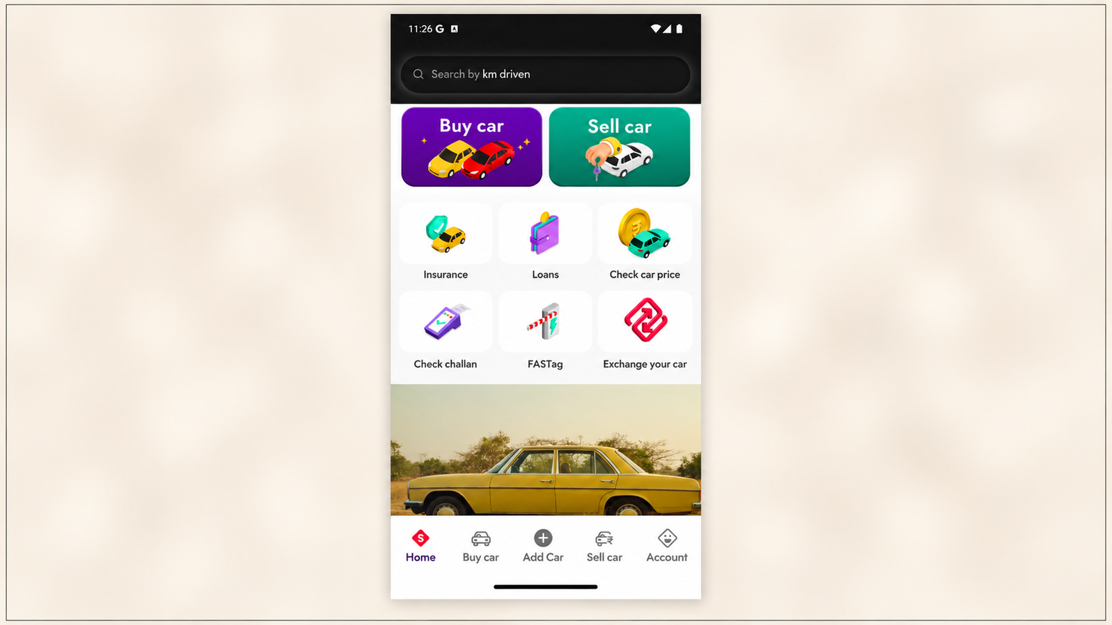
A first launch opens on Spinny's red diamond mark and hands off to a full-screen animated sequence.

The sequence moves through the wordmark, a line reading go far, an illustrated pair of cars under buying a car is picnic, a key handover under selling, easy like Sunday, and a three-beat delivery of now go / faster. / further. / together. It then runs a reel of eight service tiles: loans, insurance, service, fastag recharge, challan, pollution check, road-side assistance, and scrap. Then the diamond mark returns and the login screen loads.
The whole thing runs about 13 seconds.
The Skip control appears at roughly the 12.1 second mark. A skip affordance present for under a second of a 13-second sequence is not an escape hatch, it is a formality. In our capture the login screen arrived on its own, not because anything was skipped.
The duration also did not vary with connection speed. An animation that runs the same length regardless of how fast the device can fetch data is not concealing a load.
Judged against published guidance that is indefensible. Apple's Human Interface Guidelines and Android's launch screen guidance both treat an artificially extended splash as a quality problem, and app-store review flags it as such. One 2026 analysis puts the recommended ceiling under 1.5 seconds and estimates roughly 8% additional abandonment for every second past two.
Two things complicate that verdict.
The animation runs only on the first launch after install, not on subsequent cold starts. It is a one-time cost paid at the single highest-intent moment in the entire lifecycle, seconds after a person actively chose to download the app. Applying an abandonment curve derived from routine app opens to that moment overstates the damage considerably.
And the content is doing work. Eight service tiles is the entire point. A user who watches it knows Spinny handles pollution checks and road-side assistance, which is not what anyone downloads a used-car app expecting. The animation is buying a category definition, and category definitions are hard to establish any other way.
Whether that is worth 12 seconds sits in Spinny's install-to-first-session data, which nobody outside the company can see. What is visible is that it was a decision.
The Login Wall, Minimised but Absolute
Three screens pass before the first permission request. A Google account phone-number chooser laid over Spinny's login, Spinny's own number entry screen, and OTP verification.
There is no browse-before-login path in the flow we observed. Identity comes first, without exception.
The cost of that is documented in adjacent research. Baymard Institute attributes roughly 19% of checkout abandonments to forced registration, consistently among the top preventable causes. Checkout is not a perfect analogue for app onboarding, but the friction is the same shape: identity demanded before the user has decided they want the thing.
What Spinny does to soften it is real and worth copying. One field. No password. No name, no email, no profile form. The system-level number chooser removes even the typing. The ask is absolute in kind and close to minimal in effort, which is a defensible place to land if you have decided you need identity.
The Permission Spent at the Worst Exchange Rate
The notification prompt lands on screen four, immediately after OTP succeeds and before the user has seen a single vehicle.
This is the most questionable decision in the flow. Android 13's runtime notification permission ended default opt-in and brought Android opt-in rates to near parity with iOS. Opt-in rates fell across most categories after that change, with the steepest declines in gaming and the smallest in finance and transportation. A prompt shown before the user has any reason to want alerts is a prompt spent at the least favourable rate available.
The argument on Spinny's side is that used-car inventory is fluid. The right car appears and sells within days. If alerting a user to a matching listing is the retention mechanic that matters most, the permission has to exist before the alert can be offered, and Spinny is choosing to secure it during the compliant post-OTP moment rather than interrupting a browsing session later.
That argument would be stronger if the app re-asked after the user had seen how thin the matching inventory was. It does not, which we return to below.
The Three Questions That Buy a Permanent Segment
A new user tapping Buy car does not land on inventory. They land on a bottom sheet headed Your dream car, in 3 steps, with a three-segment progress bar and a persistent Skip in the top right.
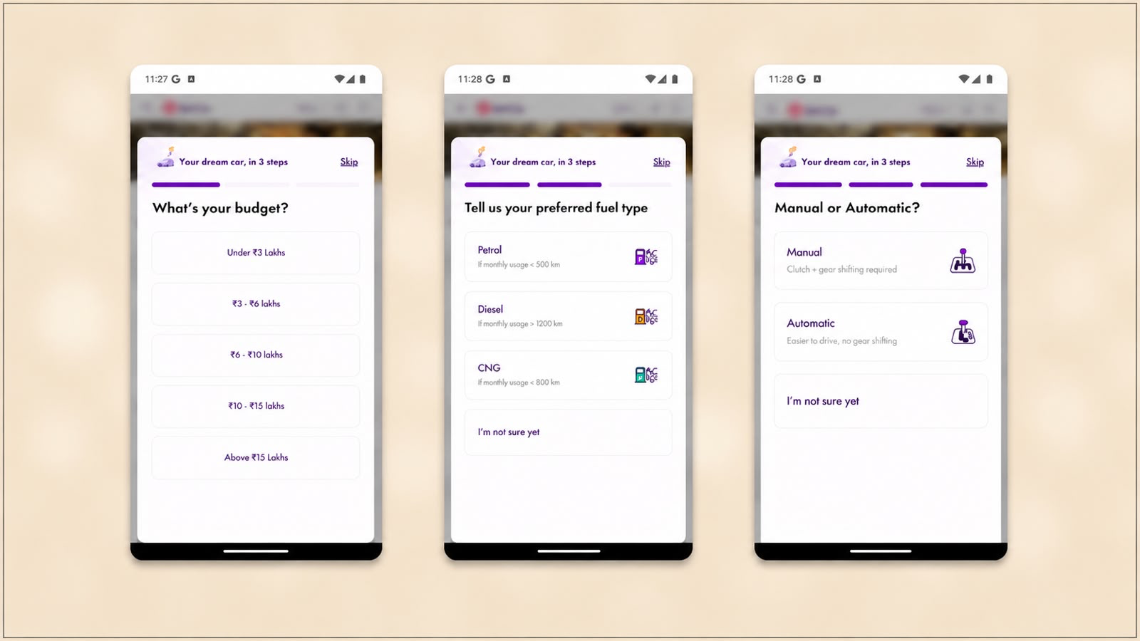
Step one asks What's your budget? across five bands. There is no option to defer.
Step three asks for transmission, with plain-language descriptors and the same deferral option.
Three taps, no typing. In our capture the whole sequence spanned about a minute of wall-clock time.
The Skip Here Actually Works
Put this beside the intro animation. The animation's Skip appeared at 12.1 seconds of a 13-second sequence. The quiz's Skip is present from the first frame of all three steps, underlined, in the same corner.
The same word, treated as a formality in one place and a genuine exit in the other.
Spinny is willing to let a user out of the questions that shape their results and unwilling to let them out of the sequence that shapes their impression of the company. Whatever else that reveals, it means the personalization the entire app runs on is the optional part, and the brand film is the mandatory part.
The sheet also renders over a blurred version of the buy screen rather than replacing it, so the user can see they are on top of something rather than diverted somewhere else. Combined with the filling progress segments, the end of the sequence stays visible throughout, which is the standard defence against mid-flow abandonment.
Budget Is the Question With No Way Out
Steps two and three both offer I'm not sure yet. Step one does not.
Every budget option is a commitment to a range. A user with no idea what they can spend still has to pick a band or abandon the whole sequence.
That asymmetry names the answer Spinny values most. Budget determines which inventory pool the user sees, which EMI figures make sense to show, and which finance products they qualify for. Fuel and transmission are refinements. Budget is the segment.
It is also the most sensitive of the three. Asking someone to declare spending capacity in the first thirty seconds is a larger ask than asking whether they prefer diesel, and it is the one question where the flow offers no cover.
The Options Teach the User How to Answer
Petrol is labelled If monthly usage < 500 km. Diesel is If monthly usage > 1200 km. CNG is If monthly usage < 800 km. Manual reads Clutch + gear shifting required and Automatic reads Easier to drive, no gear shifting.
Spinny is not only collecting a preference. It is handing the user the rule for forming one. A buyer who does not know whether they want diesel is given a number they do know, their monthly running, and a mapping from that number to an answer.
This matters beyond the immediate flow. A preference formed from a supplied decision rule is more stable and more accurate than one guessed under pressure, which means the segment Spinny stores is a better segment. The technique costs one line of grey text per option.
I'm Not Sure Yet Is Not a Blank
The deferral option looks like an opt-out. Treated properly it is a segment of its own.
A user who taps it on transmission has said something specific: they are early, they have not driven both, and they are a candidate for a test drive or a wider initial result set. That is a different person from someone who confidently chose Manual, and the two should not get the same follow-up.
Whether Spinny uses it that way is not visible from outside. What is visible is that the option keeps a hesitant user inside the flow instead of pushing them to Skip, which is the right instinct regardless.
Why This Is the Asset, Not the Cost
Three questions before inventory looks like an onboarding tax. It is closer to a capital investment.
Those three answers produce a durable segment. In our reinstall pass the budget, fuel, and transmission values came back from the server and applied themselves before the user did anything, having survived a complete uninstall and reinstall.
That changes the arithmetic entirely. A preference captured once and discarded at session end would never justify putting a form in front of inventory. A preference captured once and reused permanently pays into every session that follows. It also gives the alerts, the saved filters, and the Notify Me mechanic something specific to filter against from session one, which is the difference between a re-engagement message naming a car and one saying an app misses you.
The exposure is the mirror image. A preference that persists forever can go stale forever.
What the Subtraction Buys
Here is the settlement.
One tap on Buy car opened a results page. Four filter chips active (₹ 2 - 4 L, Manual, Diesel, In stock Cars), the sort already on Recommended, and two lines of copy stacked above the results.
The first read 2 cars matched your preferences. The second read From 269 used cars in Jaipur.
The Contrast Is Load-Bearing
Showing the large number beside the small one is not redundancy. Each half answers a different objection.
269 used cars in Jaipur establishes that the market is deep and Spinny has access to it. Without that line, a two-result page reads as an app with no inventory. With it, the same page reads as an app that has inventory and chose not to show most of it.
2 cars matched your preferences then converts smallness from a defect into evidence of work performed. The app is not failing to find cars. It is declining to show 267 it judged wrong.
Strip either line and the screen changes meaning. That is a well-constructed screen and it costs nothing to copy.
The Case for Subtraction, With Its Caveat
The behavioural argument for two options over 269 is heavily cited and frequently overstated, so it needs handling carefully.
In Iyengar and Lepper's 2000 study, a tasting booth displaying 24 jam varieties attracted more traffic than one displaying 6, but converted at 3% against 30%, and buyers from the smaller set reported higher satisfaction with their choice. The shape maps onto Spinny's screen almost too neatly. The big number attracts, the small number converts.
The honest caveat is that the effect does not generalise. A 2010 meta-analysis by Scheibehenne, Greifeneder and Todd found the average effect across roughly 50 experiments was near zero.
The conditions under which it does hold are the conditions Spinny operates in. Later meta-analytic work identifies decision complexity and the importance of getting the choice right as the factors that make assortment reduction effective. A used car is a high-consequence, high-complexity, infrequent purchase made by someone who mostly cannot evaluate the product themselves.
That qualifier is the single most important sentence in this article for anyone planning to apply it. Aggressive filtering is not a universal win. It is a win under specific conditions, and the section on transfer below separates which are which.
The Chips Are the Receipts
The four filter chips are not primarily a control surface. They are an explanation.
A two-result page without visible reasoning reads as arbitrary. The same page with ₹ 2 - 4 L, Manual, Diesel, and In stock Cars on display becomes a traceable output. The user sees the logic that produced the shortlist and can attack any part of it with a tap.
That transparency is what makes aggressive filtering tolerable. A system that narrows without showing its work is a black box. A system that narrows and shows it is an assistant. The underlying algorithm can be identical.
Recommended Is Doing More Than It Looks
The sort control arrives preselected on Recommended and most users will never touch it.
That is the point. The default effect, documented by Johnson and Goldstein in 2003 and replicated across insurance, pension, and software settings, is the tendency to accept whatever option is preselected, driven by the effort of changing it and by the implied endorsement that someone competent already chose. A preselected Recommended transfers the ranking decision from user to platform without asking.
For a buyer who does not know whether mileage matters more than model year, that transfer is a relief. It is also complete control over which two cars a user sees, held by the platform, exercised silently.
The Card Compresses the Decision
The first result was a 2013 Volkswagen Vento Highline Diesel at 97K km, priced at ₹3.64 Lakh, with or ₹13,763/m directly beneath.
That second number changes who the buyer is. ₹3.64 lakh is a savings-account question. ₹13,763 a month is a salary question, and far more people can answer the second immediately. Putting the EMI on the listing card rather than deferring it to a finance page means the affordability reframe happens before the user decides whether to click.
Everything After the Shortlist Argues For It
Opening the first result moves the user into the densest part of the app. No module on the product page expands the choice set. Every one of them defends the car already on screen.
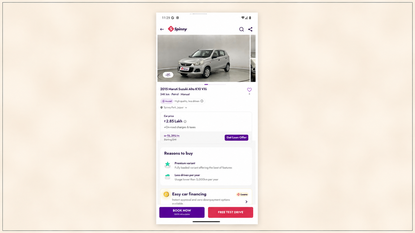
Visual proof standing in for inspection. The page opens with a large studio image and a 360 viewer badge. The badge matters more than the photograph. It signals the vehicle was photographed comprehensively, which implies it was inspected comprehensively, which is the reassurance a remote buyer cannot otherwise get.
Price decomposition. Sticker price, transfer tax framing, an EMI alternative, and a Calculate your EMI action. Repeating the monthly figure from the listing card reinforces the affordability frame at the point of highest hesitation rather than introducing it there.
Reason-led selling. A Reasons to buy section converts specifications into claims. Ours read Great performance in segment, Jaipur's most affordable car, and 3 new tyres. Each does different work. The first is a category judgment the buyer could not make alone. The second is a comparative claim across the 269-car pool they are not looking at. The third is a checkable fact about money already spent on the vehicle. This is the same interpretation-selling the quiz was doing with its usage rules, now applied to a specific car.
A resumable loan module. Loan offer pending with Resume now to view your loan offer in under 2 minutes. The finance journey is a state that follows the user rather than a destination they must re-enter. The two-minute framing caps the perceived cost of resuming, which is the objection that kills half-finished finance flows.
A trade-in bonus. An exchange offer worth ₹10,000 against an old car. It lowers the effective price, which is a conversion lever, and pulls the user's existing car toward Spinny's inventory, which is a supply lever. One component serving both sides of a marketplace is efficient in a way most cross-sell modules are not.
Dual-lane conversion. BOOK THIS CAR and FREE TEST DRIVE stay docked at the bottom. A user who has decided can transact. A user who has not can take a step costing nothing that still hands Spinny a high-intent lead with an appointment attached. The lower-commitment option is not visually demoted, which is what makes it a genuine second lane rather than a decoy.
Where the Trade Breaks
Coherent is not the same as safe. Four places this model fails badly.
The Shortlist Has No Margin
A two-result page works when at least one result is plausible. When neither is, the screen offers no recovery. No prompt to widen the filters, no adjacent set framed as near misses, and no acknowledgement that the other 267 cars exist as anything but a denominator.
A user in that position has to work out unaided that the chips are editable. Some will. The rest read 2 cars matched your preferences as the app's final answer, and the final answer is no.
The fix is not a bigger result set. It is a fallback state that fires when the matched count is low and the user does not engage, offering a widened set framed as deliberate expansion rather than failure.
Preference Memory Can Go Stale
The strongest finding is also the biggest exposure. Preferences survived a full reinstall and applied themselves silently.
Used-car preferences move. A buyer who set ₹2 to 4 lakh in an early exploratory session may since have decided they can stretch, or that automatic is worth the premium after driving one. Applying stored answers silently and returning two results against them risks handing a stale verdict to someone whose situation changed months ago.
A single confirmation strip closes it. A line at the top of the results naming the preferences on file, with a one-tap path to revise, preserves the speed and removes the staleness.
The First Session Carries Too Much Load
The cost and the payoff are unevenly distributed. The user pays 12 seconds, a login, an OTP, a permission prompt, and three questions, and receives everything back on one screen.
Concentrated payoffs have one point of failure. If the two cars land, the whole preceding cost is retroactively justified. If they do not, the user spent a minute and a phone number on nothing.
Spreading even a little value earlier, a single listing visible before login or a price-band preview during the animation, would reduce that concentration without dismantling the model.
Nothing Recovers a Declined Permission
We tapped Don't allow on the notification prompt. The session continued normally and nothing later attempted to recover the channel.
For an app whose retention argument rests on telling users when a matching car appears, that gap is expensive. Someone who declined at screen four, before they had any reason to want alerts, may well want them forty seconds later while looking at a shortlist of two and seeing how thin the matching inventory is. The Notify Me block on the results page is the natural place to re-ask, framed around the specific thing they would hear about.
Asking once, at the least persuasive moment available, and never asking again is the costliest possible way to handle a permission this important.
Does This Transfer to Your Category?
Spinny's specific answers are used-car answers. Applying them wholesale to a different category is how teams end up with a 12-second animation on a food delivery app.
The honest split runs along two axes: how considered the purchase is, and how often it repeats.
| High-consideration, low-frequency (insurance, lending, real estate, healthcare, education, B2B) | Low-consideration, high-frequency (quick commerce, food, content, transit, payments) | |
|---|---|---|
| Front-loaded brand time | Defensible once, at install. The user needs to know who they are trusting. | Contradicts the product promise. Cut it. |
| Identity before value | Usually necessary, since the product cannot function without it. Minimise the fields, not the requirement. | Defer it. Let people transact first and register after. |
| Preference quiz before results | Strong. The user often cannot form criteria alone and welcomes the structure. | Weak. The user knows what they want and the quiz is a tax. Infer from behaviour instead. |
| Aggressive shortlisting | Strong, and the core mechanic. Complexity plus consequence is where choice reduction earns its keep. | Risky. High-frequency users have specific intent and a filtered set that misses it reads as broken. |
| Decision rules attached to options | Strong. Teaching the user how to answer improves both the answer and the trust. | Neutral. Mostly unnecessary. |
| Permission asked pre-value | Wrong in both. Move it to the moment after an action it would serve. | Wrong in both. |
The pattern in that table is worth stating directly. Spinny's model is a confidence machine, and confidence machines only pay off where confidence is the scarce resource. A user ordering groceries is not short on confidence. A user choosing a term insurance policy, a home loan, a school, or a first car is short on almost nothing else.
For teams in the left-hand column, the transferable core is the sequence: collect a small number of high-value answers, supply the decision rules that make those answers easy, return a shortlist rather than a catalogue, expose the reasoning, then spend the rest of the experience justifying the shortlist.
For teams in the right-hand column, the transferable parts are narrower and still valuable. The visible-reasoning pattern works anywhere. The dual-lane CTA works anywhere. The resumable-state module works anywhere a journey spans sessions. Zepto's onboarding runs the opposite bet in the same market and is worth reading beside this one, because the contrast makes both designs legible in a way neither is alone.
The Audit to Run This Week
Under an hour on any consumer app.
Time the on-ramp with a stopwatch, not from memory. Install fresh, record the screen, and measure to the tenth of a second how long passes before the user sees something they could act on. Teams consistently underestimate this because they have never sat through their own cold start on a clean device.
Count the screens before your first permission prompt, then name what value preceded it. If the answer is nothing, the prompt is being spent at the worst rate available. Move it to the moment immediately after an action it would serve.
Write down your take-and-give table. Use the four columns from the top of this article. Every ask in your onboarding gets a row. Fill in the last column honestly. Rows where the last column is empty are debts, and you should know how many you are carrying before the payoff arrives.
Establish your ratio between what you hold and what you show. Spinny shows 2 of 269. Write down yours. If you show everything, ask whether your user has the expertise to sort it. If you show a fraction, ask whether they can see why.
Find the screen with no recovery path. Every funnel has one state where a user who wants something different has nowhere obvious to go. Spinny's is the low-match results page. Find yours, then design the fallback.
Audit what your defaults decide on the user's behalf. A preselected sort, payment method, or plan carries real influence. Whoever set it made a decision for most of your users. Confirm it was a decision.
The obstacle to acting on any of this is rarely the analysis. It is that the fixes are UI changes. A fallback state on a low-match page, a preference-confirmation strip, a repositioned permission prompt, and a re-ask after a decline are all small edits to screens that already exist, and in a conventional mobile stack each one needs a build, a release, and a store review before a single user sees it. Teams end up testing sequencing decisions twice a quarter instead of twice a week. Rendering those surfaces server-side through Digia Engage moves them out of the release queue, so the change and the result land in the same week.
Key Takeaways
Onboarding is a trade, not a checklist. Price every ask against what the user gets back for it, and count how many asks return nothing at the moment they are made.
Spinny takes four things before delivering anything: 12 seconds of fixed brand animation on first install, a verified phone number, a notification permission at screen four, and three preference answers. Only the last one returns value immediately.
The three quiz answers survived a complete uninstall and reinstall, which converts a one-time friction cost into a permanent personalization asset and is what makes the ask defensible at all.
The payoff is a results page collapsing 269 listings into 2, with the reasoning exposed as filter chips and the sort preselected on Recommended. Showing the large inventory number beside the small matched number is what stops the shortlist reading as an empty app.
The design's weakest points are a low-match page with no recovery path, preference memory that can go stale silently, and a declined notification permission that is never re-asked at a moment when the user would say yes.
Aggressive shortlisting and preference quizzes transfer to high-consideration, low-frequency categories where users cannot form criteria alone. They work against high-frequency products where users arrive with specific intent. Visible reasoning, dual-lane CTAs, and resumable state transfer everywhere.
Further Reading
From Digia Engage:
- How Zepto's Onboarding Gets Users to Their First Order in Under 3 Minutes. the opposite bet in the same market, where every step not serving the purchase decision is cut
- How to Build an In-App Onboarding Flow That Gets Users to Their First Win. first-win mapping and its correlation with Day-7 retention
- How Indian Fintech Apps Drive User Activation: 8 In-App Patterns. permission timing and activation sequencing in a high-consideration category
- Urban Company's Post-Order Screen: Anatomy and Cross-Sell Mechanics. cross-sell placement on a high-attention surface
- Mobile App Retention Rate: What It Is and What's Pulling It Down. why first-session decisions carry disproportionate weight
External Sources: All Claims Attributed
- Best Practices for Mobile App Onboarding. Dots Mobile, March 2026 (25% single-use abandonment, 77% loss within three days)
- Why Users Abandon Apps During Onboarding. Sparklin, May 2026 (forced sign-ups, feature overload, and aggressive permission requests as first-session abandonment drivers)
- Splash screen does not persist for excessive duration. AuditBuffet Pattern Catalog, April 2026 (Apple HIG and Android launch screen guidance, app-store review flagging)
- App Splash Screen Best Practices. Appy Pie, May 2026 (sub-1.5 second recommendation, estimated 8% additional abandonment per second beyond two)
- Ecommerce Checkout UX Guide. Baymard Institute (19% abandonment attributed to forced registration)
- Your Guide to Airship's Mobile App Push Notification Benchmarks for 2026. Airship, June 2026 (Android 13 ending default opt-in, Android and iOS opt-in rates reaching near parity)
- Push Notifications Android 2026: Setup, Permissions and Best Practices. Pushwoosh, May 2026 (POST_NOTIFICATIONS runtime permission mechanics, category-level opt-in declines)
- The Paradox of Choice: Choice Overload, Minus the Myth. Yu-kai Chou, April 2026 (Iyengar and Lepper 2000 jam study 30% against 3%, Scheibehenne, Greifeneder and Todd 2010 meta-analysis near-zero average effect)
- The Paradox of Choice: Jam Experiment and Its Application. Substack, February 2024 (Kellogg meta-analysis conditions under which assortment reduction helps)
- Defaults Explained: The Nudge Nobody Notices. SUE Behavioural Design, April 2026 (Johnson and Goldstein 2003 default effect, mechanisms of effort and implied endorsement)
- India Used Car Market Share, Size and Trends Overview. Mordor Intelligence, 2026 (organised retail moving from 30% to 50% share by 2030)
- India Used Car Market Size, Share and Future Scope. Persistence Market Research, 2026 (5.9 million unit volume FY2024-25, 9.5 million forecast by 2030)
Want to change what a user sees at a drop-off point without waiting on an app release? Digia Engage renders in-app surfaces like fallback states, preference confirmation strips, and repositioned permission prompts as native components configured from a dashboard, updating server-side in under 100ms. Book a demo to see how the trigger and suppression layer works on a first-session flow.