


TL;DR: Micro-interactions are the small, single-purpose responses an interface delivers in reaction to a user action or system state. Inside in-app nudges, they operate at the moment of highest decision-making pressure: the instant before a user decides whether to tap the CTA or dismiss. This article covers what micro-interactions are (and why they are not the same as animations), the three functional roles they serve, the specific elements that matter inside nudges, how they reduce perceived friction at the point of action, the conditions under which they make performance worse instead of better, real examples from high-performing nudge designs, and a practical testing framework for measuring their impact on click-through rate. Sourcing note: All data citations are attributed to their source and methodology. Where no published study exists for a specific claim, the article says so explicitly.
The Click Before the Thought
There is a specific moment in every nudge interaction that designers either win or lose. It is not when the nudge appears on screen. It is not when the user reads the headline. It is the split second when the user's thumb moves toward or away from the CTA button.
That moment happens faster than conscious evaluation. Research in decision neuroscience is clear on this: the motor system begins preparing a response before the prefrontal cortex has finished deliberating. The user's body starts moving before they have explicitly decided to move. What determines the direction of that movement is not the headline text or the offer logic. It is whether the interface at that moment feels responsive, safe, and rewarding to interact with.
Micro-interactions are what create that feeling. They are not decoration added after the fact. They are the mechanism through which an interface communicates trustworthiness, responsiveness, and progress to the user's nervous system in the period of time that reasoning hasn't fully caught up to. When a CTA button responds immediately to a hover or a tap with a visible change, the user's brain receives a confirmation: this interface works, this action is safe, continuing is rewarded. When it does not respond, the user's brain receives a different signal: uncertainty.
Uncertainty is the enemy of the click. Micro-interactions eliminate uncertainty at the exact moment it matters most.
This article is specifically about micro-interactions inside in-app nudges: the tooltips, bottom sheets, banners, and overlays that prompt users to take a specific action inside an app. It is not a survey of micro-interactions at large. The scope is narrow because the stakes are concentrated. In a nudge, the entire job of the UI is to move a user from reading to acting in a few seconds. Every interaction detail either advances that transition or adds friction to it.
What Micro-Interactions Are and How They Differ from Animations
The terms "micro-interaction" and "animation" are used interchangeably in most product discussions, and that conflation causes real design errors. They are different things with different purposes, and the distinction determines whether what you build helps users act or just looks polished.
A micro-interaction is a contained, single-purpose response that occurs when a user takes an action or when a system condition is met. According to interaction designer Dan Saffer, who formalized the concept in his book Microinteractions: Designing with Details, a micro-interaction has four components: a trigger (the user action or system event that starts it), rules (the logic determining what happens), feedback (the visible or tactile response the user receives), and loops or modes (whether and how the interaction changes over time). The trigger might be tapping a button. The rules determine how the button responds. The feedback shows the user that the action registered. The loop determines if repeated taps produce the same or different feedback.
An animation, by contrast, is a visual motion element that serves primarily aesthetic or narrative purposes. It can be part of a micro-interaction (the feedback component), but it does not have to be, and many animations exist purely as visual language with no direct connection to user action. A hero animation that plays on app open is an animation. A loading skeleton that fills progressively as data loads is a micro-interaction. Both involve motion; only one responds to user behavior.
The Interaction Design Foundation states this distinction clearly: micro-interactions are fundamentally about functionality and direct user engagement, while micro-animations focus on visual appeal and indirect guidance. All micro-interactions contain some form of motion or visual change, but not all animations qualify as micro-interactions. The test is whether the motion is directly tied to a specific user action or system condition and serves a functional communication purpose within that context.
Why does this distinction matter for nudges specifically? Because nudge design is almost entirely about reducing the time and cognitive effort between a user's arrival and their action. Every element in a nudge is competing for that user's limited attention span. A full-screen animation that plays when a nudge appears may look impressive in a design review, but it consumes the attention budget the CTA needs. A micro-interaction on the CTA itself that fires when the user's thumb moves near it uses that same attention to accelerate the decision. The animation is visual noise. The micro-interaction is a conversion mechanism.
The practical rule for nudges: if the motion does not directly respond to something the user has done or is about to do, it is an animation. If it does respond to user action and communicates something functional about what happens next, it is a micro-interaction. Nudge design needs far more of the second kind.
The Three Roles: Feedback, Guidance, and Reward
Every micro-interaction inside a nudge serves at least one of three functional roles: feedback, guidance, or reward. These are not interchangeable. Each addresses a different psychological need at a different point in the interaction, and confusing them produces designs where the motion is technically present but not doing any real work.
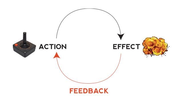
Feedback: Confirming That the System Received the Action
Feedback is the most fundamental role of a micro-interaction. It answers the user's implicit question: "Did that work?" Without feedback, the user experiences uncertainty about whether their action registered, and uncertainty in a conversion moment translates directly into hesitation or abandonment.
Research from IBM's usability testing found a 45% increase in task satisfaction when clear feedback accompanies every user action. This is not because users appreciate the aesthetics of a color change. It is because the feedback signal eliminates the gap between action and confirmation, which removes a source of cognitive load from the interaction.
Inside a nudge, feedback micro-interactions operate at two critical moments: when the user interacts with the nudge itself (hovering, focusing, or touching the CTA) and when the user completes the action the nudge is prompting. Both need feedback. A CTA that does not visually respond to a tap leaves the user unsure whether the tap registered, which sometimes produces a second tap, a hesitation, or a decision to dismiss. A flow that does not confirm completion leaves the user without the closure signal their brain needs to feel that the interaction succeeded.
Guidance: Directing Attention Before the Action
Guidance micro-interactions do their work before the user acts, not after. Their role is to reduce the search cost: the mental effort a user expends trying to identify what to do next. In a nudge context, where the design goal is to move the user to a specific action as efficiently as possible, guidance micro-interactions are what ensure that the CTA is perceived as the obvious next step rather than one of several competing options.
Hover states are the primary guidance micro-interaction on desktop and on mobile interfaces where cursor proximity is tracked. When a button visually responds to approach before it responds to contact, it confirms affordance: this is a thing you can press. A Microsoft research study on interactive affordances found that clear hover states improve usability by up to 15%, especially in complex interfaces where users need visual guidance. The effect is smaller in simpler interfaces, but in a nudge where the design is already stripped down, a 15% usability improvement from a single interaction detail is significant.
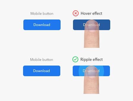
On mobile, where hover states do not exist in the traditional sense, guidance comes from tap highlight colors, ripple effects at the point of contact, and focus states that activate when the user's thumb is near an interactive element. The purpose is identical: confirm that the interactive element is interactive before the full commitment of a tap.
Guidance micro-interactions also operate at the structural level through progress indicators in multi-step nudge flows. When a user sees a step indicator that shows they are on step 2 of 3, the guidance is not just informational. It is motivational. The proximity to completion activates what psychologists call the "completion bias," which is the brain's drive to finish tasks that are already in progress. The user who is two-thirds through a flow is more likely to complete it than the user who cannot see how far they have come.
Reward: Reinforcing the Completed Action
Reward micro-interactions fire after the user has taken the action the nudge is prompting. Their role is to make the completion of the action feel satisfying rather than neutral, which produces two outcomes: it increases the likelihood of return behavior and it positively anchors the user's association with the app and the action they just completed.
The reward does not need to be elaborate. A completion checkmark animation, a momentary color shift on a confirmed transaction, a subtle haptic response on iOS when a form submits: these are all reward micro-interactions. Their size is not what determines their effectiveness. What determines effectiveness is precision of timing (the reward must fire at the exact moment of completion, not 500ms later) and appropriateness to context (a confetti explosion is right for finishing a savings goal; it is wrong for approving a wire transfer).
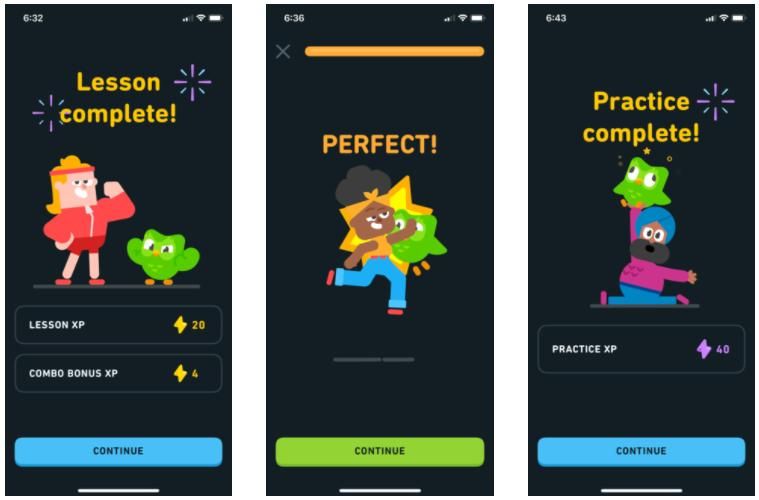
Duolingo's use of reward micro-interactions is well-documented. Duolingo's internal reports suggest that instant feedback increases daily active users' lesson completion rates by over 30%. The mechanism is not complex: when a learner answers correctly, a combination of visual cues, auditory signals, and a celebratory animation fires immediately. The result is a dopamine signal that the brain associates with completing the action, which increases the probability of returning to repeat it.
Which Role Matters Most for Nudges
The honest answer is: feedback, and it is not particularly close.
Guidance matters at the design level, but most nudge designs are already stripped to a degree where affordance confusion is rare. The CTA is visible, labeled, and typically contrasted against the background. Users do not struggle to find it. Reward matters for long-term retention behavior, but individual nudge interactions are often one-shot: the user either converts or they do not, and they may not return to the same nudge context. Reward micro-interactions matter more for gamification mechanics and streak systems than for individual nudge CTAs.
Feedback, by contrast, is the mechanism that determines whether the tap-to-confirmation loop feels smooth or uncertain. In a nudge, where the user is making a binary decision (act now or dismiss) under the time pressure of being in the middle of doing something else in the app, any uncertainty signal in the interaction pushes toward dismissal. The user who is not sure their tap registered dismisses to try again or abandons entirely. The user who receives immediate, clear feedback that their action is processing continues.
This does not mean guidance and reward do not belong in nudge design. It means that if you are going to prioritize one role for your CTA micro-interactions, you should start with feedback, get it right, and then layer in guidance and reward.
The Four Elements That Do the Work Inside Nudges
The theory of feedback, guidance, and reward maps to four specific micro-interaction elements that appear repeatedly in high-converting nudge designs. Each operates at a different point in the nudge interaction arc.
Hover States and Tap Highlights
Hover states on desktop and tap highlights on mobile serve the same function: they confirm affordance at the moment of approach, before the full commit. On a desktop nudge, this means the CTA button changes visually when the cursor enters its bounding area, typically through a color shift, a subtle shadow, or a slight scale increase. On mobile, the equivalent is the tap highlight color that appears at the point of contact when a finger touches the button, or a brief ripple effect that radiates from the touch point.
Research indicates that well-designed hover effects can increase clickability by up to 30%. The design requirement is that the hover state change must be noticeable but not distracting: substantial enough that the user perceives it at a glance, not so extreme that it draws attention away from the label text that explains what the button does.
The timing constraint matters more on mobile than on desktop. On desktop, cursor hover states have no timing threshold because the cursor can hover indefinitely. On mobile, the tap highlight must fire within the window that the human nervous system processes as "immediate." For time-sensitive actions, response latency should be under 200ms; otherwise users perceive lag. A tap highlight that appears 300ms after contact does not reduce uncertainty. It confirms the action registered after the user has already moved on to wondering whether it did.
For nudge CTAs specifically, tap highlights should be designed to remain visible slightly longer than the tap duration: a brief residual state after the finger lifts that transitions to the processing state. This creates a continuous visual chain from touch to confirmation, with no moment where the user is looking at a static, unresponsive interface wondering what is happening.
Progress Indicators
Progress indicators serve dual roles in nudge design. In multi-step nudge flows, they function as guidance micro-interactions, showing the user where they are in a sequence and how much remains. At the CTA processing level, they function as feedback micro-interactions, confirming that the action is being processed after a tap.
The psychological mechanism behind progress indicators is well established. When users see a smooth progress indicator rather than a static spinner, the brain interprets the experience as advancing toward completion. Structured waiting feels shorter because the brain can map progress. Micro-interactions can therefore influence perceived speed: a transition that gently slides content into place may feel faster than an abrupt content swap, even if both occur within the same timeframe.
Google's Material Design team notes that loading feedback reduces perceived wait times by nearly 20%. For nudge designers, this number matters because a nudge that requires a backend call to process the user's action (registering a purchase, initiating a verification flow, unlocking a feature) has a window of perceived waiting that can produce abandonment. A skeleton screen or progress shimmer that fires immediately on tap closes that abandonment window by giving the user a signal that something real is happening.
The design rule for progress indicators in nudge CTAs: they should fire within the 200ms threshold after the tap, they should communicate directionality (moving from left to right, from empty to full) rather than spinning in place, and they should transition to a completion state rather than simply disappearing when the process finishes. The disappearance of a spinner without a completion confirmation is a feedback gap that requires a reward micro-interaction to close.
In multi-step nudge flows specifically, step indicators serve a function that has nothing to do with loading states. The Zeigarnik Effect, the psychological tendency to better remember and feel compelled to complete unfinished tasks, means that showing users their progress through a flow increases completion rates because incomplete tasks generate a mild tension that motivates closure. A nudge flow that shows "Step 2 of 3" is leveraging this effect. One that shows only the current step is not.
Completion Confirmations
A completion confirmation is the micro-interaction that fires when the user successfully completes the action the nudge was prompting. It is the reward layer in concrete form: a checkmark, a brief animation, a color shift from pending to confirmed, or a haptic response that tells the user "this worked."
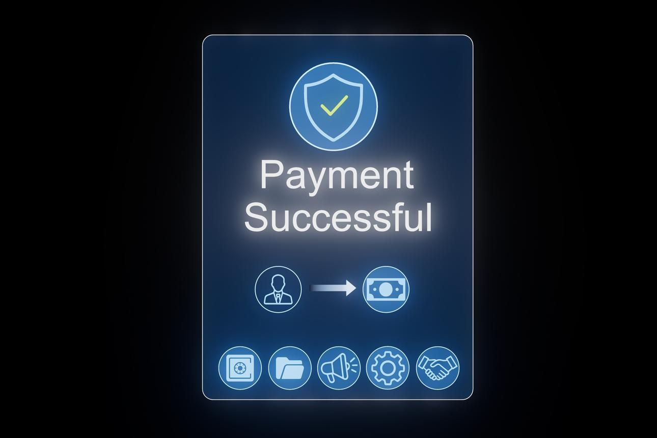
The importance of completion confirmations is consistently underestimated because their absence is invisible. When there is no completion confirmation, the user simply stops seeing the nudge and lands on whatever screen comes next. The experience is functional but cold. When a well-designed completion confirmation fires, the user receives a closure signal that satisfies the brain's need to categorize the completed action, and that categorization registers as positive.
Financial service apps implementing micro-feedback for transactions saw customer satisfaction scores improve by 24%. In fintech particularly, where transaction confirmations carry both practical and emotional weight, the completion micro-interaction is not optional UX polish. It is a trust mechanism. A user who transfers money and receives an immediate, clearly animated confirmation that the transfer is processing trusts the app differently than a user who transfers money and watches a static screen.
Completion confirmations must be appropriately proportioned to the action. A minor action, such as dismissing a tooltip or saving a preference, warrants a subtle acknowledgment: a brief color flash, a small checkmark. A significant action, such as completing a purchase, verifying identity, or unlocking a premium feature, warrants a more substantial confirmation that communicates the weight of what just happened. Mismatched confirmation scale (heavy celebration for trivial actions, silence for significant ones) signals a poorly designed system and erodes trust in both directions.
Animated CTA States
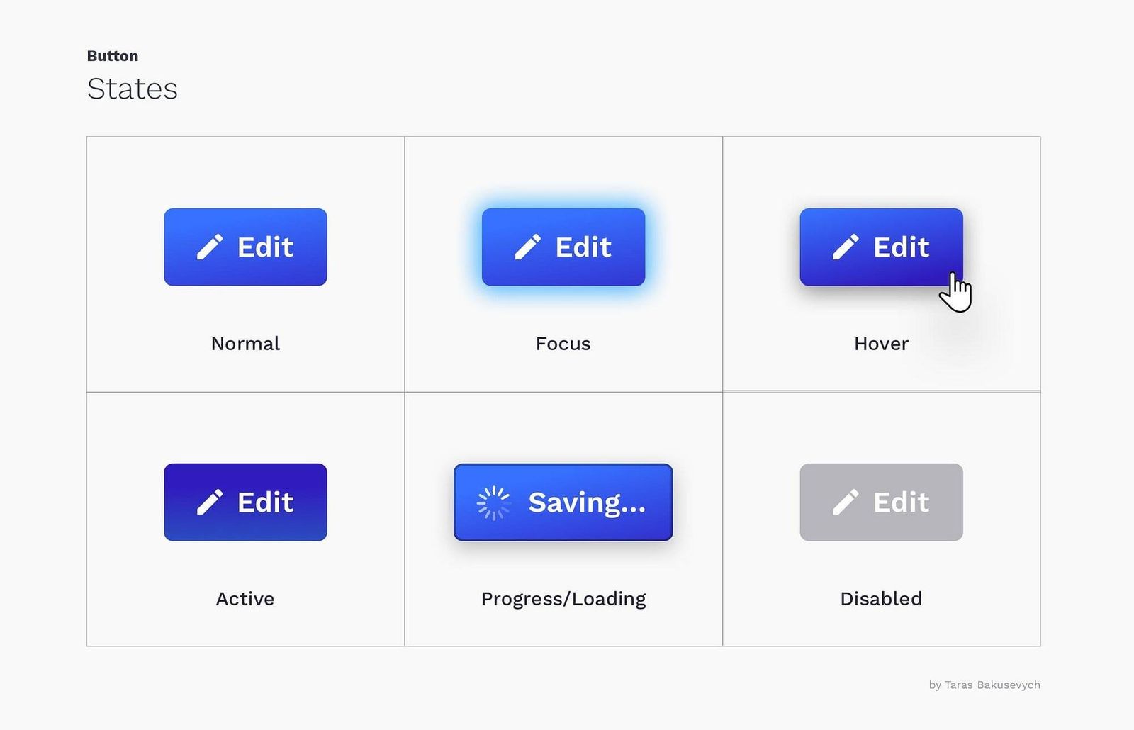
The CTA button inside a nudge is the most loaded piece of UI in the entire interaction. It represents the ask, carries the conversion risk, and is the last point of friction before the user acts or does not. The micro-interactions on that button's states, specifically its resting state, its hover or focus state, its active (pressed) state, its processing state, and its disabled state, determine whether the button feels like a dead pixel or a live control.
Adobe's Mobile Experience Report tracked 7.2 billion mobile interactions and found that CTA buttons with micro-animation feedback on tap outperformed plain text links by 218% on screens smaller than 6 inches. This is not a marginal effect. The difference between a button that responds visually to a tap and a text link that does not is not just stylistic: it is the difference between an interface that communicates "I received your action" and one that does not.
The practical design of animated CTA states involves a sequence: the resting state is the baseline; the hover or focus state fires on approach or keyboard focus; the active state fires on press (typically a brief scale-down or color deepening to simulate physical depression); the processing state fires on submission and holds until response; the success or error state fires on completion and communicates the outcome.
Each state transition should be under 200ms. Most micro-animations live in the 200 to 400ms range overall, with ease-out curves for exits and ease-in curves for entrances. For the active (pressed) state specifically, the response should be instantaneous to the finger, meaning the animation should begin with zero perceptible delay. This is where the technical implementation of hardware-accelerated CSS transitions, rather than JavaScript-driven animation, becomes a functional requirement rather than an optimization preference.
How Micro-Interactions Reduce Perceived Friction at the CTA
Friction at the CTA is not always visible. A user who sees a well-designed nudge with a clear headline, a relevant offer, and a prominent button, but still does not tap it, is not necessarily unconvinced by the content. They may simply be experiencing micro-level uncertainty that the interface has not resolved: uncertainty about whether the button does what they think it does, uncertainty about whether the interaction will be fast, uncertainty about whether they can reverse the action if needed.
Micro-interactions address each of these uncertainty sources through specific mechanisms.
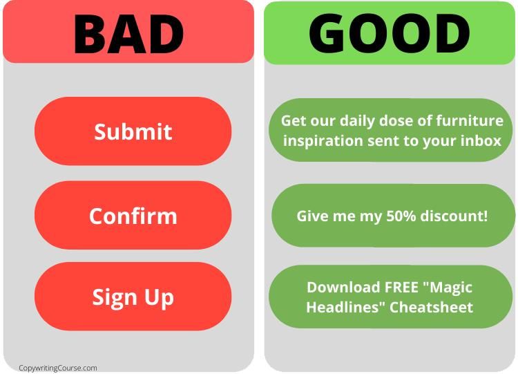
Uncertainty about interactivity is addressed by the hover state and tap highlight. When the button changes on approach or contact, it confirms that it is a live control responsive to input. Businesses see click-through rates improve when call-to-action states react promptly to hover, focus, and tap. The click-through improvement is not because the button looks better. It is because the user no longer has to commit to a tap to find out whether the button will respond.
Uncertainty about what happens next is addressed by the active and processing states. A button that immediately shifts to a processing animation after a tap tells the user that their action was received and that the system is working on it. Without this feedback, the user's mental state during the processing window is active uncertainty: they do not know if the tap registered, they do not know how long to wait, and they are deciding whether to tap again or abandon. Each of those states creates an abandonment risk that the processing micro-interaction eliminates.
Uncertainty about reversibility is addressed less directly by micro-interactions and more by the copywriting and flow design of the nudge. However, completion micro-interactions that include an undo or confirmation state, as in Gmail's send confirmation with its brief "Undo" option, address this uncertainty by giving the user a clear signal that the action is in progress but not yet final. For high-stakes nudge actions in fintech apps specifically, this state design matters.
Perceived duration of processing is addressed by progress indicators, which reduce the subjective experience of waiting even when they do not reduce the actual wait time. The user who watches a progress bar filling does not check the time and calculate elapsed duration. They watch the bar and feel that progress is occurring. That feeling reduces the abandonment probability in the processing window.
A basic psychological principle underlies all of these mechanisms: predictability builds trust. Users whose cognitive load is reduced when they know what to anticipate from each click stay longer, move more quickly, and make fewer errors. Micro-interactions are the mechanism through which interface predictability is communicated, not through documentation or instructions, but through moment-by-moment feedback that tells the user: "you understand how this works, and it is working correctly."
When Micro-Interactions Backfire: Delay, Distraction, Overdesign
Micro-interactions fail in three distinct ways, and each failure mode is more common than it should be because the failure is not always immediately visible in design reviews. It only surfaces in analytics when conversions drop or session recordings show users stalling or abandoning.
Delay: The Feedback Arrives Too Late
A micro-interaction that fires after the user's attention has moved on is not a micro-interaction. It is a latency problem with a motion graphic attached. The timing threshold that determines whether feedback is perceived as responsive or laggy is approximately 100 to 200ms from the triggering action. Beyond this window, users begin to experience the interface as slow, and perceived slowness is one of the most reliable predictors of user abandonment in mobile contexts.
A button that takes several seconds to change color, or an animation that requires seconds of loading time, draws attention away from the task at hand and hampers user flow. Users expect immediate feedback; any unnecessary delays will lead to frustration. This is a specific failure mode in nudge designs built on heavy JavaScript animation libraries where the motion is visually impressive but frame-rate dependent in a way that introduces variable latency across devices. A nudge CTA that performs perfectly on a new flagship device may produce 300ms+ feedback delays on a mid-range device from two years ago, which is a significant portion of the app's user base.
The technical solution is hardware-accelerated rendering (using CSS transform and opacity rather than properties that trigger layout reflow) and capping animation complexity to what the target device's minimum specification can render at 60fps. The design discipline required is testing micro-interactions on the actual median device in your user base, not on the development team's current-generation equipment.
Distraction: The Motion Competes With the Message
A nudge has one job: move the user to the CTA. Every element in the nudge is competing for the user's attention, and attention spent on a motion effect is attention not spent on the copy, the offer, or the CTA label. When a nudge deploys elaborate entrance animations, multiple simultaneous motion elements, or a looping animation anywhere near the CTA, the visual system's involuntary orientation to motion is working against the nudge's goal.
If every step on a checkout page triggers complex animations, the result is slowing down progress and introducing friction that can give users time to second-guess a purchase. The same principle applies inside nudges: complex motion on the path to the CTA gives the user's deliberative mind time to reconsider what the impulsive part of their brain was about to do.
The design rule is not that nudges should be static. It is that motion that does not serve a functional role (feedback, guidance, or reward) has no legitimate place in a nudge. An entrance animation that makes the nudge feel polished does not serve any of the three roles. It serves the designer's aesthetic preference, or the brand team's desire to feel premium. Neither of these is worth the attention budget it consumes at the moment of conversion.
The test for any motion element in a nudge: which of the three functional roles does it serve, and does it serve that role better than the same element without motion? If the answer is "none" or "not measurably," the motion should be removed.
Overdesign: The System Accumulates Interactions That Cancel Each Other Out
Overdesign happens when multiple micro-interactions are layered on the same element or screen, producing a design that feels busy and confusing rather than responsive and polished. It is the most common form of micro-interaction failure because it emerges gradually as features are added and each individual addition seems reasonable in isolation.
A nudge CTA that has a hover state, an entrance pulse animation, a loading ripple, a success checkmark, and a confetti burst on completion has five distinct motion events attached to a single element. In isolation, each is defensible. Together, they produce a sensory experience that the user's nervous system registers as noise rather than signal. Flashy animations can have a counterproductive effect and overwhelm users. Ensure they are not too distracting and serve to reduce screen complexity, not add to it.
The symptom of overdesign in analytics is a pattern where nudge view rates are acceptable but click-through rates are lower than expected given the quality of the offer. Users are seeing the nudge and not clicking. When session recordings show users watching the nudge without interacting, or show repeat exposures without conversion, overdesigned micro-interactions are a likely contributor. The solution is to audit each motion element against its functional role and remove any that are not serving a clear purpose, starting with the elements that are closest to the CTA itself.
Examples from High-Performing Nudge Designs
Examining what high-performing nudge designs actually do with micro-interactions reveals that the best implementations share a common characteristic: they are almost invisible when working correctly. The user does not think "that was a nice animation." They just click, and clicking feels easy.
The Ripple-to-Process Sequence
A pattern that appears consistently in high-converting mobile nudge CTAs is the ripple-to-process sequence: the button emits a brief ripple effect radiating from the touch point on tap (feedback, confirming contact), then immediately transitions to a progress state (feedback, confirming processing). There is no gap between these two states. The user's thumb leaves the screen and the button is already in its processing state.
This sequence works because it converts the high-uncertainty window (the moment between tap and system response) into a continuous visual narrative. The user who sees their tap produce a ripple that flows into a progress animation is experiencing an unbroken story of "I did something, and something is happening." The user who sees their tap produce nothing while the system processes is experiencing the equivalent of talking into a phone and not knowing if anyone is on the other end.
The Step Indicator in Multi-Step Nudge Flows
Digia Nudges supports multi-step nudge formats including bottom sheets and overlays that walk users through a sequence. In these flows, step indicators that update with a visual transition on each step completion outperform static indicators consistently because the visual update at the step boundary functions as both a progress indicator (guidance) and a mini-reward (reward) simultaneously.
Products using interactive micro-prompts in place of large onboarding animations saw an average 15% increase in task completion rate and a decrease in perceived waiting time. In a multi-step nudge flow, the step indicator doing a brief check animation or color fill when a step is completed performs this function. The user's brain registers the completion before they consciously process it.
Inline Validation on Input Fields Inside Nudges
Nudges that include input fields, such as nudges that capture an email, a referral code, or a preference selection, benefit disproportionately from inline validation micro-interactions. A field that turns green with a checkmark immediately on valid input and shows a gentle shake with an inline error message on invalid input removes the friction of submit-then-discover-error cycles.
The Nielsen Norman Group reports that real-time inline validation reduces form errors significantly because users fix mistakes before submission. Case studies show that when forms give immediate feedback, correction time drops by up to 22% and completion rates rise. For nudges specifically, where the user did not come to the app to fill out a form and is already operating on a reduced patience budget, removing even one failed-submission cycle is a meaningful reduction in abandonment risk.
Duolingo and the Power of Immediate Completion Reward
Duolingo's treatment of lesson completion is widely cited because it directly quantifies the effect of reward micro-interactions on return behavior. Duolingo's micro-interactions are designed to reward effort and soften failure. Their internal reports suggest that instant feedback increases daily active users' lesson completion rates by over 30%. The completion reward includes visual animation, sound, and a brief celebration state that communicates not just "this worked" but "you did well."
The lesson for nudge design is not that every nudge needs confetti. It is that the completion state of a nudge is a design decision with measurable consequences, and most nudges treat it as an afterthought. The nudge fires, the user taps, the nudge dismisses, the user lands on the next screen. That sequence has no reward micro-interaction. Adding even a brief confirmation state, a checkmark, a color transition, or a single-second animation, gives the user a signal that doing the thing the nudge asked them to do produced a good outcome. That signal matters for the next time a nudge appears.
Instagram's Like Animation and Engagement Increase
Instagram's double-tap heart animation is one of the most studied micro-interaction implementations because its impact is measurable at scale. Instagram's heart animation contributed to a 42% increase in user engagement, and Twitter's like animation helped boost interaction rates by 29%. Both are reward micro-interactions: the animation fires after the action, confirms the action, and makes the action feel satisfying to repeat. The mechanic is simple enough that it can be described in one sentence, but the psychological architecture it exploits (dopamine reward linked to a specific gesture) is precisely what makes it effective.
For nudge designers, the takeaway is not to add hearts to everything. It is that micro-interactions which make a small action feel rewarding increase the probability of that action being repeated. If the nudge is asking the user to do something that the user will need to do again (invest, share, review, rate), the completion micro-interaction is an investment in repeat conversion, not just single-session conversion.
How to Test Micro-Interaction Impact on Click-Through Rate
Most product teams do not test micro-interactions systematically. They ship them as part of a component update or a brand refresh, and they observe overall click-through trends without isolating the micro-interaction's contribution. This produces ambiguous results: click-through went up, but was it the new offer text, the new button color, or the new tap animation? No one knows.
Isolating micro-interaction impact requires a testing approach that controls for all other variables. The following is a framework for doing this systematically.
Define the Specific Interaction Being Tested
The first step is isolating exactly which micro-interaction you are testing and at exactly which state. "We tested the new button animation" is not a useful specification. "We tested the presence versus absence of an active (pressed) state color shift on the primary CTA, with all other elements held constant" is. The precision of the test definition determines the precision of the result.
Each micro-interaction state should be tested independently: hover state versus no hover state, processing animation versus static button during processing, completion confirmation versus immediate dismiss, step indicator animation versus static step counter. Testing multiple micro-interactions simultaneously produces results that cannot attribute causality to any individual element.
Set the Primary Metric Before the Test
The primary metric for micro-interaction testing in nudges is click-through rate on the CTA, measured as the proportion of nudge views that result in a CTA tap. This is the most direct measure of whether the micro-interaction is doing its job in the conversion moment.
Secondary metrics include time-to-tap (how long after nudge appearance the user taps the CTA, where a shorter time suggests lower friction), repeat tap rate (whether users are double-tapping, which indicates the feedback state is insufficient), and abandonment rate during processing (whether users are leaving after a tap but before the action completes, which indicates the processing state is insufficient).
Session recordings and heatmaps (through tools such as Hotjar or FullStory) should be collected alongside click-through data because they provide the behavioral context that quantitative metrics alone cannot. A click-through rate that drops in the variant with the more elaborate animation is explainable via session recordings if those recordings show users watching the animation and then dismissing. Without the recording, the data shows a drop but not a cause.
Run the Test on the Correct Segment
Micro-interaction impact varies by user segment in ways that matter for nudge design. New users are more sensitive to feedback micro-interactions because they have no established mental model for how the interface behaves: the button that responds to their tap provides more value to them than to a returning user who already knows the button works. Returning users are more sensitive to processing and completion states because they are further along in their relationship with the app and their expectations are calibrated to prior experiences.
Testing a micro-interaction on the entire user base and reporting a blended result obscures these segment-level differences. If the new CTA feedback animation moves click-through significantly for new users but has no effect on returning users, the blended result will show a modest improvement that may not reach statistical significance. Segmented analysis would show a meaningful result for the segment where it matters.
Interpret Results Against the Interaction Architecture
A test result showing that a micro-interaction had no significant effect on click-through rate does not necessarily mean the micro-interaction is unnecessary. It may mean the micro-interaction is correct and its absence would cause a decline. The control (no micro-interaction) versus variant (with micro-interaction) structure only tells you the direction of the difference, not whether the baseline without the micro-interaction would perform worse over time.
For this reason, testing micro-interaction removal (where the current implementation has one and you test removing it) is often more informative than testing micro-interaction addition (where the current implementation lacks one and you test adding it). Users who have been trained to expect a response from a button will experience its absence as friction more acutely than new users experience its absence as a baseline.
ConversionXL has published multiple A/B test reports where small interaction changes, including button animation, confirmation microcopy, and inline success icons, produced conversion lifts of 6 to 10%. These are not astronomical numbers, but they are consistent and they compound. A 7% improvement in click-through rate on a nudge that fires a million times per month, using Digia Engage's scale as a reference point, is a material conversion difference that pays for itself in the time it takes to run the test.
The Testing Ladder
A practical testing sequence for micro-interactions inside nudges, from the highest-impact to the lowest-impact, runs in this order:
The highest-priority test is feedback on the CTA active state: does a visible pressed state increase click-through and reduce double-tap rate compared to a static button? This test has the most direct connection to the conversion moment and produces results that generalize across nudge formats.
The second test is the processing state: does an immediate processing animation after a tap reduce abandonment during the loading window compared to a static button during the same period? This test requires measuring abandonment during the processing window, not just initial click-through, which requires event-level instrumentation.
The third test is the completion confirmation: does a visible completion state after the action increases return engagement with the next nudge exposure compared to an immediate dismiss? This is a longer-horizon test that requires cohort tracking across sessions rather than single-session analysis.
The fourth test is the step indicator animation in multi-step flows: does an animated step indicator increase flow completion rate compared to a static step counter? This test applies specifically to nudge formats that use sequential steps.
Running these in order provides a sequenced evidence base that builds from the most immediate conversion impact to the longest-horizon retention impact.
Key Takeaways
Micro-interactions are not visual polish. They are the communication layer through which an interface tells a user, in real time, that their actions are received, that they are on the right path, and that completing the action produces a good outcome. In the context of in-app nudges, where the interface has seconds to move a user from attention to action, that communication layer is a conversion mechanism, not a design preference.
The distinction between micro-interactions and animations matters in practice: animations that do not respond to user behavior consume attention without serving a functional role. Nudge design needs far more of the first kind and should be rigorous about auditing the second.
Of the three functional roles, feedback is the most critical for nudge performance. The hover state, tap highlight, active state, processing indicator, and completion confirmation are the five feedback states a nudge CTA must have to eliminate uncertainty from the conversion moment. Guidance and reward matter but are secondary to feedback at the individual nudge interaction level.
Micro-interactions fail in three ways: delay (feedback arrives too late to resolve uncertainty), distraction (motion competes with the CTA for attention), and overdesign (accumulated motion events produce noise rather than signal). Each failure mode is testable, and identifying which is present requires session recordings combined with click-through data, not click-through data alone.
Testing micro-interactions requires isolating individual states, defining a primary metric before the test, segmenting by user lifecycle stage, and running the testing ladder in priority order from CTA active state to completion confirmation. The effect sizes are often moderate in isolation, but they compound across nudge volume and they are among the few conversion levers that can be changed without an engineering dependency, given a platform that supports configuration of interaction states without a code release.
If the nudge content is the reason the user wants to click, micro-interactions are the reason clicking feels easy.
Further Reading
From Digia
- Progressive Disclosure Using In-App UI (Without Overwhelming Users): how timing the delivery of complexity reduces cognitive load, covering the three core patterns and the behavior-based sequencing that drives them
- Designing Non-Annoying Nudges: Frequency, Placement, and Context: the operating rules for nudge systems including suppression logic and lifecycle-adaptive frequency
- Breaking Down CRED's Subtle In-App Nudges That Drive User Engagement: how restraint and well-timed design build trust in a high-stakes fintech nudge context
- Bottom Sheets vs Modals: Choosing the Right Interruption Layer: the format decision that precedes micro-interaction design
- Digia Nudges: event-based nudge triggers that fire within 100ms of a qualifying user action, without an engineering build
- Monetization use case on Digia Engage: how nudges deployed at high-friction conversion moments reduce drop-off rates
External Sources: All Claims Attributed
- The Role of Micro-Interactions in Modern UX: Interaction Design Foundation (Dan Saffer's four-component framework: trigger, rules, feedback, loops; distinction between micro-interactions and micro-animations)
- The Neuroscience of Micro-Interactions: Why Tiny Animations Change User Decisions: Medium / Pallavi Sharma (confirmation signals; structured waiting; perceived speed and brain mapping of progress)
- The Psychology Behind Effective Human-Computer Interaction: Moldstud (IBM usability testing: 45% task satisfaction increase with clear feedback; Google UX research: learning curve reduction via predictive cues)
- Psychology of Microinteractions in UX Design: Supercharged Studio (dopamine and reward loops; Zeigarnik Effect and progress indicators; completion bias)
- The Power of Micro Interactions in UX: Small Details That Shape Big Experiences: Line and Dot Studio (Nielsen Norman Group inline validation data; Duolingo 30% lesson completion rate increase; Google Material Design 20% perceived wait time reduction; ConversionXL 6–10% conversion lift from small interaction changes)
- Small Micro-Interactions That Drive Massive Conversion Gains: SalesHub (Instagram heart animation 42% engagement increase; Twitter like animation 29% interaction rate increase; fintech micro-feedback 24% satisfaction improvement; button state research: up to 45% CTR increase)
This article is part of Digia's Engagement and Lifecycle series. Previous articles covered progressive disclosure in mobile UX, nudge frequency, placement, and context, and CRED's in-app nudge architecture.
Building nudges where micro-interactions are configurable without an engineering ticket? See how Digia Nudges work or book a demo.