
Retention curves are one of the most widely used charts in mobile analytics, yet they are also among the most misunderstood. Teams rely on them to measure engagement, validate product decisions, and track growth, but often reduce them to a set of percentages that must go up over time. This simplification hides the real value of retention.
The real purpose of a retention curve is not to show how many users return, but to reveal how users experience your product over time. Every point on the curve represents a decision made by a user based on perceived value. When retention is treated as a KPI instead of a behavioral signal, teams optimize numbers without improving the product itself.
Understanding this distinction is what separates teams that chase metrics from those that build durable products.
What Retention Curves Actually Represent
At a surface level, retention curves show the percentage of users who return to an app after their first session across a defined time window. However, this definition only captures the output, not the underlying meaning.
Retention curves represent a sequence of user decisions. Each drop in the curve reflects a moment where users decided not to return because the product did not deliver enough value relative to effort or expectation. These decisions accumulate over time and form the shape of the curve.
Another important dimension is cohort analysis. Looking at aggregated retention across all users blends different behaviors into a single line, which often leads to misleading conclusions. Cohort-based retention isolates users by their start date or acquisition source and allows teams to see how changes in the product impact behavior over time.
There is also a critical limitation to acknowledge. Retention curves show what is happening, but they do not explain why it is happening. Without connecting retention data to user journeys, feature usage, and qualitative feedback, the curve remains an incomplete signal.
Understanding Day 1, Day 7, and Day 30 Retention
Retention is often broken into standard checkpoints such as Day 1, Day 7, and Day 30. These metrics are widely used across the industry, but they are frequently interpreted without sufficient context.
The following table provides a clearer interpretation of what each stage actually represents:
| Retention Stage | What It Reflects | Product Insight |
|---|---|---|
| Day 1 | Immediate value recognition | Strength of onboarding and first experience |
| Day 7 | Repeated usage behavior | Early habit formation and use case clarity |
| Day 30 | Long-term engagement | Product market fit and sustained value |
Day 1 retention is often the most sensitive metric because it reflects the first impression. If users do not return the next day, it usually indicates friction in onboarding, unclear value, or misaligned expectations. Improving this stage often requires simplifying the initial experience and delivering value faster.
By Day 7, the product must prove consistency. Users who return multiple times are testing whether the product fits into their routine. If retention drops sharply at this stage, the issue is rarely onboarding. It is more often related to weak use cases or lack of sustained value.
Day 30 retention is a much stronger signal of long term success. At this stage, users who remain have likely integrated the product into their lives. However, these benchmarks vary significantly across categories, and comparing them blindly across industries often leads to incorrect conclusions.
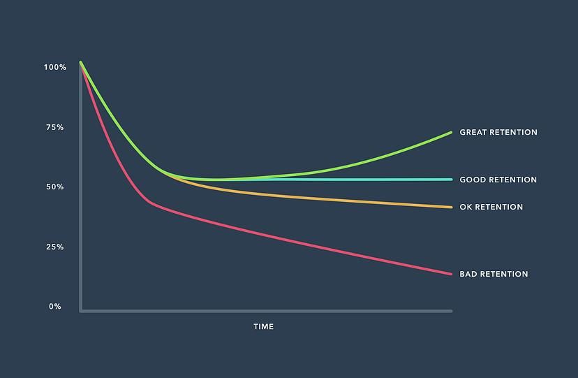
Reading Retention Curve Shapes, Not Just Numbers
Most teams focus on individual retention percentages, but the real insight lies in the shape of the curve. The curve tells a story about how value is delivered over time.
A steep drop immediately after acquisition usually indicates that users do not find value quickly enough. This pattern is common in products with complex onboarding or unclear positioning. Fixing this requires reducing time to value rather than adding more features.
A gradual decline suggests that users see some value but not enough to remain engaged. This often points to inconsistent experience, weak feature depth, or lack of compelling reasons to return.
A flattening curve is one of the strongest signals a product can have. It indicates that a segment of users has formed a habit and continues to find value consistently. This is where true product strength begins to emerge.
In some cases, teams observe a curve that rises after an initial drop. This is often referred to as a smiling curve and is usually driven by re engagement mechanisms such as notifications or external triggers. While this can improve retention metrics, it does not always reflect genuine product value.
The shape of the curve explains behavior. The numbers only describe it.
When Retention Lies: Identifying False Positives
Retention is not always a clean signal. In many cases, it can be artificially inflated in ways that mask underlying problems.
One common source of distortion is incentivized behavior. Users may return to claim rewards, discounts, or streak benefits without engaging meaningfully with the product. This creates the illusion of strong retention while actual value remains weak.
Push notifications are another factor. While they can bring users back into the app, they do not guarantee engagement. A user opening the app due to a notification is not the same as a user returning out of intent.
External factors such as marketing campaigns, seasonality, or viral trends can also temporarily boost retention. Without isolating cohorts, teams may attribute these changes to product improvements, leading to misguided decisions.
The table below highlights the difference between real and artificial retention:
| Signal Type | Description | Risk |
|---|---|---|
| Genuine Retention | Users return due to intrinsic value | Strong foundation for growth |
| Incentivized Retention | Driven by rewards or gamification | Unsustainable engagement |
| Notification Driven | Triggered by external prompts | Masks weak product experience |
| Campaign Driven | Influenced by marketing efforts | Misleading product signals |
From Data to Experience: Connecting Retention to Product Reality
Retention becomes actionable only when it is connected to the actual user experience. A curve on its own cannot guide decisions unless it is mapped to real interactions.
Every drop in retention corresponds to a point in the user journey. Identifying where users disengage helps uncover friction that is not immediately visible in analytics dashboards. This requires combining retention data with event tracking, session analysis, and user feedback.
Feature level analysis is also critical. Not all features contribute equally to retention. Some features drive repeated usage while others are rarely used after the first session. Understanding this difference allows teams to focus on what truly matters.
Ultimately, retention reflects how consistently a product delivers value. If users continue to return, it means the product is solving a meaningful problem in a reliable way.
Why Teams Misinterpret Retention
The misinterpretation of retention curves is not accidental. It is often the result of how teams are structured and how metrics are used.
Many teams focus on improving retention percentages without understanding the underlying causes. This leads to short term optimizations that do not improve the actual experience. For example, increasing notifications may improve retention temporarily but degrade long term trust.
Another issue is the lack of cohort analysis. Without isolating user groups, it is difficult to determine whether changes in retention are due to product improvements or external factors.
There is also an over reliance on benchmarks. While benchmarks can provide context, they often ignore differences in user behavior, market conditions, and product categories.
Treating them as universal standards can lead to poor strategic decisions.
Metrics without context create confidence without clarity.
Turning Retention Into Product Decisions
Retention data is only valuable when it leads to meaningful action. The goal is not to monitor retention, but to use it as a guide for improving the product.
Different curve patterns require different responses. A steep drop calls for improving onboarding and reducing friction. A gradual decline requires strengthening core value and repeat use cases. A flat curve suggests an opportunity to double down on what already works.
Experimentation plays a key role in this process. Instead of making assumptions, teams can design experiments based on retention insights and measure their impact on specific cohorts.
Retention should also be a shared metric across teams. Product, design, engineering, and marketing must align around what retention signals mean and how to respond to them. This alignment ensures that improvements are not isolated but systemic.
Advanced Retention Concepts Most Teams Miss
Beyond basic retention analysis, there are deeper concepts that can significantly improve understanding.
Rolling retention measures whether users return on or after a specific day, rather than exactly on that day. This provides a more flexible view of engagement, especially for products with irregular usage patterns.
Bracket retention groups users into time ranges instead of specific days. This reduces noise and helps identify broader trends in behavior.
Segmented retention breaks down retention by user attributes such as acquisition channel, geography, or behavior. This reveals which segments are truly valuable and which ones are not.
Another important concept is time to value. This measures how quickly users experience the core benefit of the product. Faster time to value often leads to higher retention, making it a critical factor in product design.