
Modern apps are instrumented end to end, capturing everything from installs and sessions to micro-interactions across screens. Dashboards are always available, always updating, and always full. On the surface, it feels like complete visibility into how users behave.
Yet decisions remain unclear. Features are shipped without confidence, retention fluctuates without explanation, and teams often disagree on what the data actually means. This is where the contradiction appears. The issue is no longer about having data. It is about the inability to turn that data into clear, confident decisions.
The Illusion of Visibility in Mobile Dashboards
Dashboards are built to make data visible, but visibility often creates a false sense of understanding. When numbers are neatly organized into charts and trends, it feels like the system is under control. Teams assume that if something is measurable, it must also be explainable.
In practice, dashboards mostly capture outcomes. They show that something happened, but not the conditions that led to it. A drop in conversion or a spike in engagement appears as a clean signal, but the underlying behavior remains hidden. This gap between observation and explanation is where most product confusion begins.
“What you see in dashboards is behavior reduced to numbers. What you need for decisions is behavior in context.”
Dashboard Overload: When Measurement Scales Faster Than Understanding
As mobile products evolve, tracking expands faster than interpretation. New features introduce new events, experiments add more metrics, and each team builds its own reporting layer. Over time, dashboards become dense collections of signals with no clear structure.
The core issue is not the presence of too much data, but the absence of prioritization. When everything is measured, nothing stands out as truly important. Teams move from one chart to another, searching for clarity, but end up with fragmented understanding instead.
| Layer of Growth | What Increases | What Breaks |
|---|---|---|
| Product complexity | Features and flows | Clarity of user journey |
| Analytics coverage | Events and metrics | Signal prioritization |
| Team involvement | Stakeholders and dashboards | Shared understanding |
This imbalance makes dashboards harder to use precisely when products need them the most.
Why KPIs Don’t Tell You What Users Actually Experience
Key performance indicators are essential for alignment. They help teams track progress and communicate performance at a high level. However, they are fundamentally limited when it comes to decision making.
KPIs compress complex behavior into single numbers. A retention rate reflects many different user journeys combined into one percentage. A conversion rate hides multiple friction points behind a single outcome. These metrics are useful summaries, but they are poor diagnostic tools.
When teams rely too heavily on KPIs, they end up reacting to symptoms rather than understanding causes. The metric signals that something is wrong, but it does not reveal where or why the experience is breaking.
The Structural Gap Between Activity Data and Real Behavior
Most mobile analytics systems are built around events. They assume that behavior can be reconstructed by stitching together discrete actions such as clicks, screen views, or completions. This approach works well for counting activity, but it struggles to capture experience.
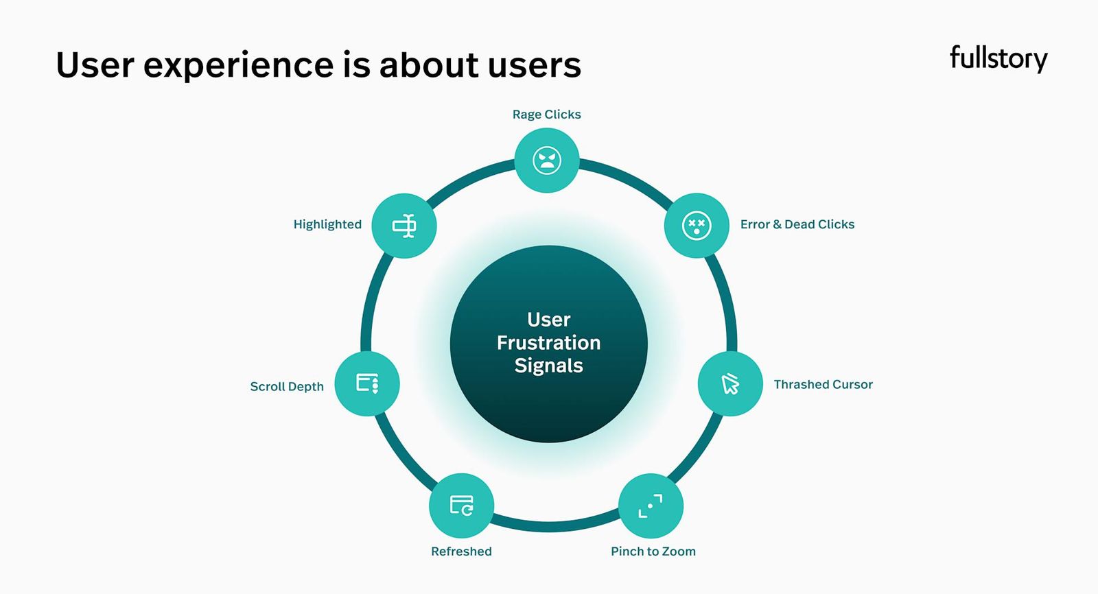
Real user behavior is continuous and often ambiguous. Between two tracked events, users may hesitate, get confused, retry actions, or abandon their intent. These moments rarely appear in dashboards, yet they define whether a user continues or leaves.
“Events show what users did. Experience explains why they did it.”
This structural gap leads to a simplified version of reality where behavior looks more intentional and linear than it actually is.
Why Teams Look at Data But Don’t Act
In most organizations, dashboards are regularly reviewed. Teams gather around metrics, analyze trends, and discuss performance. Despite this, many of these discussions fail to produce concrete actions.
The problem lies in the missing transition from observation to decision. Dashboards highlight changes but do not guide interpretation. Without a clear process to move from data to hypothesis, teams remain in a loop of speculation.
A typical pattern looks like this:
- A metric changes
- Multiple explanations are suggested
- No single explanation is validated
- No clear action is taken
This is not a failure of effort. It is a failure of structure.
The Comfort Trap: When Monitoring Replaces Thinking
Dashboards create a sense of activity. Checking metrics, preparing reports, and reviewing trends feel like productive work. Teams stay engaged with data, which creates the impression of progress.
However, this activity often replaces deeper thinking. Instead of investigating user behavior, teams rely on surface-level interpretations. Instead of challenging assumptions, they stay within familiar metrics.
Over time, this creates a culture where being informed is mistaken for being effective. The team is busy with data, but not necessarily improving the product.
When Growth Metrics Mislead More Than They Help
Growth metrics are particularly prone to misinterpretation. A rise in daily active users or session counts can signal improvement, but it can also be driven by external factors such as campaigns, notifications, or temporary incentives.
At the same time, retention and long-term engagement reflect whether the product is delivering consistent value. When these deeper metrics are ignored or misunderstood, teams may optimize for short-term visibility rather than sustainable growth.
| Metric Signal | Surface Interpretation | Deeper Reality |
|---|---|---|
| Increase in DAU | More users are engaged | Users are returning due to prompts |
| Higher session frequency | Strong engagement | Users are retrying or struggling |
| Feature usage spike | Successful adoption | Users are navigating confusion |
Without context, dashboards encourage conclusions that are directionally correct but strategically misleading.
What Dashboards Systematically Miss
Dashboards are designed around what can be measured reliably. This inherently limits what they can represent. They emphasize structured events and aggregated trends, but underrepresent intent, friction, and variability.
This leads to blind spots in understanding. Two users may follow the same path in a dashboard but have completely different experiences. One might be confident and efficient, while the other is confused and struggling.
From a metrics perspective, they look identical. From a product perspective, they require entirely different solutions. This mismatch is one of the most critical limitations of dashboard-driven analysis.
Why Mobile User Journeys Cannot Be Reduced to Static Charts
Mobile behavior is shaped by context. Users interact in short sessions, often while multitasking, and make decisions quickly. Their journeys are not linear, and their attention is not constant.
Static dashboards aggregate this behavior into averages and trends, which removes sequence and timing. However, sequence is essential for understanding intent. The order in which actions happen often reveals more than the actions themselves.
To understand mobile behavior properly, teams need to move from static snapshots to dynamic flows. This requires looking at how actions connect over time, not just how often they occur.
From Monitoring Metrics to Asking Better Questions
Strong product decisions are not driven by metrics alone. They are driven by the questions that follow those metrics. Dashboards should act as starting points for inquiry, not endpoints for reporting.
Instead of focusing on what changed, effective teams explore why it changed and what that implies for user experience. This shift transforms analytics from a passive activity into an investigative process.
The quality of decisions depends less on the volume of data and more on the depth of questions being asked.
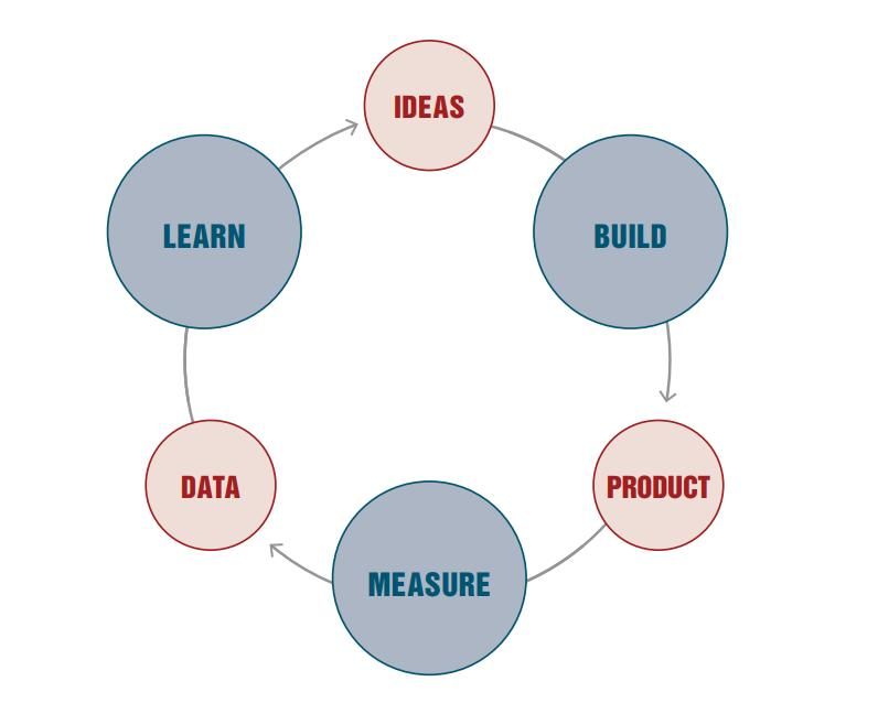
Decision Loops: Turning Insight Into Action
To bridge the gap between data and decisions, teams need a repeatable process that connects observation with action. Decision loops provide this structure by ensuring that every signal leads to exploration, hypothesis, and change.
A well-functioning decision loop moves through stages in a continuous cycle rather than stopping at observation.
| Stage | Description |
|---|---|
| Signal | A meaningful change or anomaly is detected |
| Exploration | Behavior is analyzed in context |
| Hypothesis | A clear explanation is formed |
| Action | A product change or experiment is executed |
| Feedback | Results are measured and fed back into learning |
The strength of this approach lies in continuity. Each loop builds on the previous one, gradually improving understanding and decision quality.
How High-Performing Teams Actually Use Analytics
Teams that consistently make strong product decisions treat dashboards differently. They do not attempt to monitor everything. Instead, they focus on a small set of critical questions tied to user value.
They combine multiple perspectives to understand behavior more deeply:
- Quantitative data to identify patterns
- Qualitative insights to understand context
- Journey-level analysis to capture sequence
Most importantly, they operate with a bias toward action. Insights are not considered complete until they result in a decision, whether that decision is a product change or an experiment.
Closing the Gap Between Data and Product Decisions
The gap between dashboards and decisions is not caused by missing tools or insufficient data. It is caused by a lack of structure in how teams interpret and act on information.
Closing this gap requires a shift in approach. Teams need to reduce noise, prioritize meaningful signals, and build processes that enforce movement from insight to action. Dashboards should support this process, not replace it.
When analytics is treated as part of a decision system rather than a reporting system, its value increases significantly.
Conclusion: Dashboards Don’t Build Products, Decisions Do
Dashboards are essential for modern product teams, but they are only one part of the equation. They provide visibility into performance, but they do not create understanding on their own.
What drives product success is the ability to interpret signals, understand user behavior, and act with clarity. Teams that rely solely on dashboards will always operate at a surface level.
In the end, the difference is not in how much data a team has, but in how effectively it turns that data into decisions.