
Mobile app analytics is not broken because teams lack data. It is broken because the data being tracked does not resolve what actually matters. Most apps today measure dozens of metrics across acquisition, engagement, retention, and monetization. Dashboards are detailed, reports are frequent, and trends are constantly monitored.
Yet, when it comes to explaining user behavior, most teams still operate with uncertainty. Users install the app, explore a few screens, and then drop off without any clear signal of failure. Nothing crashes. Nothing obviously breaks. The numbers move, but they don’t explain.
Engagement rises in one release and drops in another. Retention fluctuates without a clear cause. Decisions are made on patterns that look meaningful but rarely hold under deeper analysis. The problem is not tracking. It is that most metrics capture movement inside the app, not whether the product actually worked for the user.
Most mobile app metrics tell you what users did. Very few tell you whether it mattered.
The Standard Metrics Framework (And Why It Feels Complete)
Most analytics systems are built around a lifecycle model that categorizes metrics into acquisition, engagement, retention, and monetization. This structure is widely adopted because it provides a clear way to organize data and monitor performance across different stages of the user journey.
Common Mobile App Metrics by Category
| Category | Metrics Included | What They Track |
|---|---|---|
| Acquisition | Installs, CPI, CAC | Efficiency of user acquisition |
| Engagement | DAU, MAU, session length, feature usage | Frequency of interaction |
| Retention | Retention rate, churn rate | User return behavior |
| Monetization | ARPU, LTV, conversion rate | Revenue generation |
This framework gives teams a sense of control. It ensures that every stage of the funnel is being measured and reported. However, it also introduces a subtle problem. It assumes that if each stage is measured, the overall system is understood.
In reality, this structure answers what is happening, but not whether it matters. It tracks movement across the lifecycle, but not whether users are progressing toward meaningful outcomes.
The Core Distinction: Descriptive vs Explanatory Metrics
To understand app usage properly, it is necessary to distinguish between two types of metrics. Descriptive metrics tell you what happened. Explanatory metrics tell you why it happened and whether it reflects meaningful behavior.
Most commonly used mobile analytics metrics fall into the descriptive category. They provide visibility into user actions, but they lack the context required to interpret those actions correctly.
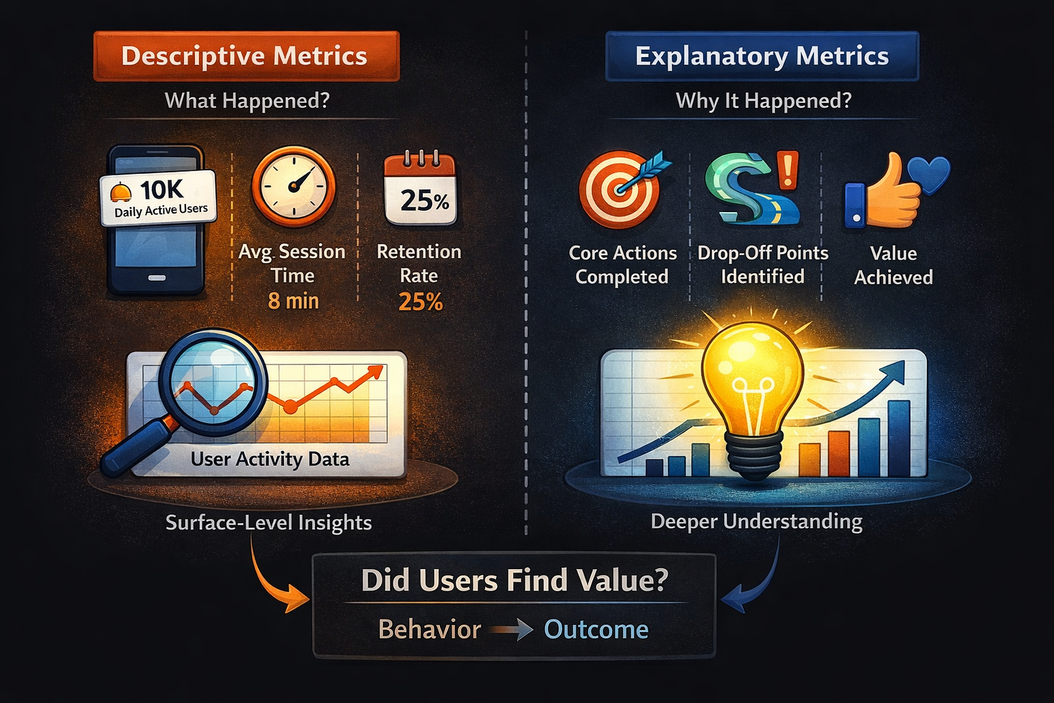
For example, Daily Active Users indicates how many users opened the app. Session length shows how long they stayed. Retention reflects whether users returned. Each of these metrics is useful in isolation, but none of them directly explain whether users achieved anything of value.
This creates a structural gap in analytics systems. Teams have data, but they lack clarity. They can observe patterns, but they cannot confidently interpret them.
A metric only explains usage when it connects behavior to outcome.
The Metrics That Don’t Actually Explain Usage
Many widely used metrics are treated as indicators of engagement and success. While they are useful for monitoring trends, they often fail to explain user behavior in a meaningful way.
Daily Active Users and Monthly Active Users are among the most commonly used metrics.
They measure how frequently users open the app and are often used to calculate stickiness. The stickiness ratio is typically defined as:

While this ratio indicates how often users return within a given period, it does not reflect the quality of those interactions. A user may open the app daily without achieving anything meaningful, making this metric incomplete as a measure of usage.
Session metrics, including session length and session count, are similarly ambiguous. A longer session is often interpreted as deeper engagement, but it can just as easily indicate confusion or inefficient navigation. Multiple sessions may reflect habit, but they can also signal repeated attempts to complete a task unsuccessfully.
Retention rate is another critical metric that is frequently misunderstood. It is typically calculated as:

While retention indicates whether users come back, it does not explain why they return or what they do once they do. Without linking retention to meaningful actions, it becomes a lagging indicator rather than a diagnostic tool.
Feature adoption rate measures how many users interact with a specific feature:

This metric is often used to evaluate product success, but it only indicates exposure. A feature can have high adoption and still fail to deliver lasting value if users do not continue using it.
Push notification metrics, such as click-through rate, measure how effectively users are brought back into the app:

These metrics reflect communication performance, not product usage. They indicate that users returned, but not whether the experience met their expectations.
The Metrics That Actually Explain App Usage
To understand real usage, analytics must shift from measuring activity to measuring outcomes. The focus should be on whether users achieve meaningful results, how quickly they achieve them, and whether they repeat those results over time.
The first and most important metric is core action completion rate. Every app has a primary action that defines its value, but this action is often misunderstood or poorly defined. The mistake most teams make is choosing a feature-level action instead of a value-level outcome.
Core action is not what the product allows users to do. It is what proves that the product worked for them.
How to Define Core Action
To identify the correct core action, three conditions must be met:
- The action must represent a completed user intent, not just an interaction
- It should create a clear outcome, not just progress
- It must be repeatable, indicating potential habit formation
A simple way to validate it is to ask: if a user does this once, do they have a reason to come back?
Examples Across Categories
| Category | Wrong Core Action | Correct Core Action |
|---|---|---|
| Food Delivery | Browsing restaurants | Completing first order |
| Fitness | Opening workout screen | Completing a workout |
| Productivity | Creating a task | Completing a task |
| Social Media | Opening feed | Participating in a meaningful interaction |

This directly reflects whether the product is delivering on its promise.
Time to Value measures how long it takes for a user to achieve their first meaningful outcome:

A shorter Time to Value indicates that users quickly understand and benefit from the product, while a longer Time to Value suggests friction or lack of clarity.
Success rate per session evaluates the effectiveness of user sessions rather than their frequency:

This reframes sessions as opportunities for outcomes rather than just interactions.
Value repetition rate measures how often users return to perform the core action again:

This is a strong indicator of habit formation and long-term engagement.
Drop-off before value identifies where users abandon the journey before achieving a meaningful outcome. Unlike generic funnel drop-offs, this metric focuses specifically on failure to reach value, making it highly actionable.
Usage Is Contextual: It Changes by Product Category
Usage is often treated as a universal concept, but it varies significantly depending on the type of product. Metrics that explain usage in one category can be misleading in another.
In consumer apps, usage is often tied to frequency and habit formation. However, even within B2C, the definition of meaningful usage differs across categories.
Social Media Apps
In social platforms, usage is not defined by time spent or app opens. It is defined by the depth of interaction.
Metrics that matter include:
- Depth of conversation threads
- Replies per post
- Meaningful interactions per session
A user scrolling for ten minutes is not equivalent to a user participating in a discussion. Passive consumption inflates engagement metrics but does not reflect real usage.
D2C and Commerce Apps
In commerce apps, usage is tied to purchase behavior and conversion flow. The journey from browsing to buying is critical.
Key patterns include:
- Step-wise conversion (product view → add to cart → checkout)
- Drop-offs between stages
- Repeat purchase cycles
An important nuance is window shopping behavior. Many users browse without immediate purchase intent, which creates high activity but low conversion. Without separating browsing from buying intent, usage metrics become misleading.
Fintech Apps
In fintech, usage is defined by financial actions rather than frequency. Opening the app frequently does not necessarily indicate meaningful usage.
Metrics that matter include:
- Assets Under Management (AUM) growth
- Investment actions (buy, sell, allocate)
- Portfolio changes over time
A user checking their balance daily is different from a user actively managing investments. Only the latter reflects true product usage.
Usage is not defined by interaction frequency. It is defined by actions that create value within that category.
The Missing Layer: User Segmentation
Metrics become significantly more meaningful when viewed through the lens of user segmentation. Without segmentation, different types of users are grouped together, masking important behavioral differences.
Key User Segments
| Segment | Description |
|---|---|
| New Users | Users who have not yet experienced value |
| Activated Users | Users who have achieved first value |
| Retained Users | Users who repeat value actions |
| Power Users | Users with high frequency of value repetition |
When metrics are segmented in this way, patterns become clearer. For example, a decline in overall retention may actually be driven by poor activation among new users rather than disengagement among existing ones.
Not all users should be measured the same way. Their stage determines what matters.
Funnel and Conversion Analysis: Understanding the Journey to Value
To fully explain usage, it is necessary to understand how users move through the product. This requires mapping the journey from entry to value and measuring conversion between each step.
Example Conversion Funnel
| Stage | Example Action |
|---|---|
| Install | App downloaded |
| Onboarding | Account created |
| Activation | First value action completed |
| Retention | Value repeated |
Conversion between steps can be calculated as:

Conversion Rate=Users in previous step. Users completing next step
This allows teams to identify where users drop off and where friction exists. Funnel analysis becomes significantly more powerful when it is tied to value rather than just navigation.
Engagement Depth: Moving Beyond Active Users
Engagement is often treated as a binary concept-users are either active or inactive. In reality, engagement exists in layers, each representing a different level of interaction and intent.
Levels of Engagement
| Engagement Type | Description |
|---|---|
| Passive Engagement | Opening the app, browsing content |
| Active Engagement | Interacting with features |
| Value Engagement | Completing core actions |
Most analytics systems focus on passive and active engagement because they are easier to measure. However, meaningful usage is defined by value engagement, where users achieve outcomes that matter to them.
Monetization Metrics and Their Dependency on Value
Monetization metrics are often treated as the ultimate indicators of success. Metrics such as Average Revenue Per User and Lifetime Value provide insight into financial performance, but they are downstream of user behavior.
Common Monetization Metrics
| Metric | Formula |
|---|---|
| ARPU | Revenue / Total Users |
| LTV | Average Revenue × User Lifespan |
| Conversion | Paying Users / Total Users |
These metrics improve when users consistently experience value. If users do not reach meaningful outcomes, monetization becomes unstable and difficult to scale.
Why Most Teams Continue Measuring the Wrong Things
Despite the availability of better metrics, most teams continue to rely on activity-based measurement. This is largely driven by how analytics tools are designed. They prioritize metrics that are easy to track, standardized across industries, and useful for reporting.
As a result, teams inherit dashboards that emphasize DAU, retention, and session metrics. These metrics are useful for monitoring trends, but they do not provide the depth needed for decision-making.
Organizational structure also plays a role. Marketing teams focus on acquisition, product teams focus on engagement, and leadership focuses on retention. Without a shared definition of value, these perspectives remain disconnected.
Building a Metrics System That Explains Usage
Creating a meaningful analytics system requires a shift in how metrics are defined and used. It begins with identifying the core value action-the single outcome that proves the product works for the user.
The user journey to this value should then be mapped, highlighting key steps, friction points, and decision moments. This creates a clear understanding of how users progress through the product.
Instrumentation should focus on capturing meaningful events that indicate progress and success. Instead of tracking every interaction, the emphasis should be on actions that reflect outcomes.
Finally, teams must align around these metrics. When everyone operates with the same definition of usage, insights become clearer and decisions become more effective.\
Practical Example: A Food Delivery App
In a traditional analytics setup, a food delivery app might track session count, time spent browsing, and screen views. These metrics indicate activity but do not explain whether users are successfully ordering food.
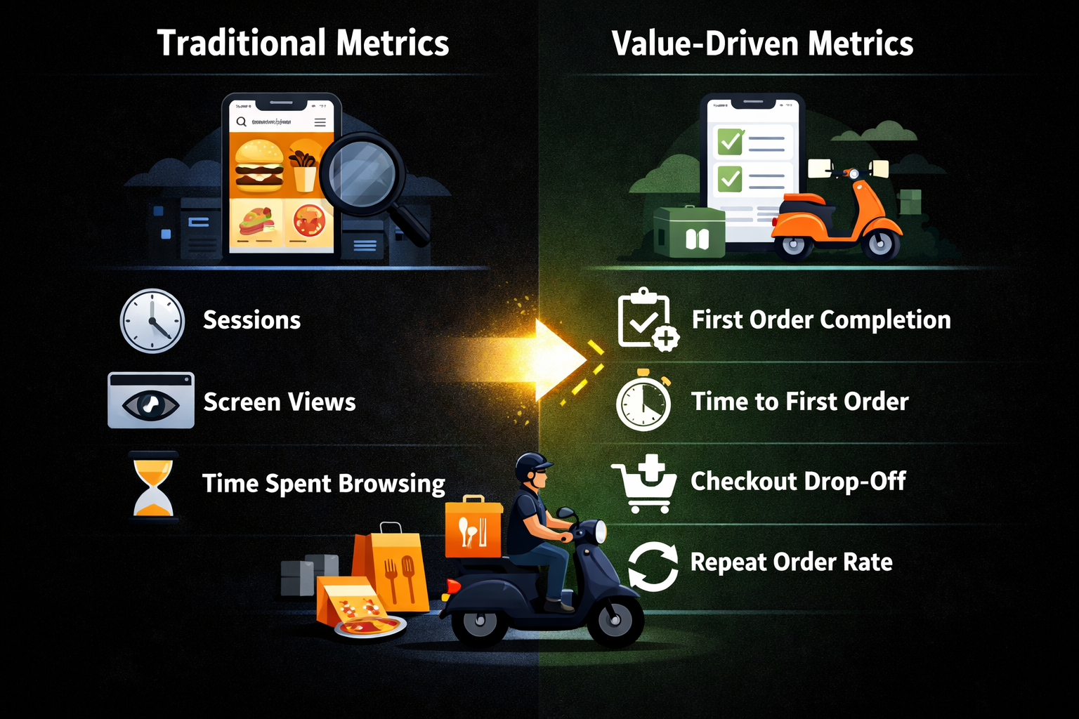
A value-driven approach would instead focus on metrics such as first order completion rate, time to first order, drop-off before checkout, and repeat order rate. These metrics directly reflect whether the app is delivering its core value.
Key Takeaways
Mobile app analytics often prioritizes activity because it is easy to measure and standardize. However, these metrics frequently fail to explain real usage.
Metrics that explain usage are those that connect behavior to outcomes. They focus on whether users achieve value, how quickly they do so, and whether they repeat it over time.
Segmentation, funnel analysis, and value-based measurement are essential for transforming data into meaningful insight.
Final Perspective
App usage is not defined by how often users interact with a product. It is defined by how effectively they achieve what they came to do.
When teams rely on activity metrics, they optimize for movement. When they shift to outcome-based metrics, they optimize for success.
That shift is what turns analytics from a reporting function into a strategic advantage.