


TL;DR
- Most in-app campaigns are triggered by external events, a product launch, a competitor move, a seasonal opportunity, where the window to act is measured in hours, not weeks.
- Teams that take three to seven days to launch a campaign miss the moment entirely.
- The bottleneck is almost never creative quality. It is process: copy approvals with no standing authority, audience creation that requires a developer, and QA cycles built for a full release rather than a single campaign.
- This article covers what a 3 to 7 day cycle actually costs when the opportunity window is 24 hours.
- It covers where the time genuinely goes and which delays are structural versus procedural.
- It covers the pre-work that makes same-day launches possible, and a full launch checklist with time estimates.
- It covers how to remove the engineering dependency entirely, and the minimum viable QA process for in-app campaigns specifically.
- It covers what to monitor in the first two hours after go-live, and how to build the 24-hour capability into a team's standing operating model rather than treating it as a one-off sprint.
61% of marketing teams cite data silos and fragmented systems as the top reason campaigns cannot scale or move quickly, and the cost of that friction is not evenly distributed across every campaign a team runs. It concentrates specifically in the campaigns that matter most: the ones triggered by something happening in the world right now, a competitor's move, a news event, a seasonal spike, a product feature going live, where the value of the campaign decays sharply the longer it takes to reach users. If a bottlenecked workflow delays a campaign by four weeks, the revenue impact is rarely linear. Early market entry often generates outsized returns, and missing the launch window can mean missing the entire opportunity, not just a fraction of it.
For in-app campaigns specifically, this dynamic is sharper than it is for paid media or email. An in-app nudge, survey, or gamification mechanic exists to meet a user at a specific moment inside a live session. A campaign responding to a same-day event that takes a week to build is not late. It is answering a question the user stopped asking six days ago.
The teams that consistently launch in-app campaigns within hours of an opportunity appearing are not moving faster through the same process. They have removed most of the process entirely, replacing sequential approvals and engineering handoffs with pre-built infrastructure that a single campaign manager can operate end to end.
Why Launch Speed Matters: The Cost of a Slow Cycle
The mismatch between a 24-hour opportunity window and a 3 to 7 day launch cycle is not a minor inefficiency. It is the difference between capturing a moment and missing it entirely, and the cost compounds across every campaign a team runs on this cadence over a year.
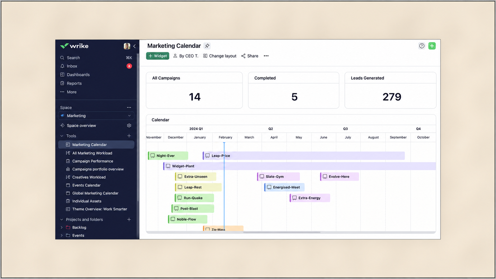
Twenty campaigns per year, each facing an average three-week delay due to process bottlenecks, adds up to 60 weeks of collective delay, more than a full calendar year of cumulative campaign time lost. For in-app campaigns tied to external events, the delay is rarely three weeks, but the same compounding logic applies at a smaller scale: a team that takes five days instead of one on every reactive campaign is not five days slower once. It is five days slower on every single opportunity across the year, and the missed opportunities do not show up as a line item anywhere. They simply never happened.
A 24-hour delay in a fast-moving campaign context can mean fewer clicks, missed momentum, and a materially tougher climb to results, because campaigns depend on reaching users right when attention and intent peak, not on reaching them eventually. The specific failure mode for in-app campaigns is that the trigger event itself, a competitor's price change, a feature launch, a seasonal moment, is usually visible to the user through other channels well before a slow-moving internal team gets a campaign live. By the time the campaign appears, the user has already formed their own view of the moment, and the campaign is responding to a context that has moved on.
What teams miss by being slow is not just the specific campaign's performance. It is the standing capability. A team that has never launched in under 24 hours does not know, when a genuine emergency opportunity appears, whether they can act on it at all, which means the option is effectively unavailable even when it would be the correct call.
Where the Time Actually Goes
The instinct when a campaign launch is slow is to assume the creative work is the bottleneck. It rarely is. Creative approval cycles are the most cited driver of delayed campaign launches, averaging 4.8 business days per campaign in one large-scale industry survey, nearly a full work week on a process that should take a single day. The word "approval" is doing the work here, not "creative." The creative itself, the copy and the visual, is typically produced quickly. What stretches the timeline is the sequential chain of people who need to review and sign off on it before it can go live.
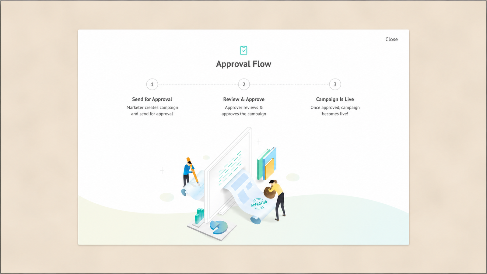
The specific steps that most commonly stretch a campaign timeline, and whether each one is structural or procedural, break down as follows:
Copy approval chains are procedural, not structural. A multi-step approval process where copy passes through a manager, then a brand reviewer, then a legal or compliance check, each with their own response time and queue, is a process design choice, not a technical constraint. It can be compressed through standing approval authority, covered in the next section, without requiring any new tooling.
Developer dependency for audience creation is structural, but solvable. When defining who should see a campaign requires an engineer to write a query or configure a segment because the growth team has no self-serve tooling, this is a genuine technical dependency. It is structural in the sense that it cannot be solved by changing a meeting cadence. It requires either building self-serve audience tooling or adopting a platform that already has it.
QA cycles built for full releases are procedural, applied to the wrong scope. A QA process designed to validate an entire app release, covering every screen and every user flow, is disproportionate when applied to a single in-app campaign that touches one screen and one trigger condition. This is a process mismatch: the checklist was built for a different scope of change and has not been adapted down for campaign-level QA.
Tool sprawl and manual coordination across systems is structural. The average B2B organisation operates 12 to 20 marketing technology tools, and when these tools operate in silos rather than as an integrated system, every campaign requires manual coordination that consumes time that should go to execution. If the audience data lives in one system, the creative lives in another, and the trigger logic lives in a third with no integration between them, the coordination overhead is a structural cost that additional process discipline cannot fully remove.
Distinguishing which category a specific delay falls into matters because the fix is different. Procedural bottlenecks are removed by pre-authorising decisions that currently require a live approval. Structural bottlenecks are removed by changing the tooling.
The Pre-Work That Makes 24-Hour Launches Possible
Every fast-launching team has done a specific set of work in advance, before any specific campaign was on the table, that converts a multi-day build into a same-day assembly.
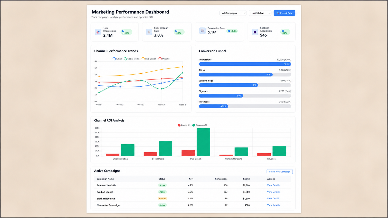
Pre-approved audience templates. Rather than defining a new audience segment from scratch for every campaign, a library of pre-built, pre-approved audience definitions (new users in their first 7 days, users who have not completed a specific activation event, users in a specific lifecycle stage, users in a specific geography or plan tier) means most campaigns can select from an existing template rather than construct a new query. New audiences that fall genuinely outside the existing library still need custom work, but a well-built template library covers the majority of reactive campaign scenarios.
Pre-built creative templates. A set of pre-designed nudge, banner, and modal templates with defined content slots, headline, body, image, CTA, means the creative team is filling in a template rather than designing a new component from a blank canvas. This does not eliminate creative judgment. It eliminates the design and build time that a from-scratch component requires.
Standing copy approval authority for growth teams. No single team should act as the sole gatekeeper for quality outcomes; responsibility should be shared rather than concentrated in one sequential chain. Applied to copy approval specifically, this means defining, in advance, which categories of copy a growth team lead can approve independently (standard promotional language, feature announcements, seasonal messaging) versus which categories genuinely require legal or brand review (anything involving pricing claims, regulated financial language, or new brand positioning). Most in-app campaign copy falls into the first category, and pre-authorising it removes a sequential approval step entirely rather than compressing it.
The pre-work is, in effect, front-loading the decisions that would otherwise need to be made live, under time pressure, during the actual launch window. A team with a strong template library and clear approval authority is not skipping governance. It has already done the governance work in advance, at a moment when there was no time pressure distorting the decision.
The Campaign Launch Checklist With Time Estimates
The following sequence assumes the pre-work above is already in place. Each step includes a realistic time estimate for a team with that pre-work done, versus without it.
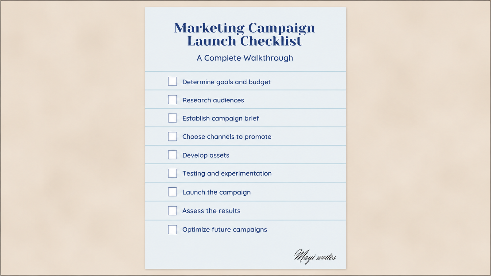
1. Trigger identification and campaign objective (15 to 30 minutes). Confirm what event or opportunity is driving the campaign and what specific action it should produce. This step is fast regardless of pre-work, because it is a judgment call, not an execution task.
2. Audience definition (5 to 15 minutes with templates, 2 to 6 hours without). Select an existing audience template that matches the campaign's target segment, or construct a custom one if none of the existing templates fit. This is the single largest time difference between a team with pre-built templates and one without.
3. Creative selection and copy (30 to 60 minutes with templates, 4 to 8 hours without). Select a creative template appropriate to the campaign format (nudge, modal, banner, gamification card) and write the specific copy for this campaign. With a template library, this is a content-filling exercise. Without one, it requires design and build time.
4. Trigger conditions and frequency caps (15 to 30 minutes). Define the specific event or session state that fires the campaign, and set frequency caps to prevent over-delivery. This step is fast once the audience and creative are locked, because trigger logic is typically configured against existing event definitions rather than built from scratch.
5. QA (30 to 60 minutes, covered in detail below). Validate the campaign renders correctly, the trigger fires as expected, and the audience targeting is accurate, using the minimum viable QA process rather than a full release-cycle QA matrix.
6. Approval (5 to 15 minutes with standing authority, 4 hours to 2 days without). If the campaign falls within pre-authorised approval categories, a single sign-off from the growth lead is sufficient. If it requires legal or brand review, this step becomes the primary bottleneck, which is why most campaigns should be designed to fall within pre-authorised categories wherever possible.
7. Go-live and initial monitoring setup (10 to 15 minutes). Deploy the campaign and confirm the monitoring dashboard is tracking the right metrics from the moment of launch, not set up reactively after something looks wrong.
With the pre-work in place, the full sequence totals roughly 2 to 4 hours of active work, well inside a 24-hour window even accounting for the campaign being one part of a team member's day rather than their only task. Without the pre-work, the same sequence realistically takes 3 to 7 days, driven almost entirely by steps 2, 3, and 6.
Which Steps Require Engineering and How to Eliminate That Dependency
Two of the steps above, audience definition and campaign deployment, are the ones most likely to require a developer if the underlying platform does not support self-serve configuration.
Audience definition requires engineering when segment logic has to be written as a database query or a custom event filter that only an engineer can construct. It does not require engineering on a platform that provides a visual audience builder, where a growth team member can combine event conditions, user properties, and lifecycle stage filters through a UI rather than writing code.
Campaign deployment requires engineering when the in-app experience itself, the nudge, the modal, the gamification component, is coded directly into the app binary, which means any new campaign or copy change requires a new app build and a store release cycle. This is the single most consequential dependency to eliminate, because a store review cycle alone can consume days, making a 24-hour launch structurally impossible regardless of how fast every other step moves.
Server-driven UI architecture separates campaign configuration from the app binary, allowing changes to in-app experiences to deploy through a delivery pipeline without touching the app store submission queue. This is the architectural precondition for a 24-hour launch capability to exist at all for in-app formats specifically. A team on a platform without this architecture is not facing a process problem that can be solved with better approval discipline. It is facing a structural ceiling that no amount of process optimisation removes.
No-code and low-code platforms are projected to account for the majority of application development activity industry-wide, and marketing and growth teams adopting them are able to design, build, test, and deploy campaigns without submitting tickets to engineering backlogs at all, which is the direct organisational consequence of the architectural shift: the growth team's actual launch speed becomes a function of their own process discipline rather than of engineering team capacity and prioritisation, which is frequently the true root cause behind a slow launch cycle, not a lack of urgency from the growth team itself.
QA for In-App Campaigns: The Minimum Viable Process
A full mobile app QA matrix, built to validate an entire release across every device and OS combination, is the wrong scope for a single in-app campaign, and applying it anyway is one of the most common reasons campaign QA takes far longer than it needs to.
Device fragmentation is real, but most apps can cover roughly 80% of their user base by testing on the 30 to 35 devices that represent their most common screen sizes, OS versions, and manufacturers, rather than attempting comprehensive coverage across the full device landscape. The correct approach starts with analytics data, not a generic device list: use Firebase, Mixpanel, or Amplitude to identify the top 5 to 10 device models an app's own users actually own, the most common OS versions, and the primary network types in use, then build a device matrix that mirrors this reality rather than a theoretical worst case.
For a single in-app campaign, the minimum viable QA process is narrower still than a full app QA matrix, because the surface area being changed is one screen and one trigger condition, not the full application. The practical checklist:
Render check on the top 3 to 5 devices by actual user share. Not a comprehensive device matrix. The handful of device and OS combinations that represent the largest share of the specific app's user base, confirmed against the app's own analytics rather than an industry-generic list.
Trigger condition verification against a test account. Confirm the campaign fires under the exact condition intended (the correct event, the correct user state) and does not fire under adjacent conditions it should not (a suppressed state, an ineligible segment). This is the single highest-value QA step for in-app campaigns specifically, because a misconfigured trigger condition, not a rendering bug, is the most common cause of a campaign firing on the wrong users at the wrong moment.
Frequency cap verification. Confirm the cap is actually being enforced by triggering the condition multiple times in a test session and verifying the campaign does not re-fire beyond the configured limit.
Deep link and CTA destination check. If the campaign includes a CTA that routes to a specific screen or external destination, confirm the link resolves correctly. A broken CTA destination is one of the most common and most damaging QA misses, because it converts an otherwise successful campaign into a dead end at the exact moment the user was ready to act.
Suppression rule check. Confirm the campaign respects the suppression conditions that should block it, transaction in progress, error state, or any other high-stakes session state defined in the team's standing suppression logic.
This five-point check, run against a small, analytics-informed device sample rather than a comprehensive matrix, takes 30 to 60 minutes for a single campaign and catches the failure modes that actually matter for an in-app campaign's specific risk profile. It deliberately does not attempt to replicate full release QA, because a single campaign's blast radius is a fraction of a full release's, and the QA investment should scale with the risk being managed, not with a fixed process regardless of scope.
Post-Launch Monitoring: What to Watch in the First Two Hours
The first two hours after go-live are the highest-value monitoring window, because this is when a genuine configuration error, as opposed to normal campaign performance variance, becomes visible.
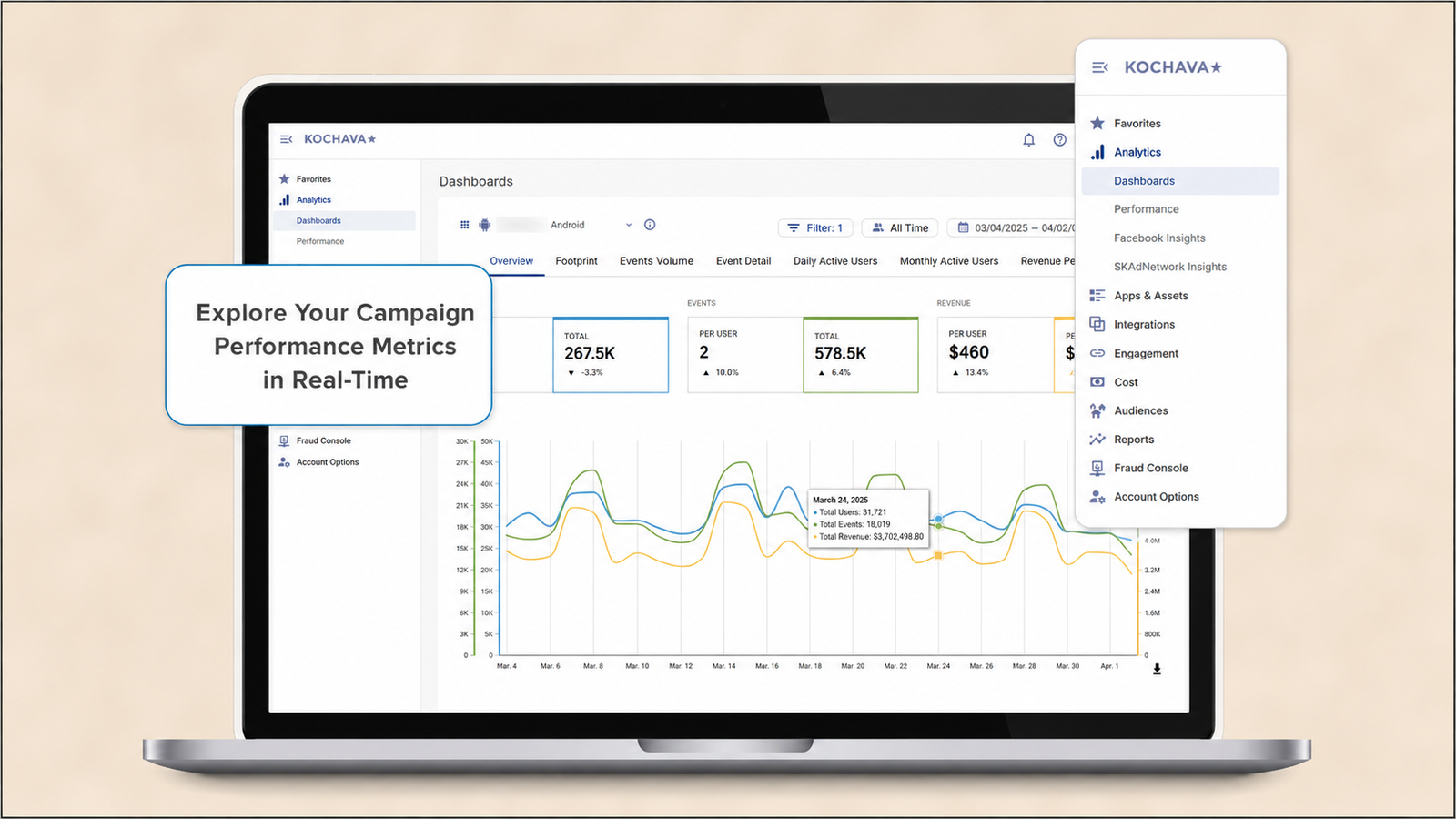
Impression count against expected audience size. If the campaign has been live for 30 minutes and impression count is dramatically lower than the defined audience size would predict given typical session frequency, this usually indicates a targeting or trigger misconfiguration, not a performance issue. This is the fastest signal that something is structurally wrong, faster than CTR or conversion data, because it does not require any user interaction to surface, only exposure.
Click-through rate against the campaign's expected baseline. Compare against the team's own historical CTR for comparable campaign formats and audiences, not a generic industry benchmark. A CTR that is dramatically below what similar past campaigns have achieved, in the first hour of data, is worth investigating before assuming it is simply a weaker campaign.
Error rate and crash correlation. If two or more red flags appear within the first stretch of a campaign's live window, the correct response is to pause and diagnose before continuing, because the failure mode is already visible at that point and additional exposure will not fix it. For an in-app campaign specifically, a spike in app crashes or error events correlated with the campaign's trigger condition, immediately after go-live, is the clearest possible signal to pause immediately rather than wait for more data.
When to pause versus continue. The threshold for pausing should be defined before launch, not decided reactively in the moment, because a reactive decision under time pressure is more likely to either under-react to a real problem or over-react to normal variance. A reasonable standing rule: pause immediately on any crash correlation or on impression count below 50% of the expected audience size within the first 30 minutes. Continue monitoring, but do not pause, for CTR variance alone within the first two hours, since click-through data needs a larger sample before a below-baseline reading is distinguishable from normal noise.
What constitutes a launch failure. A launch failure, for the purpose of a 24-hour campaign process, is not the same as a campaign that underperforms. A campaign that reaches its intended audience, renders correctly, and produces a lower-than-hoped CTR is a normal outcome that calls for iteration, not a failure. A launch failure is specifically a configuration error, wrong audience, broken trigger, broken CTA, that prevented the campaign from doing what it was built to do. Distinguishing these two categories matters because conflating them produces either excessive caution (pausing every underperforming campaign as if it were broken) or excessive risk tolerance (letting a genuinely broken campaign run because the team is used to treating all monitoring alerts as normal variance).
Building the 24-Hour Capability Into the Team Operating Model
A single fast launch, achieved once under unusual focus and urgency, is not the same capability as a team that can reliably launch within 24 hours whenever the opportunity calls for it. The difference is whether the pre-work described earlier is a standing part of the team's operating model or a one-time sprint.
What to standardise. The audience template library and creative template library should be living assets, reviewed and expanded on a regular cadence, not built once and left static. Adopting a weekly review cadence has been shown to produce measurably faster launches than a monthly cadence, because issues and gaps are identified and addressed before they accumulate into larger blockers. Applied to the 24-hour capability specifically, a weekly review of which audience segments and creative formats were used in the past week, and which reactive opportunities the team was unable to act on quickly, is what keeps the template library aligned with actual need rather than drifting out of date.
What to pre-approve. The specific copy categories, audience types, and campaign formats that fall within standing approval authority should be documented explicitly, not left as an informal understanding. A written, shared reference that any growth team member can check against removes the ambiguity that otherwise causes people to seek approval out of caution even when it was not strictly required, which quietly reintroduces the delay the pre-authorisation was meant to remove.
What governance structure makes fast campaigns possible without sacrificing quality. The governance that matters is not a slower approval chain. It is a clear, pre-defined boundary between what requires live human judgment (genuinely novel campaigns, anything touching regulated claims, anything outside the existing template library) and what does not (standard promotional or lifecycle messaging using established templates and pre-approved copy patterns). A team that has drawn this boundary clearly can move fast on the majority of campaigns that fall inside it, while still routing the genuinely higher-risk minority through full review, which is a better outcome on both speed and quality than applying uniform full review to every campaign regardless of its actual risk profile.
Topics Not in the Brief That Teams Should Know
The learning phase problem for algorithmically optimised campaigns. For campaigns that rely on an algorithm to optimise delivery over time, rather than a fixed targeting rule, premature edits made during the campaign's early optimisation window can reset the learning process entirely, meaning a campaign that appears to be underperforming in its first day may simply still be calibrating, and an anxious edit at that stage can extend the effective launch time by weeks rather than shortening it. For in-app campaigns using any form of algorithmic optimisation (send-time prediction, dynamic audience expansion), the same discipline applies: define the threshold for when edits are appropriate before launch, and resist the urge to intervene within the first hours based on incomplete data.
Post-launch review beyond the first two hours. Post-launch monitoring should extend to a defined 24 to 48 hour window specifically to catch issues that only surface in a real, live environment rather than a test environment, such as delivery rate drops or missing attribution data that were not visible during pre-launch QA. The first two hours catch configuration errors. The following 24 to 48 hours catch a different category of problem: issues that only emerge at scale or over a longer session-behaviour window than a QA test account can simulate.
Documented rollback procedure, not improvised recovery. When a rollback threshold is crossed, the correct sequence is to pause further rollout immediately, preserve the specific records of what failed for post-incident diagnosis, and restore the last known working configuration through a rehearsed path, rather than improvising a fix live. A team that has never rehearsed what a campaign rollback actually looks like will lose meaningful time improvising the process during the one moment speed matters most: an active incident.
The single-owner sign-off principle. One person should hold final sign-off authority for every campaign, even when the QA process itself is a shared responsibility across the team, because a diffuse approval process creates the specific failure mode where everyone assumes someone else has already checked the campaign. This is distinct from the approval authority question covered earlier. Pre-authorising categories of copy removes the need for approval in most cases. For the cases that do require sign-off, a single named owner, not a committee, is what prevents the diffusion-of-responsibility failure mode specifically.
Key Takeaways
- Most in-app campaigns respond to external events with a natural window measured in hours, not weeks. A 3 to 7 day launch cycle does not deliver the same campaign late. It frequently delivers a campaign that is no longer relevant to the moment it was built to address.
- The bottleneck is almost never creative production. It is the approval chain around the creative, developer dependency for audience and deployment, and QA processes scoped for a full release rather than a single campaign.
- The pre-work that makes 24-hour launches possible, audience templates, creative templates, and standing copy approval authority, front-loads governance decisions to a moment without time pressure, rather than making those decisions live during the actual launch window.
- The full checklist, with pre-work in place, totals roughly 2 to 4 hours of active work: trigger identification, audience selection, creative and copy, trigger conditions, QA, approval, and go-live with monitoring configured from the start.
- Server-driven UI architecture is the structural precondition for a 24-hour in-app campaign capability to exist at all, because it removes the app store release cycle that would otherwise make same-day deployment impossible regardless of how efficient every other step becomes.
- The minimum viable QA process for a single in-app campaign covers a render check on the top 3 to 5 devices by actual user share, trigger condition verification, frequency cap verification, CTA destination check, and suppression rule check, deliberately scoped smaller than a full release QA matrix.
- The first two hours after launch are the highest-value monitoring window, with impression count against expected audience size as the fastest signal of a configuration error, and a pre-defined pause threshold, not a reactive in-the-moment decision, determining when to stop a campaign.
- Building the 24-hour capability into the standing operating model, not treating a single fast launch as proof the capability exists, requires a living template library reviewed on a regular cadence, documented pre-approval categories, and a clear boundary between campaigns that require full review and campaigns that do not.
Further Reading
From Digia Engage:
- Git Continuous Deployment for No-Code and Low-Code In-App Campaigns - the server-driven UI architecture and CD pipeline that removes the app store release dependency this article's speed case depends on
- When NOT to Show a Nudge: Building a Suppression Logic - the suppression rule framework referenced in the minimum viable QA checklist
- How to Know If Your Personalization Is Actually Working - the measurement discipline relevant to evaluating a fast-launched campaign's actual performance beyond the first two hours
- The ROI of In-App Engagement: Business Case for Leadership - the revenue case for why launch speed itself, not just campaign quality, is worth the operational investment this article describes
- Digia Engage Nudges - self-serve audience targeting and no-code campaign deployment relevant to eliminating the engineering dependency described in this article
External Sources:
- How to Remove Campaign Bottlenecks Faster - Kroolo (61% of teams citing data silos as the top scaling blocker; the compounding cost of delayed launches across a full campaign calendar)
- Where the Real Bottlenecks Are in Digital Campaign Launch - Scopic Studios (formal workflow process adoption rates and their correlation with launch success)
- Campaign Creation Bottlenecks: Where Launches Die and How to Fix Each One - Ad Library (4.8-day average creative approval cycle; scaling-related process breakdowns)
- Launching Campaigns Too Slowly? Fix These 5 Bottlenecks Now -Ad Library (algorithmic learning phase mechanics; premature-edit reset risk)
- How to Launch Social Media Campaigns Faster and Beat the Trend Cycle - Optmyzr (the specific cost of a 24-hour delay on momentum and competitive positioning)
- 30 Marketing Campaign Time-to-Launch Statistics by Company Size - Flint (weekly versus monthly review cadence launch speed comparison)
- How to Audit Campaign Execution Bottlenecks in 2026 - Pedowitz Group (average marketing technology stack size and its coordination overhead)
- Mobile App Testing Strategy: How to Build a Scalable QA Process - Kobiton (device fragmentation scope and prioritisation methodology)
- 5 Game-Changing Mobile App Testing Strategies - Kualitatem (80% audience coverage achievable through 30 to 35 representative devices)
- Mobile App Testing Best Practices: A Practical 2026-Ready Guide -DeviQA (analytics-informed device matrix construction methodology)
- 5 Ways to Enhance Your Mobile App Testing Strategy - QualityLogic (shared QA responsibility principle)
- No-Code Marketing Tools: Speeding Up Execution Without Developers - Markhub24 (no-code adoption rate projections and the structural shift away from engineering-dependent execution)
- Campaign QA Checklist for Marketing Automation - 4Thought Marketing (single-owner sign-off principle; pre-launch versus post-launch QA scope distinction)
- Marketing Campaign Best Practices: 2026 Playbook - Improvado (red-flag threshold methodology for pausing a live campaign)
- Website Launch Checklist: Verify, Release, and Recover - Playcode (rollback procedure structure and named launch authority)
The self-serve audience builder, template library, and server-driven campaign deployment described in this article are native to Digia Engage, letting a growth team define audiences, select creative formats, and launch in-app campaigns without an engineering ticket after initial SDK integration. Campaigns deploy within minutes of approval, not after an app store review cycle. Book a demo to see how a same-day campaign launch works end to end, or read the git-based deployment guide for the technical architecture that makes it possible.