


TL;DR
- Wearable apps break most of the standard in-app engagement playbook. A phone session lasts minutes. A watch session lasts seconds.
- Users are not staring at the screen, they're glancing at it while walking, running, or mid-conversation. Every engagement mechanic built for extended attention has to be redesigned for an interaction model that assumes almost none.
- The article covers how the glance-duration session changes information density and CTA design, and why modals and interstitials are unusable on a 1.7-inch screen and what replaces them.
- It covers the companion app problem: designing across two surfaces without creating friction at the handoff.
- It covers why passive biometric data is the real engagement hook rather than content or campaigns.
- It covers how goal and streak mechanics need to change when data collection is passive rather than intentional.
- It covers the interruption hierarchy deciding between a push notification, a haptic tap, and a watch notification.
- It covers the cross-device model that uses phone moments to reinforce wearable behaviour, and what Fitbit, Apple Watch app partners, and Cult.fit share in sustaining daily use past the first month.
Health and fitness apps retain just 8.48% of users by Day 30, despite a healthy 28% Day 1 retention rate, and over 90% of fitness app users abandon the category entirely within six months. Every mechanic in the standard mobile engagement toolkit, onboarding tours, modal nudges, in-app surveys, gamified banners, was built for a screen the user is actively looking at for an extended period. A wearable screen gets looked at for two seconds, sometimes less, and the user's hands are frequently busy, their attention split, and their environment often loud, bright, or in motion. An engagement system built on the assumption of sustained visual focus does not degrade gracefully on a watch. It simply stops working.
Over 60% of US patients now own a wearable health device, and 75% of consumers say they are willing to use one for health monitoring, which means the wearable surface is no longer a niche add-on to a mobile app. For any product in the health, fitness, or personal analytics category, it is increasingly the primary surface, and the engagement architecture built for the phone does not transfer to it. This article covers what has to change and why.
The Wearable Interaction Model: Glance vs Browse
The foundational difference between a phone session and a watch session is not screen size. It is duration and intent. Mobile apps often engage users for minutes at a time. Wearable sessions are short and task-focused: people glance at a watch while walking, running, or working, and the design has to deliver value in seconds. A phone session assumes the user has chosen to stop and engage. A watch session assumes the opposite: the user is mid-task and the screen has one shot to communicate before their wrist drops back down.
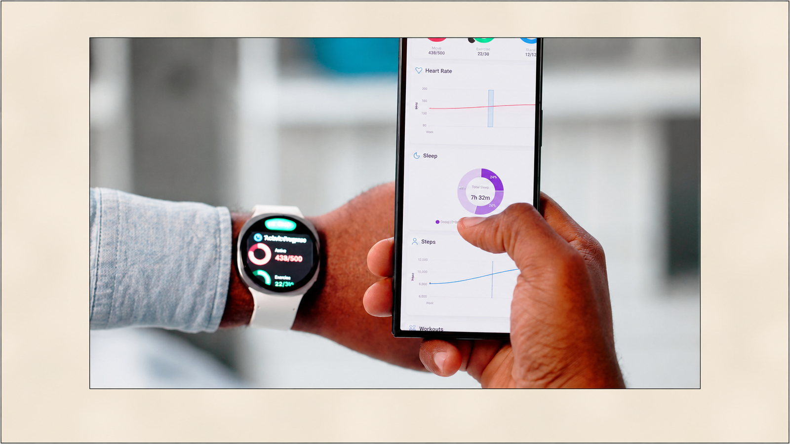
A user should understand a wearable screen in under two seconds, which requires short labels of one to three words, large high-contrast typography that survives motion and outdoor lighting, and a clear visual hierarchy of one focal element supported by a single piece of context. This is not a stripped-down version of mobile content design. It is a different discipline entirely, because the two-second budget has to accommodate the full communication: what happened, what it means, and what to do next, all readable at a glance while the arm is still in motion.
The practical implication for information density: a wearable screen supports exactly one piece of primary information and, at most, one supporting detail. A phone screen can show a chart, a trend line, and three data points simultaneously because the user has chosen to look at it. A watch screen showing the same three data points at once produces a screen the user cannot parse in the window they have available, which means none of the three pieces of information land, rather than all three landing partially.
CTA design follows the same constraint. Wearable sessions end suddenly, so each view should be treated as a self-contained unit that shows the critical status first and optional context second. If the user cannot finish reading, they should still walk away informed. A CTA that requires the user to read a full sentence of context before the action is intelligible will lose the majority of users who glance, do not have time to read the setup, and move on. The action has to be legible on its own, independent of any surrounding copy, because the surrounding copy is the first thing that gets cut when the user's attention window closes early.
Why Standard In-App Nudges Don't Translate
Modals, overlays, and interstitials, the standard toolkit for mobile in-app engagement, are built on an assumption that does not hold on a watch: that the user has enough screen real estate and enough sustained attention to process an element that sits on top of the primary content and requires a deliberate dismissal action.
A 1.7-inch display does not have room for an overlay that does not obscure the entire screen. There is no "on top of the content" on a watch, because there is barely enough room for the content itself. An interstitial that requires the user to read a message and then tap a specific dismiss target, rather than simply glancing away, is asking for an interaction the wearable context frequently cannot support: wearables are often used while walking or commuting, which means interaction demand needs to be minimised through large targets, ample spacing, and a limit on time-sensitive prompts that pressure the user to act immediately.
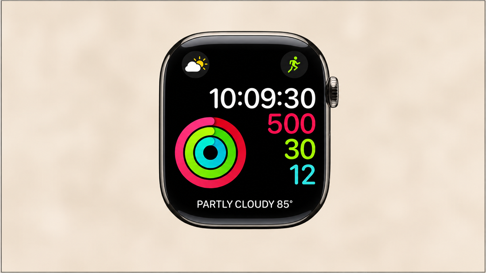
What replaces the modal is the complication and the notification, treated as first-class content rather than an afterthought. A complication, the small always-visible data element on a watch face, is the wearable equivalent of a persistent banner: it does not interrupt, it is simply present, updating in real time as the underlying data changes. Streaks, the Apple Design Award-winning habit tracker, made the Watch the primary interface rather than a companion to the phone app, with a glanceable complication that updates in real time and a one-tap interaction to complete a habit. This is the wearable-native equivalent of an in-app nudge: not a message that appears and must be dismissed, but a persistent, glanceable surface that the user checks on their own schedule.
For the rare case where a genuine interrupt is warranted, Apple's distinction between a Short Look and a Long Look is the wearable version of a progressive disclosure pattern: raising the wrist triggers a Short Look, showing only a title, app name, and icon, and only a sustained look triggers the Long Look with fuller detail. This is the closest wearable equivalent to a modal, and it is designed from the ground up to fail gracefully: a user who only sees the Short Look before lowering their wrist still receives the core information, rather than an interrupted, half-read modal.
The Companion App Problem
Most wearable apps operate across two surfaces simultaneously: the watch UI, built for glance-duration sessions, and the phone companion app, built for the standard extended-browsing mobile model. The engagement strategy has to work across both without creating friction at the point where a task moves from one to the other.
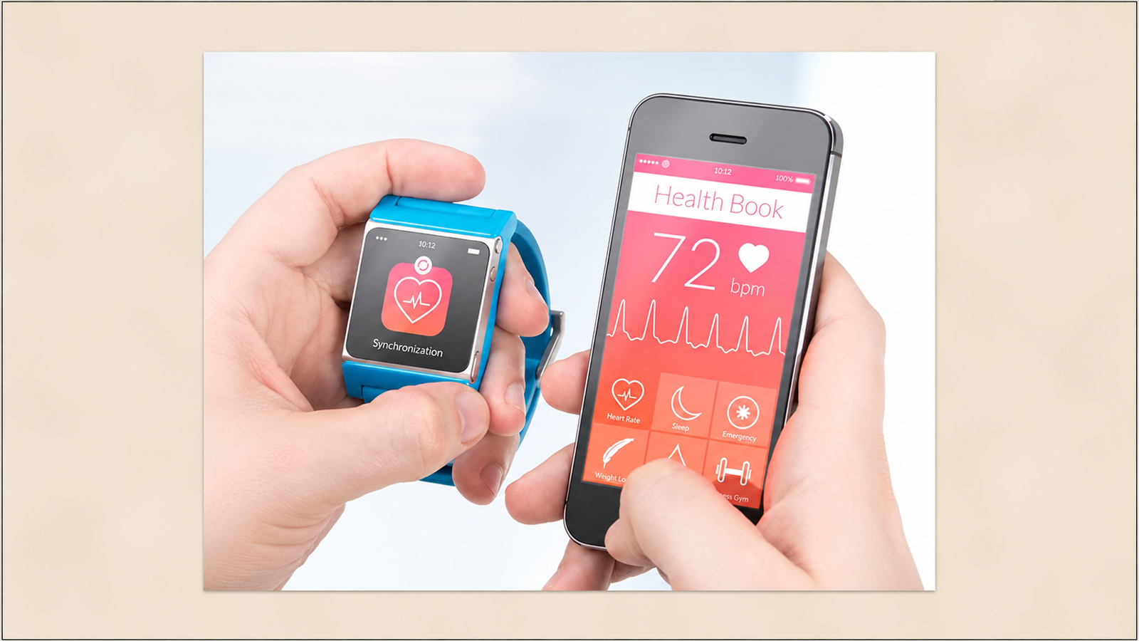
Progressive disclosure is the governing principle: on watches, more detail often belongs on the paired phone, and additional context should appear only when the user requests it, keeping the watch interface calm while still capable of depth when needed. The design discipline this requires is deciding, for every piece of content and every interaction, which surface owns it. A workout summary belongs on the watch in its glanceable form (calories, duration, heart rate zone) and on the phone in its full form (a chart of heart rate over time, comparison against previous sessions, coaching notes). Duplicating the full experience on both surfaces produces a watch app that tries to be a small phone, which is precisely the failure mode wearable design has to avoid.
The handoff moment is where most wearable apps lose users. A user who taps something on the watch expecting more detail and is dropped into a phone app that requires them to re-navigate to find the same context they were just looking at experiences a broken thread, not a continuation. The mechanics that prevent this: deep-linking the phone handoff directly to the relevant screen, rather than the phone app's home screen, and carrying the specific data point or session ID across the handoff so the phone screen opens already scoped to what the user was looking at on the watch.
The reverse handoff matters equally. A user who sets a goal or adjusts a setting on the phone needs that change reflected on the watch complication without requiring a manual sync or app restart. Deep integration between the watch and phone, syncing effortlessly through frameworks like HealthKit, ensures data accuracy and a unified dashboard experience rather than two surfaces that drift out of sync with each other, which is the single fastest way to erode trust in a wearable product: a user who sees conflicting numbers on their watch and their phone stops trusting either one.
Passive Data as the Primary Engagement Surface
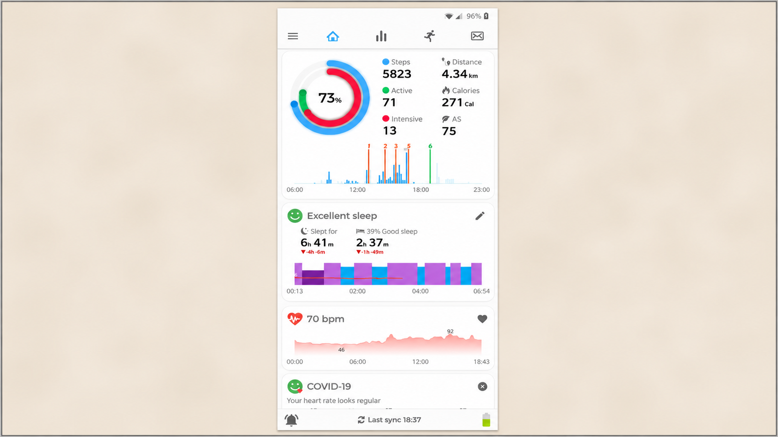
The most consequential difference between wearable engagement and standard mobile engagement is what actually drives the retention hook. A standard app retains users through content and campaigns: new material to consume, offers to respond to, features to discover. A wearable app retains users primarily through passive data, biometric information collected automatically in the background, with no deliberate user action required to generate it.
Wearables can anticipate needs and deliver value without asking for constant input, using context to nudge a user who has been sitting too long, silence notifications during sleep hours automatically, or surface directions when a user starts walking somewhere new. This passive-first model inverts the standard engagement funnel. A mobile app has to earn each session by giving the user a reason to open it. A wearable app is already collecting the data that becomes the reason, continuously, whether or not the user opens anything, which means the engagement design problem is not "how do we get the user to generate data" but "how do we surface the data that already exists at the moment it becomes meaningful."
This is why heart rate, sleep score, step count, and HRV function as engagement hooks in a way that no content feed can replicate on a wearable surface. The data was collected without the user doing anything deliberate to produce it, which means presenting it back does not feel like the product is asking for anything. It feels like the product is reporting something the user is naturally curious about, which is a fundamentally lower-friction engagement model than any campaign-driven mechanic. The design discipline this requires is resisting the urge to layer campaign-style engagement (streaks, badges, promotional content) on top of the passive data before the passive data itself is being surfaced well. The data is the primary hook. Everything else is secondary reinforcement.
Goal Mechanics Adapted for Wearable
Streaks and goals are standard mobile engagement mechanics, but they behave differently when the underlying data is collected passively rather than through an intentional check-in action.
On a standard mobile app, a streak rewards a deliberate action: opening the app, completing a lesson, logging a meal. The user knows exactly what they did to earn the streak, and exactly what they need to do tomorrow to keep it. On a wearable, a step count goal or a sleep score threshold can be met or missed by behaviour the user was not consciously managing as a discrete task. This changes what "achievable but not trivial" means for goal design. A step goal set too high relative to a user's actual passive movement pattern produces a goal that fails by default regardless of intentional effort, which reads as a punishing, arbitrary target rather than a motivating one.
Streaks have a specific failure mode: if a user misses a day and loses the streak, guilt and loss aversion drive many to abandon entirely rather than restart. Successful apps like Fittr and HealthifyMe offer streak freezes, typically once per month, that let a user skip a missed day without losing the streak, removing the punishment feeling while keeping the habit intact. This mechanic matters more for wearable-driven streaks than for intentional check-in streaks, because a passively-tracked goal can be missed for reasons entirely outside the user's control: the watch was charging overnight and missed a sleep session, the device was left at home for a day, a data sync failed. Penalising a broken streak caused by a technical gap rather than a genuine behavioural lapse produces exactly the guilt-driven abandonment the streak mechanic was supposed to prevent.
Apple offers achievement badges tied to specific milestones: the first time a user performs a new exercise type, workout personal records, seven-workout weeks, and monthly challenges, which is a design pattern well suited to passive data collection because the badge triggers automatically off data the device already has, rather than requiring the user to self-report an accomplishment. The achievable-but-not-trivial calibration works best when goals are personalised against the individual user's own baseline rather than a fixed universal target, since a fixed daily step target is trivial for an already-active user and unachievable for a sedentary one, and neither version motivates the behaviour it is meant to encourage.
The Interruption Hierarchy for Wearables
Three distinct interruption channels are available on a wearable product, and choosing the wrong one for a given message costs user trust in a way that is difficult to recover from, because the wearable sits on the body and every unwanted interruption is physically felt.
Haptic feedback has a taxonomy that most products underuse: distinct vibration patterns can convey success, failure, or a simple click, and a well-designed haptic language distinguishes urgency (urgent versus can-wait), context (foreground, related to what the user is currently doing, versus background) and system-level alerts. Most wearable products use a single generic vibration pattern for every notification type, which means the user cannot distinguish, without looking, between a message that requires immediate attention and one that can wait until they have a free moment. Haptics that guide are good design. Haptics that interrupt without adding clarity are bad design, and the discipline is to use haptics only when they measurably improve clarity, keep the pattern short and intentional, and match the sensation to the meaning.
The three-tier interruption hierarchy that follows from this: a haptic-only alert, no visual component required, for information the user benefits from feeling but does not need to read (a goal milestone reached, a gentle activity reminder, a passive data update). A watch notification, requiring the Short Look glance described earlier, for information that benefits from a brief visual confirmation but does not require phone-level detail (a completed sync, a specific achievement, a time-sensitive but low-complexity prompt). A phone push notification, reserved for content that genuinely requires the extended attention and detail that only the phone screen can support (a weekly summary ready for review, a significant health signal that warrants explanation, anything requiring the user to read more than a sentence or take an action more complex than a single tap).
The cost of getting this wrong runs in both directions. Escalating a haptic-appropriate message to a full phone push notification trains the user to treat push notifications as low-value noise, degrading the channel for the moments that genuinely need it. Downgrading a message that actually needs phone-level detail to a watch-only haptic means the user feels something happened but has no way to understand what, which produces anxiety rather than information, particularly for health-related alerts where the ambiguity itself is stressful.
The Cross-Device Engagement Model
The best wearable products do not try to make the watch do everything. They use specific phone-based in-app moments to reinforce the behaviour the watch is quietly tracking throughout the day, creating a rhythm between the two surfaces rather than treating them as competing channels.
The morning summary is the first of these moments: a phone-based recap of the previous night's sleep data, delivered at a time the user is already likely to be checking their phone, converting passively collected overnight data into a legible, reviewable format the watch's small screen cannot support well. The weekly review serves the same function at a longer time horizon: aggregating a week of passive data (steps, active minutes, sleep consistency, heart rate trends) into a format that benefits from the phone's larger screen and the user's willingness, once a week, to spend more than two seconds engaging with their own data. The achievement unlock moment, when a milestone badge or personal record is reached, benefits from a phone-based celebratory moment that a watch's constrained screen cannot deliver with the same impact, even though the underlying trigger, the data crossing a threshold, happened silently on the wrist.
This cross-device rhythm is what prevents the watch from becoming a data-collection device the user never actually engages with. The watch generates the data. The phone, at deliberate, well-timed intervals, is where that data becomes a story the user actually reads and reflects on. Neither surface alone produces the full engagement loop. The watch without phone-based reinforcement produces a device that quietly tracks without ever creating a moment of reflection. The phone without watch-based passive collection produces a standard mobile app with none of the frictionless data advantage a wearable provides.
What Fitbit, Apple Watch App Partners, and Cult.fit Have in Common
Despite operating in different markets and different device ecosystems, the category leaders in sustained wearable engagement converge on the same underlying architecture past the first month of use.
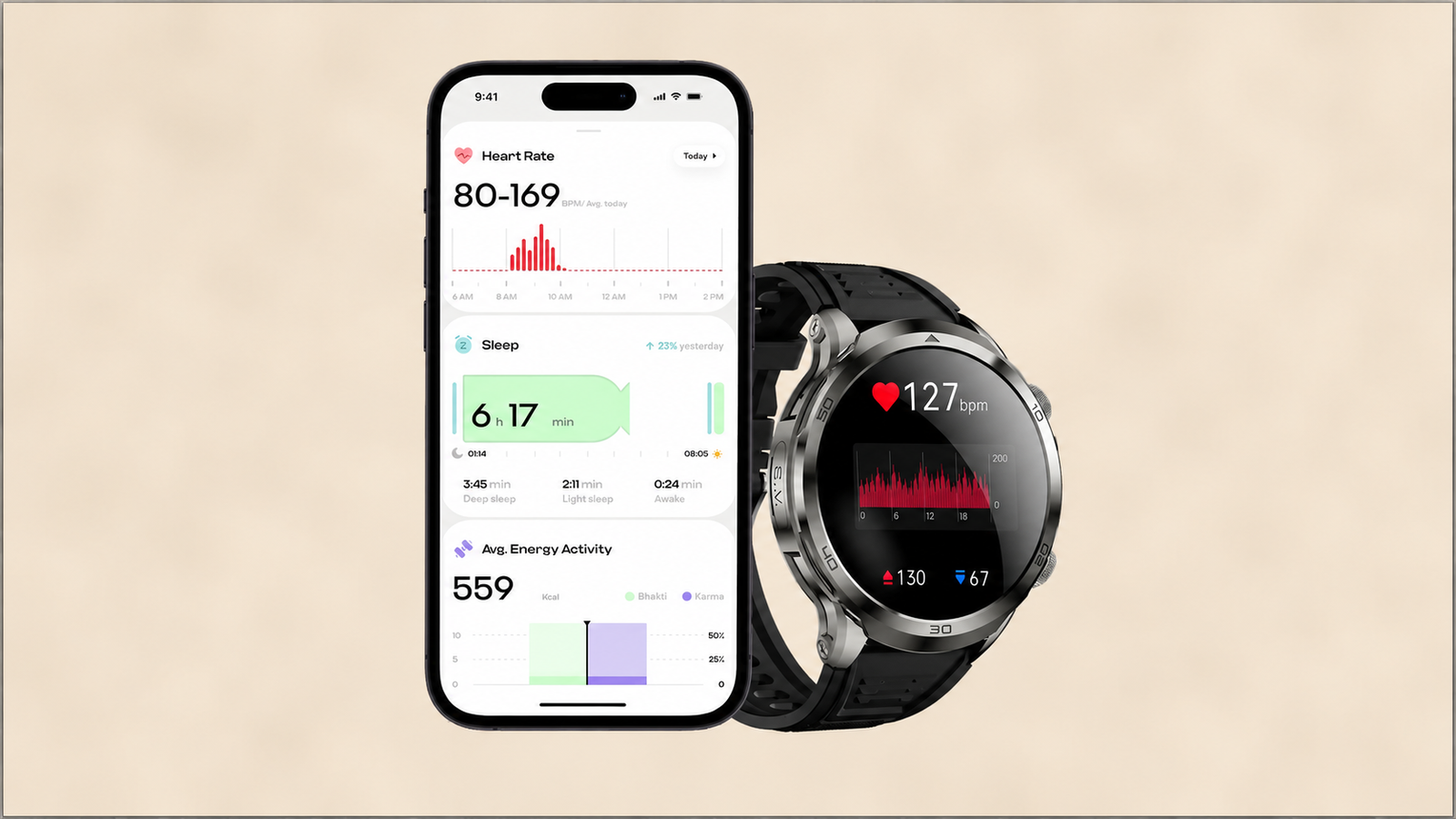
Passive data as the foundation, not a feature. Fitbit's core engagement model is built on the wealth of health and fitness metrics its devices collect automatically, steps, sleep patterns and stages, calories, distance, which empowers users to make informed decisions and lays the foundation for Fitbit's broader analytics and personalised recommendations. The passive collection is not a supporting feature. It is the product's entire reason for being retained, with every other engagement mechanic layered on top of it rather than substituting for it.
Personalisation calibrated to the individual, not a universal benchmark. Fitbit Premium's AI-driven Recovery Score factors sleep stages, HRV, and skin temperature to recommend workout intensity each morning, a recommendation that only makes sense calibrated against that specific user's own baseline data, not a fixed population-wide target. This matches the goal-calibration principle covered earlier: engagement mechanics that are personalised against a user's own passive data outperform mechanics built on universal thresholds.
Social and community layers, deployed carefully. Cult.fit's retention strength is explicitly social: a friends list showing friends' activity, live leaderboards framed around personal consistency rather than raw performance ("you're in the top 10% of your friends for consistency"), challenges with concrete completion targets, and kudos or comments that create social reciprocity. The framing detail matters: a leaderboard built around consistency rather than absolute performance is achievable for a broader range of users than a raw-output leaderboard, which is the same "achievable but not trivial" calibration principle applied to a social mechanic rather than an individual one.
Streak forgiveness as a standard feature, not an edge case. The streak freeze mechanic described earlier, standard across Fittr, HealthifyMe, and comparable category leaders, reflects a shared recognition that a passive-data-driven streak needs a built-in recovery path, because the causes of a missed day are frequently outside the user's control in a way a purely intentional check-in streak is not.
Achievement design tied to milestones the device can verify automatically. Apple's badge system for first-time exercise types, personal records, and consistency streaks works because every trigger condition is something the device's own sensors can confirm without requiring the user to self-report anything, which keeps the achievement layer frictionless and consistent with the passive-first engagement model the rest of the product is built around.
Topics Not in the Brief That Teams Should Know
Battery life as a silent engagement constraint. High power use from animations, background sensors, or frequent screen wake events drains a wearable's battery quickly, and designers have to balance visual richness against resource use to keep the device functional throughout the day. An engagement mechanic that is visually compelling but battery-expensive produces a device users start leaving at home or taking off partway through the day, which is a retention failure with a technical rather than a design cause. Every complication, every haptic pattern, and every background sync interval carries a battery cost that has to be weighed against its engagement value.
Situational accessibility, not just permanent accessibility. A user in a loud street cannot rely on audio feedback. A runner cannot read tiny text mid-stride. A worker wearing gloves cannot perform fine gestures. Wearable accessibility design has to account for situational impairment, temporary conditions created by context rather than permanent user characteristics, which is a category of accessibility consideration that standard mobile design guidance does not typically address with the same rigor.
Notification fatigue is a faster, more acute failure mode on wearables than on phones. 40% of fitness app users abandon within six months specifically due to notification overload, and because a wearable notification is physically felt on the body rather than simply appearing on a screen the user can choose to ignore, the fatigue threshold is reached faster than the equivalent phone notification pattern would produce. The interruption hierarchy covered earlier is not a nice-to-have refinement. It is the primary defence against this specific and fast-acting churn driver.
Wearable abandonment has causes beyond design and technical execution. Research on long-term wearable engagement found that abandonment is driven by a combination of user intention, the wearable's capability, and the flexibility of the device to adapt to changing user habits, not solely by technical or design flaws. A product team that treats every abandonment as a design problem to fix will miss cases where the underlying issue is that the user's motivation for wearing the device in the first place has genuinely changed, which calls for a different kind of intervention than an interface refinement.
Health-adjacent wearable categories face steeper retention challenges than fitness. Behavioural health and addiction-recovery wearable apps see abandonment rates as high as 95 to 97%, reflecting the difficulty of sustaining engagement around deeply ingrained habits where a single setback often produces permanent departure rather than a temporary lapse, and privacy sensitivity in these categories further limits how much social or community-based engagement mechanics, effective in general fitness, can be applied without user discomfort.
Key Takeaways
Wearable sessions last seconds, not minutes, which requires content designed for two-second comprehension: one primary data point, one supporting detail, and a CTA legible without requiring the user to read surrounding context first.
Modals, overlays, and interstitials do not translate to a 1.7-inch screen. What replaces them is the glanceable complication for passive, always-present information, and the Short Look and Long Look pattern for the rare genuine interrupt, both designed to fail gracefully if the user's attention window closes early.
The companion app relationship requires deciding which surface owns which level of detail, glanceable summary on the watch, full depth on the phone, and building deep-linked handoffs in both directions so a user never has to re-navigate to find context they were just looking at on the other device.
Passive biometric data, not content or campaigns, is the primary engagement hook on a wearable, which inverts the standard mobile engagement funnel from earning each session through content to surfacing data that is already being collected regardless of what the user does.
Goals and streaks need to account for passively-collected data being missed for reasons outside the user's control, which makes streak-freeze forgiveness mechanics a structural requirement rather than an optional refinement for wearable-driven streaks specifically.
The three-tier interruption hierarchy, haptic-only, watch notification, phone push, has to match the message's genuine urgency and complexity. Escalating too often trains users to ignore push notifications entirely. Downgrading too often produces ambiguous alerts that create anxiety rather than information.
The category leaders share an architecture: passive data as the foundation rather than a feature, personalisation calibrated to individual baselines rather than universal thresholds, social mechanics framed around consistency rather than raw performance, standard streak forgiveness, and achievement systems tied to milestones the device can verify automatically without requiring self-reporting.
Further Reading
From Digia Engage:
- When NOT to Show a Nudge: Building a Suppression Logic — the suppression framework that underlies the interruption hierarchy decision between haptic, watch, and phone notification
- Scratch Cards and Spin-the-Wheel in Mobile Apps: How They Drive Engagement — the psychological mechanics behind streak and reward design, relevant to wearable goal calibration
- In-App Storytelling: How to Use Stories Format to Drive Engagement — content format principles relevant to phone-side weekly review and achievement unlock moments
- Mobile App Retention Rate: What It Is and What's Pulling It Down — the retention benchmark context for the D1 to D30 drop-off pattern common across health and fitness categories
- Digia Engage Nudges — event-based trigger architecture relevant to phone-side reinforcement moments in a cross-device engagement model
External Sources:
- Wearable App UI/UX Design: Best Practices and Future Trends — Appventurez (glance-duration sessions, battery constraints on visual complexity)
- Wearable UX Design 2025: Speed, Privacy and Context Explained — Influencers Time (one-glance comprehension principles, notification-as-first-class-screen design)
- Wearable Web Design 2025: Simplify UX for Watches and Glasses — Influencers Time (progressive disclosure between watch and phone, situational accessibility, interaction demand reduction)
- UX for Wearables in 2025 — Seven Koncepts (contextual anticipation and passive value delivery)
- Designing for Apple Watch: Design Guidelines — Envato Tuts+ (Short Look and Long Look interaction pattern, haptic feedback taxonomy)
- Why We Need a Haptic Design Language for Wearables — Fast Company (five-category haptic taxonomy: urgent, later, foreground, background, system)
- Haptic Feedback: The Future of Touch Technology — Mediusware (haptic design discipline and common failure modes)
- Best Apple Watch Apps in 2026 — Lifestack (Streaks app as a watch-primary interface case study)
- Fitbit vs Apple Watch: Battle of the Fitness Smartwatches — Tech Advisor (Apple's achievement badge system tied to verifiable milestones)
- 13 Proven Strategies to Increase App Retention and Engagement for Fitness Apps — Orangesoft (Fitbit's passive-data-first engagement architecture)
- Fitbit in 2025: New Pixel Watch, Tracker Upgrades, and a Strategy Shift — SimplyMac (Fitbit Premium's personalised Recovery Score model)
- Fitness App Retention: What the Top Apps Do Differently — Product Growth Intelligence (Cult.fit's social engagement architecture, streak freeze mechanics at Fittr and HealthifyMe)
- How to Develop an App like Apple Fitness App — Sisgain (watch-to-phone deep integration via HealthKit)
- Fitness App Development 2026: Clinical-Grade Workout Apps — Taction Software (wearable healthcare device market scale, 60%+ US patient wearable ownership)
- 15 Must-Have Fitness App Features — Stormotion (D1 vs D30 retention benchmark for health and fitness apps)
- How to Create a Fitness App in 2025 — OpenArc (90%+ six-month abandonment rate for fitness apps)
- Fitness App Usage Statistics 2026 — Fitness App Solutions (40% notification-overload abandonment rate)
- Different Stages of Wearable Health Tracking Adoption and Abandonment — arXiv (multi-causal abandonment research beyond pure design failure)
- Retention Metrics for Fitness Apps: Industry Insights — Lucid (behavioural health app abandonment rates as high as 95 to 97%)
Cross-device engagement patterns, event-based haptic and notification triggers, and passive-data-driven nudges are configurable in Digia Engage as native components deployable across mobile and companion surfaces without engineering tickets after initial SDK integration. Book a demo to see how a cross-device engagement sequence can be configured for a wearable-integrated product, or explore the nudges product page for the full trigger and targeting specification.