


TL;DR:
- Commerce apps have the shortest decision windows in mobile.
- The entire funnel, from discovery to confirmed order, can happen in under three minutes in a quick-commerce app.
- Users are often comparing your app with a competitor’s tab at the same time.
- Any on-screen content that requires users to stop and read has already lost the decision before it finishes rendering.
A quick commerce user opening the app to reorder milk is not evaluating your product. They already decided. The entire in-app job in that session is to not get in the way. A first-time e-commerce shopper comparing three tabs for the same jacket is evaluating in real time, and every extra second your app takes to answer "is this the right choice" is a second a competing tab uses to answer it first. These are different jobs, but they share the same constraint: the decision window is short enough that anything requiring the user to stop and read has already lost.
The Compressed Decision Window
What changes when the entire funnel runs in under three minutes is not just speed. It is the format every in-app element has to use. A message that requires a full sentence of context before its point lands has already missed the window it was built for, because the user's attention has moved on before the sentence finishes.
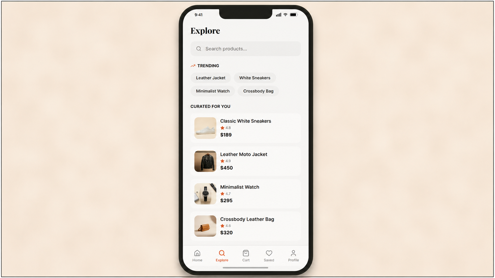
The average smartphone user has 110 or more apps installed but opens only 9 per day, and the ones that get opened are the ones that give the user a reason to return before a competing app fills the same time slot. For commerce apps specifically, this competition is not sequential. It is often simultaneous: a user with a genuine need to buy something is frequently comparing multiple apps or browser tabs in parallel, in the same few minutes, and whichever surface answers "can I get this, when, and for how much" fastest wins the transaction, independent of brand loyalty or prior purchase history.
This is why the design discipline for commerce in-app content differs from a SaaS onboarding tour or a fintech risk disclosure. A tooltip explaining a feature can afford three sentences because the user has already committed to learning the product. A commerce in-app element cannot, because the user has not committed to anything yet, and every additional word is measured against the cost of losing them to a tab that answers faster.
Surfaces Along the Commerce Funnel
Each stage of the commerce funnel calls for a different in-app element, matched to what the user is actually deciding at that specific point, not a generic promotional banner reused across every screen.
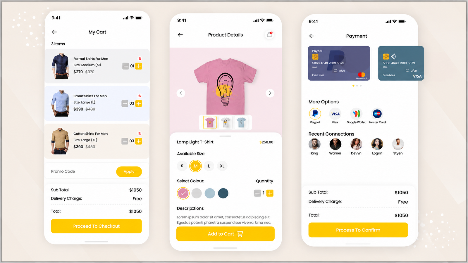
Discovery. The home screen and category browse surface benefit from curated, popularity-driven or personalised product surfacing rather than an undifferentiated catalogue, paired with a persistent delivery-time or availability signal that answers the user's first implicit question before they tap anything. Curated categories like "Top Picks" organised by clear labels, rather than a generic catalogue dump, give a user a fast starting point rather than requiring them to search through an undifferentiated list, a pattern that transfers directly from fintech onboarding to commerce discovery, since both are solving the same problem: converting an overwhelming option set into a fast first decision.
Product page. This is where social proof density matters most, ratings, review counts, and delivery estimate all visible without scrolling, because the product page is the moment the user is actively weighing whether this specific item satisfies the need that brought them to the app.
Cart. The cart is a decision-reinforcement surface, not just a summary. It needs to show the full cost, including delivery, before checkout, and it is the correct place for a threshold nudge, covered in detail below, since the user is actively looking at their basket total at exactly the moment a nudge to add one more item is most likely to land.
Checkout. The in-app element here should be minimal by design: payment method pre-selection, a clear total, and no new information competing with the single task of completing the transaction. Anything promotional at checkout risks introducing doubt at the exact moment the user was ready to commit.
Post-order. The moment immediately after a completed purchase is the highest-attention, lowest-competition surface in an entire session, because the user has just finished the action the app exists to facilitate and has nowhere else for their focus to go in that instant. This is where gamification, cross-sell, and reorder-habit formation belong, covered in the sections below.
Cart Abandonment In-App: Why In-Session Recovery Outperforms Post-Session Messaging
Post-session recovery, the standard playbook of email, SMS, and push notifications sent after a user has already left the app, has real but modest recovery rates, and understanding those numbers is what makes the case for in-session recovery concrete rather than assumed.
On average, only 6.1% of abandoned carts are recovered via email alone, and combining email with SMS recovery campaigns raises that to a range of 8.4% to 24.3%. Push notifications average a 50% open rate and 10% click-through rate, compared to 39% open and 21% click-through for abandonment emails, and well-executed SMS cart recovery sequences recover 15 to 25% of abandoned carts, compared to 3 to 5% for email alone, though SMS requires explicit opt-in consent that most stores collect via a checkout phone field or a site pop-up.
These numbers describe a real, working recovery channel. They also describe a channel that only activates after the user has already left, which means the app has already lost the moment of active intent and is now trying to re-manufacture it from outside the session. In-session recovery works on a different principle entirely: it intercepts the abandonment before it fully happens, while the user's attention and intent are still live, rather than trying to win it back afterward.
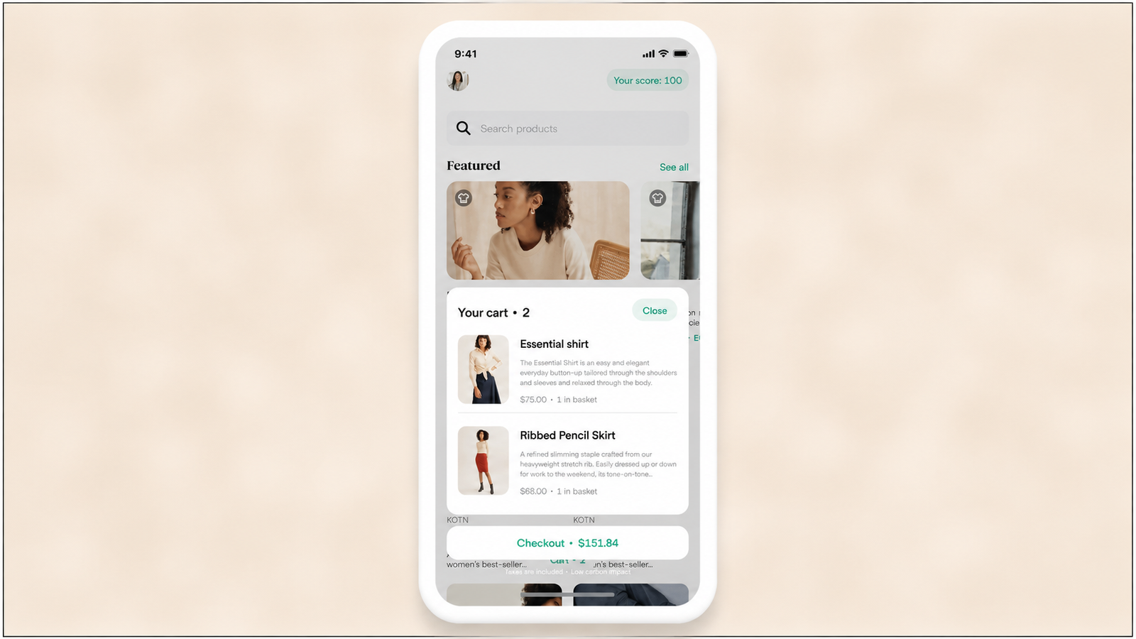
The specific in-session patterns that work: a persistent, low-friction cart indicator visible from anywhere in the app, so the user is never more than one tap from returning to an in-progress cart without having to reconstruct it from memory. A bottom sheet that surfaces automatically when the user's navigation pattern signals an exit intent, showing the cart contents and total rather than a generic "don't leave" message. And continuing an in-progress cart seamlessly across devices and sessions, so a user who added items on mobile and returns later on the same or a different device finds the cart already populated rather than starting from scratch, which converts what would otherwise become a completed abandonment into a session that never actually broke.
The reason in-session recovery outperforms post-session messaging is structural, not just a matter of better copy. Post-session recovery has to re-earn attention from zero, competing against everything else in the user's inbox or notification tray. In-session recovery never lost that attention in the first place. It is working with intent that is still active rather than intent that has to be reconstructed.
Category and Inventory Context Without Adding Friction
Surfacing availability, delivery windows, and substitutions is a trust-building function, not a decoration, and the design challenge is delivering this information without adding a step the user has to actively process.
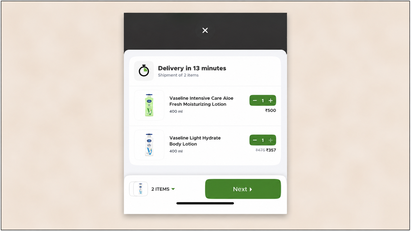
The pattern that works is passive, glanceable context embedded directly into the product surface rather than a separate screen the user has to navigate to. A delivery time estimate shown directly on the product card, before the user taps into the product detail page, answers the question before it has to be asked. A substitution suggestion shown at the moment an item is found to be out of stock, rather than a dead-end "unavailable" message, keeps the transaction moving instead of ending it. This matters specifically for quick commerce, where the delivery time promise functions as a persistent trust and urgency signal throughout the session, reinforcing the core value proposition at every screen rather than being stated once at the start and then dropped from view.
The friction to avoid is any inventory or availability context that requires the user to make an active decision before they were ready to. A substitution prompt that interrupts the flow with a modal the user has to dismiss is worse than no substitution at all, if the same information could have been surfaced passively, already selected as a sensible default, with an easy option to change it rather than a forced choice.
Promotion Mechanics: What Lifts Basket Value and What Trains Discount-Seeking
Not every promotional mechanic produces the same long-term outcome, and the distinction between a mechanic that lifts genuine basket value and one that trains a user to wait for a discount before ever transacting is the single most consequential design decision in this category.
Threshold nudges. A free shipping or minimum-order threshold set 15 to 25% above current average order value, with a visible progress bar showing the user how close they are to qualifying, produces a 17 to 30% average order value lift and an 18 to 30% conversion rate improvement. 58% of shoppers report adding an item specifically to reach a qualifying threshold, and the strongest response comes from baskets within roughly $5 to $15 of the line. This mechanic works because it is not a discount. It converts a genuine spending decision, add one more relevant item, into a rational choice the user makes because the value proposition (avoid a shipping fee, unlock free delivery) is real and immediate, not because the platform trained them to wait for a price cut.
Scratch cards and spin-the-wheel. These mechanics work through variable ratio reinforcement, the same reward structure that produces the highest and most extinction-resistant response rate of any pattern in behavioural psychology, and they function best when attached to an action the user was already taking rather than requiring a separate task. Fired at the post-order moment, this mechanic adds interest to a transaction that already happened rather than manufacturing a reason to transact that would not otherwise exist, which is the design discipline that separates a durable engagement mechanic from one that erodes.
What trains discount-seeking specifically. Overusing discounts trains customers to abandon their cart deliberately, waiting for a promotional trigger before completing a purchase they were already going to make. A discount offered too early or too predictably in the cart abandonment sequence teaches exactly this behaviour: a user who receives a 10% off code every time they leave items in a cart for twenty minutes learns, correctly, that leaving items in a cart is a strategy, not an accident. The specific recommendation from cart recovery research is to reserve any discount for the final message in a sequence, and only if margin genuinely supports it, since a discount offered at the first touchpoint teaches even a platform's best customers to abandon on purpose.
The practical rule that separates the two categories: a threshold nudge and a post-order gamification reward both attach to a purchase decision the user is making or has just made. A discount fired reflexively at every sign of hesitation attaches to the hesitation itself, which is the exact behaviour it ends up reinforcing.
Repeat Purchase and Reorder: Where the Prompt Belongs
Repeat customers spend 4.8 times more than first-time buyers in aggregate, and 67% more on average per individual order, with repeat customer conversion rates reaching 60 to 70%, compared to just 5 to 20% for new-customer traffic. This gap is the entire business case for treating the reorder surface as a first-class design priority rather than an afterthought bolted onto the home screen.
The reorder prompt belongs at the specific moment a user's own behavioural pattern indicates readiness, not on a fixed calendar schedule applied uniformly across the user base. For a genuinely repeatable product, a grocery staple, a subscription-adjacent item, a consumable, the prompt fires based on the user's own historical purchase interval for that specific item, not a generic "it's been two weeks" trigger applied to every user regardless of their actual usage pattern. This is the same principle that governs Day N return triggers in retention design generally: a trigger tied to something the user actually did outperforms a trigger disconnected from behaviour, because the connection to a real pattern is what makes the prompt feel earned rather than arbitrary.
The surface itself works best as a low-friction, single-tap reorder from the home screen or a dedicated "buy again" section, pre-populating the cart with the previous order's items rather than requiring the user to reconstruct the purchase from scratch through search and browse. This converts the entire discovery and product-selection stage of the funnel into a single decision, confirm or adjust, which is the correct compression for a purchase the user has already validated once and is not evaluating from scratch a second time.
Peak Event Readiness
Sale periods and festive traffic spikes are predictable, recurring events in the commerce calendar, and the operational reality most teams underweight is that these are exactly the moments a standard app-release cycle is least able to accommodate, because engineering teams typically freeze releases during peak traffic windows specifically to avoid introducing risk during the highest-revenue period of the year.
This creates a direct conflict: the moments when in-app campaign changes matter most, a flash sale extending by two hours, a shipping cutoff message updating in real time, a sold-out banner appearing the instant inventory depletes, are the same moments a code freeze makes a standard app-release-dependent change impossible. Server-driven UI architecture, where in-app screens, messaging, and sequencing are controlled from a backend rather than hardcoded into the app binary, removes this ceiling entirely, letting teams update campaign copy, layout, and targeting during a live event without submitting a new app build. This is not a nice-to-have for peak events specifically. It is the specific architectural requirement that makes peak-event in-app agility possible at all, since the alternative, a code freeze that blocks any in-app change for the exact window when changes matter most, is a structural failure mode that only shows up when it is too late to fix.
The practical implication for planning: any in-app campaign a team expects to need to adjust during a sale period, a countdown, an inventory-driven message, a threshold that needs recalibrating mid-event based on real-time basket data, needs to be built on infrastructure that does not require a release to change, confirmed and tested well before the freeze window begins, not discovered as a gap once the freeze is already in effect.
Measurement: Attributing Revenue to In-App Surfaces Credibly
The single most common measurement failure in this category is comparing users who engaged with an in-app surface against users who did not, without a randomised holdout, and then attributing the entire difference to the surface itself. This produces an inflated, indefensible number, because users who engage with an in-app nudge are frequently already higher-intent users who would have converted at a higher rate regardless.
The correct methodology is a rule-based holdout: randomly assign 10 to 20% of the qualifying audience to a holdout group before the campaign launches, and track both groups on identical metrics over the same window, so the resulting comparison isolates the campaign's actual causal contribution from the underlying difference between users who were always going to convert and users the campaign genuinely influenced. Applied to a commerce in-app surface specifically, this means a cart recovery bottom sheet, a threshold nudge, or a reorder prompt should each be measured against a holdout group that qualified for the same trigger but did not see the treatment, with the revenue delta between the two groups, not the raw conversion rate of the treated group alone, as the number reported to leadership.
This distinction matters most for the exact mechanics covered in this article, because a threshold nudge or a reorder prompt is, by definition, targeting users who already have strong purchase intent, which means the raw conversion rate among treated users will look impressive regardless of whether the specific in-app element caused any of it. A holdout-based revenue attribution number is the only version of this measurement that survives a serious finance or leadership review, because it answers the actual question being asked, what did this specific surface add, rather than a proxy question that happens to produce a more flattering number.
Topics Not in the Brief That Teams Should Know
Sticker shock at checkout is a distinct failure mode from cart abandonment generally, and it needs its own fix. About half of shoppers abandon carts because of unexpected extra costs, shipping, taxes, and fees, revealed for the first time at checkout, and 48% specifically cite shipping cost as the number one reason for abandonment. The fix is showing the full delivered cost, including any delivery fee, at the cart stage rather than the checkout stage, so the moment of price surprise happens earlier, while the user still has full context and options, rather than at the exact moment they were about to commit.
Micro-commitment nudges reduce reorder friction independent of the reorder prompt's timing. Implementation intentions, specific plans that name when, where, and how an action will happen, significantly increase the rate at which an intended action actually occurs, compared to a general intention alone. A post-order prompt inviting the user to schedule their next reorder, rather than simply reminding them later, converts a passive future intention into an active, specific plan, which is a distinct and additive mechanic to the behaviour-triggered reorder prompt covered above.
Suppression logic prevents commerce in-app surfaces from firing during the exact moments they would do the most damage. A cart recovery nudge or a threshold prompt fired while a payment is actively processing, or immediately after a failed transaction, converts a recoverable moment into a trust-damaging one. The same suppression discipline that governs any in-app engagement system, blocking delivery during transaction-in-progress or error states, applies with particular weight to commerce specifically, since a poorly timed promotional element during a payment failure reads as tone-deaf in a way that is disproportionately damaging to trust.
Novelty effects distort early results for any newly launched in-app commerce mechanic. A newly introduced threshold nudge or gamification element will often show an inflated early conversion lift purely because it is unfamiliar, independent of its actual long-term merit. Measuring performance across a longer window, past the first few weeks of exposure, rather than concluding from an early result, is the specific discipline that prevents a team from over-investing in a mechanic whose apparent success is mostly novelty rather than durable design.
Key Takeaways
The compressed decision window in commerce apps, sometimes under three minutes end to end, means every in-app element has to communicate its point without requiring the user to stop and read, because a competing tab or app is very often being evaluated in parallel.
Each stage of the commerce funnel calls for a distinct in-app element matched to what the user is actually deciding at that point: curated discovery, dense social proof on the product page, a threshold nudge and full-cost visibility in the cart, minimal friction at checkout, and gamification or cross-sell at the post-order moment when attention is highest.
In-session cart recovery, a persistent cart indicator, an exit-intent bottom sheet, and cross-device cart continuity, outperforms post-session push, SMS, and email because it intercepts abandonment while intent is still active, rather than trying to re-manufacture that intent from outside the session after it has already lapsed.
Threshold nudges set 15 to 25% above current average order value, with a visible progress indicator, produce genuine basket value lift because they convert a real spending decision into a rational choice, while reflexive discounting at the first sign of hesitation trains exactly the abandonment behaviour it was meant to prevent.
Repeat customers convert at 60 to 70% compared to 5 to 20% for new users and spend meaningfully more per order, which makes a behaviourally-triggered, single-tap reorder surface one of the highest-leverage in-app investments available in this category.
Peak event readiness depends on server-driven in-app architecture that does not require an app release to change, since the moments when in-app agility matters most, live sale periods and festive traffic spikes, are the same moments a standard engineering code freeze makes release-dependent changes impossible.
Credible revenue attribution for any commerce in-app surface requires a randomised holdout group, not a raw conversion rate comparison, because the users most likely to engage with a threshold nudge or reorder prompt are frequently already high-intent users who would have converted regardless.
Further Reading
From Digia Engage:
- How Zepto's Onboarding Gets Users to Their First Order in Under 3 Minutes — the compressed decision window and persistent trust signal design pattern this article builds on directly
- Urban Company's Post-Order Screen: A Deep Teardown — the post-order surface as the highest-attention moment in a session, covered in full detail
- Scratch Cards in Mobile Apps: Design, Timing, and Conversion Data — the full reveal-mechanic design principles behind the gamification section in this article
- The ROI of In-App Engagement: Business Case for Leadership — the holdout methodology this article's measurement section is built on
- Mobile App Onboarding Is a Growth Lever — the server-driven architecture referenced in the peak event readiness section
- When NOT to Show a Nudge: Building a Suppression Logic — the suppression framework referenced in this article's additional topics
- The Engagement Gap: Why Mobile Apps Lose Users Between Sessions — the implementation intentions research referenced in the reorder friction discussion
- Digia Engage Widgets — inline threshold nudges, cart persistence, and cross-sell surfaces configurable without engineering tickets
External Sources:
- Abandoned Cart Recovery Guide: 7 Ways to Convert Lost Shoppers — AppBrew (push versus email open and click-through comparison; SMS recovery rate data)
- Cart Abandonment Rate: 2026 Benchmarks & Recovery Tactics — Proactive AI (email and combined-channel recovery rate benchmarks)
- Abandoned Cart Recovery in 2026 — BigCommerce (cross-device cart continuity as a recovery pattern)
- Mobile App Cart Abandonment: The Recovery Push Sequence — PushEngage (discount sequencing and opt-out risk from early discounting)
- Free Shipping Threshold Strategy for AOV — Blend Commerce (threshold-setting methodology)
- Free Shipping Threshold Strategy 2026: The AOV Playbook — Digital Applied (threshold basket redistribution data)
- Free Shipping Threshold: The Margin Math for 2026 — Eightx (58% threshold-driven add-to-cart behaviour; optimal threshold range)
- Free Shipping Impact Data 2026 — EasyApps (AOV lift and conversion improvement from progress-bar threshold display; sticker shock abandonment data)
- 45 Average Order Value Statistics for 2026 — Ringly (repeat customer spend and conversion rate comparison)
- Abandoned Cart Recovery Strategies to Increase Conversions — Zoho Commerce (discount-training risk in recovery sequences)
The threshold nudges, cart persistence, cross-sell, and post-order gamification surfaces described in this article are configurable in Digia Engage as native in-app components, deployable without engineering tickets after initial SDK integration and without requiring an app release during a code freeze. Book a demo to see how a commerce in-app sequence can be configured across your discovery, cart, and post-order surfaces, or read the ROI measurement guide for the holdout methodology this article's attribution section depends on.