
TL;DR: The word "nudge" has been stripped of its meaning in mobile product circles. It now refers to any in-app prompt, banner, or modal regardless of whether it actually nudges anything. That conflation matters because it leads to bad design: interruptions dressed up as nudges, modals that block users mid-task, and banners that fire when nobody asked for them. A nudge, in the original behavioral economics sense defined by Richard Thaler and Cass Sunstein, is a prompt that shifts behavior without forcing it. It works only when two conditions are met: the user must have latent intent already, and the nudge must appear at the right contextual moment. This article covers the definition, the four nudge types that reliably work in mobile, the six formats you can use and when each applies, trigger mechanisms and their conversion impact, and 12 specific examples across fintech, e-commerce, edtech, health, and quick commerce, with nudge type, format, trigger, and what makes each one work.
What a Nudge Actually Is
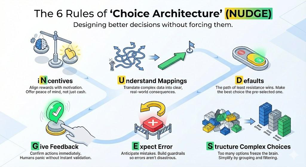
The term comes from behavioral economics. Richard Thaler, who received the Nobel Prize in Economics in 2017, and Cass Sunstein defined a nudge as follows in their 2008 book Nudge: Improving Decisions About Health, Wealth, and Happiness:
"Any aspect of the choice architecture that alters people's behavior in a predictable way without forbidding any options or significantly changing their economic incentives. To count as a mere nudge, the intervention must be easy and cheap to avoid. Nudges are not mandates. Putting the fruit at eye level counts as a nudge. Banning junk food does not."
Three things are packed into that definition and each one has direct implications for mobile design.
First, a nudge alters behavior in a predictable way. It is not a random pop-up. It is a designed intervention that operates on a known psychological mechanism: loss aversion, social comparison, completion pressure, or friction reduction. If you cannot name the mechanism your prompt is exploiting, you are not designing a nudge. You are guessing.
Second, a nudge preserves choice. It does not block the interface, gate content behind a decision, or force an action. Any in-app element that removes a user's ability to continue their task without interacting with it is not a nudge. It is an interruption. That distinction matters more than it sounds, because interruptions produce resentment and nudges produce behavior change. They are not the same engineering problem.
Third, a nudge must be easy to avoid. A dismissible tooltip is a nudge. A full-screen interstitial that cannot be skipped without tapping an acknowledgment button is not. The ease of avoidance is not a weakness in the design. It is the mechanism. When users know they can ignore a prompt, those who do not ignore it are the ones with genuine intent. Their action becomes a signal. Forced engagement produces compliance, not intent, and compliance does not convert downstream.
In mobile product design, the practical consequence of Thaler and Sunstein's definition is this: most in-app elements called nudges are not nudges. A promotional modal that fires on app open, a push notification dressed up as a personalized message, and a bottom sheet that appears after a scheduled 24-hour delay are all interruptions built on campaign logic. They share zero design DNA with a nudge. Treating them as equivalent produces bad outcomes because the design decisions that make an interruption perform well (attention-grabbing, time-sensitive, high visual contrast) are precisely the decisions that make a nudge fail.
How a Nudge Differs from a Campaign, an Alert, and a Push Notification
The confusion between nudges and other in-app formats is partly semantic and partly structural. Here is where the categories genuinely differ.
A campaign is a planned communication initiated by the growth or marketing team on a schedule. It targets a defined segment, uses a defined channel, and fires at a defined time. Campaigns run whether or not the user is doing anything relevant at the moment of delivery. A Black Friday banner that appears on app open to all active users on November 29 is a campaign. It is not a nudge.
An alert is an informational message about a state change the system needs to communicate: a transaction processed, a price change, a security event, an error. Alerts are triggered by system events, not user behavior. They serve the user's need to know, not the product's need for the user to act. A "your payment failed" modal is an alert. Calling it a nudge neither changes its function nor improves its design.
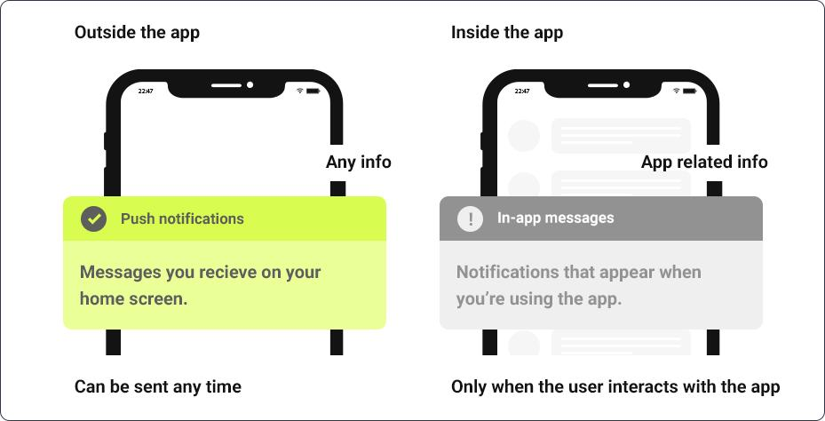
A push notification is a message delivered to the device's notification tray outside the app session. It reaches users who are not currently in the product. It requires OS-level permission and arrives against unknown context. Push notification opt-in rates sit at approximately 56% on iOS and 67% on Android, meaning a meaningful portion of your users will never receive push regardless of how well you design it. Push is the correct channel for re-engaging lapsed users and delivering time-sensitive transactional messages. It is not a nudge, even when its copy is written to sound like one.
A nudge is triggered by the user's own behavior inside a live session. It fires because the user did something, or was about to do something, or paused at a point where a specific prompt would help them make a decision that is already latent. The nudge does not create the intent. It resolves it.
The clearest way to tell the difference: if your prompt would fire even if the user had zero interest in the action it suggests, it is a campaign, not a nudge.
The Two Conditions That Make a Nudge Work
Behavioral economists and UX researchers have converged on a principle that most mobile teams ignore: a nudge requires two conditions simultaneously. Remove either one and the prompt becomes noise.
Condition 1: The user must have latent intent.
A nudge does not create desire from scratch. It surfaces a desire the user already has but has not acted on. A user who has added items to a cart but not checked out has latent purchase intent. A user who has visited the savings feature twice without enabling it has latent savings intent. A user who has completed 80% of onboarding but stopped has latent completion intent. Each of these is a genuine nudge opportunity because the intent exists.
By contrast, a user who has never visited the savings feature, never browsed the checkout flow, and has not engaged with the product in three weeks has no latent intent for any of these prompts. Firing a "complete your savings setup" nudge at that user is a campaign. A re-engagement campaign. It might be the right tool, but it is not a nudge, and designing it as one (small tooltip, minimal copy, dismissible with a light swipe) will produce weak results because the format does not match the communication need.
Condition 2: The nudge must be contextually relevant to what the user is doing right now.
A nudge is a contextual intervention. Its power comes from arriving at the moment when the relevant action is cognitively active. A "you are 1 step away from activating your investment account" tooltip that appears on the investments screen is contextual. The same message delivered as a push notification three hours after the user closed the app is not. The investment screen context is gone. The intent may or may not persist. The relevance of the specific prompt to that specific moment is what makes the nudge format appropriate.
This is the design logic that event-triggered nudges exploit and time-triggered nudges destroy. When both conditions are met, even a simple tooltip with minimal visual weight can produce conversion rates that a full-screen interstitial with higher interruption value cannot replicate.
The Four Nudge Types That Work in Mobile
The nudge types that consistently produce measurable behavioral outcomes in mobile apps map directly to four psychological mechanisms. Each has distinct design implications and distinct failure modes.
1. Social Proof Nudges
Social proof nudges show the user that others have already taken the action being suggested. The psychological mechanism is conformity and uncertainty reduction: when a user is unsure whether an action is worth taking, evidence that peers have taken it reduces the perceived risk of doing so.
Research consistently shows that social proof lifts adoption by 20 to 40 percent versus generic feature announcements. The specificity of the social proof matters. "Over 1 million users have enabled this" is less effective than "12 of your teammates are already using this." The more the reference group resembles the user, the stronger the conformity effect.
Design implication: Social proof nudges work best as tooltips or inline banners near the feature being suggested, not as modals. A modal blocks the user from seeing what they are being asked to adopt. A tooltip or inline banner appears next to it, so the social signal and the feature are visible simultaneously.
Fatal misuse: Fabricated or outdated social proof ("Trending with 10,000 users" when the feature was launched two years ago) erodes trust and produces the opposite of the intended effect.
2. Friction-Reduction Nudges
Friction-reduction nudges present a simpler path to an action the user intends to take but has been deterred from completing. The mechanism is effort reduction: users abandon high-friction paths not because they lack intent but because the cost of the action exceeds their available attention or time.
A pre-filled form with "just confirm your address" is a friction-reduction nudge. A tooltip on a complex settings page that says "we can do this in one tap" is a friction-reduction nudge. A bottom sheet that surfaces the next step when a user has paused mid-onboarding is a friction-reduction nudge.
Design implication: These nudges work best when they reduce a visible friction point. The user needs to have encountered the friction (started the form, opened the settings, entered the onboarding flow) before the nudge fires. Firing the friction-reduction nudge before the friction exists tells the user they are about to find something difficult, which can introduce anxiety rather than confidence.
Fatal misuse: Friction-reduction nudges that appear before the user has encountered the friction convert poorly and can feel presumptuous. The trigger must confirm that the friction has been experienced.
3. Progress Nudges
Progress nudges show the user how close they are to completing something they have already started. The psychological mechanism is the Zeigarnik effect: people are more motivated by unfinished tasks than completed ones, and the closer a task is to completion, the stronger the pull toward finishing it.
A "you are 1 step away from completing your profile" banner at 80% profile completion is a progress nudge. A "you are 3 lessons away from finishing this course" tooltip after the seventh lesson in a ten-lesson series is a progress nudge. An investment app that shows "your portfolio is 2 months from your first milestone" after a user has set a savings goal is a progress nudge.
Design implication: The framing matters more than the format. "2 days left" outperforms "12 days done" when both describe the same state of a 14-day goal. Frame progress nudges around the gap to the goal rather than the distance from the start.
Fatal misuse: Progress nudges fired at the beginning of a journey (0 to 20 percent completion) produce weak results because the Zeigarnik effect requires meaningful prior investment. Reserve them for users who are genuinely close.
4. Loss-Aversion Nudges
Loss-aversion nudges make the cost of not acting more psychologically salient than the benefit of acting. The mechanism is prospect theory: humans experience the pain of losing something as approximately twice as intense as the pleasure of gaining something of equal value. A nudge that activates the fear of loss is therefore more motivating than one that promises equivalent gain.
"Don't lose your 47-day streak" is a loss-aversion nudge. "Your cart expires in 2 hours" is a loss-aversion nudge. "You'll miss your free trial if you don't activate by tonight" is a loss-aversion nudge. Duolingo built its entire retention system on streak loss aversion, and the data showed this outperforms "keep your streak going" framing by a meaningful margin.
Design implication: Loss-aversion nudges require genuine stakes. The user must actually have something at risk: a streak, a reward, a trial, an offer window. Fabricating urgency for things that will not actually expire is a pattern users detect quickly, and the trust cost is permanent.
Fatal misuse: Overusing loss-aversion language in low-stakes contexts (every nudge becomes "don't miss this") trains users to ignore the framing entirely, which destroys its effectiveness in the moments where genuine stakes exist.
Format Options: Six In-App Formats and When Each Applies
The nudge type defines the psychological mechanism. The format defines how it is delivered and at what interruption cost. These are independent decisions, and pairing them incorrectly is the single most common source of poor nudge performance.
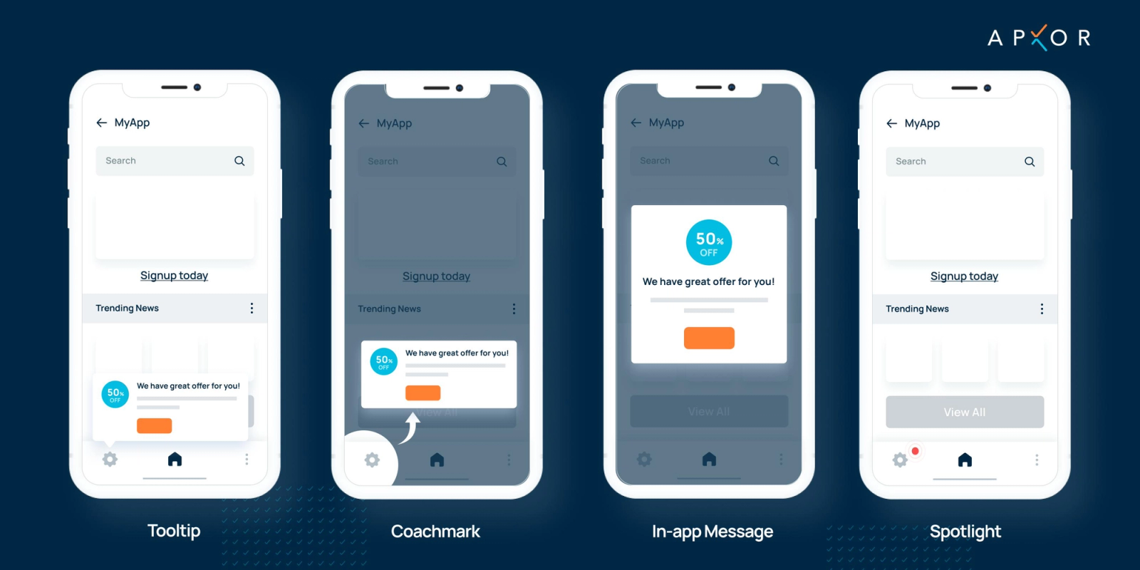
Tooltips
A tooltip is a small, position-anchored overlay that points to a specific UI element. It is low-interruption, typically dismissible by tapping elsewhere, and carries minimal visual weight.
Right use case: Feature discovery, keyboard shortcut hints, contextual explanations of specific elements, and social proof attached to a specific feature button. Tooltips work because they appear next to the thing they describe, preserving the user's ability to act on the information immediately.
Fatal misuse: Stacking tooltips in a sequence without giving the user time to act on each one. Three consecutive tooltips on app launch are an onboarding tutorial pretending to be a tooltip sequence. They block the interface and produce skip behavior.
Modals
A modal is a dialog box that overlays the current screen and requires user action before the interface beneath it can be accessed. It is the highest interruption format available in the in-app toolkit.
Right use case: Irreversible actions (delete, deactivate, cancel subscription), high-stakes decisions where acknowledgment is legally or operationally required, and genuine upgrade moments where the user is at a clear decision point. Modals are appropriate when 100 percent of users need to see the message and the product cannot function normally without their response.
Fatal misuse: Promotional modals on app open. A user who has just opened the app to complete a specific task does not want to respond to an upgrade offer before reaching the screen they opened the app to reach. Modals that interrupt a user mid-task convert poorly and damage trust by a measurable margin.
Banners
A banner is a slim, non-blocking horizontal element that appears at the top or bottom of the screen, allowing the user to continue using the interface without interacting with it.
Right use case: Low-urgency announcements, new feature teasers, system status updates, and persistent reminders that should stay visible across multiple screens. Banners are appropriate when the message has value but not enough value to justify interrupting the user's task.
Fatal misuse: Using a banner for a genuinely time-sensitive offer where the user might dismiss it by accident. Banners are scroll-past elements. If missing the message has a real cost, a banner is the wrong format.
Coach Marks
A coach mark is a semi-transparent overlay that dims the screen except for the highlighted element, drawing the user's attention to a specific UI component. It is higher interruption than a tooltip but lower than a modal.
Right use case: First-time feature introduction during an active session, directing attention to a newly added button or navigation element, and guided steps where visual focus is necessary. Coach marks work because they cannot be visually ignored. The contrast between the highlighted element and the dimmed background forces attention.
Fatal misuse: Using coach marks for anything other than a genuinely new or critical feature. A coach mark for a feature the user has already used is perceived as a product failure. The implication of the coach mark format is "you have not seen this before." Misapplying it to familiar elements breaks that implication.
Bottom Sheets
A bottom sheet is a panel that slides up from the bottom of the screen, presenting additional options, information, or a confirmation step while keeping the screen context partially visible behind it.
Right use case: Upsell moments during active task completion (offering a coupon when the user is browsing a product), cart recovery when session behavior signals drop-off risk, quick survey prompts after completing an action, and feature expansion offers triggered by a specific user action.
Fatal misuse: Using a bottom sheet as a session-start promotional device. A bottom sheet that slides up before the user reaches the relevant screen creates confusion about why it appeared and what screen it belongs to.
Full-Screen Interstitials
A full-screen interstitial occupies the entire display and prevents access to the underlying interface. It is the highest interruption format in the mobile toolkit, delivering maximum visibility at maximum friction cost.
Right use case: Major product announcements that affect every user (terms of service changes, app redesigns, critical feature retirement), onboarding flows where sequential context is necessary and partial views would be confusing, and upgrade moments where the value proposition requires space to be communicated clearly.
Fatal misuse: Any promotional use case outside of the genuine first-session onboarding context. A full-screen interstitial that appears mid-session for a feature announcement or promotional offer produces CTR that looks acceptable in isolation but causes downstream session abandonment at a rate that offsets any conversion gain.
Timing: Event-Triggered vs Session-Triggered vs Time-Triggered
Trigger mechanism is where most nudge implementations fail quietly. A well-designed nudge with the correct format delivered via the wrong trigger mechanism will underperform a simpler nudge on the right trigger by a factor of two to five. Behavior-triggered nudges outperform schedule-triggered nudges by 30 to 50 percent across most categories. Here is why.
Event-Triggered Nudges
An event-triggered nudge fires when the user completes or partially completes a defined behavioral event: viewing a screen twice, pausing for more than 15 seconds on a specific element, reaching 80 percent of a form completion, abandoning a cart, or enabling a specific feature. The trigger fires based on what the user just did, which means both conditions for a nudge (latent intent and contextual relevance) are confirmed at the moment of delivery.
This is the highest-converting trigger mechanism and the one that best matches the behavioral economics definition of a nudge. The user's behavior is the evidence of intent. The trigger fires when that evidence is present.
Event-triggered nudges also produce cleaner measurement because the conversion rate can be attributed to a single behavioral state. Users who saw the nudge at the point of cart view number two are a defined cohort. Their conversion rate after the nudge is meaningful data.
Session-Triggered Nudges
A session-triggered nudge fires when a user opens a session, based on conditions about that session's context. "Fire this nudge when the user opens the app for the first time on iOS 18" or "fire this nudge when the user reaches their third session without completing onboarding" are session-triggered conditions.
Session-triggered nudges are appropriate for onboarding flows where the relevant trigger is the session count itself, and for experiments where you need a defined entry point for the test. They are weaker than event-triggered nudges because they fire based on a session state rather than a behavioral signal of intent. A user who opens their third session may or may not have latent intent for the onboarding completion. A user who returns to the onboarding screen in their third session has confirmed it.
Time-Triggered Nudges
A time-triggered nudge fires based on a calendar or clock condition: 24 hours after signup, seven days after the last transaction, three hours before an offer expires. These are the weakest nudge trigger mechanism because they treat all users in the segment as equivalent regardless of what they are doing at the moment the clock fires.
A time-triggered nudge that fires when the user is in the middle of a checkout flow is an interruption. The same nudge firing when the user has not opened the app in three days is a re-engagement campaign. Neither is a nudge in the behavioral economics sense, because neither confirms latent intent at the moment of delivery.
Time-triggered nudges are not without value. They are the correct mechanism for expiring offers where the time itself is the relevant variable, and for dormancy interventions where the trigger is the absence of behavioral signals rather than their presence. But building a nudge strategy primarily around time-triggered delivery is building a campaign system with nudge formatting, and the results will reflect that.
12 In-App Nudge Examples Across Industries
The following examples are drawn from fintech, e-commerce, edtech, health, and quick commerce. Each entry specifies the nudge type, format, trigger, and the design decision that makes it effective.
Fintech
1. Investment App: First Deposit Nudge Nudge type: Progress nudge. Format: Bottom sheet. Trigger: User views the portfolio screen twice in the same session without initiating a deposit. The bottom sheet shows the user's account setup progress at 90 percent and the single remaining action (first deposit) with a pre-filled suggested amount based on their declared income bracket. The trigger confirms latent intent (two portfolio screen views in one session). The progress framing (90% done, one step left) activates the Zeigarnik effect.
2. Payments App: KYC Completion Nudge Nudge type: Progress nudge. Format: Persistent banner. Trigger: User completes phone verification but has not submitted ID documents within 48 hours of sign-up. The banner stays visible across the home screen and transaction history, showing "Unlock higher limits: 1 step remaining." The persistent format is appropriate here because the KYC completion benefit (higher limits) is contextually relevant every time the user attempts any transaction. The nudge surfaces at the moment of highest intent without requiring a dedicated trigger.
3. Stock Trading App: Loss-Aversion Nudge for Watchlist Movers Nudge type: Loss-aversion nudge. Format: Tooltip. Trigger: User opens the app and a stock on their watchlist has moved more than 5 percent in the previous 24 hours. The tooltip appears anchored to the watchlist item. Copy: "HDFC is down 6.2% since you last checked. Set an alert to stay ahead." The event (5% movement) is the trigger. The watchlist context confirms latent intent. The tooltip format keeps the stock price visible while the nudge is displayed. This is a nudge, not an alert, because the action being suggested (set an alert) is behavioral, not informational.
4. Lending App: Social Proof Nudge for Credit Score Feature Nudge type: Social proof nudge. Format: Coach mark. Trigger: User lands on the home screen for the first time after the credit score feature is enabled in the app. The coach mark highlights the credit score widget with copy: "87% of users who check their score monthly improve it within 6 months." The first-session trigger is correct here because the feature is genuinely new to this user. The coach mark format forces attention on the widget without blocking access to any task the user arrived with intent to complete.
E-Commerce
5. Fashion App: Cart Recovery Nudge Nudge type: Friction-reduction nudge. Format: Bottom sheet. Trigger: User spends more than 45 seconds on the cart screen without initiating checkout. The bottom sheet slides up with: "Apply your saved voucher and pay in 2 taps." The session behavior (45 seconds of inactivity on the cart screen) confirms that friction is the problem, not lack of intent. The bottom sheet reduces the path to payment without blocking the cart view.
6. Beauty E-Commerce: Subscription Upsell Nudge Nudge type: Loss-aversion nudge. Format: Modal. Trigger: User reaches their fifth single-purchase session without subscribing to the replenishment program. The modal fires at checkout confirmation (after purchase, not before), so it does not interrupt the primary action. Copy: "You have ordered this 5 times. Subscribe and save 18% before your next order ships." The post-purchase timing means the user is in peak satisfaction mode and the nudge meets them there rather than interrupting the purchase.
7. Quick Commerce App: Time-Window Social Proof Nudge Nudge type: Social proof nudge. Format: Inline banner. Trigger: User browses a product category between 6 PM and 9 PM, which are peak order hours. The banner appears inline in the product feed: "68 people ordered from this category in the last hour." The peak-hour time window is not a time-triggered nudge in the campaign sense. It is a session condition that confirms contextual relevance: users browsing at this hour are in active purchase mode. The social proof confirms demand without interrupting the browse flow.
Edtech
8. Language Learning App: Streak Preservation Nudge Nudge type: Loss-aversion nudge. Format: Full-screen interstitial. Trigger: User opens the app at 11 PM after having not completed a lesson yet that day, with an active streak of 14 or more days. The full-screen format is appropriate here because the stake (a 14-day streak) warrants full attention and the user opened the app specifically at a time when completing the lesson is the obvious intention. Copy: "Your 17-day streak ends at midnight. 5 minutes saves it." The format is justified by the stakes. The trigger is behavioral (late-day open without lesson completion), not calendar-based.
9. Skill Development App: Progress Nudge for Near-Course Completion Nudge type: Progress nudge. Format: Tooltip. Trigger: User completes the seventh lesson in a ten-lesson course without immediately starting lesson eight. The tooltip appears anchored to the "Next Lesson" button: "3 lessons left. Most users finish at this pace in 45 minutes." The trigger (7 of 10 complete, then pause) confirms the Zeigarnik-appropriate moment. The social proof element within the tooltip (most users finish) adds a conformity signal without requiring a separate nudge.
Health and Fitness
10. Fitness App: Habit Formation Nudge for Missed Day Nudge type: Friction-reduction nudge. Format: Banner. Trigger: User opens the app on a day where their scheduled workout was missed. The banner appears at the top of the home screen: "Yesterday's session is queued. Start where you left off." The banner does not ask the user to redo the missed session or create guilt. It removes friction by treating the missed day as a saved state, not a failure. The trigger (missed session + app open) confirms that the user has returned with intent, and the nudge reduces the decision cost of resuming.
11. Nutrition App: Social Proof Nudge for Premium Feature Nudge type: Social proof nudge. Format: Bottom sheet. Trigger: User views the meal planning feature three times without upgrading. The bottom sheet fires on the third view: "4 out of 5 users who plan their week with this feature hit their calorie goal. Unlock it for free for 7 days." The three-view trigger confirms intent without requiring purchase history. The social proof is outcome-based, not usage-based, which makes it more persuasive because it describes what the feature produces, not just that others use it.
Quick Commerce
12. Grocery App: First-Order Progress Nudge Nudge type: Progress nudge + friction-reduction nudge (combined). Format: Banner. Trigger: User has items in cart worth 80 percent of the free delivery minimum. The banner shows: "Add ₹45 more for free delivery." The trigger is a cart value condition, which is a behavioral event (cart reach). The framing activates the Zeigarnik effect (you are close to a threshold) while simultaneously reducing friction (the specific amount needed removes the calculation step). This is one of the highest-converting nudge patterns in e-commerce because it combines two mechanisms in a single low-interruption format.
The Frequency Problem
Nudge frequency is where most teams create their own biggest problem. The instinct after seeing early conversion lifts from a nudge is to expand it: more segments, more screens, more sessions. This is the pattern that converts a nudge strategy into a noise problem.
Research on in-app nudge fatigue shows that three nudges per session is approximately the cognitive ceiling before users begin reflexively dismissing without reading. Beyond that threshold, CTR on all nudges in the session drops, not just the ones that exceeded the limit. The fatigue is generalized, not specific to the over-fired nudge. A user who has been interrupted twice already will dismiss the third nudge regardless of how well-timed or contextually relevant it is.
The longer-term trust effect is more consequential than the session-level CTR drop. Sending 2 to 5 push notifications per week causes 46 percent of users to opt out entirely. While this statistic relates to push rather than in-app messaging, the psychological mechanism is the same: repeated interruption against user intent produces avoidance behavior that is difficult to reverse. A user who has developed a dismiss reflex toward your in-app nudges will not begin reading them again when you add a more contextually relevant one. The reflex has already formed.
The frequency caps that work in practice are:
- One nudge per user per session, maximum. For high-intent users (cart viewers, onboarding returners), a second nudge in the same session is defensible if it fires on a separate, distinct behavioral trigger. Two nudges firing in sequence on the same screen is not.
- No more than three nudges per user per week across all campaign types. This is the cap where trust is preserved. Below three, users perceive the product as helpful. Above three, the perception shifts to being managed.
- No same-nudge repetition within a seven-day window. A dismissed nudge should not reappear the next day. The dismissal is behavioral data. A user who dismissed a "complete your savings setup" nudge yesterday is not more likely to complete it today from the same prompt. Change the trigger, the format, or the message, or accept that this user is not currently in a latent intent state for this action.
For teams using Digia Engage's nudge platform, frequency capping is set at the campaign level and enforced at the user level, so the same user does not see conflicting campaigns from different growth team experiments in the same session.
What to Measure
A nudge that ships without measurement is an experiment that cannot be learned from. The metric set for each format is not the same, because the behavioral intent each format captures is different.
Impression rate tells you how often the nudge was triggered and displayed to the target audience. A low impression rate against a large segment usually means the trigger condition is too narrow or the targeting logic has an error. This is the first thing to check before interpreting conversion data.
Click-through rate (CTR) measures the proportion of users who took the primary action suggested by the nudge after seeing it. Healthy CTR for in-app nudges sits between 15 and 40 percent, well above the 2 to 8 percent range typical for push notifications. CTR below 10 percent for a well-targeted nudge usually signals one of three problems: the copy does not match the user's state, the format creates more friction than the action it suggests, or the trigger is firing at the wrong moment.
Dismiss rate is CTR's inverse and often more informative. A nudge with a high dismiss rate has found the right moment but delivered the wrong message, or has deployed the wrong format for the stakes involved. A tooltip with a 70 percent dismiss rate is probably carrying a message that warrants a bottom sheet. A modal with a 70 percent dismiss rate is probably appearing at the wrong point in the user session.
Downstream conversion rate is what CTR cannot tell you. A nudge that achieves 35 percent CTR but a 5 percent downstream conversion (users who clicked the CTA and then completed the target action) is producing engagement, not behavioral change. The nudge got the tap but not the follow-through, which means either the experience after the tap is broken or the nudge is surfacing intent that the product cannot fulfill.
Session impact measures whether the nudge affected the current session's depth, time-in-app, or subsequent actions. A nudge that produced a 25 percent CTR but also caused 40 percent of users to end their session immediately after interaction is a net negative, regardless of what the CTR says.
Nudge Testing: What a Successful A/B Test Looks Like
Nudges should be A/B tested before scaling, and the test structure matters as much as the result. The three things that distinguish a nudge test that produces actionable signal from one that produces confusion:
Test one variable at a time. Testing a new copy variant against a new format against a new trigger in the same experiment produces uninterpretable results. You will not know what moved the needle. The sequence is: validate trigger first (does the behavioral event correctly identify latent intent?), then optimize format (does the format match the interruption level the content requires?), then optimize copy (does the specific language activate the right psychological mechanism?).
Define the success metric before the test launches. A nudge testing for CTR and one testing for downstream conversion will produce different winners from the same data. Know which metric you are optimizing before seeing the results, because post-hoc selection of the favorable metric is the most common way nudge experiments produce false confidence.
Run tests to statistical significance on the conversion event, not the CTR event. CTR accumulates faster and tempts early stopping. A nudge that produces 30 percent CTR after 200 impressions may be random noise. The downstream conversion event, which accumulates more slowly, is the metric that matters. Set your sample size based on the downstream conversion rate you need to detect, and do not stop the test until you reach it.
Timing experiments that vary the trigger condition (behavioral event versus session count versus time since last session) consistently show that behavioral triggers outperform the others by 30 to 50 percent on downstream conversion, even when the copy and format are identical. If you run one test before any other, run this one. The trigger is the highest-leverage variable in nudge performance.
Key Takeaways
- A nudge, in the behavioral economics sense, is a prompt that shifts behavior without forcing it. Most in-app elements called nudges are campaigns or interruptions. The distinction determines which design decisions are correct.
- A nudge requires two conditions simultaneously: the user must have latent intent, and the nudge must be contextually relevant to what they are doing at that exact moment. Remove either condition and the prompt becomes noise.
- The four nudge types that reliably work in mobile are social proof nudges (others have done this), friction-reduction nudges (here is the simpler path), progress nudges (you are close to completion), and loss-aversion nudges (you will lose something real). Each operates on a distinct psychological mechanism and requires distinct design decisions.
- Format and nudge type are independent decisions. A loss-aversion nudge can be delivered as a banner, a tooltip, or a bottom sheet. The format determines the interruption cost. Match the interruption cost to the stakes.
- Event-triggered nudges outperform time-triggered nudges by 30 to 50 percent on downstream conversion because they confirm latent intent at the moment of delivery. Time-triggered nudges are campaign tools, not nudge tools.
- Three nudges per session is the practical cognitive ceiling. Above that threshold, dismiss behavior generalizes to all in-app prompts and the effect is difficult to reverse.
- The measurement set that matters for nudges: impression rate, CTR, dismiss rate, downstream conversion, and session impact. CTR alone is insufficient and can be actively misleading.
Further Reading
From Digia Engage:
- In-App Nudges Product Page: tooltips, bottom sheets, banners, and coach marks that fire in under 100ms on behavioral triggers, without an app release.
- In-App Messaging vs Push Notifications: What's the Difference?: the full channel comparison with delivery data, opt-in rate impact, and when each channel is the right tool.
- Increasing Feature Adoption with Progressive Nudges: how to sequence nudges across sessions to drive feature adoption without fatiguing users.
- Timing Experiments: When to Trigger In-App Engagement: trigger mechanism comparisons with conversion data across session-depth, event-based, and time-based approaches.
- Recovering Abandoning Users with Contextual In-App Prompts: how friction-reduction and progress nudges are used to recover users at drop-off points across the funnel.
- No-Code In-App Campaigns: How Growth Teams Ship Without Developers: the operational case for running nudge campaigns from a dashboard without engineering tickets.
Sources
- Nudge Theory, Behavioral Economics Hub, based on Thaler and Sunstein (2008): definition of a nudge, choice architecture, and the behavioral economics foundation.
- Nudge Theory, EBSCO Research Starters: historical context, development of nudge theory, and Nobel recognition.
- Nudge Theory, Wikipedia: canonical Thaler-Sunstein definition and global applications.
- The Great Push Notifications Benchmark 2025, Batch: opt-in rates by OS, in-app message CTR by format, and Android consent policy impact.
- 50+ Push Notification Statistics for 2025, MoLoud: frequency and opt-out rate data, weekly send cap and its trust implications.
- In-App Nudges: 12 Examples and 6 Design Patterns, Nvecta: CTR benchmarks (15 to 40 percent healthy range), behavioral trigger vs scheduled trigger performance gap, and session-level fatigue data.
- The Ultimate Guide to In-App Nudges, Plotline: format taxonomy, trigger logic, and real examples from Indian consumer apps.
- Psychological Principles in CRO, AWA Digital: loss aversion double-weighting of losses vs gains, social proof lift estimates, and progress bar mechanics.
- In-App Banners vs Modals vs Tooltips, AnnounceKit: format comparison with use case mapping and interruption-cost analysis.
- Different Types of In-App Nudges, Nudgenow: CTR measurement framework and nudge type taxonomy.
- Mobile App Retention Benchmarks by Industry 2025, Growth-onomics: push notification frequency and its effect on opt-out rates across app categories.
- The Psychology of Push, ContextSDK: timing optimization, peak engagement windows, and the case for context-sensitive notification logic.
Digia Engage builds in-app nudges, tooltips, banners, bottom sheets, and coach marks that fire in under 100ms on behavioral triggers, with no app release required. Growth teams at Probo, Dezerv, and Lokal run nudge campaigns from the Digia dashboard independently of engineering. See how it works in your app.